White Tiles vs Grey Tiles: Choosing the Right Neutral for 2026
June 09, 2026 50
Compare white and grey tiles for living rooms, bedrooms, bathrooms, kitchens, and outdoor spaces. Learn which colour suits your lighting, maintenance needs, and interior style best.
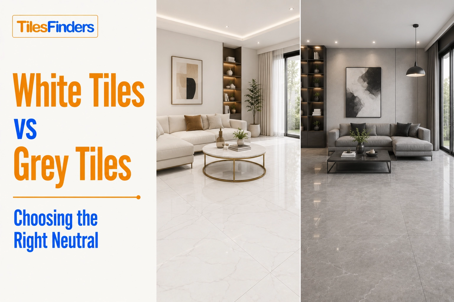
White tiles make rooms feel brighter, larger, and more open, making them ideal for compact bathrooms and low-light spaces. Grey tiles hide dust better and suit busy households with higher daily foot traffic. For most Indian homes, warm white and warm grey remain the safest, most versatile choices, with the final decision depending on room size, natural light, maintenance expectations, and furniture style.
Ask ten homeowners renovating a flat in India what colour they want for their tiles, and eight of them will say either white or grey. These two neutrals have dominated Indian tile choices across living rooms, bathrooms, and kitchens for the better part of a decade, and for good reason. They work with almost every furniture colour, they stay in fashion long after bolder choices feel dated, and they are available in every tile category, size, and finish.
But white and grey are not interchangeable. The two colours behave very differently across Indian homes, and choosing the wrong one for your specific room, lighting, lifestyle, and family situation creates problems that are visible every single day.
White tiles in a north-facing Mumbai flat with limited natural light look brilliant in the showroom and turn greyish at home. Grey tiles in a ground-floor apartment with high dust from the compound corridor look perpetually dirty within weeks of installation. Both outcomes are avoidable with the right information before purchase.
This guide breaks down white tiles versus grey tiles across every factor that matters in Indian homes: how each behaves under Indian lighting conditions, which rooms each suits better, how each holds up to daily maintenance, and how to decide between them for your specific situation.
Why White and Grey Tiles Dominate Indian Home Choices
The popularity of white and grey tiles in India is not just a design trend. It has practical roots that suit the way Indian homes are decorated and used.
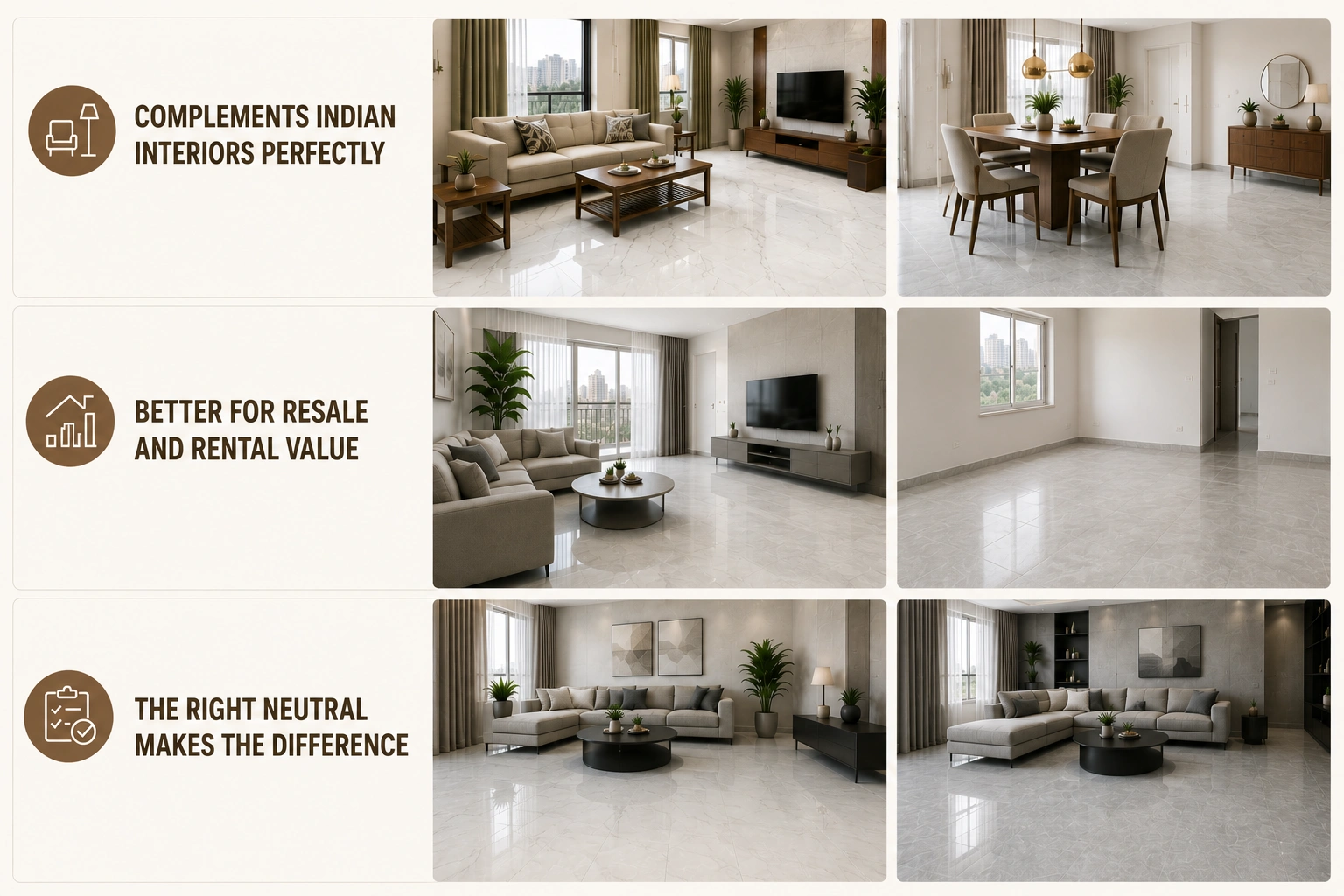
Indian homes typically use warm-toned wood furniture, brass or chrome hardware, fabric upholstery in earthy or jewel tones, and walls in off-white or cream. White and grey tiles complement this entire range without clashing. A bold terracotta or olive green tile limits furniture choices permanently. A neutral floor does not.
Resale consideration also plays a role. Most Indian homebuyers and rental tenants prefer neutral interiors because they project a blank canvas. Property consultants in cities like Pune, Hyderabad, and Chennai consistently confirm that strongly coloured tiles are among the first things buyers ask to see in pre-owned flats. Neutral tiles avoid that conversation entirely.
The practical question is never white or grey versus a bolder choice. It is which of these two neutrals that is the right one for your specific combination of room, light, lifestyle, and maintenance expectation.
Before finalising a colour, it's worth reviewing a Tile Sizes Guide since tile dimensions can affect how spacious, bright, and balanced a room feels, often as much as colour itself.
How White and Grey Tiles Actually Behave in Indian Homes
White Tiles: What They Do Well and Where They Fall Short
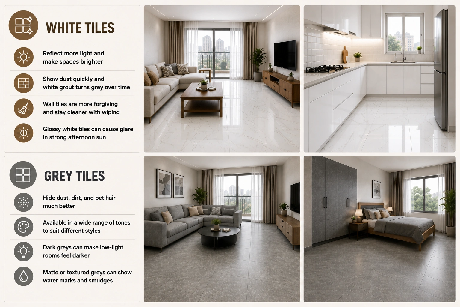
White tiles reflect more light than any other colour. In a room with limited natural light, a north-facing bedroom in a Mumbai society apartment, or a kitchen with no direct window above the counter, white tiles can make a meaningful difference to how bright the space feels. This is their strongest quality, and it is why white bathroom tiles remain the default choice in compact Indian bathrooms where every bit of perceived space matters.
The maintenance reality of white tiles in Indian homes is more complex than showrooms suggest. White tiles do not hide dust. In cities with high ambient dust levels, including most interior Indian cities and ground-floor flats near compound gates, white floor tiles show a film of dust within hours of mopping. White grout in particular turns visibly grey within months of installation in a heavily used bathroom or kitchen, and no amount of regular cleaning fully restores it.
White wall tiles are more forgiving than white floor tiles in terms of maintenance. Walls do not accumulate foot-traffic dust or muddy footprints. In bathrooms and kitchens where walls are wiped rather than mopped, white tiles stay clean with standard cleaning routines.
White tiles in glossy finish amplify light reflection to the point of glare in rooms with direct afternoon sun. South-facing and west-facing rooms in Indian cities experience intense afternoon light. A white glossy tile floor in a west-facing living room in Ahmedabad or Nagpur in May can be uncomfortable to be in during afternoon hours. Matte or Posh finish white tiles handle this significantly better.
Grey Tiles: What They Do Well and Where They Fall Short
Grey tiles hide dust, fine sand, pet hair, and light dirt far better than white tiles. This is their single biggest practical advantage in Indian homes, where daily sweeping and mopping is the norm and where dust from construction, road traffic, and seasonal winds is a constant presence. A medium grey matte floor tile in a living room that gets heavy footfall from a joint family, children, or domestic help with outdoor footwear will look clean and maintained in conditions where a white tile would look perpetually grimy.
Grey tiles come in a wider tonal range than white. Warm greys that lean toward taupe, cool greys with blue or green undertones, dark charcoal tiles, and pale silver-grey tiles all read as grey but behave very differently in a room. Warm grey tiles complement Indian teak and sheesham furniture, brass light fittings, and earthy upholstery tones naturally. Cool grey tiles suit contemporary interiors with chrome or black hardware and light-toned furniture.
The limitation of grey tiles appears in rooms that already have limited light. A dark charcoal tile in a north-facing bedroom in a Bangalore society apartment with trees blocking the window will make the room feel cave-like, regardless of how tasteful the design is. Grey tiles in lighter tones (pearl grey, silver, pale warm grey) avoid this problem, but still do not match the light-reflective quality of white.
Grey floor tiles in textured or matte finish can also show water marks and footprint smears more visibly than white in some situations. A mopping residue left to dry on a dark grey matte tile leaves visible streaks. The key is choosing a mid-tone grey rather than a very dark shade for floors that will be mopped daily.
White Tiles vs Grey Tiles: A Direct Comparison by Factor
| Factor | White Tiles | Grey Tiles |
| Light reflection | High - best for dark or north-facing rooms | Moderate - depends heavily on shade depth |
| Dust and dirt visibility on floors | High - shows dust quickly, needs frequent mopping | Low to moderate - mid-grey hides daily dust well |
| Grout maintenance | Harder - white grout stains and discolours noticeably | Easier - grey grout with grey tiles stays looking clean |
| Small room effect | Makes rooms feel larger and airier | Mid-grey is neutral; dark grey can make rooms feel smaller |
| Match with Indian furniture | Works with all furniture tones | Warm grey best with teak and wood; cool grey with modern |
| Resale appeal | Very high - universally accepted | High - especially mid-grey and warm grey tones |
| Outdoor and balcony suitability | Good with matte/GHR finish | Good with matte/GHR finish; hides outdoor dirt better |
| Kitchen backsplash | Classic, stays bright, and shows oil splashes more | Hides cooking residue better, suits modern kitchens |
| Bathroom wall | Brightens compact bathrooms best | Works well in larger bathrooms, suits grey-toned fixtures |
| Cost difference | No consistent price difference - finish and category matter more | No consistent price difference |
Room-by-Room Guide: White or Grey?
Living Room and Drawing Room
The living room decision depends primarily on two things: the room's natural light and the family's daily maintenance routine.
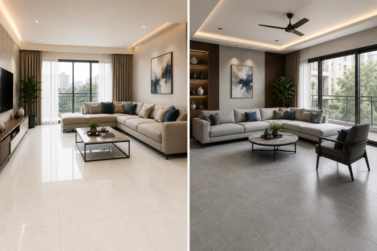
A south-facing or east-facing living room with good natural light suits grey tiles very well. A mid-tone warm grey GVT tile in matte or Posh finish on a 600x1200 mm (2x4) or 800x1600 mm (32x64) format keeps the room looking clean with normal Indian daily sweeping, handles the joint-family foot traffic that most Indian drawing rooms see, and does not create glare issues. Paired with warm-toned wood furniture and earthy upholstery, a warm grey tile floor looks considered and well-coordinated.
If you're considering the popular 2x4 format, this 600x1200 Tiles Guide explains where it works best, installation considerations, and why it remains a favourite for modern Indian living rooms.
A north-facing living room with limited natural light needs white or a very pale off-white tile to compensate for the light shortfall. In these rooms, grey tiles in anything beyond a pale silver tone make the room feel dim and flat. If the homeowner is committed to grey for maintenance reasons, the compromise is a very light grey tile (close to silver or pearl grey) in a reflective Posh or matte finish rather than a deep charcoal.
For large open-plan living and dining layouts in premium 3BHK and 4BHK apartments, a warm white GVT tile across the full floor plan creates the most unified, expansive quality. The uniform light tone makes the continuous floor plan feel like one generous space rather than two rooms placed next to each other.
Homeowners looking for fewer grout lines and a seamless luxury appearance can explore this 800x1600 Tiles Guide to understand why large-format tiles are becoming the preferred choice for premium flooring projects.
Bedroom
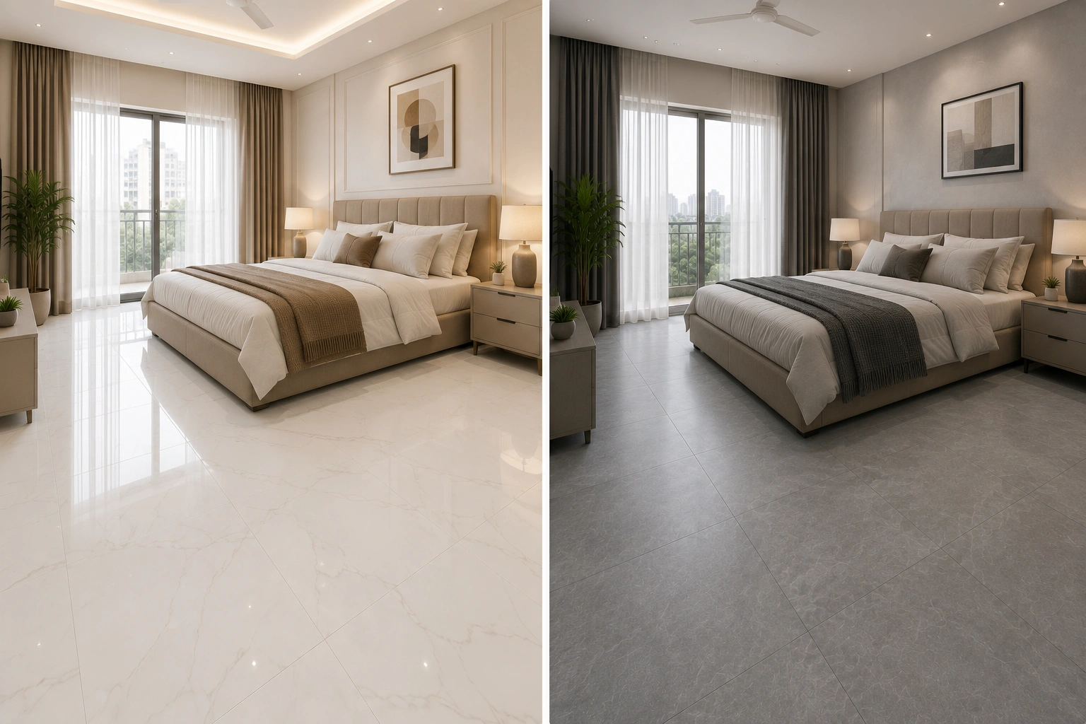
Bedrooms are where the white versus grey decision is most personal and least governed by practical rules. Both colours work in bedrooms. The choice comes down to the mood the homeowner wants and how the tile coordinates with furniture and bedding.
White or warm off-white tiles in a bedroom create a calm, clean, retreat-like quality. They suit bedrooms with darker wood bed frames, warm fabric headboards, and richly toned rugs. The contrast between the cool white floor and warm furniture tones is a combination that interior designers use consistently because it works across almost every bedroom furniture colour.
Grey tiles in a bedroom, particularly in warm taupe-grey or soft greige tones, create a cozier, more enveloping quality. They suit bedrooms designed in the Japandi or Scandinavian-influenced style that has become popular in Indian premium apartments, where the colour palette is deliberately muted and layered. A pale warm grey floor tile with warm linen, natural wood furniture, and rattan accents reads as sophisticated without feeling cold.
For children's bedrooms, white or light grey tiles in matte GVT finish are the practical choice. Crayon marks, clay, and art supplies clean off vitrified tile surfaces without staining. Darker grey tiles in children's rooms show chalk dust and light-coloured art residue more than white tiles do.
Bathroom
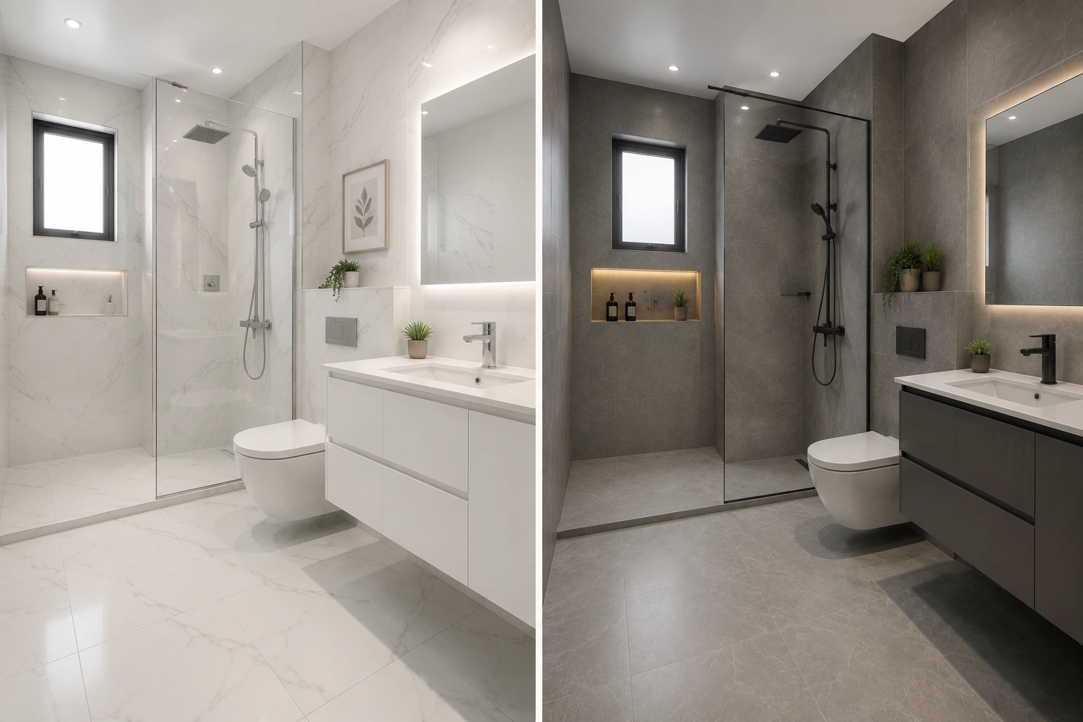
The bathroom is where white tiles have their strongest historical advantage in Indian homes. White tiles in a compact bathroom, which describes most bathrooms in 2BHK apartments, reflect the light from a single ceiling fixture or window across the entire surface, making the bathroom feel larger and brighter than its actual dimensions. This effect is real and meaningful in an 8-by-5-foot bathroom.
Grey tiles in bathrooms work well when the bathroom is larger (above 50 sq. ft.) and when the fixtures, fittings, and hardware are coordinated with the grey tone. A mid-grey GVT wall tile paired with a gunmetal grey shower fitting and a dark-veined marble-look floor tile creates a spa-like cohesion that white tiles cannot achieve in the same way. But this coordination requires deliberate planning that a standard builder-grade renovation rarely achieves.
For bathroom floors in both white and grey tiles, the finish choice is non-negotiable: matte, Rain Drops, or GHR finish only. Glossy, polished, or Satin Matte finish tiles on bathroom floors are a fall hazard when wet, regardless of colour. An anti-skid rating of R10 or above is the minimum for any Indian bathroom floor.
White grout in a grey-tiled bathroom and grey grout in a white-tiled bathroom both create problems. The grout colour contrast highlights every grout line. The better approach is tone-on-tone grout: off-white grout with white tiles, mid-grey grout with grey tiles. This reads as a more continuous surface and stays looking clean for longer.
Kitchen
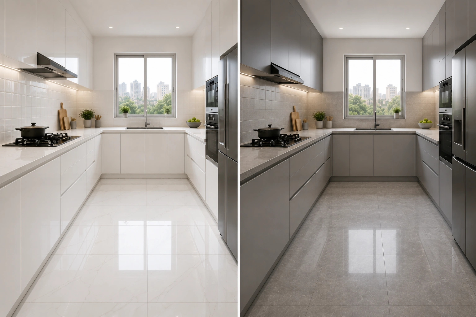
Indian kitchen maintenance is intensive. Daily cooking with oil, spices, and steam means kitchen tiles face conditions that no other room in the house matches. The colour and finish choice here is entirely driven by practical maintenance considerations.
For kitchen floors, grey tiles in matte GVT or GHR finish are the more practical choice over white. Oil mist, turmeric residue, and foot traffic from cooking are less visually obvious on a mid-grey floor than on a white one. A dark grey kitchen floor shows grease marks immediately; a mid-grey or warm grey tile manages this better than either extreme.
For kitchen backsplash walls, both white and grey work, but behave differently. White backsplash tiles in a glossy finish look bright and clean immediately after wiping, which is why they remain popular in Indian kitchens. The glossy surface repels oil splashes better than matte and cleans easily with a damp cloth. Grey backsplash tiles suit modern modular kitchen designs where the cabinet colour and hardware are already in darker or cooler tones.
Balcony and Outdoor Areas
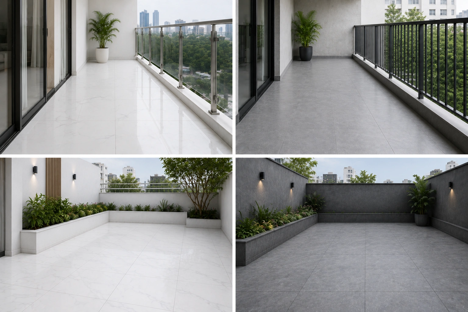
For balconies and covered outdoor areas, the colour decision is secondary to the finish and category decision. Any tile used outdoors in India must be a GVT or Full Body tile in matte, GHR, or textured finish with a high anti-skid rating. PGVT and any glossy finish tile should never go outdoors.
On the colour question: grey tiles hide the concrete dust, bird droppings, and leaf stain that accumulate on Indian balconies better than white tiles. A mid-grey GHR finish tile on a balcony floor requires noticeably less aggressive cleaning between monsoon seasons than a white tile in the same finish. For covered outdoor corridors and building entrances in residential societies, grey is the more practical choice for this reason alone.
Choosing the Right Shade: Not All Whites and Greys Are Equal
The biggest mistake most homeowners make in the white versus grey decision is treating each colour as a single option. There are many whites and many greys, and the differences between them change how the tile reads in a room dramatically.
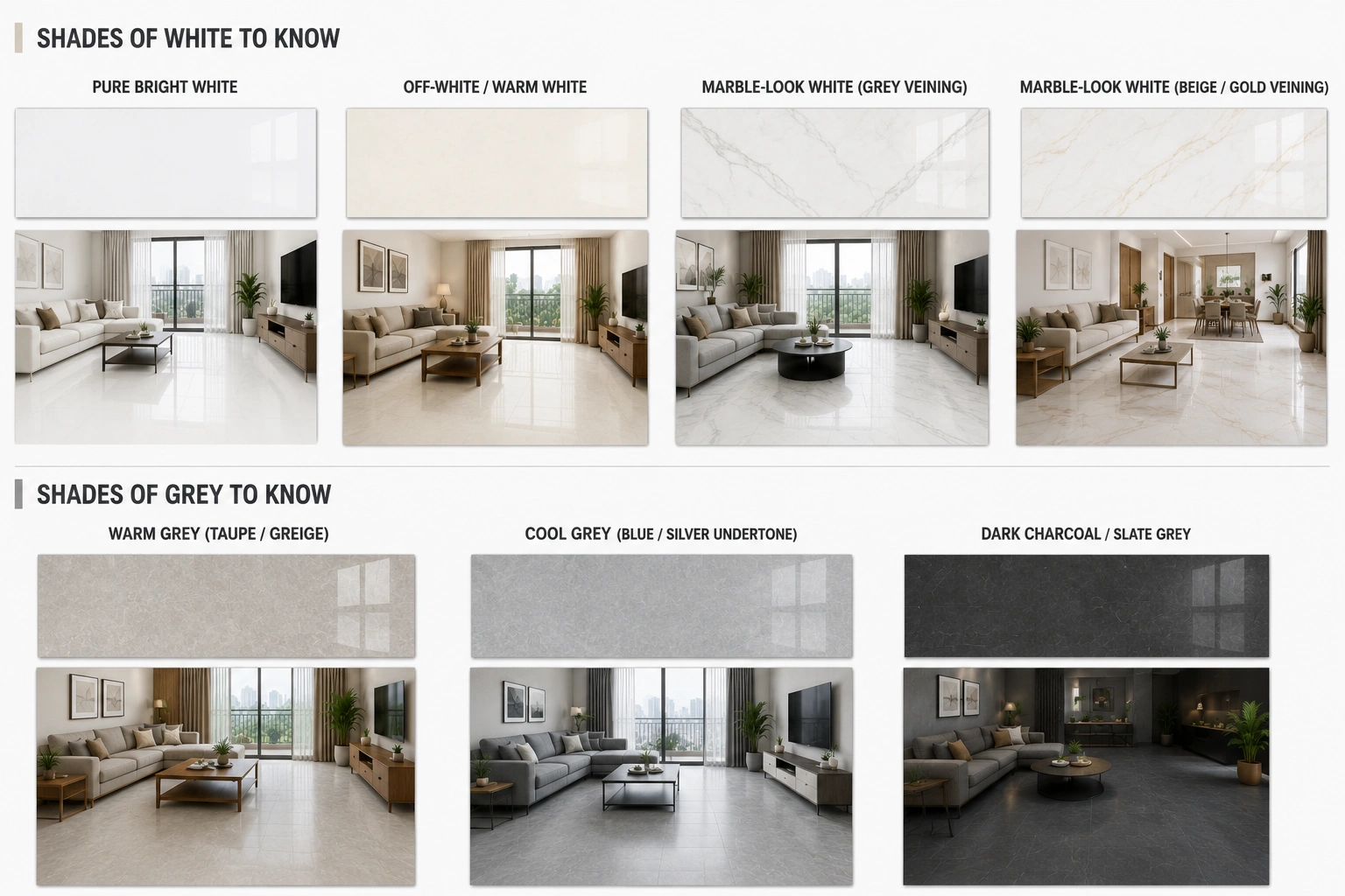
Shades of White to Know
Pure bright white tiles have a cool, clinical quality that works in modern minimalist interiors but can feel harsh in warm, traditionally furnished Indian homes. If the furniture is teak, sheesham, or any warm wood tone, a pure white tile creates an uncomfortable contrast between the warm wood and the cool floor.
Off-white and warm white tiles, which carry a slight cream, ivory, or warm grey undertone, bridge this gap. They read as white in the room but do not create the hard contrast that pure white does. Warm white is generally the better choice for Indian homes with traditional or transitional furnishing styles.
Marble-look white tiles carry veining in soft grey, gold, or beige that breaks the uniformity of a plain white surface. These tiles avoid the clinical quality of pure white while delivering the light-reflective benefit of a light-toned floor. They are among the most popular white tile designs in Indian living rooms and bedrooms for exactly this reason.
Shades of Grey to Know
Warm grey tiles, which lean toward taupe, greige, or mushroom tones, are the most forgiving grey for Indian homes. They coordinate with both warm wood furniture and contemporary interiors. In showrooms and catalogues, warm grey often looks like a straightforward neutral. In Indian homes, it reads as an intentional, harmonious choice.
Cool grey tiles, which carry blue, green, or silver undertones, suit contemporary interiors with chrome or matte black hardware, light-wood or painted furniture, and a cooler colour palette overall. They can look disconnected in rooms with heavy, warm-toned furniture.
Dark charcoal tiles, slate grey, and graphite tiles create a bold, dramatic quality that suits premium interiors with confident design choices. But dark grey on floors in rooms under 180 sq. ft. can feel overwhelming. In those rooms, dark grey works better as a feature wall tile or as an accent strip, not as the main floor tile.
Finish Choices for White and Grey Tiles in Indian Homes
| Finish | White Tiles | Grey Tiles | Where to Use | Avoid |
| Matte | Warm, soft, non-glare look | Rich, earthy, hides dust well | Floors and walls in all rooms | Nowhere - most versatile finish |
| GHR (Glaze High Resistance) | Clean textured quality | Excellent for high-traffic use | Outdoor, corridors, commercial floors | Fine china interiors - too textured |
| Posh (smooth matte) | Elegant, Italian marble-like | Sophisticated, low-key luxury | Premium bedroom and living room floors | Wet outdoor areas |
| PGVT Polished | Bright, hotel-lobby quality | Dramatic, high-contrast depth | Feature walls, dry indoor floors only | Bathrooms, outdoor, wet floors |
| Glossy (ceramic/GVT walls) | Bright, easy-clean for walls | Modern, bold for feature walls | Kitchen backsplash and bathroom walls | Any floor application |
| Matte Carving | Textured, tactile, less clinical | Rich stone-like character | Feature walls, rustic floor looks | Heavy-use commercial floors |
| Rain Drops | Clean anti-skid for wet use | Practical anti-skid for wet use | Bathroom floors, balcony floors | Smooth surface rooms - too textured visually |
The finish rule that applies to both white and grey tiles equally: glossy, high-gloss, polished, and Satin Matte finishes belong on walls and dry indoor floors only. No glossy finish tile, white or grey, should ever be used on bathroom floors, balcony floors, or any outdoor surface. The slip risk is the same regardless of colour.
Grout Colour: The Decision Most People Get Wrong
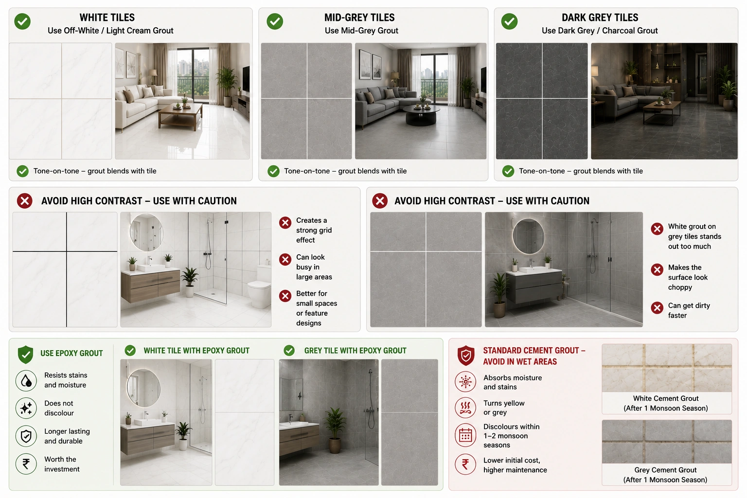
Grout colour with white and grey tiles is where many Indian home renovations lose the quality of the final result. The grout lines are visible across the entire floor or wall surface. Choosing the wrong grout colour turns a well-chosen tile into a disappointment.
The practical principle: match grout tone to tile tone. White tiles get off-white or light cream grout. Mid-grey tiles get mid-grey grout. Dark grey tiles get dark grey or charcoal grout. This tone-on-tone approach minimizes the visual presence of grout lines and lets the tile surface read as a continuous plane.
The contrasting approach, white tiles with dark grey grout or grey tiles with white grout, creates a graphic grid effect that is a deliberate design choice in some contemporary interiors. It works in bathrooms with a geometric aesthetic but reads as cluttered in large floor areas.
Epoxy grout is worth the additional cost in bathrooms and kitchen backsplashes for both white and grey tile applications. It resists staining, does not absorb moisture, and holds its colour for years. Standard cement grout in white turns yellow or grey within one to two monsoon seasons in Indian bathrooms. Epoxy grout does not.
Lighting, Climate, and Indian Context Factors
Room Orientation and Natural Light
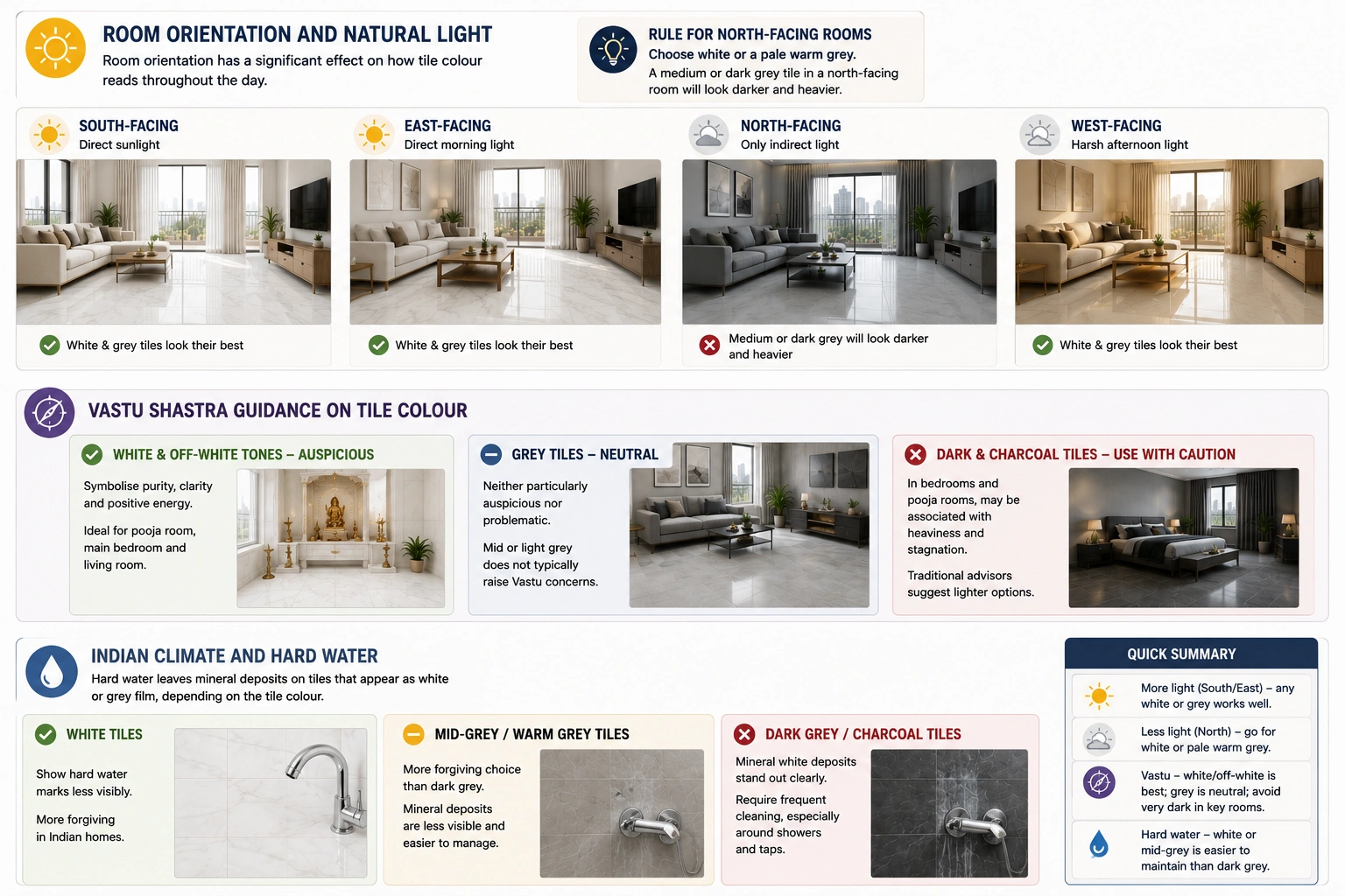
In Indian homes, room orientation has a significant effect on how tile colour reads throughout the day. South-facing and east-facing rooms receive direct sunlight that makes both white and grey tiles look their best. North-facing rooms receive only indirect light, which makes colours appear duller and cooler than they do in a showroom.
The rule for north-facing rooms in Indian homes: choose white or a pale warm grey. A medium or dark grey tile in a north-facing room will look significantly darker and heavier in real conditions than it did in the showroom.
Vastu Shastra Guidance on Tile Colour
Many Indian homeowners consider Vastu Shastra principles when choosing floor and wall colours. According to traditional Vastu guidance, white and off-white tones are considered auspicious for most rooms because they symbolize purity, clarity, and positive energy. White tiles in the pooja room, main bedroom, and living room align well with these principles.
Grey tiles are considered neutral in Vastu, neither particularly auspicious nor problematic. The concern in Vastu is with very dark or heavily saturated floor colours, which are sometimes associated with heaviness and stagnation. A mid or light grey tile does not typically raise Vastu concerns. Dark charcoal flooring in bedrooms and pooja rooms is where some traditional advisors suggest caution, recommending lighter options instead.
Indian Climate and Hard Water
Hard water is a reality in most Indian cities, from Delhi and Jaipur to Chennai and Bengaluru. Hard water leaves mineral deposits on tiles that appear as white or grey film, depending on the tile colour. White tiles show hard water marks less visibly than dark grey tiles, where the mineral white deposits stand out clearly against the darker surface.
In cities with very hard water, mid-grey or warm grey tiles on bathroom floors and walls are a more forgiving choice than dark grey or charcoal tiles, which require frequent cleaning to remove the white mineral film that accumulates around shower areas and near taps.
Which Should You Choose? A Practical Decision Guide
| Your Situation | Better Choice | Why |
| North-facing or low-light room | White or pale warm grey | Reflects available light, prevents a dark, cave-like feel |
| High-traffic floor, children or pets | Mid-tone grey (matte/GHR) | Hides daily dust, footprints, and light dirt much better |
| Small bathroom under 50 sq. ft. | White | Maximizes light reflection, making the space feel larger |
| Large bathroom above 70 sq. ft. | Either - grey for a modern spa look, white for a classic clean look | Room size handles both; match to fixture and fitting colour |
| Open-plan living and dining area | Warm white or pale grey | Creates a unified, expansive floor plane |
| An Indian kitchen with heavy daily cooking | Mid-grey for floor; white gloss for backsplash | Grey floor hides cooking residue; white wall stays bright |
| Balcony or covered outdoor corridor | Grey (matte or GHR) | Hides dust, bird stains, and outdoor grime better |
| Joint family home with high foot traffic | Grey (mid-tone matte) | Reduces visible maintenance burden significantly |
| Premium bedroom for resale value | Warm white or warm grey | Both read as premium; avoid dark charcoal in small rooms |
| Vastu-conscious home | White or off-white | Traditional Vastu favours light, pure tones in main spaces |
Common Mistakes When Choosing White or Grey Tiles
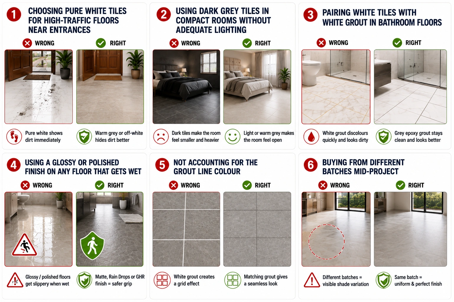
Choosing pure white tiles for high-traffic floors near entrances. Entrance areas in Indian homes accumulate outdoor dust and soil tracked in from footwear. Pure white tiles near the main doors and in hallways show this dirt immediately. A warm grey or off-white tile in a matte or GHR finish handles entrance areas far better.
Using dark grey tiles in compact rooms without adequate lighting. Dark charcoal and slate grey tiles require generous natural or artificial light to look intentional rather than gloomy. In a 10 by 12 foot bedroom or a bathroom under 50 sq. ft. with one overhead light, dark grey tiles create a space that feels smaller and heavier than it is.
Pairing white tiles with white grout in bathroom floors. White cement grout in Indian bathrooms discolours within months due to moisture, soap residue, and cleaning chemicals. On a bathroom floor, it becomes a maintenance burden that looks dirty even after cleaning. Dark grey or mid-grey epoxy grout with white floor tiles is far more practical.
Use a glossy or polished finish on any floor that gets wet. This mistake appears with both white and grey tiles. A glossy white bathroom floor tile and a polished grey kitchen floor tile both become slip hazards. Matte, Rain Drops, or GHR finish is the non-negotiable requirement for any floor tile in a wet or high-humidity area, regardless of colour.
Not accounting for the grout line colour in the final visual. A grey tile floor with white grout creates a gridded effect that emphasizes every tile joint. Many homeowners notice this only after installation. Decide on grout colour before ordering and ask your dealer to show a mock-up panel with the chosen grout in place.
Buying from different batches mid-project. This is more common with white tiles, where a first stock order runs short and a second delivery comes from a different batch. Even a 5% shade difference across a large floor area is visible in natural light. Calculate carefully and order the full quantity in one go.
Making the Choice That Works for Your Home
The white versus grey tile decision does not have a universal right answer. It has the right answer for your specific room dimensions, light conditions, family lifestyle, furniture palette, and maintenance expectations.
White tiles are genuinely better in dark rooms, compact bathrooms, and spaces where maximum light reflection matters. Grey tiles are genuinely better in high-traffic floors, rooms with abundant natural light, and spaces where daily maintenance realism should drive the choice over aesthetics.
Before going to a showroom, note down: the room's orientation, the ceiling light type, the furniture tones you are working with, the level of daily foot traffic the floor will see, and whether there is a specific maintenance concern (hard water, high dust, cooking residue). These five factors will narrow the decision down significantly before you see a single tile in person.
You can browse a wide range of white and grey tiles across GVT, PGVT, and marble-look categories in every size and finish on TilesFinders, India's growing tile marketplace, where you can compare options from leading Morbi manufacturers and request samples before visiting a showroom.
FAQs
Yes, white tiles reflect more light than any other colour, which creates a perception of greater space and airiness. This effect is most pronounced in rooms with limited natural light and in compact bathrooms where light reflection from all surfaces contributes to the overall brightness. The effect is strongest with a glossy finish on walls and a Posh or matte finish on floors in larger tile formats that reduce grout line interruptions.
Mid-tone grey tiles in matte or GHR finish are easier to maintain in Indian homes for floor applications. They hide the daily dust, fine soil tracked in from outdoor footwear, and cooking residue that accumulates on Indian floors. White tiles and dark charcoal tiles are both more demanding: white shows light dust and floor mop residue, and dark grey shows hard water mineral deposits and chalk-coloured dust clearly. Mid-grey is the practical middle ground for floors.
White tiles work very well for Indian bathroom walls, particularly in compact bathrooms under 50 sq. ft., where the light reflection genuinely makes the space feel larger. For bathroom floors, the colour is less important than the finish. White tiles on bathroom floors must be in matte, Rain Drops, or GHR finish with an anti-skid rating of R10 or above. Glossy or polished white bathroom floor tiles are a fall hazard and should not be used, regardless of how they look in the showroom.
Warm grey tones, which lean toward taupe, greige, or mushroom undertones, suit Indian living rooms best. They coordinate naturally with the warm wood furniture, brass or gold hardware, and earthy upholstery tones common in Indian drawing rooms. Cool blue-grey or silver-grey tiles suit contemporary interiors with lighter furniture and chrome hardware, but can look cold against traditional Indian furnishing styles. In all cases, test a physical sample at home under your actual lighting before finalising the shade.
Yes, and it is a common choice in Indian bathrooms and kitchens. A typical combination is white GVT tiles on walls with a grey matte tile on the floor, or grey wall tiles with white anti-skid floor tiles. The key is keeping the tones coordinated: warm white walls with warm grey floors, or cool white walls with cool grey floors. Mixing a warm-toned white with a cool-toned grey creates an unintended colour clash that reads as an error rather than a deliberate design choice.
Both perform well for resale. Pure white tiles are universally safe and unlikely to create any objection from buyers. Mid-tone warm grey tiles are increasingly accepted as a premium neutral in Indian property markets, particularly in cities like Mumbai, Bangalore, Hyderabad, and Pune, where contemporary interior aesthetics are more established. Dark charcoal tiles carry slightly more resale risk because they read as a bolder choice that some buyers will want to change. For resale-focused renovations, warm white or warm grey in the most common large formats (2x4 or 32x64) in matte or Posh finish is the reliable combination.
There is no consistent price difference between white and grey vitrified tiles of equivalent category and size. The price is determined by the tile category (GVT, PGVT, Full Body), size, finish complexity, and brand. A mid-grey matte GVT tile and a white matte GVT tile in the same size from the same manufacturer cost approximately the same. Approximate 2026 ranges: GVT tiles ₹70 to ₹180 per sq. ft., PGVT tiles ₹80 to ₹250 per sq. ft., marble-look tiles ₹90 to ₹280 per sq. ft. These apply equally to both white and grey options.