Pink Tiles, Spaces That Radiate Warmth, Joy & Soft Luxury
Loading designs...
-
Adam 03 300x600Matte -
Lyon 300x600Matte -
7411 300x600Matte -
Sea Sand Rossa 800x1200Matte -
3030 HL 1 300x450Glossy -
3030 300x450Glossy -
3030 L 300x450Glossy -
3030 D 300x450Glossy -
3030 D 300x450Glossy -
3030 HL 1 300x450Glossy -
3030 L 300x450Glossy -
3030 HL 1 300x450Glossy -
3030 L 300x450Glossy -
3030 D 300x450Glossy -
3030 D 300x450Glossy -
3030 HL 1 300x450Glossy -
3030 L 300x450Glossy -
(ELE-9016)ELE-1224 300x450Matte -
(RD-7002)RD-5004 300x450Matte -
Rossa 600x600Glossy


ELE-1224")
RD-5004")

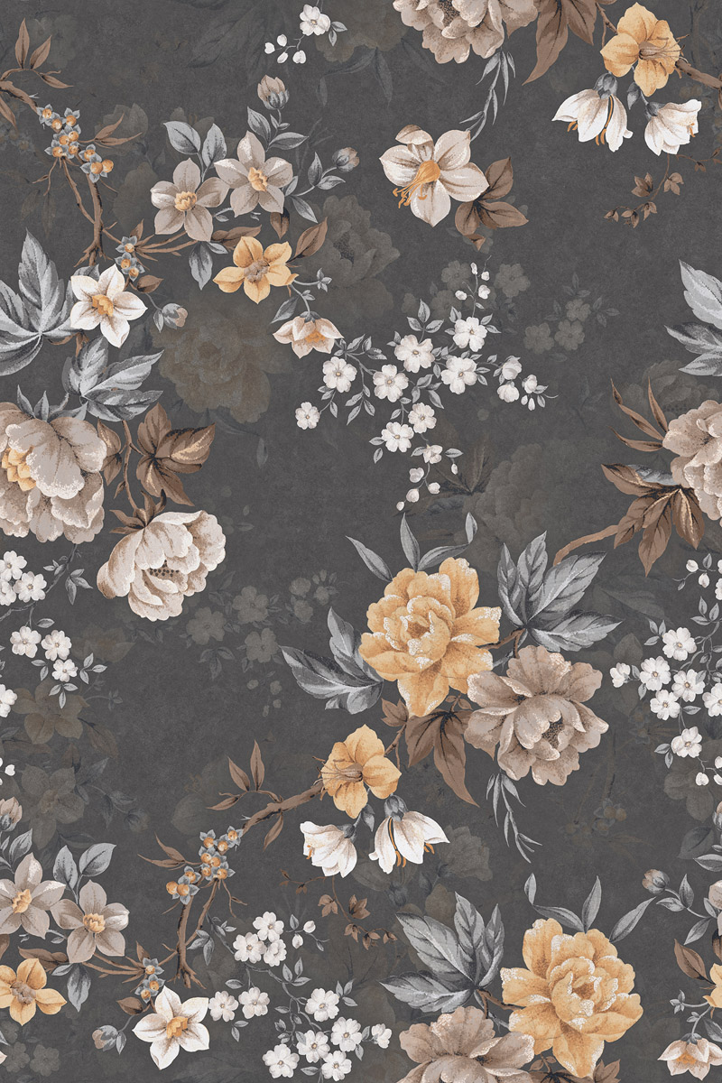
Pink( Gulabi) is far more than a visual shade in Indian culture; it is an emotion wrapped in heritage, spirituality, and social meaning. Across centuries, pink has symbolized hospitality, femininity, nurturing love, compassion, and joyful celebration, deeply rooted in traditions ranging from Jaipur’s iconic Pink City, painted to welcome royalty, to the opulent Rani Pink Banarasi silks cherished by queens. The color appears in festivals like Holi, in the spiritual serenity of Goddess Mahagauri, and in the natural wonders of flamingos and Lonar Lake, forming a cultural memory that blends softness with quiet power. Today, pink also stands for modern empowerment, fearlessness, hope, and social awareness, making it a color that carries both nostalgia and progressive identity.
When reimagined as tiles, pink transforms interiors into spaces of serenity, warmth, and visual comfort. Its gentle tones soften harsh lines, its brighter hues inject youthful energy, and its natural warmth makes rooms feel more open and inviting. Pink tiles adapt beautifully across design styles, minimal, artistic, contemporary, luxury, or bohemian, while bringing a memorable charm that other colors rarely achieve. Whether used in a subtle blush accent wall or a bold Rani Pink statement zone, the color introduces harmony, emotional depth, and a soft-luxury aura. This makes pink tiles a preferred choice for homeowners and designers seeking a balance of aesthetic elegance, emotional upliftment, and cultural connection within modern Indian spaces.
Why Pink Tiles Effortlessly Stand Out
1. They Make Interiors Feel Positive, Gentle & Nurturing
Pink tiles instantly soften the atmosphere, making homes feel warm, caring, and comfortable, especially for families with children or elderly members who prefer calm surroundings. Even though lighter pinks can sometimes look faint in very bright rooms, this softness actually becomes an advantage for people who want a peaceful, non-distracting look that still feels warm and inviting.
2. Pink Responds Beautifully to Warm Lighting
Under warm lighting, pink reflects a pleasant glow that enhances the overall ambience of living rooms, bedrooms, and boutique spaces. In cooler white light, the shade may feel slightly muted, but many designers use this to their benefit. It allows the same tile to shift between a cosy evening mood and a clean daytime look without changing anything else.
3. Balanced Color: Not Too Loud, Not Too Plain
Pink hits the perfect balance between plain whites and strong blacks. It adds character without overwhelming the room, making it ideal for customers who want subtle color. At times, very soft pinks may merge with beige or cream elements, but this neutral blending is often preferred in minimalist homes, helping the space feel bigger and more uniform.
4. A Designer Favourite for Accent Walls, Bathrooms & Backsplashes
Designers choose pink because it introduces personality without creating visual noise. Whether used in accent corners, bathrooms, or kitchens, it helps spaces look fresh and thoughtfully designed. While certain finishes, especially glossy textures, can show smudges more easily, this encourages homeowners to opt for matte or satin pink tiles, which maintain a cleaner and more premium look.
5. Highly Photogenic for Social-Media-Friendly Spaces
Pink tiles photograph exceptionally well, making them perfect for cafes, salons, studios, and modern homes that need visually appealing backgrounds. Although too much pink can sometimes make a space look overly themed in photos, pairing it with whites, greys, or natural wood instantly adds maturity and balance, turning the same color into a sophisticated backdrop.
Psychology of Pink Colour in India
In India, pink carries a unique psychological influence because it blends red’s energy and passion with white’s purity and calmness. This combination creates a color that feels warm, positive, and emotionally reassuring. Soft pinks help reduce visual stress, making them ideal for bedrooms, meditation corners, and bathrooms where relaxation is important. Brighter shades such as fuchsia and magenta stimulate creativity and enthusiasm, which is why they are often used in study areas, home offices, and artistic spaces.
Pink also naturally encourages feelings of care, affection, and bonding, making it especially popular in couples' bedrooms and family homes. Even though extremely pale or overly intense pinks may sometimes feel too soft or too bold, these variations can act as advantages. Soft tones calm the mind, while bold tones energize it, allowing homeowners to choose the emotional effect they want.
Best Pink Tile Shades
1. Baby Pink
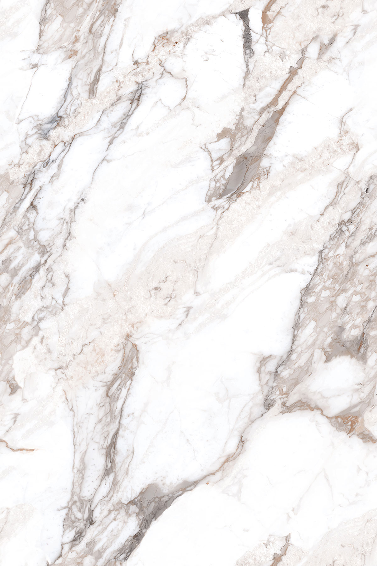
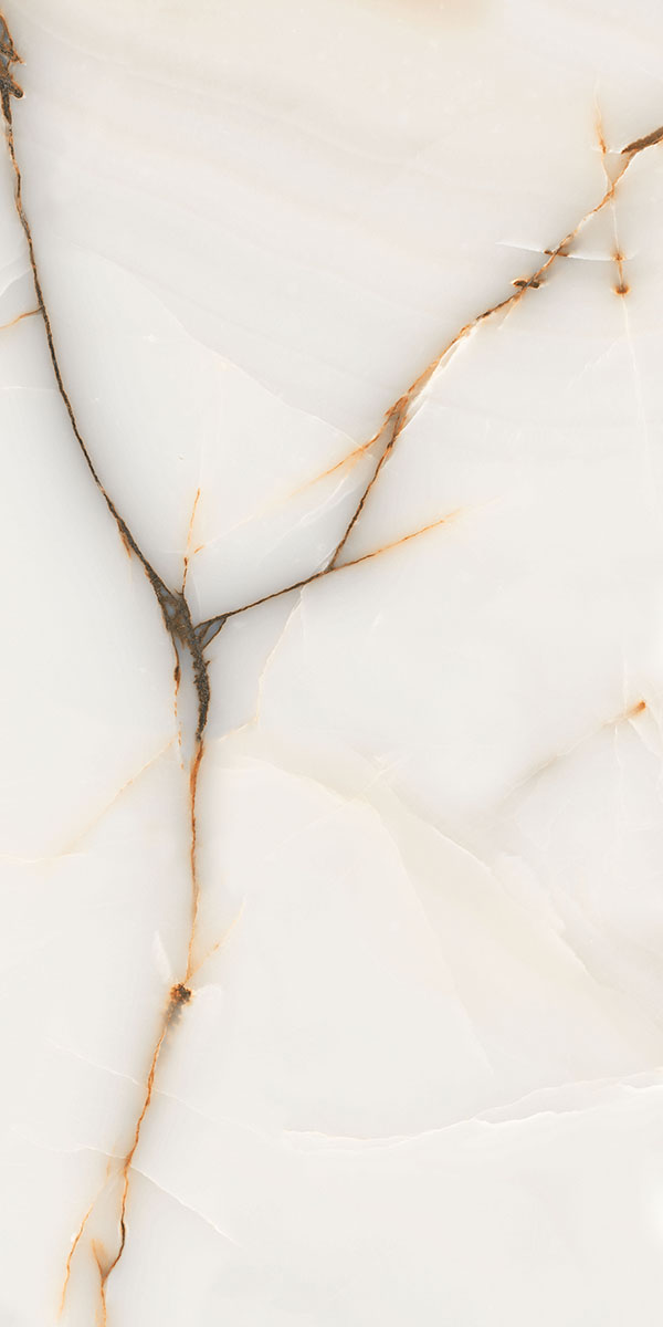
Baby Pink is one of the most popular tile shades because it creates a gentle, soothing environment similar to lotus petals seen around Lotus Temple (Delhi) and traditional South Indian temple ponds. Its tone resembles natural stones like Rosa Pink Marble and Pink Quartzite, which are known for their soft blush character. Today, the same marble-like designs are widely available in Baby Pink ceramic and vitrified tiles, offering the same calming look at a much more affordable price and without the high maintenance required for real marble.
2. Light Pink / Blush Pink
Light Pink or Blush Pink tiles are preferred in modern homes for their subtle luxury, reflecting the soft tones of rose quartz crystals sold in wellness hubs like Haridwar and Rishikesh, and roses used in temples of Vrindavan. This shade closely matches natural materials such as Rosa Pink Marble, Rose Quartzite, and Udaipur Pink Marble. Tile manufacturers now offer blush-pink marble-look tiles that replicate these stones' patterns beautifully at a lower cost, while also being stain-resistant and easier to maintain.
3. Rose Pink
Rose Pink tiles take inspiration from wedding roses and cultural floral decor seen in Jaipur, Udaipur, and Varanasi. The color closely resembles natural marbles like Rosa Portugués Marble and Udaipur Pink Marble, both known for their soft elegance. These stone patterns are now reproduced in Rose Pink marble-look tiles, giving homeowners the same graceful effect without polishing, sealing, or the high upkeep real marble demands.
4. Hot Pink / Bright Pink
Hot Pink and Bright Pink tiles are bold shades frequently used in cafes and creative interiors, inspired by vibrant visuals from Mathura's Holi, Chandni Chowk bridal markets, and modern versions of Banarasi Rani Pink. These tones are similar to the richness of Mughal Pink Onyx, a premium stone admired for its brightness. Today's tile collections offer stunning, bright-pink onyx-look surfaces at a fraction of the price, providing the same statement effect while avoiding the fragility and maintenance issues of real onyx.
5. Deep Pink / Magenta
Deep Pink and Magenta tiles reflect festive Indian aesthetics seen in textile centers like Jaipur, Hyderabad, and Varanasi. These tones resemble stones such as Pink Travertine and deeper versions of Rosa Portugues Marble, which naturally carry magenta veins. Tile factories now offer magenta and deep-pink marble-look options that deliver the same rich, luxurious appeal without the cost, porosity, or maintenance needs of real stone.
6. Fuchsia
Fuchsia tiles bring youthful vibrancy, similar to the bright bougainvillea flowers seen in heritage cities like Pondicherry, Goa, and Jaipur. This shade is closest to the dramatic tones of Pink Quartzite and Pink Onyx, often used in designer interiors. Affordable fuchsia tiles now mimic quartzite and onyx patterns effectively, giving a premium look while avoiding issues like heavy weight, sealing requirements, and color sensitivity of natural stone.
7. Coral Pink
Coral Pink tiles offer a warm, refreshing look inspired by the sunset glow on Mandu Fort and coastal towns like Goa and Pondicherry. This shade matches well with stones such as Rosa Pink Marble, which carries a soft coral tint. Tile versions of coral-pink marble patterns are now popular because they offer the same warmth and elegance as marble but at a lower price, with simple cleaning and no need for periodic polishing.
8. Salmon Pink
Salmon Pink tiles have a peachy-pink warmth influenced by coastal tones seen along Konkan beaches, Kerala backwaters, and Diu's cliffs. Their undertones resemble Rose Granite, an Indian stone known for its earthy pink warmth. Many brands now offer salmon-pink granite-look tiles that capture this natural beauty without granite's weight, cost, or installation complexity, while still maintaining a premium look.
9. Dusty Rose
Dusty Rose tiles carry earthy undertones similar to the mineral blush shades of Lonar Lake (Maharashtra) during its rare pink bloom. This shade visually aligns with natural stones like Udaipur Pink Marble and sometimes Pink Travertine, which have muted elegance. Tile manufacturers now offer Dusty Rose marble-look tiles that replicate these natural textures affordably, giving the same sophisticated feel without marble's porous nature or ongoing maintenance.
10. Candy Pink
Candy Pink tiles are playful and energetic, resembling the vibrant visuals of sweet shops in Mathura, Kolkata, and Gujarat's traditional mithai markets. This shade is similar to the lively tones found in Pink Quartzite, a naturally bright stone. Tile alternatives provide the same cheerful appeal at a budget-friendly cost and are much easier to clean, ideal for spaces that require hygiene and durability.
How Pink Tiles Elevate Modern Homes
1. Living Room
For living room accent walls, sizes like 600×1200 mm, 800×1600 mm, and 1200×2400 mm are commonly preferred because large-format tiles create a seamless and premium look. These formats allow bookmatch, marble-look, punch textures, endless-vein patterns, and soft 3D designs to appear bold and continuous across the wall. Subtle pink marble-look slabs and abstract or terrazzo-inspired surfaces in these sizes instantly elevate the space, giving the room a sophisticated and modern backdrop.
2. Bedroom
In bedrooms, 300×600 mm and 600x600 mm tiles are generally chosen because these sizes are easier to install in medium and compact rooms and help maintain visual softness. Matte pastel tiles, GHR finishes, floral decor, geometric patterns, monochrome blush tiles, and plain pastels look best in these formats since they fit naturally behind the headboard without overpowering the space.
3. Kitchen
For kitchen backsplashes, pink tiles in 100×300 mm subway, 50×200 mm Kitkat, 300×300 mm Moroccan, 300x450, and 300×600 mm wall tile formats are widely used. These sizes fit easily around cabinets, switches, and chimneys while still offering a stylish, modern visual. Pink backsplashes add charm without making the space look smaller, and patterns such as Moroccan motifs, rustic pink stone looks, modern abstract tiles, and monochrome blush surfaces are commonly selected.
Dining spaces usually feature pink tiles in 300×600 mm, 600×600 mm, and 600×1200 mm sizes because these formats create a clean, balanced look while covering larger wall areas efficiently. Pink tiles help make dining corners feel welcoming and visually bright, blending well with modern and traditional Indian decor. Popular looks include marble-inspired blush panels, floral prints, textured punch tiles, Moroccan accents, and soft monochrome pink surfaces.
For countertops and vertical fascia areas, 600×600 mm and 600×1200 mm slab-format tiles are often preferred because they offer a smooth, continuous appearance and are easier to maintain than natural stone. Matte and satin pink tiles are commonly used here, as they replicate a modern stone-like finish while staying resistant to stains and scratches. These pink slab tiles bring a warm, contemporary feel to the cooking zone without needing the heavy upkeep of natural materials.
4. Bathroom Areas
Bathrooms benefit from pink tiles because the color creates a soft, spa-like environment. Tile sizes like 300x450, 300×600 mm, and 600×1200 mm are commonly used, as they provide easy handling and elegant coverage for shower walls, vanity areas, and wet zones. Suitable looks include glossy surfaces, subtle 3D ripple effects, floral decor tiles, stone-inspired textures, and modern marble-look finishes, all of which help the bathroom appear brighter and more refined.
5. Children's Rooms & Study Areas
For kids' rooms and study areas, 300×600 mm, 600×600 mm, and 300×300 mm tiles are preferred. These sizes allow playful patterns, Moroccan, geometric, abstract, monotone pastel pink, decorative motifs, and terrazzo visuals to be showcased clearly without overwhelming the room. They are also easier to maintain, especially when used as half-height wall cladding.
6. Commercial Spaces – Cafes, Salons & Boutiques
Commercial interiors rely heavily on strong visual appeal, which is why 300×300 mm Moroccan tiles and large slabs such as 800×1600 mm and 1200×1800 mm are widely used for cafes, salons, and boutiques. These sizes help create bold feature walls and eye-catching brand backdrops that work perfectly for Instagram-friendly corners. Popular styles include endless-vein marble looks, embossed decor textures, Moroccan-inspired patterns, and modern abstract panels, all of which help businesses create a memorable and visually impactful environment.
Perfect Color Combinations with Pink Tiles
White + Pink – Clean, Modern, Airy
White and pink together create a bright, fresh look that makes any space feel open and modern. White softens pink's warmth and keeps the room looking clean, minimal, and airy, perfect for bathrooms, kitchens, and simple contemporary interiors.
Grey + Pink – Balanced Sophistication
Grey tones down pink's softness and creates a refined, balanced atmosphere. This combination feels mature without losing warmth, making it ideal for living rooms and bedrooms that need a subtle, elegant touch.
Gold + Pink – Royal Elegance
Gold accents add richness to pink tiles, giving the space a luxurious, festive, and royal feel. It's a perfect pairing for vanity areas, accent walls, and boutique-like interiors where a hint of glamour is desired.
Black + Pink – Bold, Contemporary Contrast
Black provides a sharp contrast to pink, creating a bold and modern look. This combination is eye-catching and stylish, often used in feature walls, cafes, and trendy kitchens for a dramatic visual impact.
Beige/Cream + Pink – Warm, Soothing Interiors
Beige or cream with pink creates a warm, soft, and calming environment. This gentle pairing works well in bedrooms, dining areas, and living rooms where comfort and subtle elegance matter.
Mint Green + Pink – Retro, Refreshing Palette
Mint green adds a cool, refreshing balance to pink, creating a cheerful and retro-inspired look. This combination suits kitchens, kids' rooms, and creative spaces that need a lively but soft feel.
Navy Blue + Pink – High-End, Dramatic Effect
Navy blue deepens pink's vibrancy and creates a high-end, dramatic contrast. It's ideal for sophisticated living rooms and commercial spaces where a bold, designer-like atmosphere is desired.
Rose Gold + Pink – Premium Feminine Luxury
Rose gold enhances pink's elegance, giving the space a premium, soft, and feminine feel. It's a great fit for bathrooms, salons, vanity corners, and walk-in wardrobes where a polished look is preferred.
FAQs
Not necessarily. Soft blush and pastel pinks feel neutral and elegant, while deeper tones add sophistication. With balanced decor, pink tiles work for all styles, minimal, modern, rustic, or luxury, and are not limited to feminine themes.
Yes, but select matte or GHR matte finishes to ensure safety and reduce slipperiness. Glossy pink tiles are better suited for walls.
Yes. Pink marble-look tiles are very popular because they replicate premium stones like Rosa Pink or Rani Pink marble at a more affordable price and with easier maintenance.
Absolutely. Pink looks beautiful with wood. Light oak, teak, walnut, and bamboo tones all complement pink tiles naturally.
The best grout colours for pink tiles are white, grey, beige/cream, or matching pink grout, depending on the look you want.
- White grout gives a clean and bright modern finish.
- Grey grout adds soft definition without overpowering the tile.
- Beige or cream grout creates a warm, natural blend with coral or salmon pink tiles.
- Pink-tone matching grout offers a seamless, monochrome look ideal for minimalist designs.
Warm white lighting enhances pink tones, making spaces feel cozy and inviting. Neutral lighting also works well for a cleaner look.