

Floral Tiles: Flower Design Options for Walls, Floors and Kitchens in India
Loading designs...
-
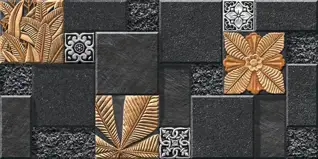 W Denver 02
 -
 W Denver 03
 -
W Denver 04
-
W Denver 05
-
W Denver 06
-
W Denver 07
-
W Denver 08
-
W Denver 11
-
W Denver 12
-
W Denver 13
-
W Denver 14
-
W Denver 01
-
1201
-
1202
-
1601
-
1203
-
1101
-
1204
-
1102
-
1205
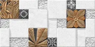
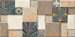
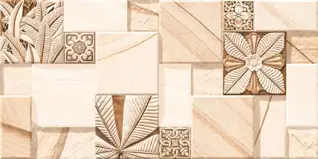
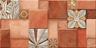
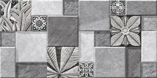
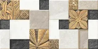
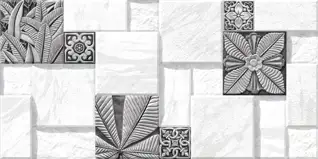
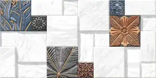
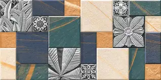
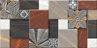
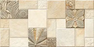
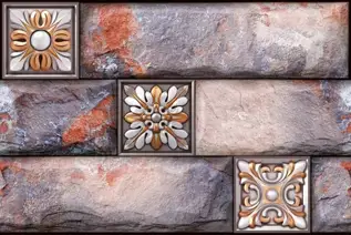
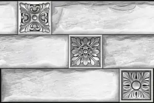
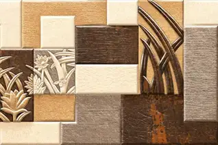
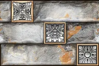
Floral tiles have been used in Indian homes for generations, from hand-painted terracotta flower tiles in traditional bungalows to high-definition digital-print GVT in modern apartments. The range today covers every surface: kitchen backsplash, bathroom wall, living room floor, bedroom accent wall, and exterior elevation. This page covers every body type, format, colour, and application for flower design tiles available in India, with guidance on where each option works and where it does not.
Why Floral Tiles Work in Indian Interiors
India has one of the longest traditions of floral motifs in architecture and design. From Mughal jaali screens to South Indian temple borders, the flower pattern is deeply embedded in how Indian spaces are decorated. Floral tiles carry that tradition into a practical surface product that is easy to install, easy to clean, and available across price points that suit both budget and premium projects.
A flowery tile does something a plain tile cannot: it adds depth and character to a surface without requiring any additional decor. A floral kitchen backsplash, a flower tile floor in a pooja room, or a decorative flower tile border on a bathroom wall all function as built-in design elements that outlast paint, wallpaper, and surface treatments.
The shift to digital printing in GVT manufacturing has significantly expanded the range. A floral tiles design that previously required hand-painting or third-firing can now be produced at scale with consistent quality. This has brought the price of a high-definition floral pattern tile down considerably, making it accessible to a much wider range of projects.
Body Types for Floral Tiles in India
| Body Type | Water Absorption | Floral Design Method | Best Use | Price Range (Rs./sq.ft) |
| GVT (Glazed Vitrified) | 0.05% | Digital inkjet print on glaze | Floor and wall, all rooms | Rs. 50 to Rs. 180 |
| PGVT (Polished Glazed Vitrified) | 0.05% | Digital print + polished surface | Living room floor, bedroom, feature wall | Rs. 65 to Rs. 200 |
| Ceramic | 12% to 16% | Digital print or third-fire decoration | Wall use only | Rs. 45 to Rs. 120 (or Rs. 150 to Rs. 400/box) |
| Porcelain | 2% to 5% | Digital print on matte body | Floor and wall, indoor | Rs. 55 to Rs. 160 |
| Encaustic / Cement | 4% to 8% | Inlaid pigment pattern (handmade) | Covered floors and walls, accent use | Rs. 90 to Rs. 280 |
| Mosaic (GVT chips) | 0.05% | Pattern assembled from cut chips | Backsplash, bathroom wall, borders | Rs. 80 to Rs. 225 |
Note: Ceramic floral tiles are wall-format only. Do not use ceramic tiles (300x300, 300x450, 300x600) on any floor regardless of design. For flower design tiles for floor applications, always use GVT or porcelain body types.
Floral Tiles by Application
Floral Wall Tiles
Wall tiles with floral motifs are the largest segment of this category in India. They are used in bathrooms, kitchens, living rooms, bedrooms, and pooja rooms. Ceramic flower tiles in 300x450mm (12x18) and 300x600mm (12x24) are the most common wall formats. GVT floral wall tiles in 600x600mm and 600x1200mm are used where a larger pattern repeat is wanted, or where the same tile needs to run across both the floor and wall.
Flower design wall tiles work best as a feature surface rather than covering all four walls. Use them on one accent wall behind a sofa, bed, or counter, and pair with a plain tile in a matching base colour on the remaining walls. This approach prevents visual overload and lets the floral pattern read clearly.
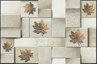
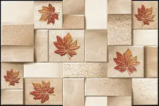
3D flower wall tiles use an embossed or relief surface where the flower motif is physically raised above the tile body. These are GVT or ceramic tiles with a High Depth punch texture applied during pressing. The raised surface catches light differently across the day, giving the wall a sculptural quality. They are used in living rooms, bedroom headboard walls, and entrance lobbies. Avoid 3D flower design wall tiles in areas that need frequent wet cleaning, as the relief grooves collect moisture and soap residue.
Floral Floor Tiles
Flower design floor tiles in India use GVT or porcelain as the base body. The floral pattern is applied through high-definition digital inkjet printing on the glaze layer. For the floor tiles, the finish must be matte, sugar, or GHR. A polished floral floor tile is slippery in wet conditions and should only be used in bedrooms and dry living areas.
Flower pattern floor tiles in large formats (600x600mm and 600x1200mm) give the full floral repeat across a larger area. Smaller formats like 300x300mm (12x12) and 400x400mm (16x16) allow a faster pattern repeat, which suits smaller rooms like bathrooms and pooja rooms better. The 300x300mm floral floor tile is a particularly common choice for pooja room floors in Indian homes, where a detailed flower motif at a smaller scale works well with the proportions of the space.
Black and white floral floor tiles in GVT matte finish are a popular choice for entrance halls, bathrooms, and heritage-style bungalow interiors. The high contrast makes the pattern very readable even in low light. Black and white floral tile in a 300x300mm format laid in a diagonal pattern is a classic look for Indian verandah and entrance floors.
Floral Kitchen Tiles
The kitchen is one of the most common applications for flower tiles in Indian homes. A floral kitchen backsplash adds colour and character to the counter area without requiring any additional styling. The most practical format for a kitchen wall tiles flower design is 300x450mm or 300x600mm ceramic or GVT in a glossy or matte finish. The smooth glaze cleans easily when oil and cooking vapour settle on the surface.
Floral kitchen wall tiles in blue and white are among the most searched colour combinations in India. The blue and white floral tile draws from both Portuguese azulejo tradition and Indian hand-painted pottery aesthetics, and it works well in both contemporary and traditional kitchen styles. Blue floral tile backsplash options are available in ceramic from Rs. 50 per sq.ft and in GVT from Rs. 75 per sq.ft.
For kitchen floors with a floral design, use GVT tiles in matte or GHR finish. Flower tiles for the kitchen floor need a minimum R10 slip rating, given the wet and greasy conditions. Ceramic kitchen floor tiles with a floral print are not a suitable choice; ceramic's water absorption of 12% to 16% makes it inappropriate for kitchen floors.
A floral kitchen tile mural is a panel of tiles that together form one large floral image across a section of wall. These are typically used as a feature panel behind the cooking range or above the counter. Mural panels are printed across multiple tiles in sequence and need to be laid in the correct order during installation. Confirm the panel sequence numbering with the supplier before beginning the lay.
Floral Bathroom Tiles
Floral tiles for bathroom walls are available in ceramic, GVT, and mosaic formats. For shower walls and wet areas, GVT in a matte or glossy finish with low water absorption (0.05%) is the correct choice. Ceramic flower tiles work well on bathroom walls outside the shower zone.
A flower mosaic tile backsplash in a bathroom, typically a 300x300mm mesh-mounted sheet of small GVT chips in a floral pattern, is a popular choice for the feature wall behind a vanity or bathtub. Mosaic floral tiles come in GVT body with 0.05% water absorption and are fully suited to wet bathroom walls. Price range for mosaic floral tiles: Rs. 80 to Rs. 225 per sq.ft.
Note: For bathroom floors, never use a ceramic floral tile or any polished-finish floral tile. Use GVT matte or sugar finish with a minimum R10 slip rating.
Floral Tiles for Living Room
Living rooms in India use floral tiles most commonly on one feature wall. A large floral tile in GVT or PGVT format (600x600mm or 600x1200mm) on the wall behind the television unit or sofa creates a strong focal point. PGVT polished floral tiles in a marble-look or Calacatta base with a floral overlay give maximum visual impact in a living room setting.
For living room floors, a GVT floral tile in matte finish in 600x600mm is the most common choice. Large floral tiles in 600x1200mm with a subtle all-over floral print (rather than a bold centrepiece pattern) work well in open-plan living areas where the pattern needs to read quietly across a large floor area.
Bedroom Flower Tiles
Bedroom flower tiles are typically used on the headboard wall behind the bed. A single floral accent wall in GVT, ceramic or PGVT tiles gives the bedroom a finished look without the upkeep of wallpaper or fabric panels. Pink floral tiles, green floral tiles, and soft grey floral tiles are the most popular colour choices for Indian bedroom walls. PGVT polished floral tiles on a bedroom wall give a luxurious finish that is durable and easy to maintain.
Floral Tiles for Pooja Room
The pooja room is one of the most culturally specific applications for floral tiles in India. Flower motifs hold religious significance in Hindu tradition, and floral tiles for the pooja room are often chosen specifically for their motif. White flower tiles with gold or saffron accent printing are a common choice. Smaller formats like 200x200mm (8x8) and 300x300mm work well in the confined proportions of a pooja space. Encaustic handmade floral tiles with inlaid pigment are also used in heritage-style pooja rooms.
Elevation Flower Tiles
Elevation flower tiles are used on exterior walls and building facades. They are typically ceramic or GVT tiles in a High Depth punch or relief format. The raised floral texture on an elevation tile creates shadow lines that give the building facade a decorative character visible from street level. Elevation flower tiles are available in 300x450mm and 300x600mm wall formats. These are cladding tiles only and must never be used on any floor surface.
Floral Tile Formats and Sizes
| Format | Size (mm) | Common Use | Pattern Scale | Body Type |
| Small square | 200x200 | Pooja room, bathroom accent | Detailed repeat | Ceramic, GVT |
| Standard square | 300x300 | Bathroom floor and wall, kitchen | Medium repeat | GVT, Ceramic |
| Wall tile | 300x450 | Kitchen backsplash, bathroom wall | Medium repeat | Ceramic, GVT |
| Large wall tile | 300x600 | Kitchen and bathroom wall | Large repeat | Ceramic, GVT |
| Standard floor | 600x600 | Living room, bedroom, kitchen floor | Large repeat | GVT, PGVT, Porcelain |
| Large format | 600x1200 | Living room, feature wall, open floor | Full panel repeat | GVT, PGVT |
| Hexagon | Varies (100–200mm across flats) | Bathroom floor, kitchen backsplash, border | Geometric floral | GVT, Ceramic, Porcelain |
| Subway (floral) | 75x150 or 100x200 | Kitchen backsplash, bathroom border | Small repeat or emboss | Ceramic, GVT |
| Mosaic sheet | 300x300 (sheet) | Backsplash, feature wall, border | Fine detail floral | GVT chips, Ceramic chips |
| Border strip | 50x300 or 100x600 | Border accent on wall or floor edge | Linear floral repeat | Ceramic, GVT |
Floral Tiles by Colour
Blue Floral Tiles and Blue and White Floral Tiles
Blue and white flower tiles are the most searched colour combination in the floral tile category in India. The blue and white floral tile draws from a long tradition of hand-painted pottery and tile-making across Rajasthan, Portugal, and the Netherlands. In Indian kitchens and bathrooms, blue floral tile backsplash panels in 300x450mm ceramic are a very common choice. Blue floral backsplash tile options range from Rs. 50 to Rs. 130 per sq.ft in ceramic and Rs. 75 to Rs. 160 per sq.ft in GVT.
White Floral Tiles
White flower tiles include both all-white relief tiles where the floral texture is visible through surface depth rather than colour, and white-ground tiles with a printed floral motif in grey, gold, or soft colour. White floral tile in a GVT matte or ceramic glossy finish is the most versatile option for bathroom walls, kitchen walls, and pooja rooms. They pair with any grout colour and suit both minimal and traditional interior styles.
Green Floral Tiles
Green flower tiles use botanical motifs: leaf and stem patterns combined with flower heads. They are used most commonly in kitchen backsplashes and bathroom feature walls. Sage green and forest green floral tiles in ceramic 300x450mm are popular for Indian kitchens going for a garden or nature-inspired look. Emerald green floral tiles in GVT matte are a stronger choice and work well on bedroom accent walls.
Pink Floral Tiles
Pink floral tile is the most popular colour choice for bedroom and bathroom walls in Indian homes. Dusty rose and blush pink floral tiles in ceramic or GVT are used on bathroom walls and bedroom headboard panels. Hot pink floral tiles with bold botanical prints are used in accent applications in children's rooms and powder rooms.
Black Floral Tiles and Black and White Floral Tiles
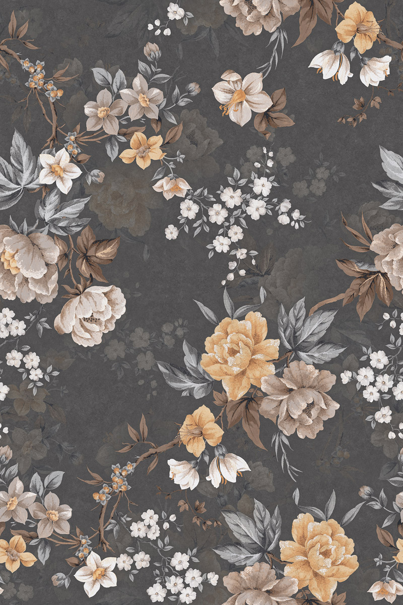
Black floral tiles in GVT matte finish are used for kitchen feature walls, bathroom accent walls, and entrance hall floors. The dark base makes the floral motif stand out sharply and gives a dramatic, high-contrast look. Black and white floral tile combinations are a classic choice for heritage-style entrance floors and Victorian-inspired porch layouts. A black white flower tile in 300x300mm laid diagonally is one of the most recognisable floor patterns in traditional Indian bungalow design.
Grey Floral Tiles
Grey flower tiles bridge the gap between bold floral designs and contemporary minimal interiors. A grey floral tile in a subtle tone-on-tone print (grey flower print on a grey base) gives texture and pattern without strong colour contrast. These suit living rooms and bedrooms where a calm, contemporary look is the goal. Grey floral tiles in GVT matte 600x600mm are available from Rs. 55 per sq.ft.
Marble-Look Floral Tiles
A marble floral tile combines a marble-look or stone-look base with a floral print overlay. The floral motif is printed onto a white or beige marble-look glaze, giving a tile that reads as natural stone with a decorative botanical element. Marble flower tile in PGVT polished finish is used on living room floors and bedroom walls. Floral marble tile in GVT matte is the more practical choice for bathrooms and kitchens. Price range: Rs. 75 to Rs. 200 per sq.ft.
Special Floral Tile Types
Antique and Vintage Floral Tiles
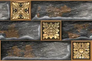
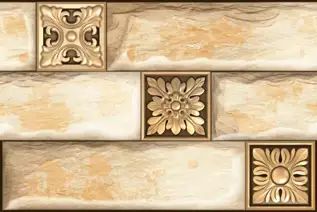
Antique floral tiles refer to tiles with aged, distressed finishes that mimic handmade or hand-painted originals. Vintage floral tile designs draw from Victorian, Edwardian, Moorish, and Indian princely-era patterns. These are available in GVT with a digital antique print and in genuine encaustic cement tiles with inlaid pigment. Antique floral tiles in ceramic or GVT start at Rs. 65 per sq.ft. Genuine handmade encaustic floral tiles from artisan producers in Rajasthan and Kerala start at Rs. 120 per sq.ft and go up to Rs. 280 per sq.ft.
Vintage floral tile designs are most commonly used in heritage home restorations, boutique hotel lobbies, café interiors, and traditional pooja rooms. They work well in entrance halls and verandah floors where a period aesthetic is the goal.
Hexagon Floral Tiles
A hexagon flower tile uses a hex-shaped body with a floral print or a floral arrangement formed by the tessellation of multiple hex tiles. Floral hexagon tiles in 100mm to 200mm across-flats sizes are used for bathroom floors, kitchen backsplashes, and decorative border strips. The hex tile flower pattern is popular in maximalist and bohemian interior styles.
Hexagon floral tiles are available in ceramic, GVT, and porcelain body types. For bathroom floors, use GVT or porcelain hex tiles with a matte finish and a minimum R10 slip rating. For backsplash use, ceramic hex floral tiles are a practical and economical choice. Hex tile flower pattern options in GVT start at Rs. 70 per sq.ft. Mosaic hex sheets with floral arrangements start at Rs. 90 per sq.ft.
Floral Border Tiles
Flower border tiles are narrow strip tiles used as a horizontal or vertical accent between field tiles. They are typically 50mm to 100mm wide and 300mm to 600mm long. A floral border tile on a bathroom wall breaks the monotony of a plain field tile and adds a decorative line without covering the full surface in pattern. Border tiles are also used on stair risers and along kitchen counter edges.
Floral border tiles are available in ceramic and GVT. They are typically sold per box or per running metre. A ceramic floral border tile box covering 2 to 3 running metres starts at approximately Rs. 150 to Rs. 350 per box depending on design complexity.
Floral Subway Tiles
A floral subway tile uses the classic 75x150mm or 100x200mm rectangular format with a floral embossed surface or a printed flower motif. The subway format gives the tile a clean, linear edge that suits contemporary kitchens and bathrooms. A white floral subway tile in ceramic with an embossed flower texture is a popular choice for kitchen backsplash areas in India. Floral subway tiles are available in ceramic from Rs. 55 per sq.ft and in GVT from Rs. 70 per sq.ft.
3D Embossed Floral Tiles
3D flower wall tiles use a physically embossed or relief surface where the flower motif is pressed into or raised above the tile body during manufacturing. These are not painted or printed effects. The texture is structural and catches light to create shadow and depth. GVT 3D flower tiles are available in 300x600mm and 600x600mm formats. Ceramic 3D flower design wall tiles in 300x450mm are also common.
Relief floral tiles are used on feature walls in living rooms, behind beds in bedrooms, and on entrance lobby walls in commercial settings. They are not suitable for wet areas or floors because the raised texture accumulates water and is difficult to clean thoroughly. Price range for 3D embossed floral tiles: Rs. 75 to Rs. 180 per sq.ft.
Floral Printed Tiles
Flower printed tiles use inkjet digital printing on the glaze surface. The print has no physical depth but can replicate extremely fine detail, including individual petal veining, watercolour washes, and photographic-quality botanical illustration. Digital floral print GVT tiles are the most commercially significant category in this look in India. Flower-printed tiles in GVT start at Rs. 50 per sq.ft for standard designs.
How to Use Floral Tiles: Mix and Match Strategy
The most common mistake with floral tiles is using them on every surface in a room. The pattern becomes overwhelming and loses its impact. A structured approach works better:
- Use a plain tile in the dominant base colour of the floral pattern as the field tile. Cover 70% to 80% of the wall or floor with the plain tile.
- Use the floral pattern tile on 20% to 30% of the surface: one feature wall, a border strip, or a panel behind a counter or vanity.
- Match the grout colour to the base colour of the floral tile, not the motif colour. A grout that matches the background makes the pattern read as continuous rather than segmented.
- On floors, a central floral medallion tile surrounded by plain field tiles is a traditional Indian approach that gives strong visual impact without covering the full floor in pattern.
- In kitchens, limit floral tiles to the backsplash zone between the counter and the upper cabinets. Use a plain tile in the same tone on any remaining wall areas.
Floral tile grout colour choice: for blue and white floral tiles, use a white or off-white grout. For dark or black floral tiles, use a charcoal or dark grey grout. For colourful floral tiles, match the grout to the lightest background colour in the tile. Avoid stark white grout with very colourful floral tiles as it fragments the pattern visually.
Floral Tiles Price in India
| Body Type | Format | Design Type | Price Range (Rs./sq.ft) | Also Quoted As |
| GVT | 300x600, 600x600 | Digital floral print (matte/sugar) | Rs. 50 to Rs. 130 | Per sq.ft |
| PGVT | 600x600, 600x1200 | Digital floral print (polished) | Rs. 65 to Rs. 200 | Per sq.ft |
| Ceramic | 300x450, 300x600 | Digital or third-fire floral print | Rs. 45 to Rs. 120 | Rs. 150–400/box |
| Porcelain | 300x600, 600x600 | Digital floral print (matte) | Rs. 55 to Rs. 160 | Per sq.ft |
| GVT 3D Relief | 300x600, 600x600 | Embossed floral texture | Rs. 75 to Rs. 180 | Per sq.ft |
| Hexagon GVT/Ceramic | 100–200mm hex | Floral print or geometric floral | Rs. 70 to Rs. 180 | Per sq.ft |
| Mosaic (GVT chips) | 300x300 sheet | Assembled floral pattern | Rs. 80 to Rs. 225 | Per sq.ft or per sheet |
| Encaustic / Handmade | 200x200, 300x300 | Inlaid pigment floral pattern | Rs. 90 to Rs. 280 | Per sq.ft or per piece |
| Floral border strip | 50–100mm x 300–600mm | Linear floral repeat | Rs. 150 to Rs. 350/box | Per box (2–3 running metres) |
| Floral subway (ceramic) | 75x150, 100x200 | Embossed or printed floral | Rs. 55 to Rs. 130 | Per sq.ft |
All prices are indicative and based on Indian market data as of 2026. Final prices vary by brand, design complexity, finish, and order quantity. Encaustic and handmade tiles are quoted per piece or per sq. ft. by individual artisan producers and may vary significantly.
Floral Tile Laying Tips
- Always do a dry lay before fixing. Arrange the tiles on the floor without adhesive to check that the pattern repeat aligns correctly before committing to the placement.
- For patterned tiles, buy 10% to 15% extra beyond the measured area. Pattern matching at edges and corners requires cutting, and pattern tiles have a higher waste percentage than plain tiles.
- For mosaic floral tile sheets, check the sheet orientation before fixing. The manufacturer marks the top edge. Laying a sheet upside down or sideways breaks the pattern continuity.
- For encaustic floral tiles, seal the surface before grouting and again after grouting. The cement body absorbs grout pigment if unsealed, which permanently stains the tile surface.
- For 3D relief floral wall tiles, use a non-sanded grout and a grout colour that matches the tile background. Sanded grout can scratch the raised surface during application.
- For floral border tiles on bathroom walls, fix the border at eye level (typically 900mm to 1200mm from the floor) for maximum visual impact. At counter height in kitchens, fix the border at the point where the counter meets the wall tile.
Browse Floral Tiles
Find flower design tiles for walls, floors, kitchens, and bathrooms from manufacturers across India, all listed on Tilesfinders with body type, finish, water absorption, size, and price range for every product. Use the colour, format, and finish filters to narrow down the right floral tile for your project. For pattern-specific queries or bulk pricing, the product spec sheet and supplier contact are available on every product listing.



FAQs
Most floral tiles in India use a GVT (Glazed Vitrified Tile) or ceramic body. GVT tiles have 0.05% water absorption and can be used on floors and walls. Ceramic flower tiles have 12% to 16% water absorption and are suitable for wall use only. Porcelain and encaustic cement floral tiles are also available but less common. The flower design is applied through digital inkjet printing on the glaze, embossed relief pressing, or inlaid pigment in the case of encaustic tiles.
Yes, if the tile is GVT or porcelain body in a matte or GHR finish with a minimum R10 slip rating. Ceramic floral tiles must not be used on kitchen floors due to high water absorption. Polished or PGVT floral tiles must not be used on any kitchen floor as they are slippery when wet. For kitchen floors with a flower design, choose GVT matte in 300x300mm or 600x600mm format.
Flower tiles price in India starts at Rs. 45 per sq ft for basic ceramic floral wall tiles and Rs. 50 per sq.ft for standard GVT digital-print floral designs. Mid-range floral GVT tiles sit at Rs. 80 to Rs. 130 per sq.ft. PGVT polished floral tiles go up to Rs. 200 per sq.ft. Mosaic and encaustic floral tiles range from Rs. 80 to Rs. 280 per sq ft, depending on design and material. Ceramic floral tiles are also quoted per box at Rs. 150 to Rs. 400 per box, depending on size and print complexity.
Antique floral tiles typically have a distressed or aged surface finish that mimics genuinely old tiles. They may be GVT with a digital antique print or genuine encaustic cement tiles with an aged patina. Vintage floral tile refers to tiles that use design patterns from historical periods, particularly Victorian, Edwardian, and Mughal-era motifs, without necessarily having a distressed surface. Both categories are used in heritage home restorations and traditional-style Indian interiors.
3D embossed floral wall tiles are not recommended for shower zones or any surface that is regularly wet. The raised texture accumulates water, soap, and organic residue in the grooves, which is very difficult to clean thoroughly. Use 3D flower tiles in dry areas of the bathroom only, such as the wall above the vanity mirror or a feature wall opposite the shower. For wet areas, use flat-surface GVT or ceramic floral tiles that clean easily.
Match the grout colour to the background base colour of the tile, not the motif colour. For blue and white floral tiles, use white or off-white grout. For dark or black floral tiles, use dark grey or charcoal grout. For multicolour floral tiles, pick the lightest tone in the tile as the grout reference. In wet areas like bathrooms, always use epoxy grout regardless of the colour chosen. Epoxy grout resists staining and moisture significantly better than standard cement grout.
GVT floral tiles in a matte or GHR finish with a minimum R10 slip rating can be used in covered outdoor areas like verandahs and sheltered patios. For open-sky outdoor floors, confirm the R-rating with the supplier. Ceramic floral tiles must not be used outdoors because their water absorption of 12% to 16% makes them susceptible to moisture damage, algae growth, and surface degradation. Encaustic floral tiles need sealing before any outdoor exposure.
For small bathrooms, 200x200mm or 300x300mm floral tiles on the wall give a clear pattern repeat without the motif being cut off too frequently at edges. On the floor, a 300x300mm floral tile suits a bathroom as small as 4x5 ft. Hexagon floral tiles in 100mm to 150mm format are also a good choice for small bathroom floors as the smaller unit size reduces cutting waste at edges and corners.