Light-Coloured Wall Tiles with Dark Floor Tiles: Perfect Balance Explained
Make your room feel taller and cleaner. Light walls reflect light, while dark floors hide marks, the perfect combo for a spacious, easy-care home.
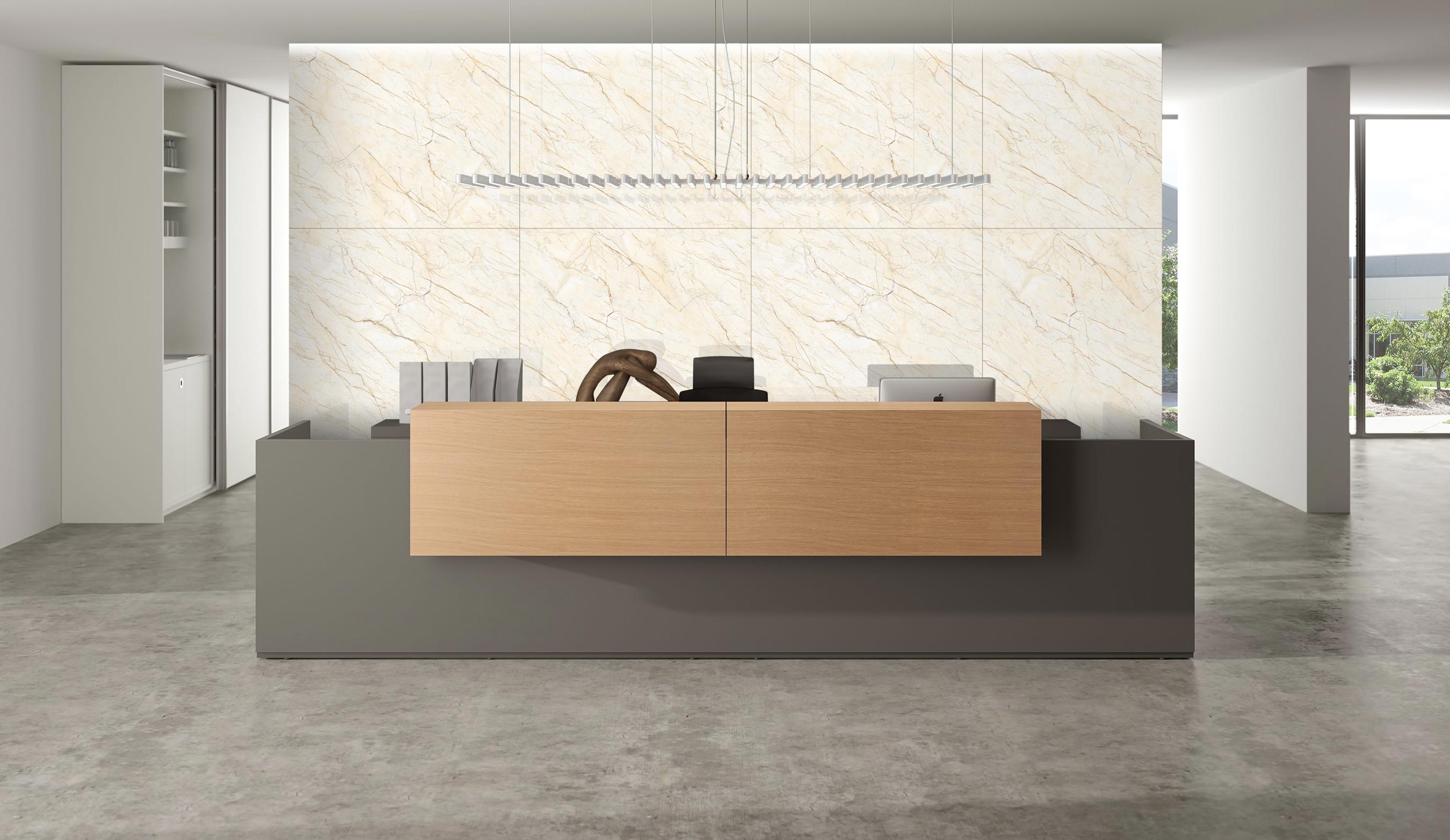
A smart tile colour combination works like interior architecture, not decoration. Cream, ivory, or pale grey walls bounce light across the room, while charcoal or mocha flooring quietly absorbs it. The contrast stretches vertical perception ceilings appear higher, and at the same time stabilises the space visually. In Indian homes where rooms are compact but busy, this pairing solves two real problems: glare on walls and visible floor dirt.
Why Choose Light Walls with Dark Floors?
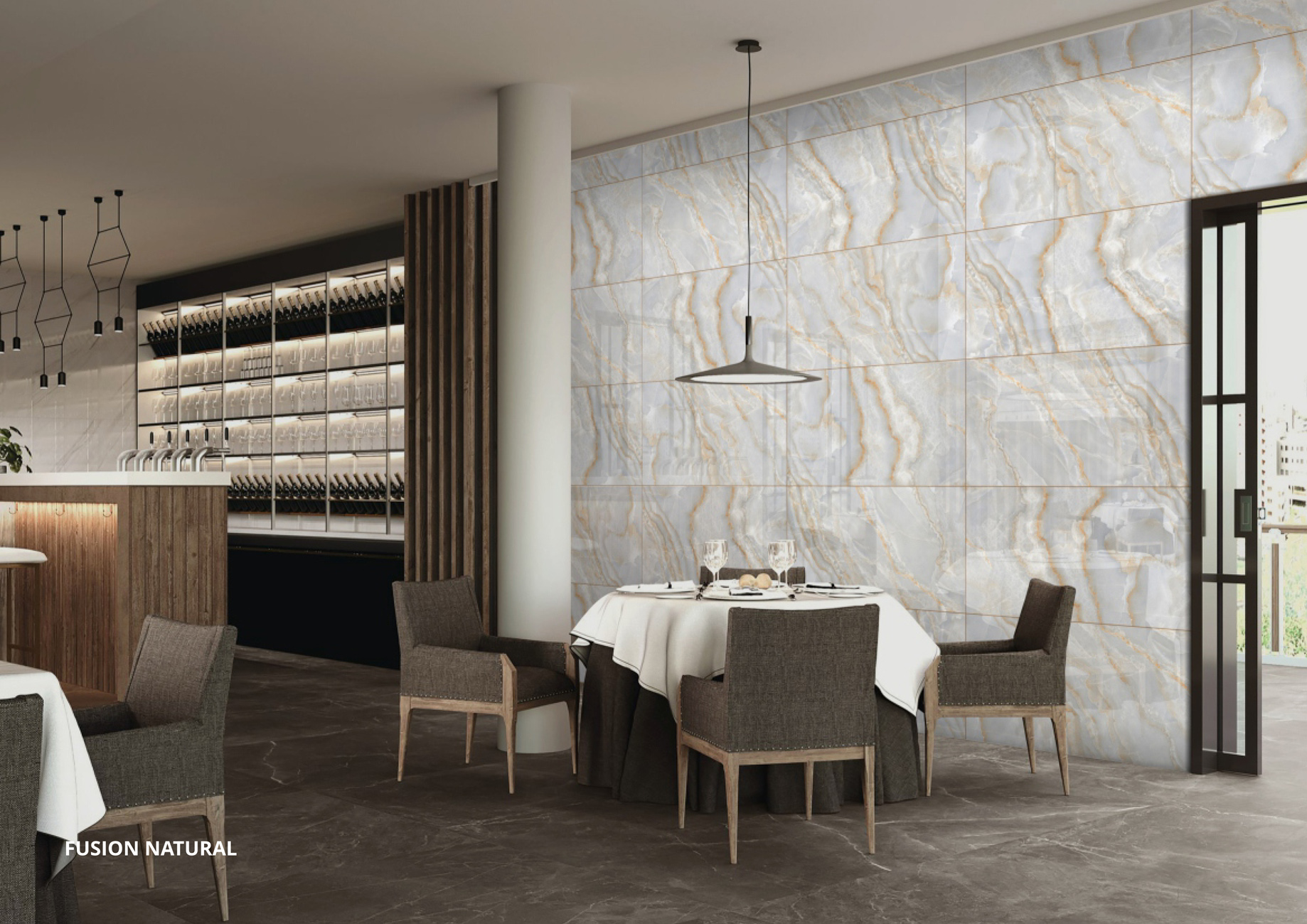
Rooms often feel brighter after renovation because walls with a higher light reflectance value (LRV) distribute both daylight and artificial illumination more evenly. A glossy or satin glaze helps scatter light rather than concentrate it, so shadows soften, and corners stop looking dull. This is exactly why light wall tiles make kitchens and bathrooms appear visually larger. The effect is subtle but noticeable; the eye naturally travels upward, and the ceiling seems higher without any structural alteration.
In contrast, stability in a space comes from the surface under your feet. Darker tones are subconsciously read as heavier, which gives the interior a sense of balance. Every day mess is also less noticeable, hair strands, spice spills, and shoe marks that would stand out on pale flooring blend into textured charcoal or coffee finishes. Because of this practical advantage, many homeowners prefer dark floor tiles, especially in high-use areas. A matte or lapato finish further reduces glare and feels more comfortable to walk on.
A balanced layout also depends on modern tile design principles. Dark floors absorb nearly 60–80% of incident light, so the room needs layered lighting: ceiling lighting for brightness and low-level wall washing or cove lighting to illuminate the floor. Without this, the base of the room visually disappears at night, making the space feel unevenly lit.
Does a Dark Floor Make a Small Room Look Smaller?
No. A dark floor paired with light walls actually increases perceived depth. The contrast creates a clear boundary line that visually stretches vertical space. Use rectified tiles with matching dark grout and choose glossy or satin wall tiles so reflected light compensates for the floor’s light absorption.
Technical Specifications: What to Look For
For Flooring
- Material: Full-body vitrified tiles, colour runs through the tile, so chips don’t reveal a pale core.
- PEI Rating: 09 or 10 (high foot traffic durability).
- Abrasion Standard: ISO 10545-7 certified surfaces resist visible wear.
- Finish: Matte or satin recommended.
- Typical sizes: 600×600 mm, 600×1200 mm, 800×1600 mm, or 1200×1800 mm create fewer grout lines.
For Walls
- Material: Ceramic or glazed vitrified.
- Finish: Glossy or high-depth glaze for a reflective effect.
- Typical sizes: 600x1200 mm, 800x1600 mm, 300×600 mm or 300×450 mm improve height perception.
Best Colour Combinations (Cheat Sheet)
Choosing colours is easier when you see how they pair in real spaces. Many tile series are manufactured in the same pattern but multiple shades, so you can use one design in both light and dark tones, even a monochrome look, without breaking visual continuity. Here are some balanced combinations that consistently work well together.
| Wall Shade | Floor Pair | Visual Effect |
| White / Statuario | Slate Grey | Minimalist & clean |
| Beige / Cream | Espresso | Warm residential feel |
| Pale Grey | Charcoal | Urban contemporary |
| Pastel Mint / Blush | Dark Terrazzo | Creative interiors |
Buyer’s Checklist: Before You Purchase
When you buy tiles online, details matter more than appearance:
- Batch number: Same batch prevents shade-mismatch patches.
- Grout choice: Match the grout to the floor tone; never use white on dark flooring.
- Skirting decision: Choosing dark skirting makes the floor appear wider, while light skirting visually raises the walls.
- Tile body: Prefer full-body vitrified for flooring areas like living rooms and kitchens.
FAQs
Floor-matching skirting visually expands the floor area. Wall-matching skirting enhances height perception. Choose based on whether your room feels narrow or low.
Natural-white 4000K LEDs with low-level cove or strip lighting illuminate the floor surface evenly and prevent shadow patches.
Colour is irrelevant to slip resistance. Check the slip rating instead. Wet areas should have at least an R-09 anti-skid rating.

See our tile guides first
Set TilesFinders as a preferred source and our buying guides surface ahead of the rest for you.
Add as preferred sourceTakes one tap. Nothing to install.
What Readers Say
I was about to redo my parking area with the wrong tile size until I read this. The layout comparisons saved me from a costly mistake.
We reference TilesFinders guides while briefing clients on material selection. The size and pattern breakdowns are accurate and easy to explain visually.
On site, I get asked about grout spacing all the time. This article gave me a solid reference I now share with my team before every job.
Finally a guide that doesn't just push generic advice. The oil stain removal steps actually worked on our clubhouse driveway tiles.
I run a small construction firm and now send this link to clients directly when they ask about entrance tile sizing. Saves me an hour of explaining.
Good practical detail, though I wish there were more examples for compact apartment entrances specifically, not just villas.
My mother-in-law wanted marble, I wanted vitrified. This blog gave us the neutral comparison we needed to actually decide together.
Detailed without being overwhelming. I appreciated that it covered both cost and maintenance, not just the aesthetics.
Used the algae and hard water removal tips on our terrace tiles after the monsoon. Worked better than what our regular cleaner was doing.
As someone who sources tiles for multiple builder projects, I find these comparisons genuinely useful for vendor conversations, not just consumer content.
Recommended this to a client who kept second-guessing the entrance design. The small vs large layout section settled the debate instantly.
Straightforward and honest, no unnecessary jargon. Would like to see a similar breakdown for outdoor pool-deck tiles next.
We've bookmarked several TilesFinders guides for our design handbook. Reliable source when clients want data, not just opinions.
Two paths, one marketplace.
Get free quotes from verified suppliers.
Share your room, budget, and style. Suppliers in Morbi respond within hours.
Get Free QuotesList your business, reach real buyers.
Put your showroom in front of homeowners searching for tiles right now.
List Your BusinessMore Blogs
See all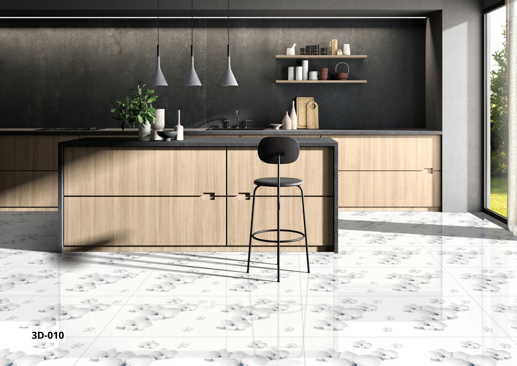
Top Kitchen Tile Colour Combinations That Transform Your Space
Choosing the right kitchen tile colour is critical. Options range from timeless Black & White...
Read More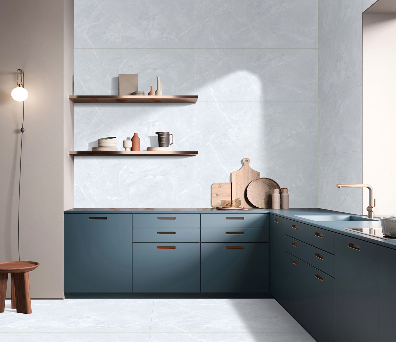
Kitchen Tile Colour Combinations for 2025: Contrasts, Pastels & Statement Walls
Explore 2025 kitchen tile trends: bold contrasts, soft pastels, and statement backsplashes. Disco...
Read More
Outdoor Wall & Floor Tile Designs for Indian Climate
Transform your outdoors with durable wall and floor tiles. From rustic brick elevations to stylis...
Read More