Kitchen Tile Colour Combinations for 2025: Contrasts, Pastels & Statement Walls
Explore 2025 kitchen tile trends: bold contrasts, soft pastels, and statement backsplashes. Discover the perfect colour balance for a stylish, timeless home.
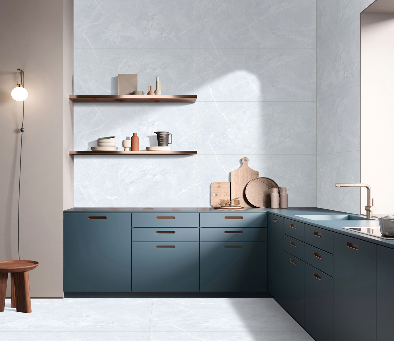
Kitchens in 2025 are no longer considered secondary spaces. They’re personal, expressive, and thoughtfully designed. Homeowners are paying close attention to how colours interact with light, cabinets, countertops, and even daily routines. The focus has shifted from random selections to intentional kitchen tile colour combinations that feel balanced, timeless, and lived-in rather than overly styled.
Contrast Kitchens: Clean, Confident, and Structured
High-contrast kitchens are making a strong comeback, especially in urban homes where clean lines dominate. One pairing that continues to stand out is the white & navy backsplash. White keeps the space open and bright, while navy adds depth and a sense of structure. This combination works beautifully with handle-less cabinets and modern lighting, giving the kitchen a crisp yet grounded feel without looking harsh.
Soft Pastels for Calm, Everyday Kitchens
For homeowners who want colour without drama, muted pastels are becoming the go-to choice. Shades like sage green, powder blue, and warm blush bring personality while keeping the space relaxed. Pastel kitchen tiles work particularly well in smaller kitchens, where darker colours might feel heavy. They reflect light gently and pair effortlessly with wood, brass, and soft white cabinetry.
Statement Backsplashes That Do the Talking
Instead of spreading colour everywhere, many 2025 kitchens are choosing one strong visual moment. A bold backsplash colour instantly draws attention and gives the kitchen its identity. Deep greens, rich terracotta, and charcoal tones are popular choices, especially when the rest of the space stays understated. One bold wall can transform an otherwise simple kitchen into a design-forward space.
Floors That Anchor the Space
While walls and backsplashes get expressive, floors are staying calm and dependable. Grey kitchen floor tiles continue to dominate because they adapt easily to changing colour trends. Grey grounds the kitchen visually, hides wear better than lighter shades, and works across styles — from pastel-heavy kitchens to dramatic contrast-driven ones. Matte finishes add a contemporary edge while staying practical for daily use.
Countertops That Balance Everything
As wall tiles become more expressive, countertops are taking on a quieter role. Neutral countertops tiles help prevent visual overload and bring harmony to the overall design. Soft whites, warm greys, and subtle stone textures allow the surrounding colours to shine while keeping the kitchen functional and easy to maintain. This balance makes the space feel cohesive rather than cluttered.
The Rise of Thoughtful, Modern Colour Palettes
What defines 2025 kitchens isn’t just colour, it’s how colours are used together. A modern kitchen palette focuses on restraint, contrast, and flow. Instead of matching everything perfectly, designers are layering tones that complement each other. The result is kitchens that feel intentional, comfortable, and adaptable to changing tastes over time.
Colours That Feel Current Without Being Trendy
Homeowners are becoming more cautious about short-lived trends. The focus is shifting toward trending kitchen colours that have staying power. Earthy greens, warm neutrals, and softened blues are leading the way because they don’t feel dated after a year. These colours evolve well with changing accessories, lighting, and finishes, making them a smart long-term choice.
How People Are Planning Kitchens Today
Design decisions are no longer rushed or dependent on showrooms. Homeowners now explore layouts, finishes, and colour pairings digitally before making a commitment. Many begin their research journey when they plan to Buy Tiles Online in India, using inspiration and comparisons to refine their choices. This shift has made people more informed and more confident about experimenting with colour combinations.
Designing a Kitchen That Actually Lasts
At the heart of every successful kitchen design is clarity. Choose contrast where you want impact. Use pastels where you want calm. Let neutrals do the balancing. When colours are selected with intention rather than impulse, the kitchen ages gracefully. 2025 isn’t about loud design; it’s about thoughtful choices that feel right every single day.

See our tile guides first
Set TilesFinders as a preferred source and our buying guides surface ahead of the rest for you.
Add as preferred sourceTakes one tap. Nothing to install.
What Readers Say
I was about to redo my parking area with the wrong tile size until I read this. The layout comparisons saved me from a costly mistake.
We reference TilesFinders guides while briefing clients on material selection. The size and pattern breakdowns are accurate and easy to explain visually.
On site, I get asked about grout spacing all the time. This article gave me a solid reference I now share with my team before every job.
Finally a guide that doesn't just push generic advice. The oil stain removal steps actually worked on our clubhouse driveway tiles.
I run a small construction firm and now send this link to clients directly when they ask about entrance tile sizing. Saves me an hour of explaining.
Good practical detail, though I wish there were more examples for compact apartment entrances specifically, not just villas.
My mother-in-law wanted marble, I wanted vitrified. This blog gave us the neutral comparison we needed to actually decide together.
Detailed without being overwhelming. I appreciated that it covered both cost and maintenance, not just the aesthetics.
Used the algae and hard water removal tips on our terrace tiles after the monsoon. Worked better than what our regular cleaner was doing.
As someone who sources tiles for multiple builder projects, I find these comparisons genuinely useful for vendor conversations, not just consumer content.
Recommended this to a client who kept second-guessing the entrance design. The small vs large layout section settled the debate instantly.
Straightforward and honest, no unnecessary jargon. Would like to see a similar breakdown for outdoor pool-deck tiles next.
We've bookmarked several TilesFinders guides for our design handbook. Reliable source when clients want data, not just opinions.
Two paths, one marketplace.
Get free quotes from verified suppliers.
Share your room, budget, and style. Suppliers in Morbi respond within hours.
Get Free QuotesList your business, reach real buyers.
Put your showroom in front of homeowners searching for tiles right now.
List Your Business