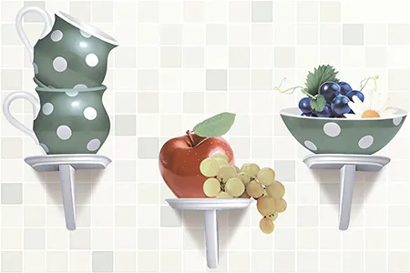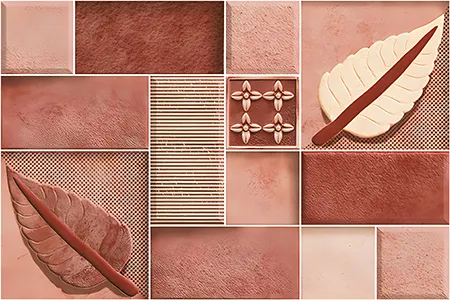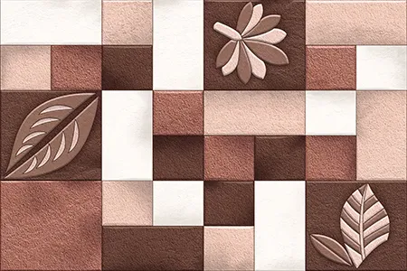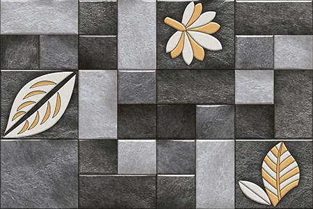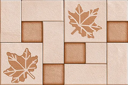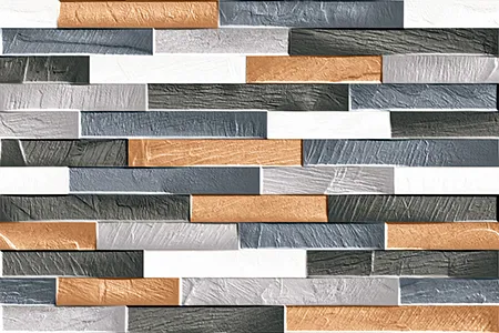
Enchanting Multi-Color Floral Ceramic Wall Accents for Sophisticated Interiors
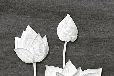
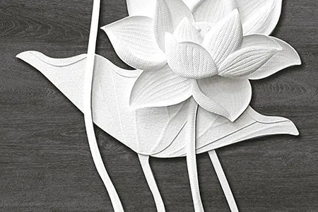
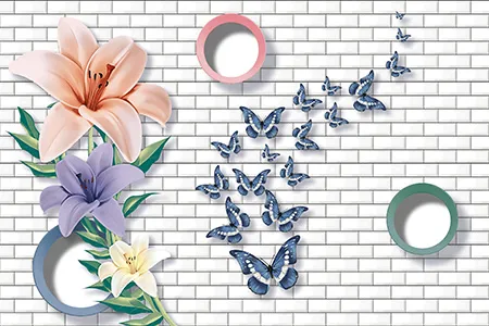
In the vibrant tapestry of Indian home design, the wall serves as a primary canvas for personal expression. This 12x18 (300x450 mm) ceramic masterpiece bridges the gap between traditional botanical artistry and modern geometric precision. Whether you are looking to explore tile designs for a complete renovation or a simple feature wall, this decor piece offers a curated aesthetic that breathes life into any interior space.
A Symphony of Botanical Movement and Geometric Depth
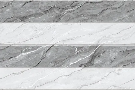
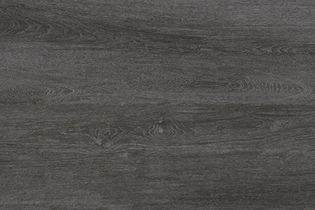
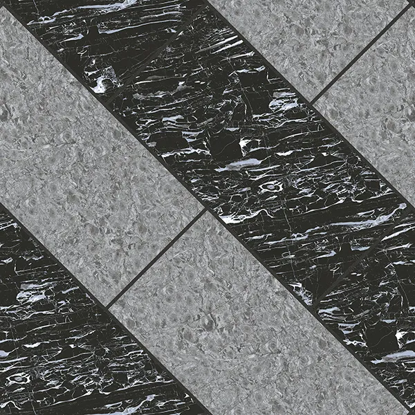
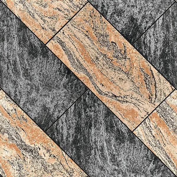
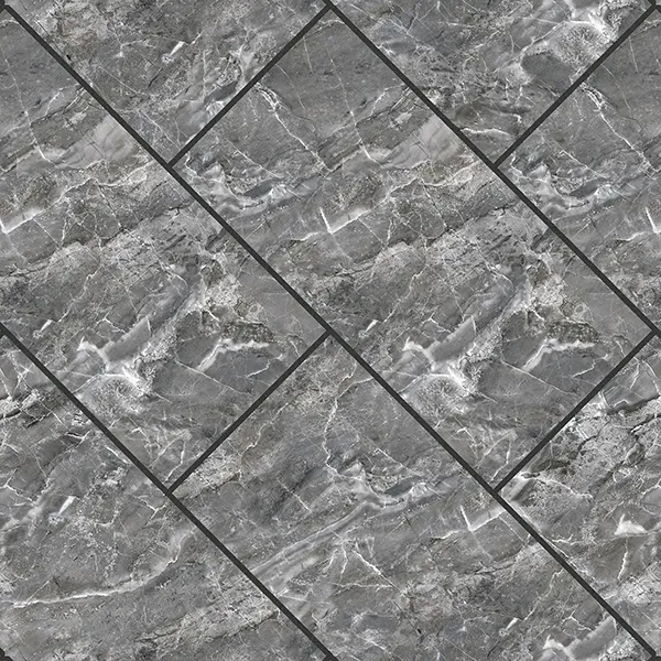
The design narrative of this ceramic decor is a sophisticated study in contrast. The background features a serene, muted grey tone that provides a neutral stage for the artistic movement within. The floral patterns do not just sit on the surface; they appear to bloom organically across the face, showcasing a watercolor-like movement with soft gradients of rose pink, marigold orange, and azure blue. Interspersed with these organic elements are subtle geometric motifs that ground the design, creating a visual depth that shifts with the play of light. The 'Plain Punch' ensures that the surface remains perfectly smooth, allowing the glossy finish to create a mirror-like sheen that enhances the 'multi-color' palette without the distraction of physical texture.
Practical Elegance for Vertical Surfaces
Choosing the 12x18 size is a strategic architectural decision for Indian urban apartments. This dimension is specifically optimized for wall applications, offering a verticality that can make standard-height ceilings feel more expansive. The ceramic body is inherently moisture-resistant, making these an ideal choice for bathroom tiles that require a touch of luxury without compromising on hygiene. The glossy finish is not only about glamour; it is a functional asset that reflects light into darker corners and ensures that the surface is incredibly easy to maintain, resisting stains and soap scum with minimal effort.
Curated Palette & Mood Selection
Designing around such a vibrant decor requires a balanced approach. To truly let these floral accents shine, pair them with understated elements that echo the tile's secondary tones.
| Element | Recommended Selection | Why it Works |
|---|---|---|
| Base Wall Surface | Dove Grey or Off-White Ceramic | Creates a seamless transition from the decor's background. |
| Fittings & Hardware | Brushed Gold or Rose Gold | Complements the warm pink and orange tones in the floral pattern. |
| Lighting | Warm White (3000K) Spotlights | Accentuates the glossy sheen and brings out the richness of the multi-color print. |
| Cabinetry | Matte Charcoal or Navy Blue | Provides a bold contrast that makes the delicate artwork pop. |