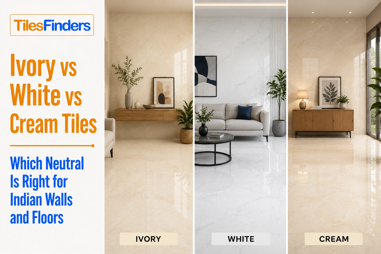
Ivory vs White vs Cream Tiles: Which Neutral Is Right for Indian Walls and Floors
Compare white, ivory, and cream tiles for Indian homes with expert guidance on lighting, room suitability, maintenance, furniture pairings, Vastu, and practical buying tips to choose the right neutral.
- What White, Ivory, and Cream Actually Are
- How All Three Neutrals Read in Indian Light
- Room-by-Room Comparison: White vs Ivory vs Cream
- Full Comparison Scorecard: White vs Ivory vs Cream
- How to Choose: Four Questions
- Neutral Tile Availability from Morbi, Gujarat: Three Tones Compared
- Compare White, Ivory, and Cream Tile Designs on TilesFinders
This guide compares white, ivory, and cream tiles across lighting conditions, room applications, maintenance, furniture compatibility, and design style for Indian homes. It helps you choose the right neutral based on your space, lifestyle, and interior preferences.
White, ivory, and cream are the three most commonly specified neutral tiles in Indian homes, and they are also the three most commonly confused. In a showroom under display lighting, they look similar. On a finished floor under Indian natural light at noon, under a monsoon overcast, or under a warm-white bedroom lamp at 10 pm, they behave completely differently.
This guide compares all three neutrals directly across Indian light conditions, room types, wall colours, furniture tones, soiling visibility, and buying specifications. The goal is a clear, honest answer to which neutral belongs in which Indian space.
What White, Ivory, and Cream Actually Are
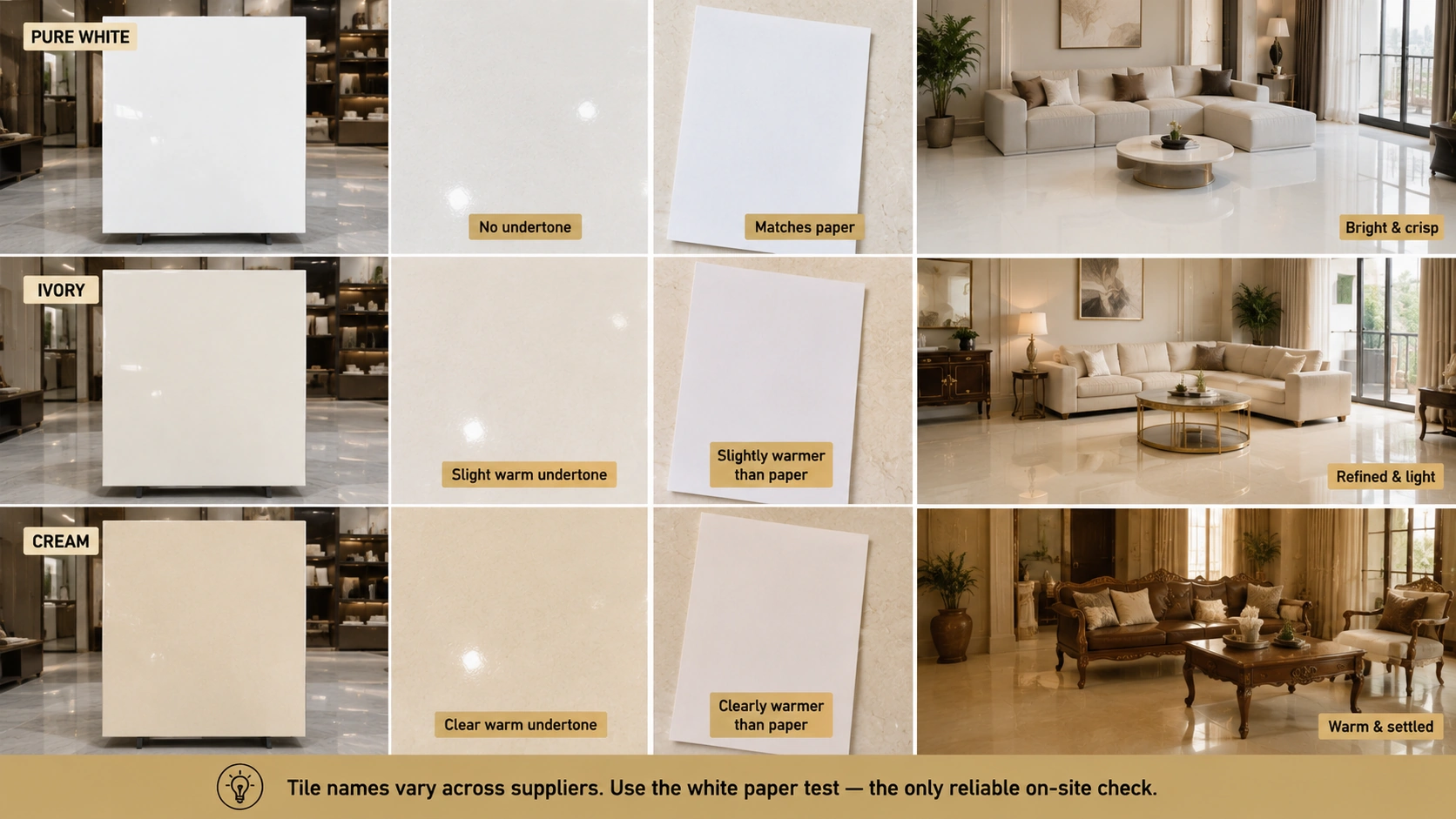
The practical definitions first, because the names are used inconsistently by Indian tile suppliers.
| Tone | Colour Description | Undertone | Test Against White Paper | What It Feels Like in a Room |
| Pure white | The most reflective and neutral of the three. No warm or cool bias. The colour of a white ceiling or a fresh coat of white paint. | None. Truly neutral. | Matches the paper. No visible difference. | Bright, clinical, or crisp, depending on the room. Makes spaces feel clean and modern, but can read as cold in low light. |
| Ivory | A slightly warm near-white. The warmth is subtle, visible next to white but not assertive on its own. | Very slight yellow-beige. Barely perceptible alone. | The tile reads very slightly warmer than the paper. The difference is visible only in direct comparison. | Refined and light. Warmer than white without adding obvious colour. The most versatile of the three neutrals for formal Indian spaces. |
| Cream | Clearly warm. The yellow undertone is visible without any comparison surface. The warmest of the three neutrals. | Clear yellow-beige. Noticeably warm. | The tile reads clearly warmer and more yellow than the paper. | Warm, settled, and slightly country-house in character. More personality than white or ivory but less universally compatible with Indian furniture and wall palettes. |
Note: In Indian tile showrooms, the same tile is frequently labelled white by one supplier and ivory or off-white by another. Some manufacturers label cream tiles as ivory. The paper test described above is the only reliable on-site check. The tile name cannot be trusted across different suppliers or product catalogs.
Want to understand where ivory tiles work best, how they perform under different lighting conditions, and which rooms they suit? Read our Ivory Tile Guide for a complete breakdown of applications, pairings, maintenance, and buying tips.
How All Three Neutrals Read in Indian Light
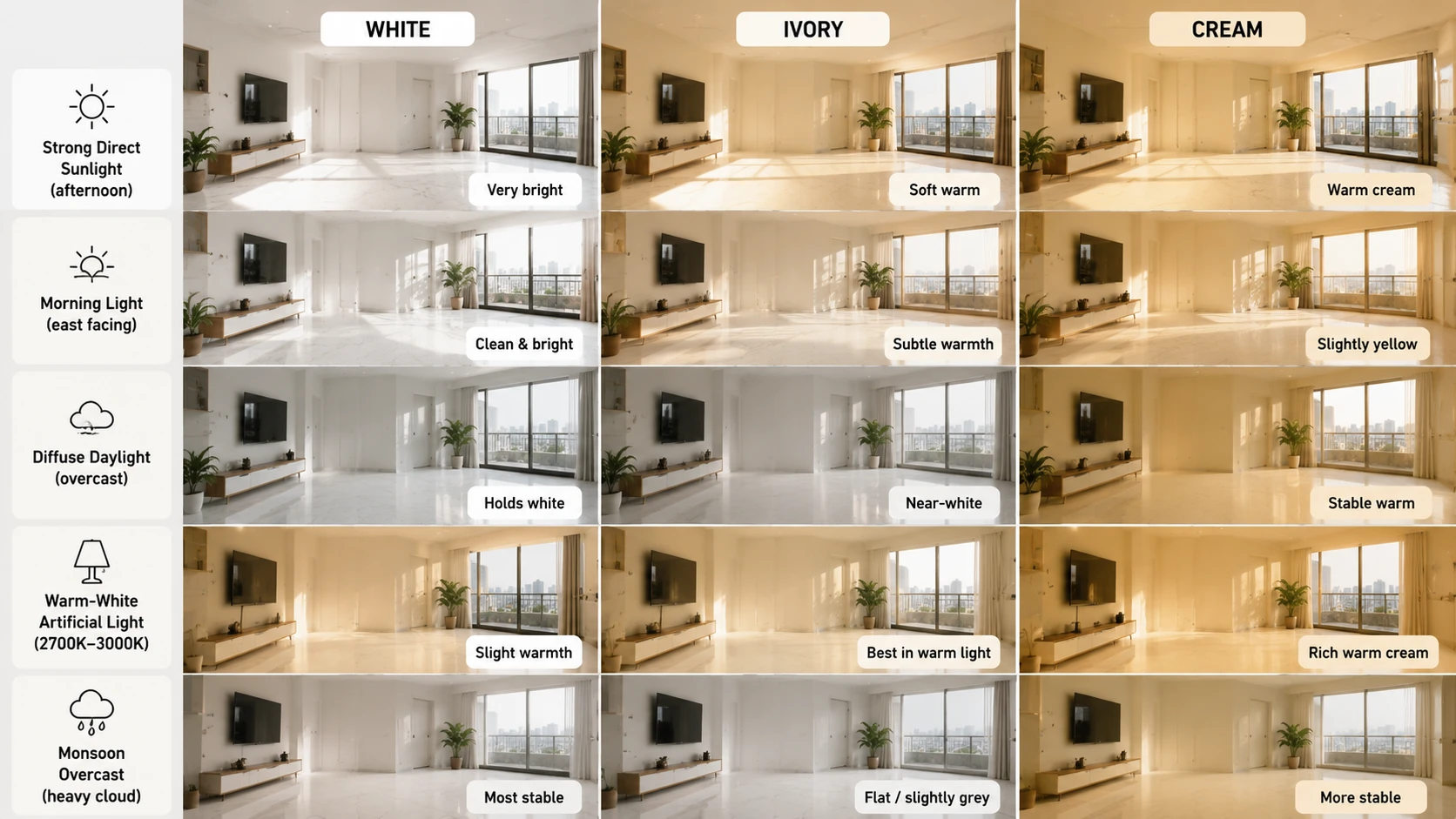
Indian light is more variable across a single day than most comparison guides account for. The same tile can read acceptably in the morning and badly in the afternoon, or vice versa. This is the most important decision variable for neutral tiles specifically.
| Light Condition | White | Ivory | Cream |
| Strong direct sunlight (south or west facing, afternoon) | Can read as very bright or slightly glaring under strong direct sun. In a white-on-white room, the brightness can be uncomfortable. | Reads as soft warm white or pale gold under strong sun. Most flattering condition for ivory. | Deepens to a warm cream-yellow under strong sun. Rich and pleasant in south-facing rooms. |
| Morning light (east-facing) | Reads cleanly and brightly. The most neutral and consistent reading for white. | Gains subtle warmth with morning light. The ivory distinction from white is clearest in warm morning sun. | Can read as slightly yellow-orange in strong warm morning light. Works well in east-facing rooms but can shift if the morning light is very warm. |
| Diffuse daylight (north facing, overcast) | Holds its white character in cool diffuse light. Consistent and predictable. | Can read as near-white or slightly cold in heavy overcast. Loses its warmth in cool diffuse light. | Most stable warm neutral in diffuse light. The yellow undertone is more light-stable than ivory's subtle warmth. |
| Warm-white artificial (2700K to 3000K) | Gains a barely perceptible yellow cast under warm-white light. Still reads as white but with slightly more warmth. | Reads at its best under warm-white light. The ivory warmth is amplified to soft cream. The most flattering condition. | Reads as rich warm cream or very pale gold under warm-white light. Luxurious but can read as very yellow in an all-cream room. |
| Cool-white artificial (4000K to 5000K) | Maintains a clean white character. Most appropriate neutral for cool-white lit spaces. | Loses its warmth completely and reads as near-white or slightly grey. In cool-white light, ivory is indistinguishable from white. | Lightens to a pale cream or soft yellow. Less warm than under natural light. Still distinguishable from white. |
| Indian monsoon overcast (heavy cloud, high scatter) | Holds its white reading. White is the most monsoon-stable neutral. | Can read flat or slightly grey in heavy monsoon overcast. Needs warm-white supplemental lighting to maintain character. | More stable than ivory in monsoon overcast. The cream undertone prevents the grey shift that ivory is susceptible to. |
Verdict: White is the most lighting-stable neutral across all Indian conditions. Cream is the most stable warm neutral, holding its character better than ivory across diffuse and overcast conditions. Ivory is the most lighting-sensitive of the three, at its best under warm-white artificial light and direct sun, and the most vulnerable to appearing flat or grey under overcast and cool-light conditions. Plan supplemental warm-white lighting if specifying ivory in a north-facing room or a room that depends on artificial light for most of the day.
Room-by-Room Comparison: White vs Ivory vs Cream
Living Room Floor
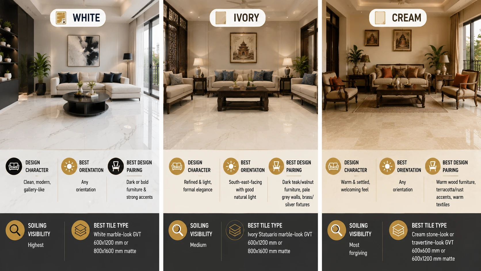
| Factor | White | Ivory | Cream |
| Design character | Clean, modern, gallery-like. The floor recedes and lets everything else read. Works best in a deliberately minimal or contemporary brief. | Refined and light. The near-white warmth creates a formal elegance without adding obvious colour. The best-balanced neutral for a formal Indian living room. | Warm and settled. The living room reads as welcoming and traditional. Better for a heritage or transitional Indian brief than for a stark contemporary one. |
| Best orientation | Any. White holds across all light conditions. | South-east-facing, with good natural light. Under warm-white artificial light in any orientation. | Any orientation. The most lighting-flexible of the three neutrals for living rooms. |
| Best design pairing | Dark or bold furniture, strong accent colours. White needs contrast to avoid reading as sterile. | Dark teak or walnut furniture, pale grey walls, brushed brass or silver fixtures. | Mid-range warm wood furniture, terracotta or rust accents, warm-toned textiles. Cream suits a richer, warmer room palette. |
| Soiling visibility | The highest soiling visibility of the three. Every mark reads clearly before mopping. | Medium soiling visibility. Slightly more forgiving than white, but still shows soiling clearly. | Most forgiving of the three. The warm yellow undertone absorbs and partially masks light soiling. |
| Best tile type | White marble-look GVT, 600x1200 mm or 800x1600 mm matte. | Ivory Statuario marble-look GVT, 600x1200 mm or 800x1600 mm matte. | Cream stone-look or travertine-look GVT, 600x600 mm or 600x1200 mm matte. |
| Price range (GVT, Morbi) | Rs. 75 to Rs. 200/sq.ft for white marble-look GVT in standard formats. | Rs. 80 to Rs. 220/sq.ft for ivory marble-look GVT in standard formats. | Rs. 70 to Rs. 180/sq.ft for cream stone-look or travertine-look GVT. |
Kitchen
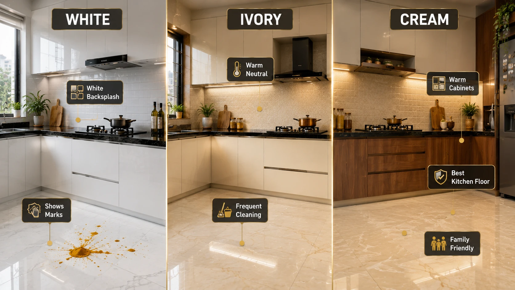
| Factor | White | Ivory | Cream |
| Floor suitability | Technically safe with an anti-skid rating. Practically difficult in Indian cooking kitchens where daily spills are heavy. Shows every mark immediately. | Marginally more forgiving than white on a kitchen floor, but still a high-maintenance choice in daily Indian cooking conditions. | Most forgiving of the three for kitchen floors. The warm undertone absorbs light soiling better. Best warm neutral for an Indian kitchen floor if a light colour is required. |
| Wall and backsplash | Glossy white ceramic is the most widely specified Indian kitchen backsplash. Clean, light-reflective, and completely neutral against any cabinet colour. | Glossy ivory ceramic backsplash suits modular kitchens with white, cream, or warm-grey cabinets, where a touch of warmth in the wall is wanted without colour. | Glossy cream backsplash suits kitchens with warm wood or warm-tone painted cabinets. Creates a warm, cohesive palette when the cabinet and backsplash are in the same warm family. |
| Cabinet pairing | Any cabinet colour. White is the most neutral and cabinet-flexible of the three. | White, cream, or light grey cabinets. Ivory backsplash with dark cabinets reads well if the light contrast is strong. | Warm wood, cream, or sage green painted cabinets. Cream backsplash with cool-grey cabinets can read as slightly yellow next to the grey. |
| Indian cooking context | Requires mopping after every cooking session to maintain a clean appearance. Not practical for kitchens with heavy daily turmeric and oil use. | Slightly more forgiving than white but still requires frequent cleaning. Kitchen floor specification needs anti-skid confirmation for any floor use. | Most forgiving for daily Indian cooking. Best light neutral for a kitchen floor in a home with heavy cooking and children. |
Bathroom
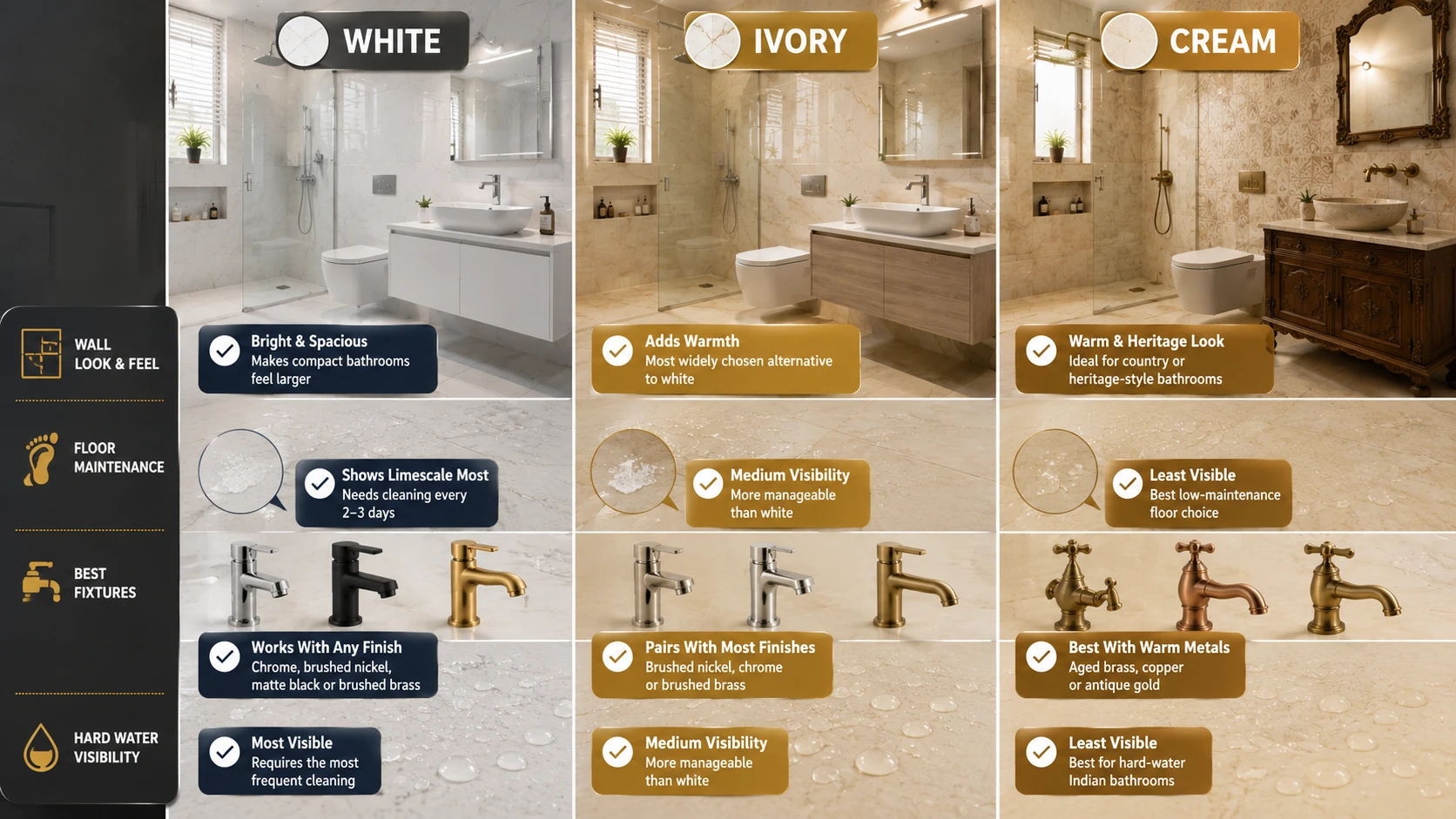
| Factor | White | Ivory | Cream |
| Bathroom wall | Glossy white ceramic is the Indian bathroom wall standard. Light-reflective, pairs with any fixture finish, and makes compact bathrooms feel larger. | Glossy ivory ceramic or ivory marble-look GVT adds warmth to a bathroom that would read too clinical in white. The most widely specified alternative to white for bathroom walls. | Cream wall tiles suit a bathroom with a warm, country-house or heritage Indian aesthetic. Best with aged brass or copper fixtures rather than chrome. |
| Bathroom floor (anti-skid) | White anti-skid GVT shows limescale and soap residue most clearly of the three. In hard-water cities, it requires cleaning every 2 to 3 days. | Ivory anti-skid GVT shows limescale and hard water deposits more clearly than cream but less than white. Moderate maintenance in hard-water cities. | Cream anti-skid GVT is the most forgiving of limescale and water mark visibility in hard-water cities. Best maintenance choice of the three for an Indian bathroom floor. |
| Fixture pairing | Chrome, brushed nickel, matte black, or brushed brass. White is the most fixture-flexible neutral. | Brushed nickel, chrome, or brushed brass. Ivory with matte black can read sharp and contemporary. | Aged brass, copper, or antique gold. Cream and chrome can read as the yellow undertone competing with the cool silver. Warm fixtures suit cream better. |
| Hard water cities | Most visible hard water deposits of the three. Requires the most frequent cleaning to maintain its appearance. | Medium hard water visibility. More manageable than white but requires attention in Delhi, Bengaluru, and Hyderabad. | The least visible hard water deposits of the three. Best low-maintenance warm neutral for hard-water Indian bathroom floors. |
Bedroom
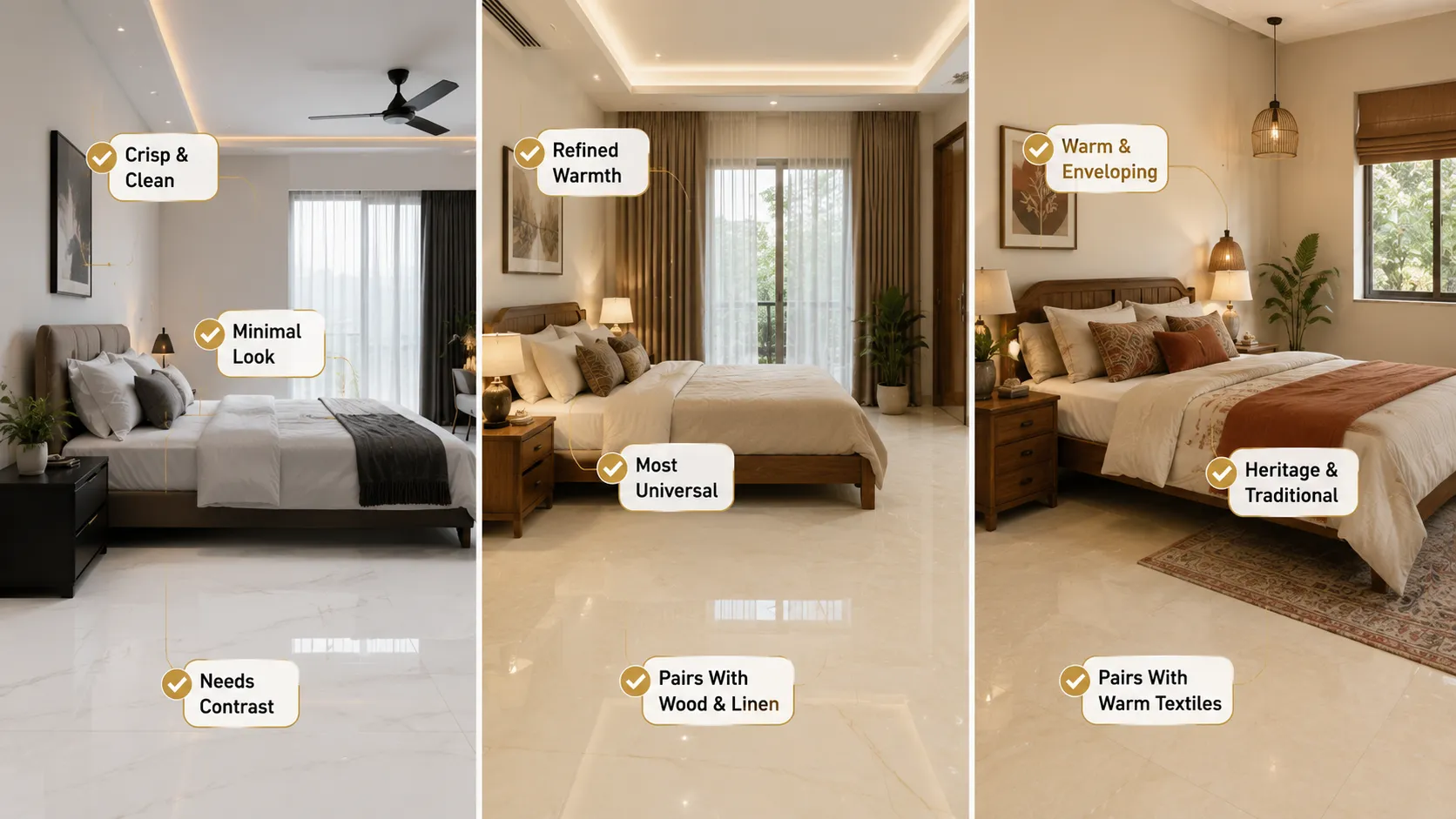
| Factor | White | Ivory | Cream |
| Restfulness | Crisp and clean. Restful in a deliberately minimalist brief. Can read as clinical if the room has no warm element. | Refined and light. The subtle warmth of ivory makes a bedroom feel settled and calm without adding obvious colour. Most universally restful of the three. | Warm and enveloping. Cream bedrooms feel comfortable and traditional. The warmth can be stimulating if the room is very sunny, but generally restful. |
| Best bedroom type | Contemporary, minimal, or Scandinavian-influenced bedroom. Or a bedroom where the brief is deliberate visual sharpness rather than warmth. | Master bedroom in any style. Ivory is the most universally applicable neutral for an Indian bedroom floor. | Heritage, transitional, or country-style bedroom. Or any bedroom in a north-facing location where additional warmth is wanted. |
| Best pairing | White bedroom walls and white floor: works in high-ceiling rooms with abundant light. Dark or charcoal furniture provides essential contrast. | Ivory floor with white or pale grey walls and dark teak or walnut furniture and linen textiles. | Cream floor with warm terracotta, rust, or sage green textiles and natural or dark wood furniture. |
Full Comparison Scorecard: White vs Ivory vs Cream
| Criteria | White | Ivory | Cream |
| Lighting stability | Highest. Most consistent across all Indian light conditions. | Medium. Sensitive to cool and overcast light. Needs warm-white supplemental lighting in challenging rooms. | High. More stable than ivory across diffuse and monsoon light. |
| Soiling visibility | Highest. Every mark is visible before cleaning. | Medium. More forgiving than white, less forgiving than cream. | Lowest. Most forgiving of the three for cooking residue and water marks. |
| Formal elegance | High in minimalist or bold-contrast rooms. Less so in traditional Indian rooms. | Highest. Ivory reads as the most refined formal neutral across Indian design traditions. | Medium. Cream reads as warm and traditional rather than formally elegant. |
| Vastu alignment | Associated with purity and the north or northeast zone in Vastu. Study rooms, meditation rooms. | Associated with purity and clarity, with a subtle warmth. Northeast zone, study rooms, and formal reception areas. | Associated with warmth and earth energy. South and southwest zones, living rooms, dining rooms. |
| Furniture flexibility | Highest. White pairs with dark, light, and mid-toned furniture. | High. Ivory pairs with most furniture tones but is best with dark or very light contrast. | Medium. Cream is best with warm mid-toned or dark wood. Struggles with cool-grey furniture. |
| Maintenance demand | Highest. Requires the most frequent cleaning to maintain its appearance. | Medium. More manageable than white but still light-coloured. | Lowest of the three. Most forgiving between cleans. |
| Best wall use | Kitchen backsplash, bathroom wall, or any room where maximum light reflection is wanted. | Bathroom wall, bedroom wall, and formal living room feature wall. | Kitchen with warm cabinets, bedroom with warm palette, bathroom with antique brass fittings. |
| Best floor use | Living room (minimal brief), bathroom (frequent cleaning accepted), and formal dining room. | Living room (formal brief), bedroom, entrance foyer, and formal dining room. | Kitchen, living room (warm brief), bedroom (any orientation), bathroom (low maintenance). |
| Price range (GVT) | Rs. 75 to Rs. 200/sq.ft | Rs. 80 to Rs. 220/sq.ft | Rs. 70 to Rs. 180/sq.ft |
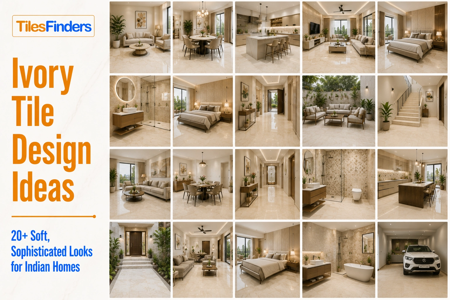
Looking for real room inspiration? Explore our Ivory Design Ideas featuring elegant living rooms, bedrooms, kitchens, bathrooms, and foyer layouts with the right tile sizes, finishes, and styling combinations.
How to Choose: Four Questions
Question 1: What does the room look like under its actual lighting most of the time?
Not in the showroom. Not at noon on a sunny day. At 8 pm on a typical weeknight, in the light the room actually uses. If that light is warm-white at 2700K to 3000K, any of the three works, with cream and ivory at their best. If the room is lit with cool-white at 4000K or above, white is the clearest choice, cream is acceptable, and ivory loses its distinguishing character and reads as white.
Question 2: How much cleaning is realistic for this room?
White: mopping after every cooking session, descaling the bathroom every 2 to 3 days in a hard-water city. Ivory: mopping every 2 to 3 days in kitchens and bathrooms to maintain appearance. Cream: Weekly mopping is adequate in kitchens and dining rooms. If the honest answer to the cleaning frequency is weekly rather than daily, cream is the correct neutral for floors, and ivory is the correct neutral for walls.
Question 3: What is the design intention for this room?
Crisp, modern, gallery-like minimalism: white. Formal, refined, and elegantly light: ivory. Warm, welcoming, and traditionally Indian: cream. The design character of each neutral is stable across rooms; the question is which character matches the brief.
Question 4: What is the furniture tone?
Dark wood (teak, walnut, wenge): works with all three, most dramatic with white or ivory. Natural or light wood (mango, blonde wood, cane): works best with cream or ivory. Mid-toned honey or amber wood: avoid white as a floor colour as both surfaces merge; ivory or cream gives the floor a distinguishable presence. Cool grey or upholstered furniture: white or ivory works well; cream's yellow undertone can read as competing with grey.
Pro tip: Order 30x30 cm samples of all three neutrals you are considering and place them side by side on the actual room floor, in the actual room's typical light, for 48 hours. View them at 8 am, 1 pm, 7 pm, and 10 pm. The neutral that reads correctly across all four time-points is the right choice. Any neutral that looks correct only at one time of day will disappoint most of the day once it is installed.
Neutral Tile Availability from Morbi, Gujarat: Three Tones Compared
| Tone | IS 15622:2006 Class | Most Common Design | Entry Price | Widest Format Range | Design Depth |
| White | GVT, 0.05% absorption, PEI 4. | White marble-look GVT (Carrara, Bianco), plain white matte GVT | Rs. 75/sq.ft for 600x600 mm matte | 300x300 mm to 1200x2400 mm slab. Widest format range of the three. | Highest design range. White marble-look covers the widest sub-design selection across all Morbi manufacturers. |
| Ivory | GVT, 0.05% absorption, PEI 4. | Ivory Statuario marble-look, plain ivory matte, and sugar GVT | Rs. 80/sq.ft for 600x600 mm matte | 300x300 mm to 800x1600 mm. Good large-format availability. | High design range. Ivory marble-look well-stocked in Morbi mid and premium tiers. |
| Cream | GVT, 0.05% absorption, PEI 4. | Cream travertine-look or stone-look GVT, plain cream matte GVT | Rs. 70/sq.ft for 600x600 mm matte | 300x300 mm to 600x1200 mm most common. Fewer large-format options than white or ivory. | Medium design range. Fewer design sub-categories than white or ivory at the premium tier. |
Note: In coastal Indian cities with monsoon humidity of 85 to 95%, all three neutral GVT tones at 0.05% absorption perform without sealing or maintenance overhead across all seasons. White GVT surfaces show salt and mineral residue from coastal air most clearly of the three; cream is the most forgiving in coastal environments where salt spray and humidity affect surface appearance between cleans.
Compare White, Ivory, and Cream Tile Designs on TilesFinders
The full range of white, ivory, and cream GVT from Morbi, Gujarat manufacturers is available on TilesFinders. Request physical samples of all three tones and view them in your actual room under your actual lighting before placing an order. This is the one category where the showroom sample is the least reliable guide to the installed result.
FAQs
White tiles have no colour warmth at all. Ivory tiles have a very slight yellow-beige warmth that is visible against white but not assertive on its own. Cream tiles have a clearly visible warm yellow undertone. All three are available as GVT at 0.05% water absorption from Morbi manufacturers. The test: hold all three against a white sheet of paper. White matches the paper. Ivory reads very slightly warmer. Cream reads clearly warmer and more yellow.
Cream is the most forgiving neutral for Indian kitchens and bathrooms. The warm yellow undertone absorbs and partially masks cooking residue, limescale, and water marks between cleans. White is the most demanding, requiring cleaning after every cooking session in a kitchen and every 2 to 3 days in a hard-water bathroom. Ivory sits between the two.
Ivory is the most formally elegant of the three neutrals for an Indian living room. Ivory marble-look GVT at 600x1200 mm or 800x1600 mm in matte finish creates the refined, light formal floor that references pale Indian stone and colonial bungalow marble. White marble-look suits a more minimalist or contemporary brief. Cream suits a warmer, more traditional brief.
For bathroom walls, ivory ceramic adds warmth to a space that pure white keeps cold, making it a popular alternative. For bathroom floors in hard-water cities, cream anti-skid GVT is the most forgiving of limescale visibility. For bathroom floors where cleaning frequency is not a concern, white, ivory, and cream are all technically appropriate with anti-skid specifications.
White and ivory are associated with purity, clarity, and the northeast zone in Vastu Shastra: study rooms, meditation spaces, and formal reception areas. Cream is associated with the earth element's warmth and suits south and southwest zones, including living rooms and dining rooms. For a puja room, all three near-whites are acceptable, with white and ivory carrying the strongest purity association.
Yes, if they are kept in separate rooms rather than mixed on the same surface. A common and effective approach: ivory marble-look in the formal living room, white glossy ceramic in the kitchen and bathrooms, and cream GVT in the master bedroom. Each room uses one neutral, and the transition between rooms reads as a deliberate tonal shift rather than a colour mistake.
White floor pairs with any wall colour, including dark, bold, or pale tones, the most wall-colour flexible of the three. Ivory floor pairs with white, pale grey, or very pale greige walls; avoid yellow or cream walls that merge with the ivory floor. Cream floor pairs with warm terracotta, sage green, soft taupe, or deep warm colours; avoid cool grey walls where the cream undertone reads as yellow by contrast.
White has the widest design range from Morbi manufacturers across the most formats, sub-designs, and price tiers. Ivory marble-look has a good range at mid and premium tiers. Cream has a smaller but serviceable range in stone-look and travertine-look designs. All three are widely available in 600x600 mm and 600x1200 mm standard floor formats.

See our tile guides first
Set TilesFinders as a preferred source and our buying guides surface ahead of the rest for you.
Add as preferred sourceTakes one tap. Nothing to install.
What Readers Say
I was about to redo my parking area with the wrong tile size until I read this. The layout comparisons saved me from a costly mistake.
We reference TilesFinders guides while briefing clients on material selection. The size and pattern breakdowns are accurate and easy to explain visually.
On site, I get asked about grout spacing all the time. This article gave me a solid reference I now share with my team before every job.
Finally a guide that doesn't just push generic advice. The oil stain removal steps actually worked on our clubhouse driveway tiles.
I run a small construction firm and now send this link to clients directly when they ask about entrance tile sizing. Saves me an hour of explaining.
Good practical detail, though I wish there were more examples for compact apartment entrances specifically, not just villas.
My mother-in-law wanted marble, I wanted vitrified. This blog gave us the neutral comparison we needed to actually decide together.
Detailed without being overwhelming. I appreciated that it covered both cost and maintenance, not just the aesthetics.
Used the algae and hard water removal tips on our terrace tiles after the monsoon. Worked better than what our regular cleaner was doing.
As someone who sources tiles for multiple builder projects, I find these comparisons genuinely useful for vendor conversations, not just consumer content.
Recommended this to a client who kept second-guessing the entrance design. The small vs large layout section settled the debate instantly.
Straightforward and honest, no unnecessary jargon. Would like to see a similar breakdown for outdoor pool-deck tiles next.
We've bookmarked several TilesFinders guides for our design handbook. Reliable source when clients want data, not just opinions.
Two paths, one marketplace.
Get free quotes from verified suppliers.
Share your room, budget, and style. Suppliers in Morbi respond within hours.
Get Free QuotesList your business, reach real buyers.
Put your showroom in front of homeowners searching for tiles right now.
List Your Business