Ivory Tiles in India: Elegant Neutral for Every Room - Complete Buyer's Guide
Discover how ivory tiles compare with white and cream, where they work best, ideal lighting, room-wise applications, design pairings, maintenance tips, and buying advice for Indian homes.
- What Ivory Is: Distinguishing It from White, Cream, and Off-White
- How Ivory Tiles Read in Indian Light Conditions
- Ivory Tile Room-by-Room Design Guide
- What to Pair with Ivory Tiles: Walls, Furniture, and Fixtures
- Common Mistakes with Ivory Tiles in Indian Homes
- Ivory Tile Buying Checklist for Indian Buyers
- Ivory GVT Availability from Morbi, Gujarat: Design Category Reference
- Browse Ivory Tile Designs on TilesFinders
Ivory tiles offer a refined warm-neutral look that feels softer than white yet subtler than cream, making them ideal for elegant Indian interiors. They pair beautifully with warm lighting, natural wood furniture, and marble-look GVT finishes for a timeless appearance.
Ivory is the warm, near-white that formal Indian interiors have historically preferred over pure white. It appears in marble palace halls, carved plaster havelis, and the painted verandahs of British-era bungalows. In 2026, ivory GVT tiles from Morbi manufacturers replicate this tone in a non-porous, maintenance-free format across living rooms, bedrooms, bathrooms, and kitchen walls.
This guide covers what ivory actually is in the Indian tile market, how it differs from white, cream, and off-white tiles, which rooms it suits, which rooms it does not, how to pair it with Indian wall colours and furniture, and the buying specifications that matter at each price tier.
What Ivory Is: Distinguishing It from White, Cream, and Off-White
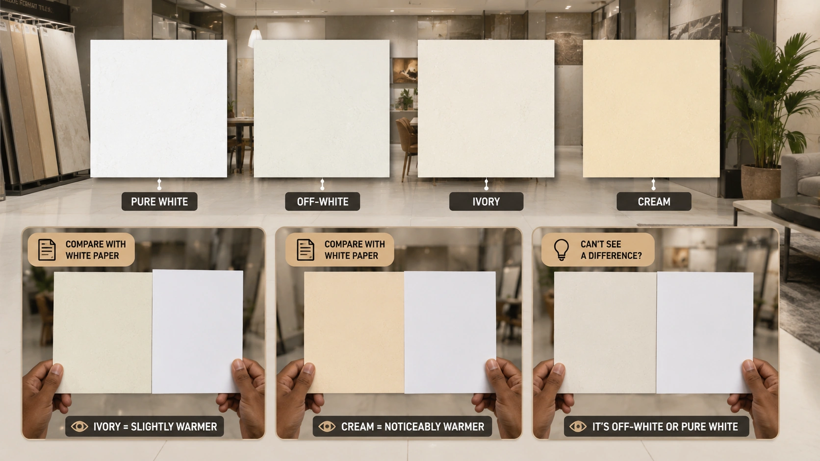
The four near - white tile tones are regularly confused in Indian showrooms. The distinction between them is not cosmetic. In an installed room, the wrong near-white can read as cold, yellowed, dirty, or simply shapeless depending on the room's light, furniture, and wall colour.
| Tone | Colour Description | Undertone | Practical Test | What Makes It Different |
| Pure white | No warmth at all. The brightest, most reflective near-white. Zero colour in any direction. | None. Neutral. | Looks like a white sheet of paper. Matches standard white wall paint. | Most clinical of the four. Reads as the default 'safe' choice but can appear cold or institutional in Indian rooms with warm-toned furniture. |
| Off-white | Slightly reduced from pure white but without a clear warm or cool undertone. A softened white. | Very slight, can lean either warm or cool, depending on the specific product. | Looks slightly yellowed or slightly grey compared to pure white. The difference is subtle. | Often used as a painting name in Indian homes. In tile, off-white can read as pure white that has aged, which is not always the intended effect. |
| Ivory | A slightly warm near-white. The warmth is subtle, visible in direct comparison with white but not assertive on its own. | Slight yellow-beige. Barely perceptible without a direct comparison surface. | Against a white tile, ivory reads as slightly warmer and softer. Against a cream tile, ivory reads as paler and cooler. | The most refined of the near-whites. Reads as white in most conditions but adds a temperature that prevents the cold, institutional quality of pure white. |
| Cream | Warmer and more saturated than ivory. The yellow tone is clearly visible without a comparison surface. | Clear warm yellow-beige. Noticeably warmer than ivory. | Against ivory, cream reads as clearly warmer and slightly yellowish. Against white, cream reads as strongly warm. | Closer to the beige family than the white family. The warmth of cream makes it pair less universally than ivory, but suits warmer room palettes better. |
Note: In Indian tile showrooms, ivory and cream tiles are frequently displayed next to each other and sometimes labelled interchangeably. The practical way to distinguish them on-site: hold both tiles against a standard white wall or a white A4 paper sheet. The ivory tile will appear very slightly warmer than the white paper. The cream tile will appear noticeably warmer. If you cannot tell the difference between the tile and white paper, you are looking at off-white or pure white, not ivory.
How Ivory Tiles Read in Indian Light Conditions
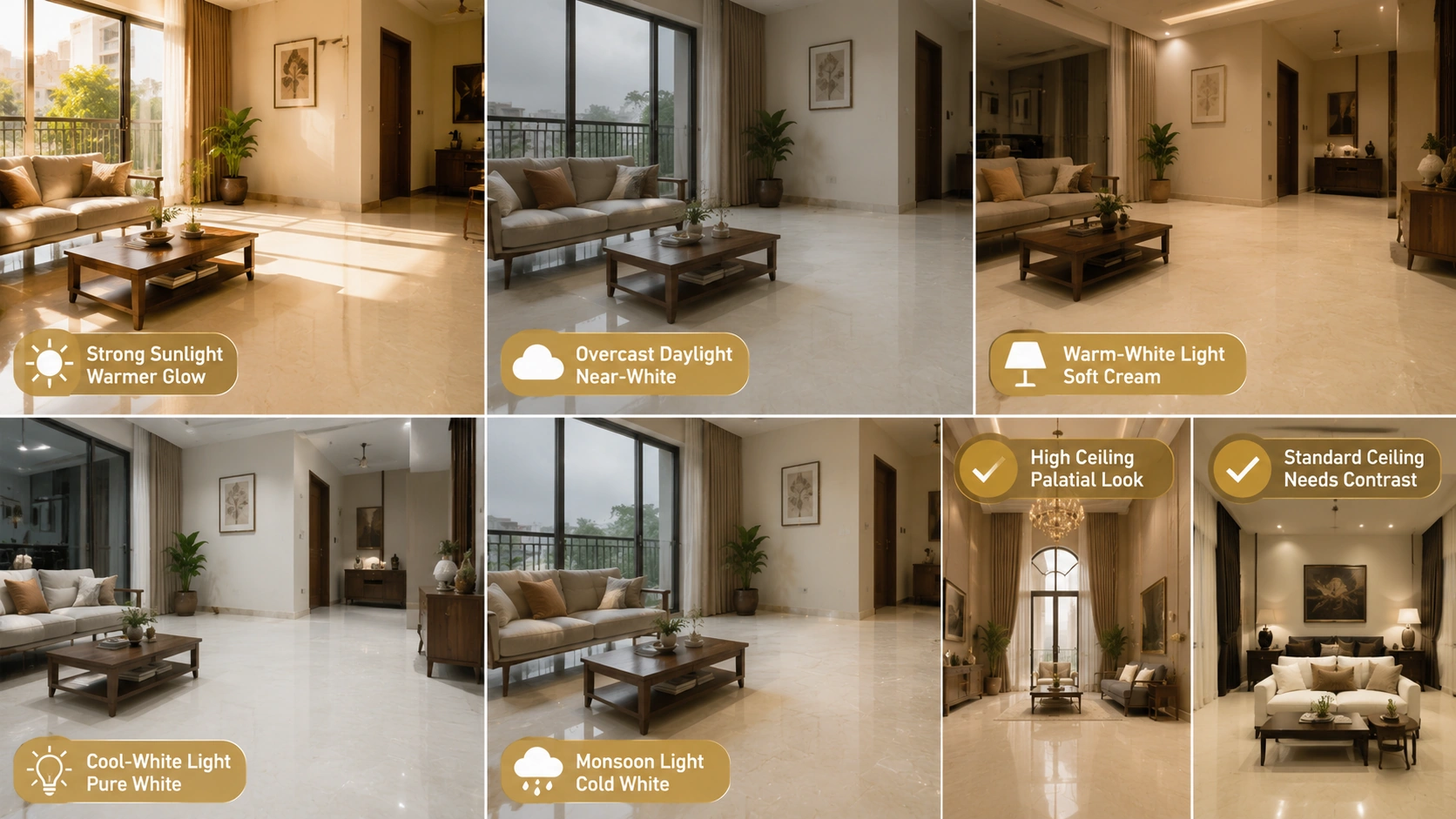
| Light Condition | How Ivory Reads | Practical Implication |
| Strong direct sunlight (south or west facing, afternoon) | Glows warmly. Reads close to a pale gold or very light cream under strong direct sun. Most flattering condition for ivory tiles. | South or west-facing rooms with large windows are ideal for ivory floors. The tile's subtle warmth is amplified by strong natural light without becoming yellow. |
| Diffuse daylight (north-facing, overcast monsoon day) | Reads as near-white or slightly cool. The subtle warmth of ivory disappears in diffuse cool light, and it can look very similar to off-white or even cold white. | In north-facing rooms or during heavy monsoon overcast, ivory tiles look like white tiles without warmth. Add warm-white artificial light at 2700K to compensate, or choose cream or beige instead. |
| Warm-white artificial light (2700K to 3000K) | Gains warmth under warm-white light. Reads as soft cream or warm white. Most flattering artificial lighting condition for ivory. | Specify warm-white recessed or pendant lighting in any room with ivory floors or walls. Under this light, ivory delivers its full character. |
| Cool-white artificial light (4000K to 5000K) | Reads as pure white or very slightly grey. The ivory warmth is completely neutralised. Can appear cold. | Avoid cool-white lighting in rooms with ivory tile floors. If the room requires cool-white (offices, some kitchens), consider off-white or pure white tile instead of ivory, as the distinction is lost. |
| Indian monsoon interior light (overcast, high scatter) | The most difficult light condition for ivory. Reads as cold white or slightly grey. Loses the warmth that defines it. | Ivory tiles in monsoon-heavy coastal Indian cities (Mumbai, Kochi, Goa) look their best under supplemental warm-white artificial light. Plan the lighting as part of the tile specification, not as an afterthought. |
Design principle: Ivory tile works best in rooms where the design brief is 'warm formality': elegant, light, and refined without the assertiveness of colour. The ceiling height plays a critical role. In a room with a 10 ft or higher ceiling, ivory floors and walls read as palatial in the traditional Indian sense. In a room with a standard 8.5 to 9 ft ceiling, ivory reads well if the walls are white or very light and the furniture is in a contrasting mid to dark tone. Ivory on both floors and walls in a low-ceilinged room can read as a pale enclosed box without any of the elegance that the tone is intended to deliver.
Ivory Tile Room-by-Room Design Guide
Living Room
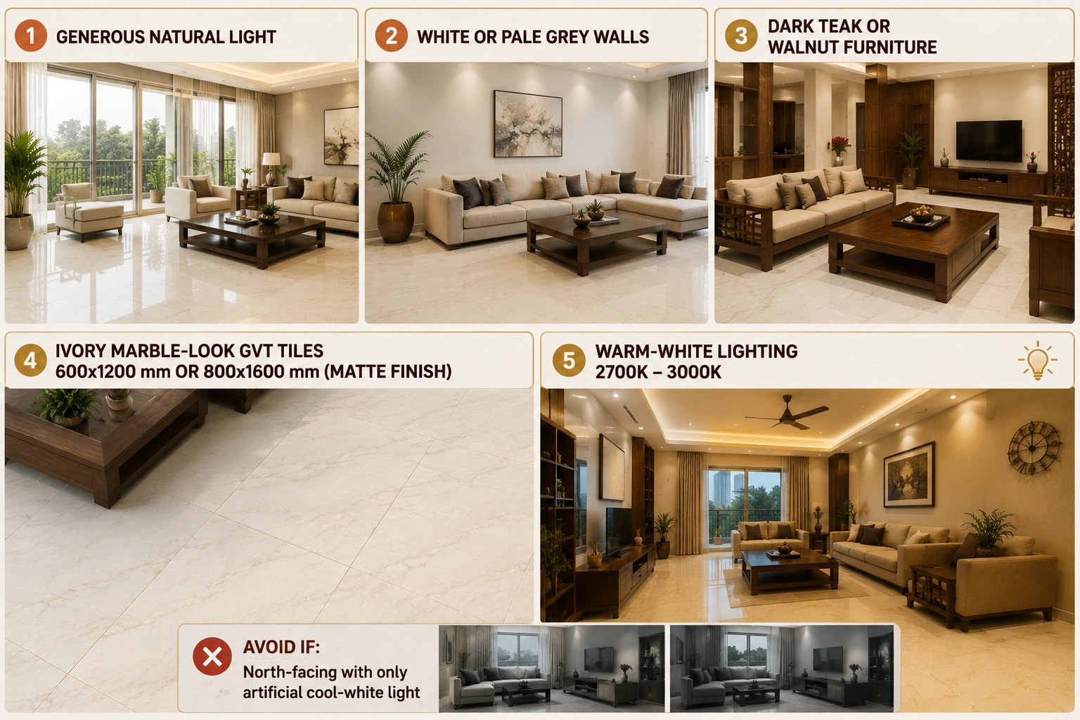
Ivory is at its best in a living room that has generous natural light, a ceiling at 9.5 ft or above, and furniture in a contrasting tone. The combination of ivory floor and white or pale grey walls with dark teak or walnut furniture is the classical Indian luxury living room palette.
- Best tile type: Ivory marble-look GVT at 600x1200 mm or 800x1600 mm in matte finish. The marble-look print adds the visual depth that a plain ivory GVT does not have at room scale.
- Best pairing: White or pale grey walls, dark walnut or teak furniture, brushed brass or silver fixtures, and warm-white recessed lighting at 2700K to 3000K.
- Price range: Rs. 80 to Rs. 200 per sq.ft for ivory marble-look GVT from Morbi in 600x1200 mm and 800x1600 mm matte finish.
- Avoid if: The living room is north-facing and depends entirely on artificial light. In this condition, ivory loses its warmth and reads as cold white under standard cool-white fluorescent lighting.
Bedroom
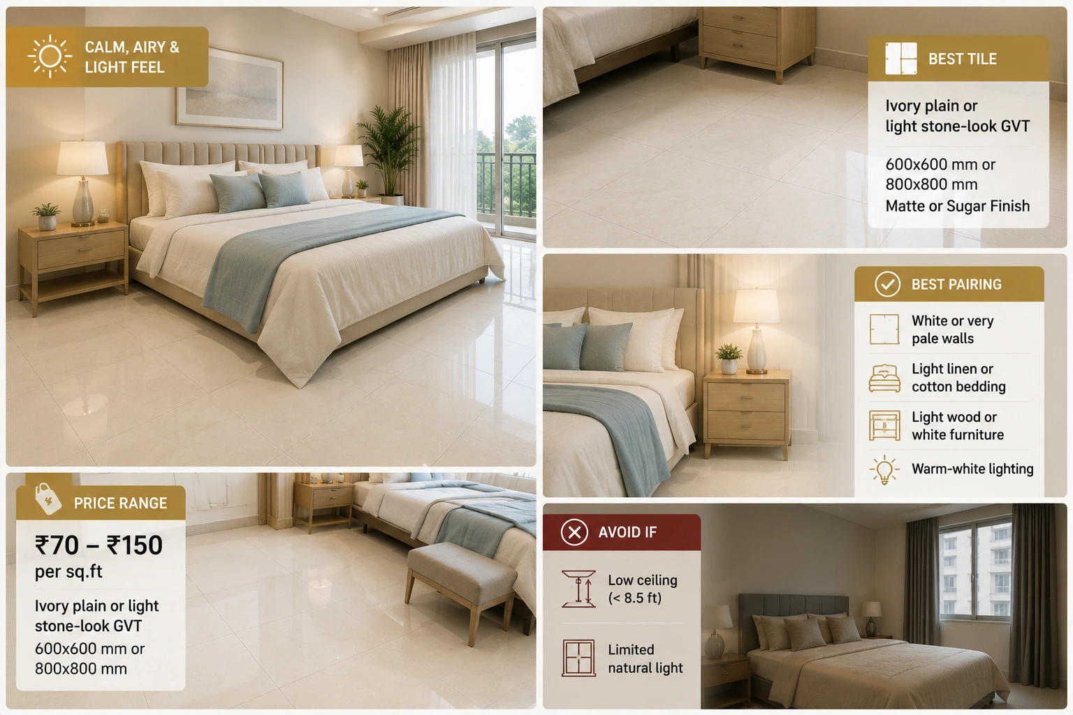
Ivory is well-suited to a master bedroom where the design brief is calm, refined, and airy. The near-white tone creates a light, restful ground that pairs naturally with linen, cotton, and silk textiles in white, cream, and soft blue tones.
- Best tile type: Ivory plain GVT or very light stone-look GVT at 600x600 mm or 800x800 mm in matte or sugar finish. The bedroom does not need the visual weight of a marble print; a soft, plain ivory or light stone-look tile reads more restfully.
- Best pairing: White or very pale walls, light linen or cotton bedding, light wood or white furniture, and warm-white lighting. Avoid dark curtains that create a strong contrast with an ivory floor in a compact bedroom.
- Price range: Rs. 70 to Rs. 150 per sq.ft for ivory plain or light stone-look GVT from Morbi in 600x600 mm and 800x800 mm.
- Avoid if: The bedroom has a low ceiling (below 8.5 ft) and limited natural light. Ivory in this condition reads as washed-out rather than refined.
Kitchen
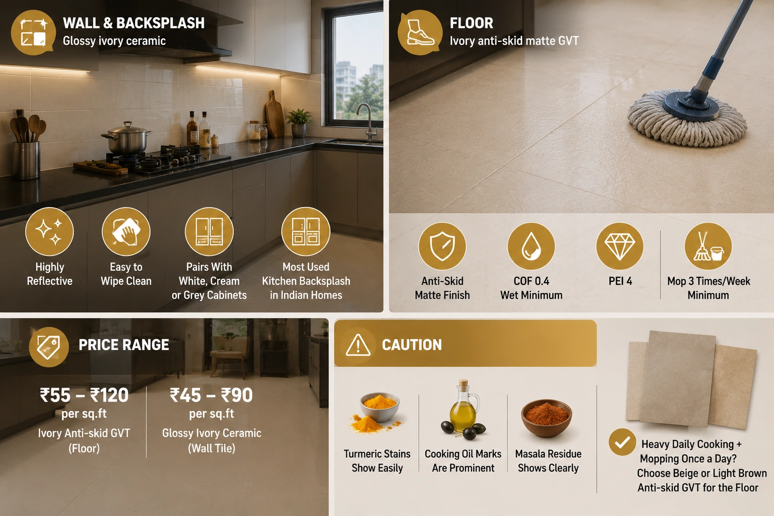
Ivory is primarily a wall tile specification in Indian kitchens. On the floor, ivory anti-skid GVT can work but requires more frequent cleaning than beige or terracotta to maintain its near-white appearance in a heavy Indian cooking environment.
- Floor: Ivory anti-skid matte GVT at 300x600 mm or 600x600 mm. COF 0.4 wet minimum. Specify PEI 4. In a kitchen with heavy Indian cooking, plan for mopping at a minimum of three times per week to keep the ivory floor from getting dirty.
- Wall and backsplash: Glossy ivory ceramic at 300x600 mm or 300x450 mm is the most widely used kitchen backsplash tile in Indian modular kitchens. The glossy surface reflects cooking-area light, is easy to wipe clean of cooking oil and splatter, and pairs with white, cream, or grey cabinets. This is the most appropriate kitchen application for ivory in Indian homes.
- Price range: Rs. 55 to Rs. 120 per sq ft for ivory anti-skid GVT (floor) or Rs. 45 to Rs. 90 per sq ft for glossy ivory ceramic wall tile.
Caution: Ivory anti-skid GVT on an Indian kitchen floor is the most high-maintenance warm neutral for this application. Turmeric, cooking oil, and masala residue are visually prominent on an ivory floor and must be mopped immediately. If the kitchen has heavy daily cooking and mopping is done once a day, rather than after every cooking session, specify beige or light brown anti-skid GVT instead of ivory for the floor.
Bathroom
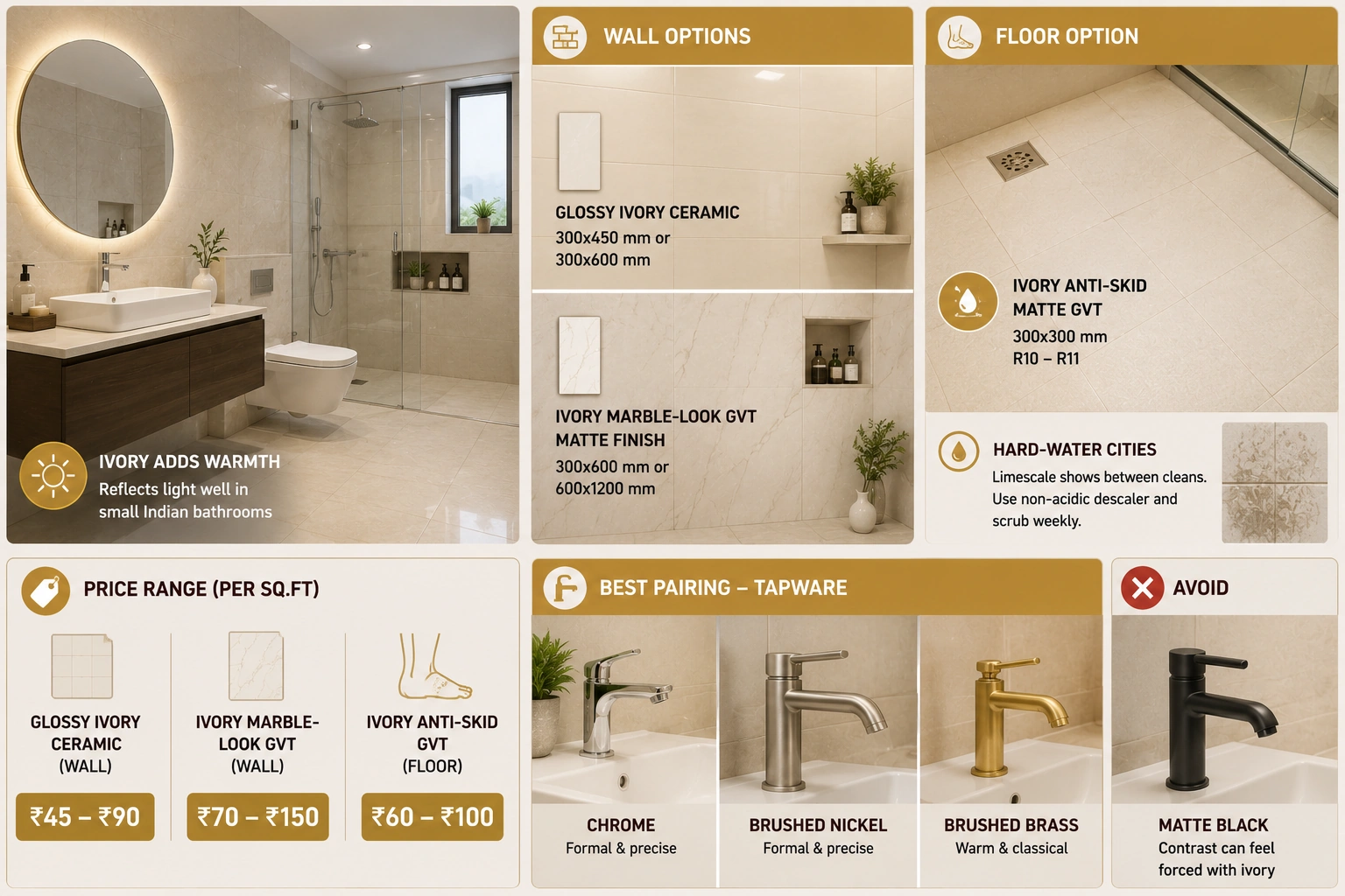
Ivory is a strong bathroom wall tile choice in Indian homes. It adds warmth to a space that standard white tiles keep cold, and the near-white surface reflects light well in compact Indian bathrooms with small windows.
- Bathroom wall: Glossy ivory ceramic at 300x450 mm or 300x600 mm is the standard budget specification. Ivory marble-look GVT in matte finish at 300x600 mm or 600x1200 mm creates a luxury bathroom wall that reads as stone cladding.
- Bathroom floor: Ivory anti-skid matte GVT at 300x300 mm with R10 to R11 rating. In hard-water cities (Delhi, Bengaluru, Hyderabad), ivory bathroom floors show limescale deposits between cleans. Weekly scrubbing with a non-acidic descaler is required to keep an ivory bathroom floor looking correct.
- Price range: Rs. 45 to Rs. 90 per sq.ft for glossy ivory ceramic wall. Rs. 70 to Rs. 150 per sq.ft for ivory marble-look GVT wall. Rs. 60 to Rs. 100 per sq.ft for ivory anti-skid GVT floor.
- Best pairing: Brushed nickel, chrome, or brushed brass tapware. Ivory and chromereads as formal and precise. Ivory and brushed brass read as warm and classical. Avoid matte black fixtures with ivory as the contrast can feel forced.
Formal Dining Room
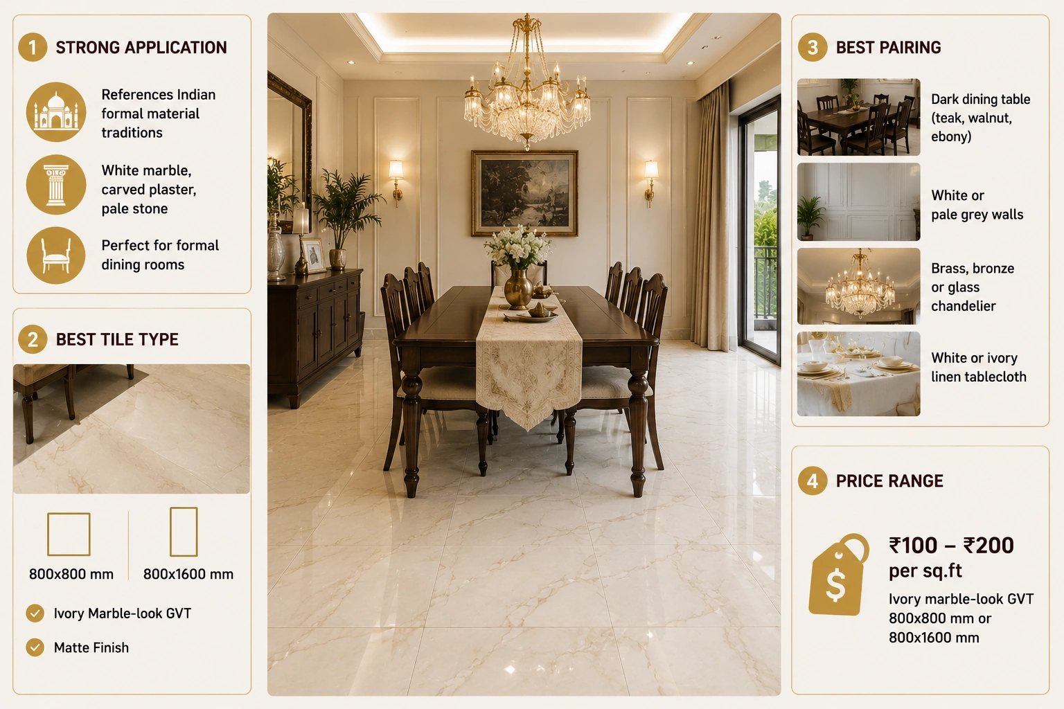
A formal dining room in an Indian home is one of the strongest applications for ivory tile. The tone references Indian formal material traditions: white marble in Mughal architecture, carved white plaster in colonial buildings, and the pale stone of formal reception rooms in traditional Indian homes.
- Best tile type: Ivory marble-look GVT at 800x800 mm or 800x1600 mm in matte finish. The large format and marble-look print create the sense of a continuous stone floor appropriate to a formal dining room.
- Best pairing: A dark dining table in teak, walnut, or lacquered ebony. White or pale grey walls. Statement chandelier or pendant in brass, bronze, or clear glass. Long dining tablecloth in white or ivory linen.
- Price range: Rs. 100 to Rs. 200 per sq.ft for ivory marble-look GVT at 800x800 mm or 800x1600 mm from Morbi manufacturers.
Entrance Foyer
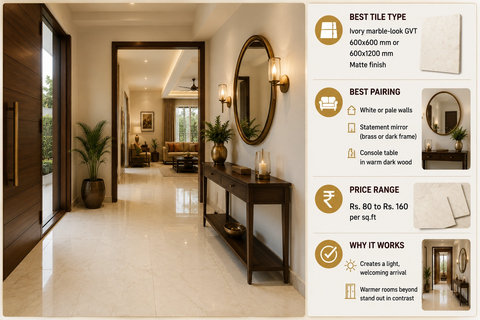
The entrance foyer is one of the most appropriate spaces for ivory tiles in an Indian home. An ivory floor at the entrance creates a light, welcoming arrival moment and allows the warmer tones of adjacent rooms to read in contrast as the visitor moves deeper into the home.
- Best tile type: Ivory marble-look GVT at 600x600 mm or 600x1200 mm in matte finish. At entry foyer scale (25 to 60 sq. ft. typically), a marble-look tile reads clearly and creates the arrival moment the space is designed for.
- Best pairing: White or pale walls, a statement mirror in a brass or dark frame, and a console table in a warm dark wood. Keep the foyer free of heavy furniture that competes with the ivory floor.
- Price range: Rs. 80 to Rs. 160 per sq.ft for ivory marble-look GVT at 600x600 mm or 600x1200 mm.
What to Pair with Ivory Tiles: Walls, Furniture, and Fixtures
| Element | Pairs Well with Ivory | Does Not Pair Well with Ivory |
| Wall colour | White, pure white, pale grey, very light warm grey (greige). These give the ivory floor room to express its subtle warmth while maintaining the overall light palette. Soft sage green walls pair unexpectedly well with ivory floors in bedrooms. | Yellow, warm beige, or cream walls. The warmth of the wall tone and the ivory floor merge, and both lose their character. Dee,p dark walls create a dramatic contrast that can work in specific rooms, but reads as very intentional. |
| Furniture tone | Dark contrasting tones: walnut, wenge, teak, ebony lacquer. The contrast between the dark furniture and the ivory floor reads as formally elegant in the Indian tradition. Or very light wood (pale oak, ash, white-painted) for a Scandinavian-adjacent reading. | Mid-toned warm wood. Pine, mango, or undyed teak furniture in a warm honey-brown tone sits tonally very close to the ivory floor,r and both surfaces lose definition against each other. |
| Fixture finish | Brushed nickel or chrome for a contemporary, formal reading. Brushed brass or antique gold for a warm, classical reading. Both read well against ivory because the contrast is strong enough to be visible. | Matte black in a room that also has warm ivory walls. The contrast becomes too stark. Matte black with ivory floor and white or pale grey walls is more successful. |
| Soft furnishings | White, pale grey, soft blue, sage green, navy blue, deep teal, charcoal. Ivory is a near-neutral that allows a strong textile colour to read clearly. | Yellow, amber, or warm gold textiles. These colours sit too close to the ivory undertone, and both lose definition. The combination reads as monochrome warm-neutral without any focal point. |
| Grout colour | White or very light grey grout in ivory marble-look tiles. The grout should disappear into the tile, not create a visible grid. For large-format ivory tiles, a tone-matched cream grout gives a slightly warmer reading. | Charcoal or dark grout with an ivory tile. The dark grout creates a graphic grid that reads against the soft, refined character of the ivory surface. If a visible grout line is the design intent, choose a bolder tile colour. |
Common Mistakes with Ivory Tiles in Indian Homes
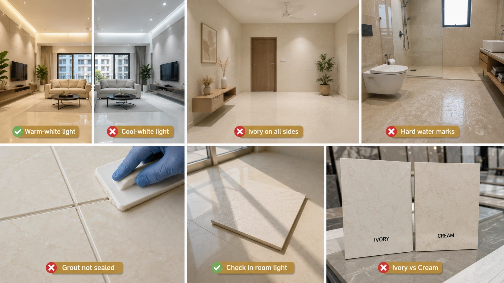
- Specifying ivory floors in rooms without warm-white lighting plans. Ivory tiles depend on warm-white light at 2700K to 3000K to express their warmth. In a room planned with cool-white fluorescent or LED at 4000K or above, ivory reads as white, and the premium paid for the subtle warmth is wasted.
- Using ivory on both the floor and the walls in a compact room. An ivory floor with ivory or cream walls in a room under 200 sq ft creates a single-tone box where nothing reads with clarity. Ivory needs contrast, typically a clear white or pale grey wall, to read as an intentional colour choice rather than as the absence of colour.
- Choosing ivory for a bathroom floor in a hard-water city without a cleaning plan. In Delhi, Bengaluru, Hyderabad, Jaipur, and most of interior India, hard water deposits appear on light tile floors within days of installation. An ivory floor in a hard-water city that is mopped weekly (not daily) will show a grey-white mineral haze between cleans. Specify beige for a low-maintenance warm neutral in hard-water bathrooms.
- Matching the grout to the tile exactly. A completely invisible grout joint on an ivory marble-look floor can make the floor read as one continuous surface, which is the intention. However, if the grout is not cured and applied perfectly, even slight variation reads as a stain on an ivory surface. Use a high-quality sanded or unsanded grout in ivory or light cream tone and seal it within 24 hours.
- Ordering ivory tiles without viewing them in the actual room light. Ivory shifts significantly between showroom lighting (typically warm display lighting that flatters the tile) and the room's actual light conditions. Always place a 30x30 cm tile sample on the actual floor under the room's existing or planned lighting before placing a bulk order.
- Confusing ivory with cream in bulk ordering. When ordering from a tile supplier and the specification says 'ivory', confirm with a physical sample that matches what you approved. Different manufacturers use ivory and cream to describe different tones, and receiving cream tiles when you specified ivory produces a warmer floor than intended.
Ivory Tile Buying Checklist for Indian Buyers
- Confirm the material body. Is it GVT (vitrified, 0.05% water absorption) or ceramic (2 to 6% absorption)? For any ivory floor tile, GVT is the correct specification. Ivory ceramic floor tiles have higher water absorption and are more prone to staining in Indian household conditions. Ivory ceramic wall tiles are appropriate for bathroom and kitchen walls.
- Confirm PEI rating for floor use. PEI 4 for the living room, dining room, kitchen, and foyer. PEI 3 for bedrooms. Anti-skid matte with a minimum wet COF of 0.4 for any bathroom or kitchen floor.
- Confirm water absorption for GVT. 0.05% or below per IS 15622:2006. Request this figure in the TDS, not verbally. At the entry price tier, some tiles are labelled as vitrified but do not meet the 0.05% threshold.
- For marble-look ivory tiles, confirm face variation and count. Minimum 4 face variations for rooms above 100 sq.ft. 6 or more for rooms above 250 sq.ft. In an ivory marble-look floor with low face variation, the repeating veining pattern reads as a printed surface rather than stone.
- View the tile under warm-white and cool-white light before ordering. The most important quality check for Ivor,y specifically. A tile that looks warmly ivory under showroom display lighting can look cold white under the room's actual lighting. Always view in the planned light type.
- Specify the grout tone in writing. Ivory marble-look tiles with the wrong grout colour are one of the most common post-installation regrets. The grout should match or be slightly lighter than the tile background, not be white or dark.
- Order 10% extra and confirm batch consistency. Ivory tiles from two different production batches can have a visible tonal difference that shows in the installed floor. Confirm the batch number on the purchase order.
Ivory GVT Availability from Morbi, Gujarat: Design Category Reference
| Ivory Design Category | Most Common Format | Price Range (Morbi) | Face Variations | IS 15622:2006 | Notes |
| Plain ivory GVT (matte and sugar) | 600x600 mm, 800x800 mm | Rs. 70 to Rs. 110/sq.ft | 2 to 4 | 0.05% water absorption, PEI 4 | Widest availability in entry and mid tiers. Most widely stocked ivory format in Morbi. |
| Ivory marble-look GVT (Statuario, Carrara, Calacatta ivory) | 600x1200 mm, 800x1600 mm | Rs. 90 to Rs. 200/sq.ft | 4 to 8 | 0.05% water absorption, PEI 4 | Primary specification for formal living rooms and hotel lobbies. Better face variation range at mid and premium tiers. |
| Ivory stone-look GVT (limestone-look, Jerusalem stone-look) | 600x600 mm, 600x1200 mm | Rs. 80 to Rs. 150/sq.ft | 4 to 6 | 0.05% water absorption, PEI 4 | Textured matte surface. Warmer and more tactile than plain ivory GVT. Suit bedrooms and formal rooms with a natural material brief. |
| Ivory anti-skid GVT (bathroom and kitchen floor) | 300x300 mm, 300x600 mm | Rs. 60 to Rs. 100/sq.ft | 2 to 4 | 0.05% water absorption, PEI 4, COF 0.4 wet | Anti-skid rating is the key specification for these formats. Confirm the R10 to R11 rating in the TDS. |
| Glossy ivory ceramic (wall tile) | 300x450 mm, 300x600 mm | Rs. 45 to Rs. 90/sq.ft | 1 to 2 (glossy wall tile is typically uniform) | IS 13712:2006 (ceramic). 3 to 6% absorption. Wall use only. | Most affordable ivory tile in the Indian market. Appropriate for bathroom and kitchen walls only. |
Note: In coastal Indian cities, including Mumbai, Goa, Kochi, and Chennai, with monsoon humidity of 85 to 95% from June to September, all ivory GVT at 0.05% water absorption performs without sealing, staining, or surface degradation regardless of humidity level. The non-porous surface is the most significant practical advantage of ivory GVT over ivory natural stone (marble, limestone, Jerusalem stone), which requires penetrating sealer reapplication every 12 to 24 months and absorbs mineral-rich water in high-humidity conditions.
Browse Ivory Tile Designs on TilesFinders
From glossy ivory ceramic bathroom wall tiles at Rs. 45 per sq.ft to premium ivory Statuario marble-look GVT at Rs. 200 per sq.ft, the full ivory and near-white tile range from Morbi, Gujarat manufacturers is on TilesFinders. Filter by design category, finish, size, and room to find the right ivory tile for your space.
FAQs
Pure white tiles have no colour warmth at all. Off-white tiles are a softened white with a very subtle undertone. Ivory tiles have a slight yellow-beige warmth that is visible in direct comparison with white but not assertive on its own. Cream tiles have a clear, visible warm yellow undertone that reads as noticeably warm without comparison. The practical test: hold the tile against a white A4 paper sheet. Ivory will appear very slightly warmer than the paper; cream will appear clearly warmer.
Ivory anti-skid matte GVT at 300x300 mm with R10 to R11 rating and COF 0.4 wet minimum is safe for Indian bathroom floors. However, in hard-water cities (Delhi, Bengaluru, Hyderabad), ivory bathroom floors require cleaning every 2 to 3 days to prevent visible limescale deposits. For lower-maintenance bathroom floors in hard-water cities, beige or light brown anti-skid GVT is more forgiving.
Ivory marble-look GVT at 800x1600 mm or 600x1200 mm in matte finish is the premium living room specification. For a mid-budget living room, 600x1200 mm ivory marble-look GVT at Rs. 90 to Rs. 140 per sq.ft from Morbi delivers the Statuario or Carrara marble-look aesthetic in a non-porous, maintenance-free format. Specify a minimum of 4 face variations for a room above 200 sq.ft.
Warm-white LED at 2700K to 3000K is the correct lighting for any room with ivory tiles. Under warm-white light, ivory reads as soft and refined. Under cool-white light at 4000K or above, ivory tiles lose their warmth and read as plain white. This is the most common reason ivory tiles disappoint after installation: they were specified without a complementary warm-white lighting plan.
Yes. Dark teak, walnut, or wenge furniture is the strongest pairing for an ivory floor in the Indian context. The contrast between the near-white floor and the dark furniture reads as formally elegant, referencing the material language of traditional Indian formal rooms where pale stone floors and dark wood furniture were the standard specification. Avoid mid-toned warm wood furniture with ivory floors as both surfaces lose definition against each other.
In Vastu Shastra, ivory and near-white tones are associated with purity, clarity, and formal learning. They are considered appropriate for study rooms, home offices, meditation spaces, and the northeast zone of the home, which is the zone of wisdom and auspicious beginnings. For living rooms and bedrooms, ivory is acceptable in Vastu but is less specifically recommended than golden, yellow, or warm earth tones for these spaces.
White or ivory-matched grout for marble-look ivory tiles. The grout should be invisible or nearly so, allowing the tile pattern to read as continuous. For a floor in a kitchen or high-traffic area where grout maintenance is a concern, a slightly grey-ivory or very pale grey grout is more forgiving than pure white, which shows staining between cleans.
Ivory GVT requires weekly damp mopping with a pH-neutral cleaner. No sealing, no polishing. In kitchens and bathrooms, clean spills immediately as the near-white surface makes cooking residue and toothpaste visible before it dries into the grout. In hard-water cities, treat limescale on ivory bathroom floors weekly with a non-acidic descaler. Do not use vinegar or acidic cleaners on GVT tiles, as these dull the matte glaze over time.

See our tile guides first
Set TilesFinders as a preferred source and our buying guides surface ahead of the rest for you.
Add as preferred sourceTakes one tap. Nothing to install.
What Readers Say
I was about to redo my parking area with the wrong tile size until I read this. The layout comparisons saved me from a costly mistake.
We reference TilesFinders guides while briefing clients on material selection. The size and pattern breakdowns are accurate and easy to explain visually.
On site, I get asked about grout spacing all the time. This article gave me a solid reference I now share with my team before every job.
Finally a guide that doesn't just push generic advice. The oil stain removal steps actually worked on our clubhouse driveway tiles.
I run a small construction firm and now send this link to clients directly when they ask about entrance tile sizing. Saves me an hour of explaining.
Good practical detail, though I wish there were more examples for compact apartment entrances specifically, not just villas.
My mother-in-law wanted marble, I wanted vitrified. This blog gave us the neutral comparison we needed to actually decide together.
Detailed without being overwhelming. I appreciated that it covered both cost and maintenance, not just the aesthetics.
Used the algae and hard water removal tips on our terrace tiles after the monsoon. Worked better than what our regular cleaner was doing.
As someone who sources tiles for multiple builder projects, I find these comparisons genuinely useful for vendor conversations, not just consumer content.
Recommended this to a client who kept second-guessing the entrance design. The small vs large layout section settled the debate instantly.
Straightforward and honest, no unnecessary jargon. Would like to see a similar breakdown for outdoor pool-deck tiles next.
We've bookmarked several TilesFinders guides for our design handbook. Reliable source when clients want data, not just opinions.
Two paths, one marketplace.
Get free quotes from verified suppliers.
Share your room, budget, and style. Suppliers in Morbi respond within hours.
Get Free QuotesList your business, reach real buyers.
Put your showroom in front of homeowners searching for tiles right now.
List Your Business