How to Use Multi-Colour Tiles Without Making Indian Rooms Look Busy: Scale, Placement and Pairing Guide
Learn how to use multi-colour tiles in Indian rooms with practical scale, placement, and pairing rules that create bold interiors without making kitchens, bathrooms, or pooja rooms look busy.
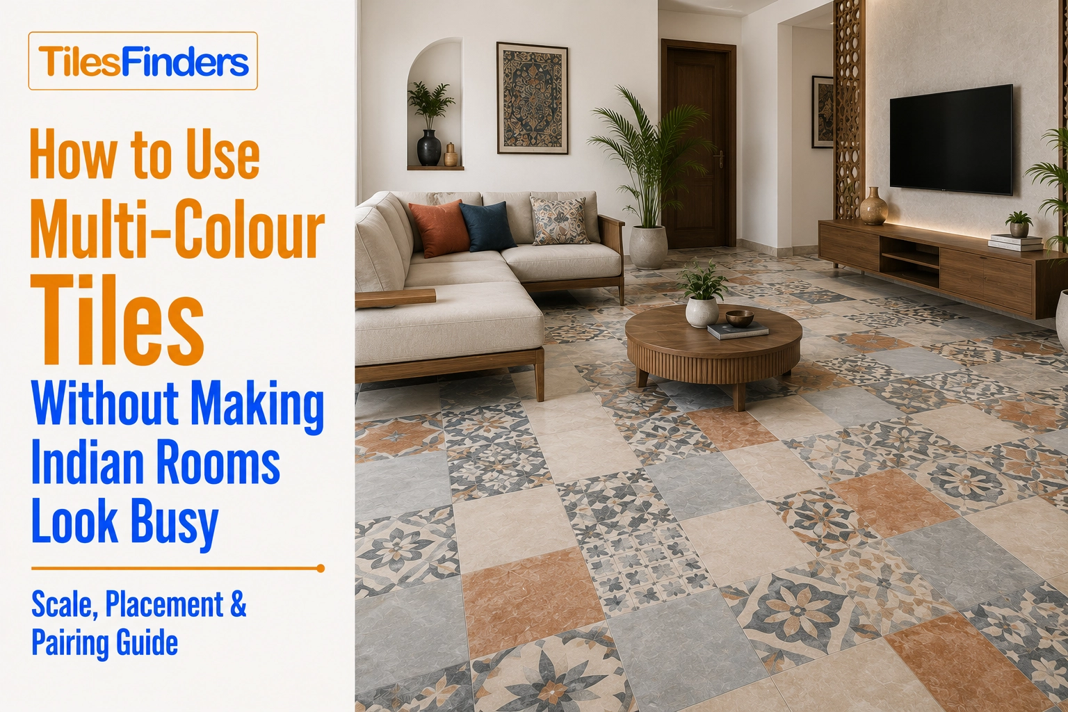
Keep one dominant colour, one secondary tone, and a smaller accent, then adjust the border or accent size according to the room's dimensions. Keep walls, cabinetry, furniture, and accessories quieter so the multi-colour tile remains the room's primary visual statement.
Multi-colour tile design fails for the same reasons abstract and highlighter tile designs fail: the wrong scale, the wrong placement, and no restraint anywhere else in the room. This guide is a practical mechanics reference specifically for combining multiple colours, extending the proportion discipline covered in our multi-colour buyer's guide with the scale, placement, and pairing rules that keep a bold room considered rather than chaotic.
The Scale Rule for Multi-Colour Combinations
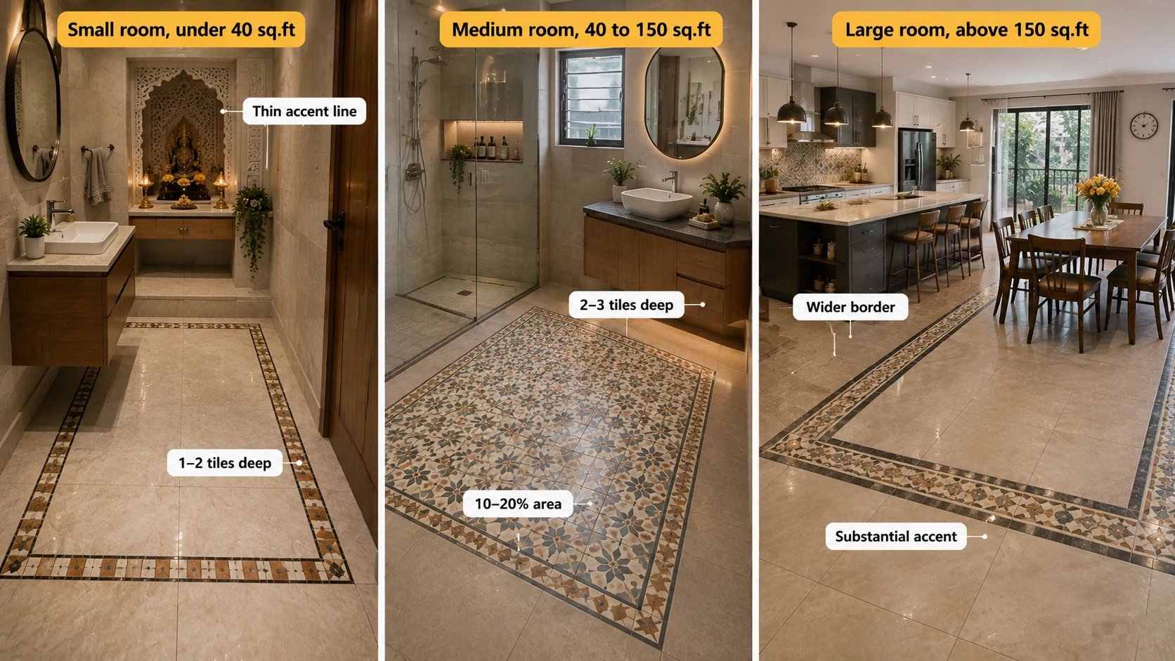
Each colour's individual presence, the size of a border, the scale of a pattern repeat, and the dimension of an accent zone need to be proportioned to the room it sits in, not selected independently of it.
| Room Size | Correct Accent Scale | What Goes Wrong at the Wrong Scale |
| Small room, under 40 sq.ft (powder room, compact pooja room) | A single thin accent line or small border, 1 to 2 tiles deep maximum | A wide, bold accent zone consumes too much of a small room's total area, overwhelming the dominant tone rather than framing it |
| Medium room, 40 to 150 sq.ft (standard kitchen, bathroom) | A border 2 to 3 tiles deep, or an accent zone covering 10 to 20% of the floor | Both very thin and very wide accents can read oddly at this scale; the 2 to 3 tile border depth is the most reliable middle ground |
| Large room, above 150 sq.ft (open-plan kitchen-dining) | A wider border or a more substantial zoning accent, since a thin line can visually disappear across a large floor | A border sized for a small room reads as fussy and insufficient when stretched across a large continuous area |
If you are still deciding which multi-colour tile combinations work best for your project, our Multi-Colour Tiles in India guide covers mosaic, patterned, and mixed-tone options in greater detail. It is useful for comparing colour combinations before deciding on the right scale and placement for your room.
From The Marketplace
Popular tiles right now
-a7bc331f-ba60-41ce-834f-5a1d0c7ac3b1.jpg)
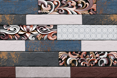
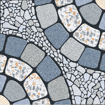

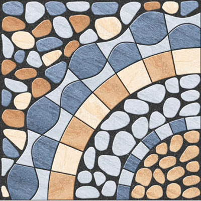
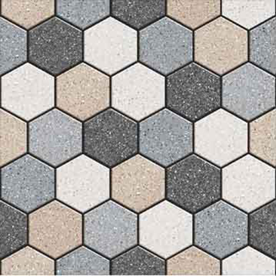
The Placement Rule
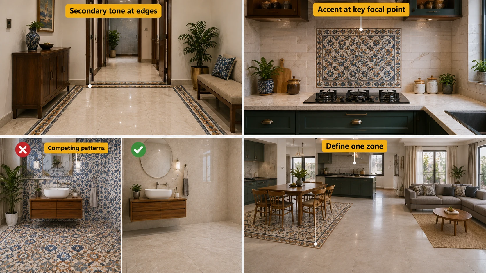
- Place the secondary tone at the room's edge or a natural boundary, a perimeter border, a threshold, a zone transition, rather than scattered through the middle of the dominant field.
- Place the accent colour at the single most visually significant point in the room, a medallion at the entrance centre, a border at the doorway threshold, a mosaic panel behind the hob, concentrating the smallest colour proportion where it will be seen and appreciated rather than diluting it across multiple small zones.
- Avoid placing two different multi-colour treatments in the same sightline. A patterned floor visible at the same time as a patterned or multi-colour wall creates competing focal points rather than one considered statement.
- In an open-plan space, let the multi-colour treatment define one zone's boundary, rather than spreading a single combination across the entire continuous floor without any variation.
The Pairing Rule
| Element | Correct Approach | What Overwhelms |
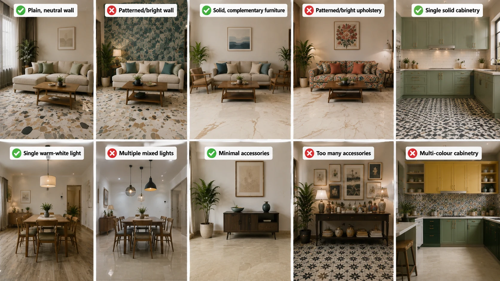
| Wall colour | Plain, neutral, matching or complementing the dominant floor tone | A patterned or brightly coloured wall competing with an already multi-colour floor |
| Furniture | Solid colours drawn from the palette's dominant or secondary tone | Patterned or brightly coloured upholstery adding a fourth or fifth colour to an already busy scheme |
| Cabinetry (kitchen) | A single solid colour that complements rather than competes with the floor's dominant tone | Multi-colour or heavily patterned cabinetry paired with a multi-colour floor, doubling the room's visual complexity |
| Lighting | A single, well-considered warm-white source | Multiple competing light sources of different colour temperatures, which can distort how the multi-colour combination actually reads |
| Accessories | Minimal, allowing the tile combination to be the room's primary visual statement. | Additional decorative colour and pattern competing directly with the floor or wall for attention |
Room-by-Room Application
Idea 1: Kitchen: Dominant Field, Bordered Perimeter, Plain Cabinetry
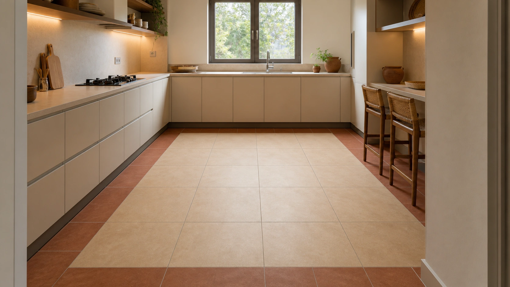
Multi-colour GVT combination + plain cabinetry | 2x2 or 24x24 (600x600 mm) field, 1x2 (300x600 mm) border | Anti-skid matte | Rs. 75 to Rs. 175/sq.ft
Apply the full scale, placement, and pairing discipline: a dominant field covering roughly 60%, a bordered perimeter as the secondary tone, and plain solid-colour cabinetry that does not compete with the floor's multi-colour statement.
Idea 2: Bathroom: Dominant Floor, Accent Wall, Plain Fixtures
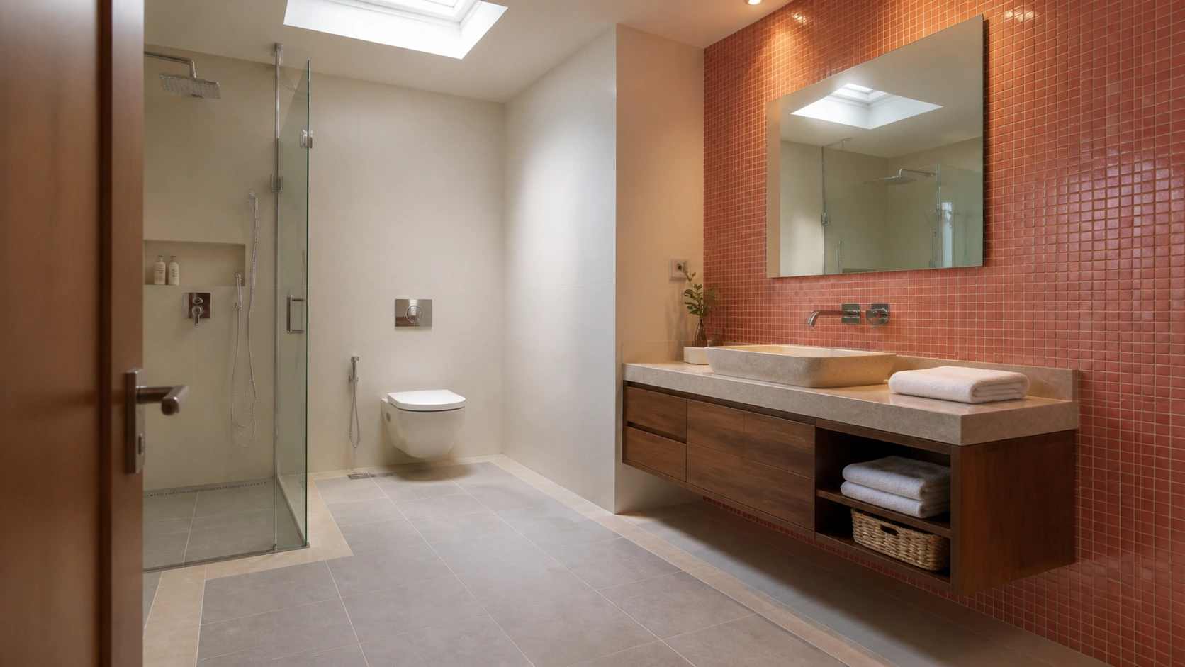
Multi-colour GVT floor + accent wall | Mixed formats | Anti-skid matte floor | Rs. 90 to Rs. 200/sq.ft
Keep the floor to a dominant-secondary combination and confine the boldest accent colour to a single wall, with fixtures in a neutral chrome or brass finish rather than a colour that competes with the tile palette.
Idea 3: Pooja Room: Dominant Field, Single Focal Accent, No Additional Colour
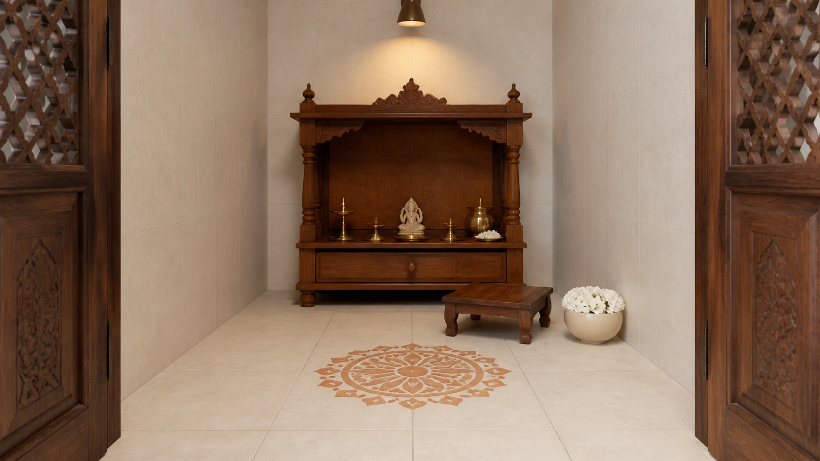
Multi-colour GVT combination, dominant field plus one focal accent | Mixed formats | Matte | Rs. 65 to Rs. 175/sq.ft
In a genuinely small pooja room, resist adding a fourth colour anywhere else in the space, decor, cloth, or lighting fixtures, once the floor already carries a dominant tone and one focal accent.
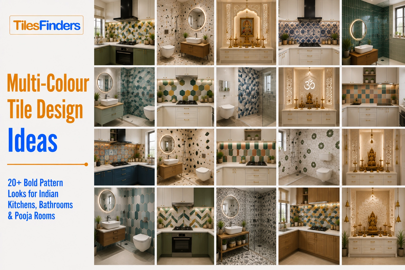
For practical inspiration, explore these Multi-Colour Tile Design Ideas covering bold looks for Indian kitchens, bathrooms, and pooja rooms. They can help you see how different colour combinations translate into real room applications before finalising your own layout.
Common Overwhelm Mistakes 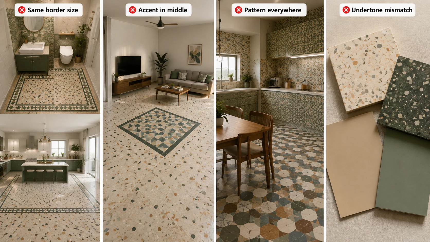
- Sizing the accent border or zone the same regardless of room size. A border that works in a powder room can look insufficient in a large kitchen, and a border sized for a large room can overwhelm a small one.
- Placing the accent colour in the middle of the room rather than at its edge or focal point. A scattered accent reads as random; a concentrated accent at a threshold or medallion reads as intentional.
- Adding pattern or colour to walls, cabinetry, or furniture once the floor is already multi-colour. Every other surface should go quiet to let the floor carry the room's statement.
- Choosing accent colours independently rather than checking undertone compatibility. Two individually appealing colours can clash once combined; always view physical samples together before ordering.
Buying Checklist
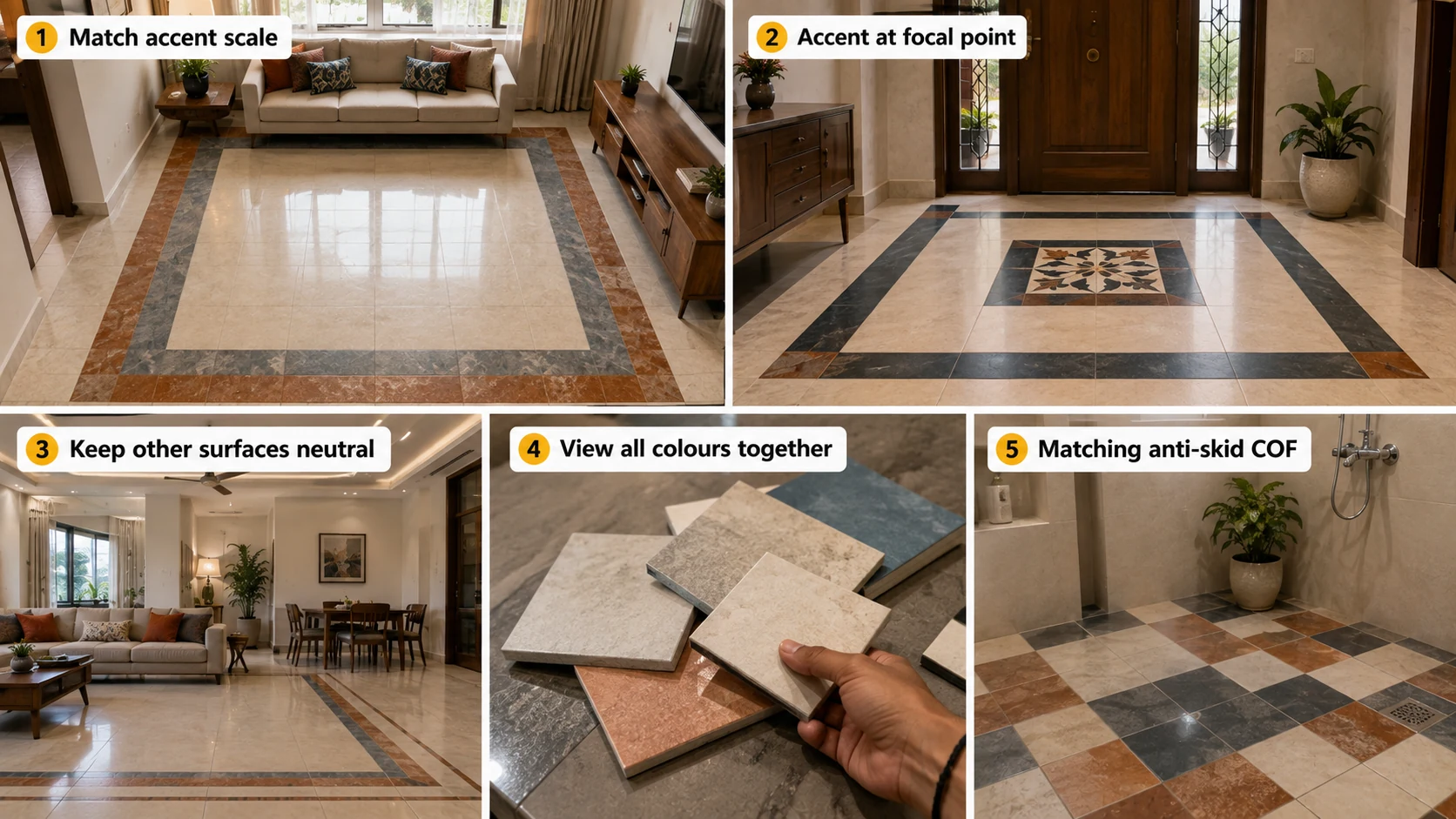
- Match accent scale to room size using the small, medium, and large room guidance in this guide before finalising border or zone dimensions.
- Place the accent colour at the room's most visually significant point, not scattered through the middle of the dominant field.
- Confirm every other surface in the room, walls, cabinetry, furniture, stays plain and neutral once the floor carries a multi-colour combination.
- View physical samples of all colours together before ordering, since undertone compatibility is difficult to judge from separate catalogue images.
- Confirm matching anti-skid COF across all colours in any wet-area combination.
Multi-Colour Application in India: 2026 Context
As multi-colour tile combinations have grown more popular in Indian kitchen, bathroom, and pooja room design through 2026, the projects achieving the most successful results consistently treat scale, placement, and pairing as deliberate decisions made alongside colour selection, not afterwards. Morbi manufacturers increasingly offer coordinated field-and-border sets specifically because this scale-and-placement discipline has become recognised as the differentiator between a successful multi-colour room and a regretted one.
Plan Your Multi-Colour Room on TilesFinders
Coordinated field, border, and accent GVT sets for kitchens, bathrooms, and pooja rooms can be sized against your actual room dimensions on TilesFinders, helping you confirm scale and placement before the tile order goes in.
FAQs
A thin accent line for a small room under 40 sq.ft, a border 2 to 3 tiles deep for a medium room between 40 and 150 sq.ft, and a wider border or substantial zoning accent for a large room above 150 sq.ft, since a thin line can visually disappear across a large continuous floor.
At the room's single most visually significant point, an entrance centre, a doorway threshold, or a hob backsplash zone, rather than scattered through multiple small areas, which concentrates its impact and reads as intentional rather than random.
Generally not recommended in the same sightline, since two competing multi-colour treatments create competing focal points. Choose one surface to carry the room's colour statement and keep the other plain.
Plain, a single solid colour that complements rather than competes with the floor's dominant tone. Multi-colour or heavily patterned cabinetry paired with a multi-colour floor doubles the room's visual complexity.
View physical samples of all colours together in person, since undertone compatibility, a warm versus cool underlying tone within colours that look similar in isolation, is difficult to judge accurately from separate catalogue images.
Placing the accent colour in the middle of the room rather than at its edge or a genuine focal point. A scattered accent reads as random, while a concentrated accent at a threshold or medallion reads as a deliberate design decision.
Yes, and arguably more so, since a small room has less total area to absorb an oversized accent. A thin accent line or single focal medallion is generally the correct scale for a compact pooja room under 40 sq.ft.
A single, well-considered warm-white light source is recommended over multiple competing light sources of different colour temperatures, which can distort how the multi-colour combination actually reads once installed.


See our tile guides first
Set TilesFinders as a preferred source and our buying guides surface ahead of the rest for you.
Add as preferred sourceTakes one tap. Nothing to install.
What Readers Say
I was about to redo my parking area with the wrong tile size until I read this. The layout comparisons saved me from a costly mistake.
We reference TilesFinders guides while briefing clients on material selection. The size and pattern breakdowns are accurate and easy to explain visually.
On site, I get asked about grout spacing all the time. This article gave me a solid reference I now share with my team before every job.
Finally a guide that doesn't just push generic advice. The oil stain removal steps actually worked on our clubhouse driveway tiles.
I run a small construction firm and now send this link to clients directly when they ask about entrance tile sizing. Saves me an hour of explaining.
Good practical detail, though I wish there were more examples for compact apartment entrances specifically, not just villas.
My mother-in-law wanted marble, I wanted vitrified. This blog gave us the neutral comparison we needed to actually decide together.
Detailed without being overwhelming. I appreciated that it covered both cost and maintenance, not just the aesthetics.
Used the algae and hard water removal tips on our terrace tiles after the monsoon. Worked better than what our regular cleaner was doing.
As someone who sources tiles for multiple builder projects, I find these comparisons genuinely useful for vendor conversations, not just consumer content.
Recommended this to a client who kept second-guessing the entrance design. The small vs large layout section settled the debate instantly.
Straightforward and honest, no unnecessary jargon. Would like to see a similar breakdown for outdoor pool-deck tiles next.
We've bookmarked several TilesFinders guides for our design handbook. Reliable source when clients want data, not just opinions.
Two paths, one marketplace.
Get free quotes from verified suppliers.
Share your room, budget, and style. Suppliers in Morbi respond within hours.
Get Free QuotesList your business, reach real buyers.
Put your showroom in front of homeowners searching for tiles right now.
List Your Business