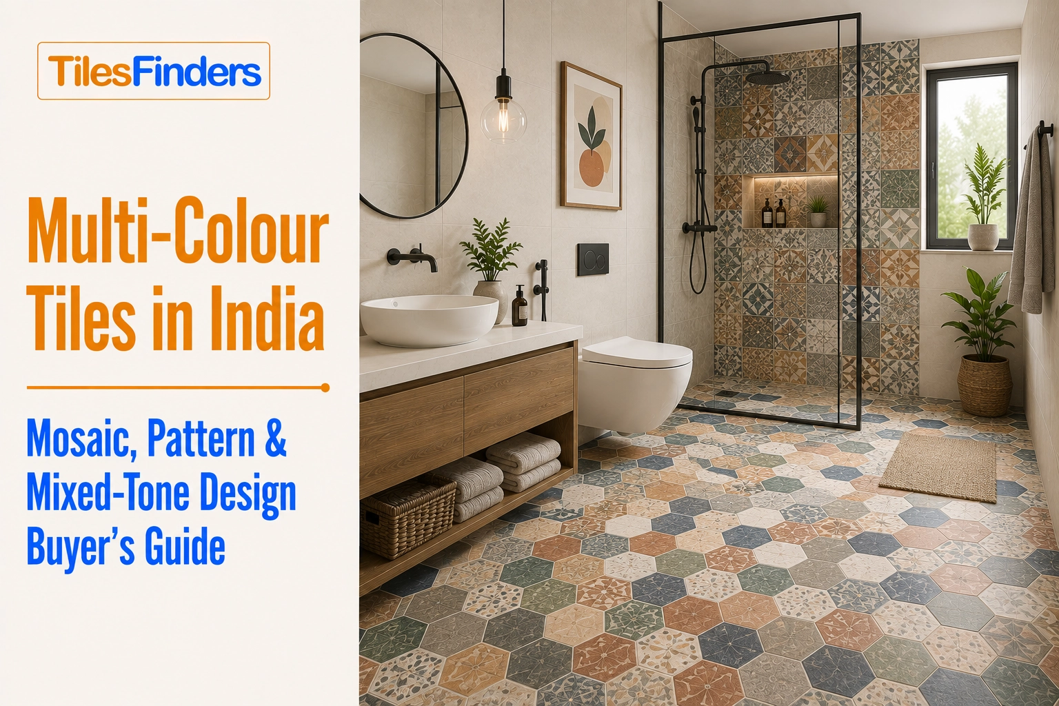
Multi-Colour Tiles in India: Mosaic, Pattern and Mixed-Tone Design Buyer's Guide
Multi-colour tiles combine mosaic, printed patterns, and mixed tones for expressive Indian interiors, with practical guidance on colour proportions, applications, and coordinated tile selection.
- Three Ways to Achieve Multi-Colour Tile Design
- The Proportion Rule: Why Most Multi-Colour Floors Fail
- How Many Colours to Use
- Multi-Colour Mosaic Tile Guidance
- Multi-Colour Pattern Tile Guidance
- Mixed-Tone Combination Guidance
- Where Multi-Colour Design Works Best
- Common Mistakes
- Multi-Colour Tile Production in India: 2026 Context
- Explore Multi-Colour Options on TilesFinders
Use multi-colour tiles with a clear hierarchy: roughly 60% dominant, 30% secondary, and 10% accent to keep the design visually balanced rather than chaotic. For a safer starting point, use two colours or apply bold combinations in contained areas such as foyers, powder rooms, and kitchen backsplashes.
Combining three or more colours in a single tile scheme is the design category with the highest failure rate in Indian residential tiling, not because multi-colour is a bad idea, but because most attempts skip the proportion discipline that separates a considered multi-hue floor from a visually chaotic one. This guide covers the three genuine paths to multi-colour tile design: printed pattern, assembled mosaic, and mixed-tone combination, and the rules that make each one succeed.
Three Ways to Achieve Multi-Colour Tile Design
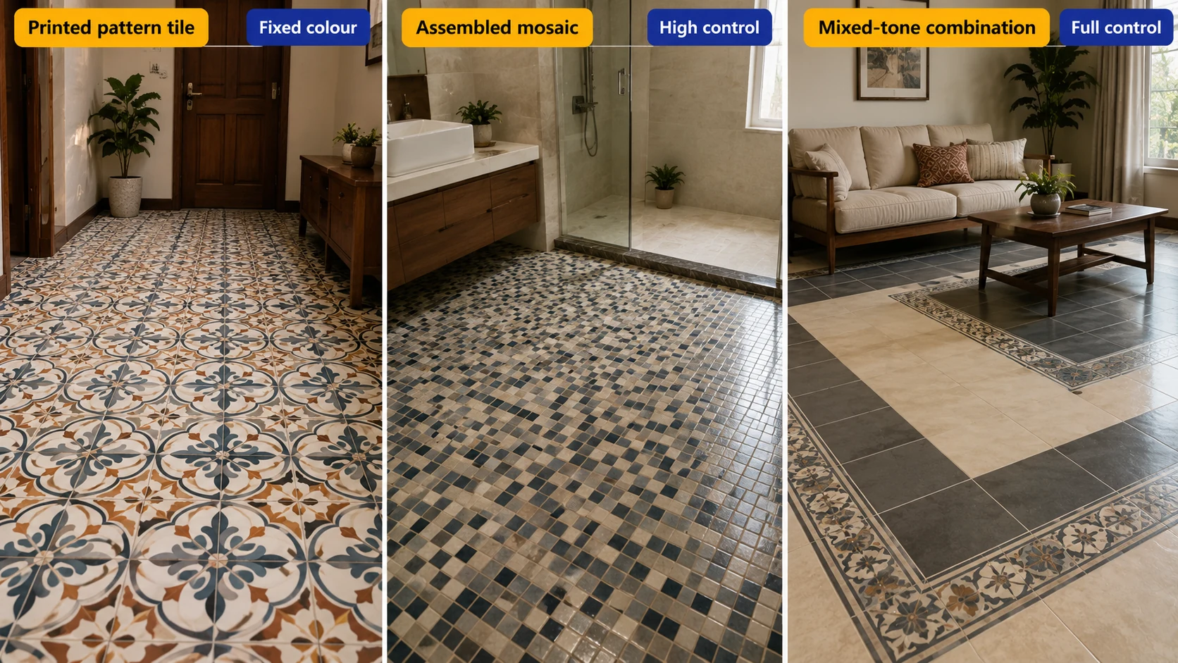
| Approach | How It Works | Colour Control |
| Printed pattern tile | Multiple colours printed onto a single tile in an encaustic-style or graphic pattern | Fixed by the manufacturer; the buyer selects a pre-designed multi-colour print |
| Assembled mosaic | Small individual chips in different colours combined into a sheet or custom layout | High, since chip colour combinations can be custom-specified or chosen from pre-blended sheets |
| Mixed-tone combination | Separate solid-colour or printed field tiles combined through borders, checkerboards, or zoning | Full control: the buyer or designer specifies exactly which tiles combine and in what proportion. |
From The Marketplace
Popular tiles right now

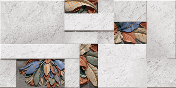
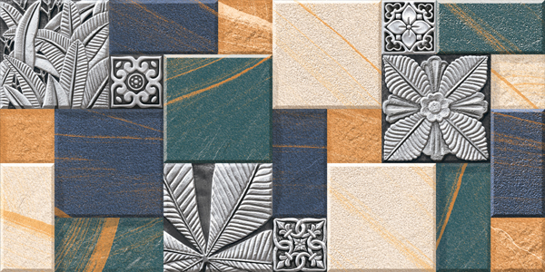
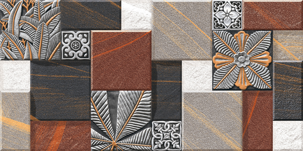
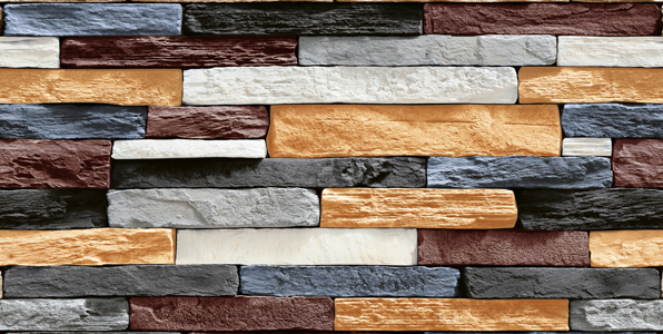
The Proportion Rule: Why Most Multi-Colour Floors Fail
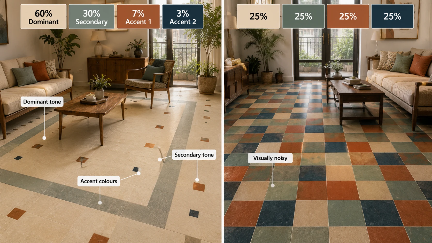
The core discipline every successful multi-colour scheme follows: A room can absorb three or four colours without reading as chaotic only if they follow a clear dominant, secondary, and accent hierarchy, roughly 60% dominant tone, 30% secondary tone, and 10% accent colour, rather than being distributed in roughly equal proportions. A floor using four colours at 25% each reads as visually noisy regardless of how well the individual colours pair, while the same four colours at a 60-30-7-3 split reads as a considered, layered composition. This single proportion principle is the difference between a successful multi-colour floor and a regretted one.
How Many Colours to Use
| Colour Count | Difficulty to Execute Well | Best Application |
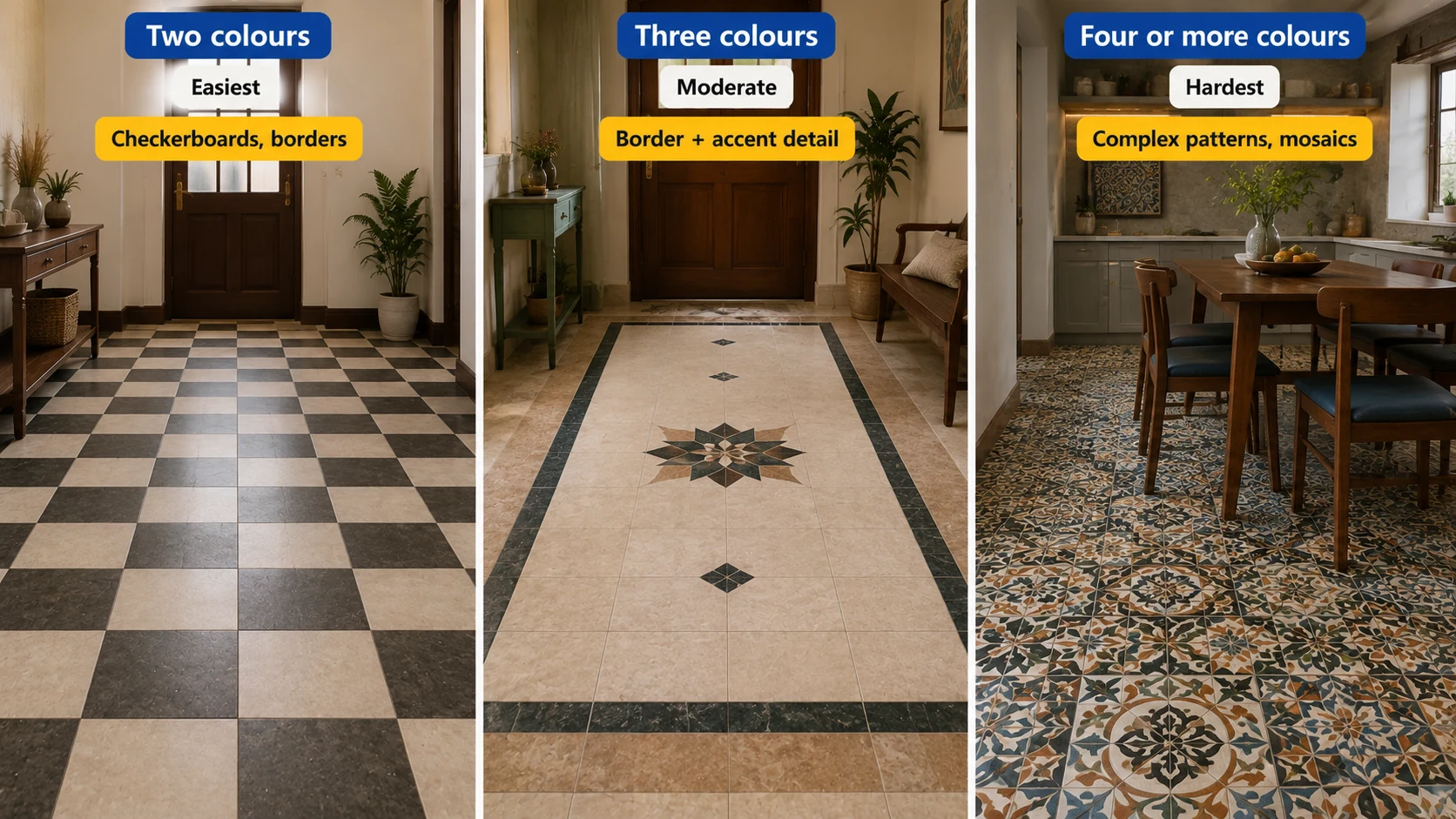
| Two colours | Easiest, the safest multi-colour starting point | Checkerboards, borders, simple zoning, suitable for a first multi-colour project |
| Three colours | Moderate, requires genuine proportion discipline | A dominant field with a secondary border and a single accent detail, such as a medallion or threshold strip |
| Four or more colours | Hardest, generally only succeeds in assembled mosaic or a manufacturer-designed printed pattern. | Complex encaustic-style patterns or custom mosaic where the colour balance has already been engineered into the design |
Multi-Colour Mosaic Tile Guidance
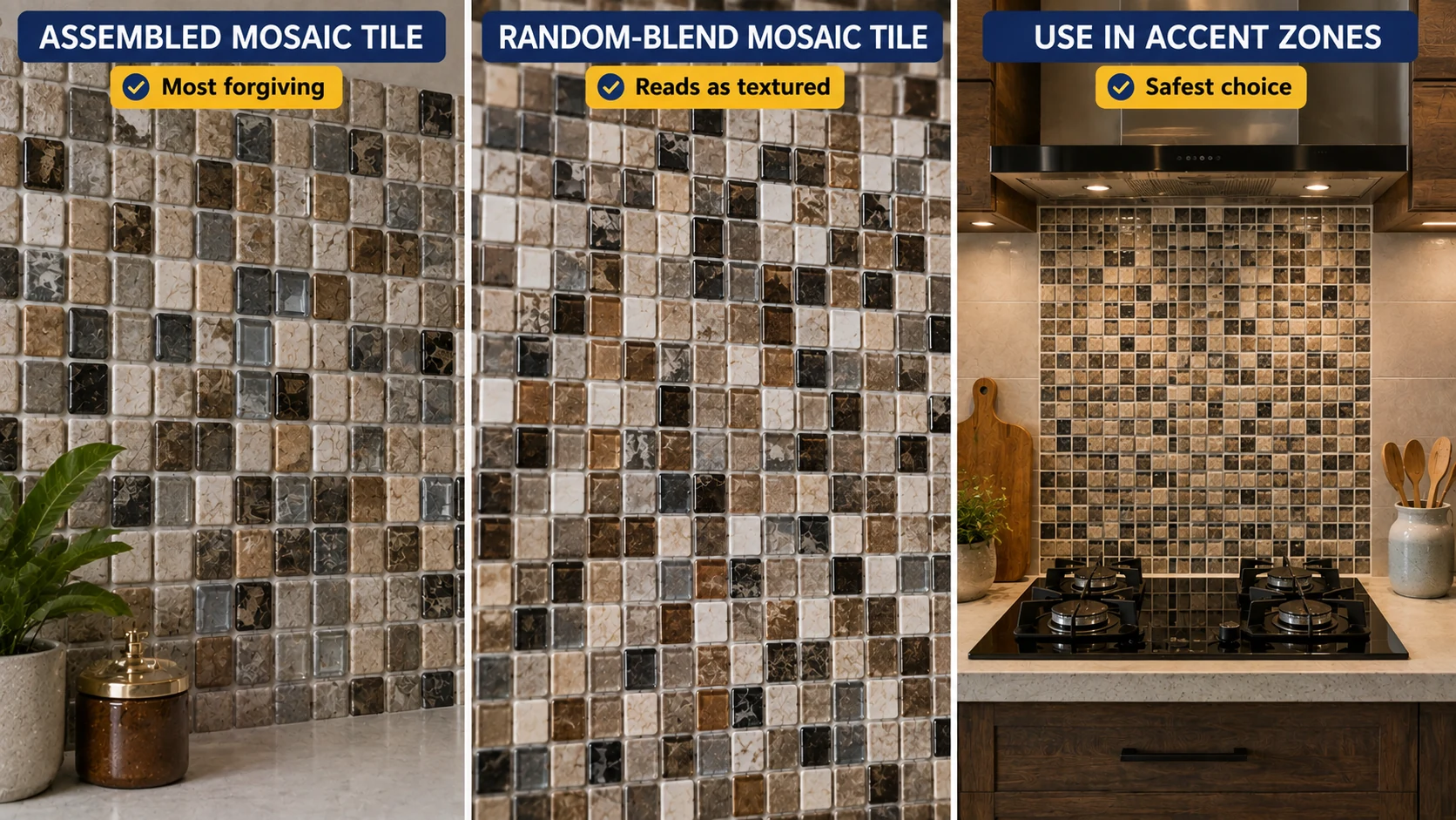
Assembled mosaic tile is the most forgiving path to genuine multi-colour design, since pre-blended sheets are engineered by the manufacturer with the proportion discipline already built in. A random-blend mosaic sheet combining four or five related tones reads as textured and organic specifically because the colour distribution has been designed to avoid any single tone dominating awkwardly. Confining a bold multi-colour mosaic to an accent zone, a hob backsplash, a niche, or a border, rather than a full room, remains the safest application regardless of how well-blended the sheet itself is.
Multi-Colour Pattern Tile Guidance
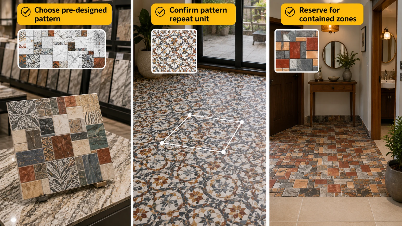
- Choose a pre-designed pattern from a reputable manufacturer rather than attempting to specify a custom multi-colour print. The proportion discipline in a well-designed encaustic-style pattern is already engineered by people who do this professionally.
- Confirm the pattern's repeat unit before ordering a large quantity. Multi-colour printed patterns can reveal an unexpectedly busy repeating unit once multiplied across a large floor, more so than a single-colour print.
- Reserve the boldest multi-colour patterns for contained zones, a foyer, a powder room, or a kitchen floor, rather than a full living room, given how visually intense a genuinely multi-hue pattern reads at large scale.
Mixed-Tone Combination Guidance
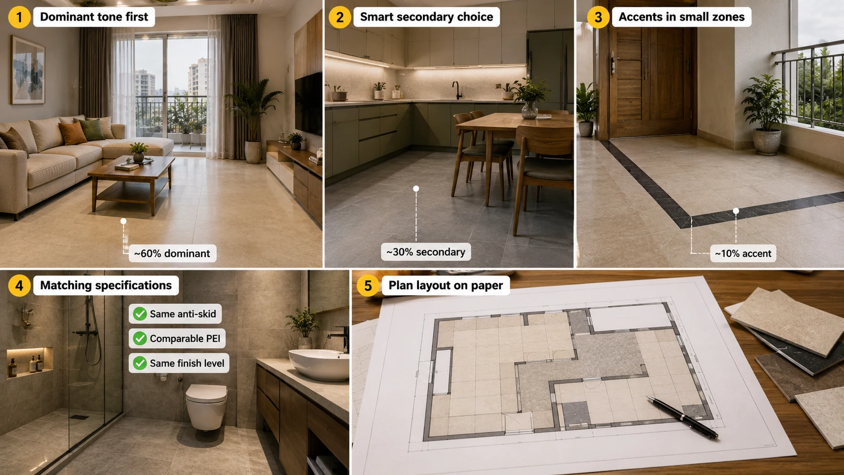
- Establish the dominant tone first, the colour that will cover roughly 60% of the visible area, before selecting secondary and accent tones.
- Choose a secondary tone that is either a close tonal neighbour or a clear complementary contrast to the dominant, avoiding a secondary colour that competes at similar visual weight.
- Limit accent colour to true accent proportion, a border, a threshold strip, or a small zone, not a third large field competing with the dominant and secondary tones.
- Confirm all tiles in the combination carry matching specifications, the same anti-skid rating for any wet-area application, comparable PEI ratings, and ideally the same finish level across the combined tiles.
- Plan the layout and proportion on paper or in a rendering before ordering, since the 60-30-10 discipline is easy to state and surprisingly easy to abandon once a design gets exciting during selection.
Where Multi-Colour Design Works Best
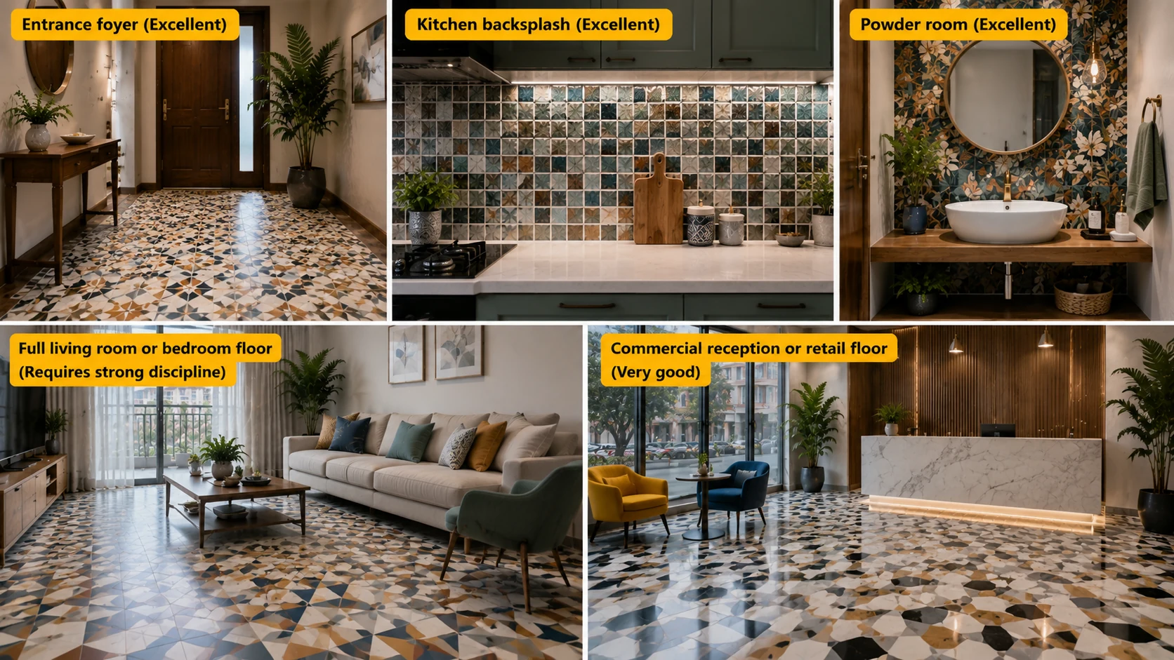
| Application | Suitability | Why |
| Entrance foyer | Excellent | A compact, high-visibility zone that can absorb bold multi-colour pattern or mosaic without overwhelming daily living spaces |
| Kitchen backsplash | Excellent | A contained vertical zone well suited to multi-colour mosaic or pattern accent |
| Powder room | Excellent | The confined footprint contains multi-colour intensity naturally |
| Full living room or bedroom floor | Requires strong discipline | Multi-colour across a large, daily-use floor needs genuine proportion control to avoid visual fatigue over time |
| Commercial reception or retail floor | Very good | Professional daily cleaning and a controlled, momentary visitor experience suit bold multi-colour statements well. |
Common Mistakes
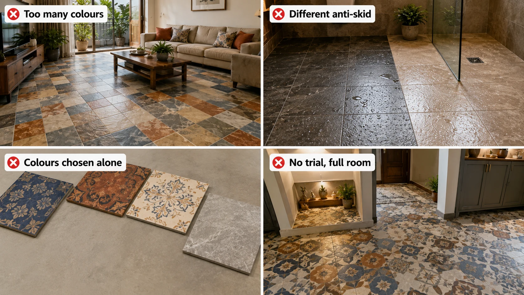
- Using three or more colours at roughly equal proportions. This is the single most common cause of a regretted multi-colour floor; establish a clear dominant tone before adding secondary or accent colours.
- Mixing tiles with different anti-skid ratings on the same wet-area floor. Confirm every tile in a multi-colour wet-area combination carries the same confirmed COF.
- Choosing colours independently rather than as a set. Selecting three individually appealing tiles without checking how they read together produces a less cohesive result than choosing from a manufacturer's coordinated multi-colour range.
- Applying a bold multi-colour scheme to a full room without a contained trial first. Test the combination in a smaller zone, a niche or a small accent area, before committing to full-room coverage.
Multi-Colour Tile Production in India: 2026 Context
Printed multi-colour pattern tiles, pre-blended mosaic, and coordinated solid-colour ranges suited to mixed-tone combinations are all produced across Morbi, Gujarat and other Indian ceramic tile centres. Manufacturers increasingly offer coordinated colour ranges specifically designed to combine well together, a helpful resource for a mixed-tone project since it removes much of the proportion and pairing risk from independent colour selection.
Explore Multi-Colour Options on TilesFinders
Printed pattern tiles, pre-blended mosaic, and coordinated solid-colour ranges for mixed-tone combinations can be browsed and compared on TilesFinders, with layout and proportion guidance available before you commit to a multi-colour project.
FAQs
Two colours are the safest and easiest starting point. Three colours can work well with genuine proportion discipline, roughly 60% dominant, 30% secondary, 10% accent. Four or more colours generally only succeed in an assembled mosaic or a manufacturer-designed printed pattern where the balance is already engineered.
Using three or more colours at roughly equal proportions rather than establishing a clear dominant tone. A floor without this hierarchy reads as visually noisy regardless of how well the individual colours pair with each other.
A contained zone, an entrance foyer, a powder room, or a kitchen backsplash, rather than a full living room or bedroom floor, since the confined footprint absorbs multi-colour intensity more successfully than a large daily-use space.
Possible, but confirm matching specifications, anti-skid rating for wet areas, comparable PEI ratings, and similar finish level across all tiles in the combination, since mismatched specifications between manufacturers are a common source of both technical and visual inconsistency.
Possible, but confirm matching specifications, anti-skid rating for wet areas, comparable PEI ratings, and similar finish level across all tiles in the combination, since mismatched specifications between manufacturers are a common source of both technical and visual inconsistency.
Roughly 60% dominant tone, 30% secondary tone, and 10% accent colour is the general guideline, though the exact split can flex depending on the specific design, provided one tone clearly leads rather than all three competing equally.
Yes, strongly recommended. Test the combination in a smaller contained zone or through a physical sample layout before committing to full-room coverage, since bold multi-colour schemes are among the hardest to judge accurately from individual tile samples alone.
Yes, particularly reception areas and retail floors, where professional daily cleaning and a controlled, momentary visitor experience suit bold multi-colour statements well, similar to how abstract tile performs in commercial applications.


See our tile guides first
Set TilesFinders as a preferred source and our buying guides surface ahead of the rest for you.
Add as preferred sourceTakes one tap. Nothing to install.
What Readers Say
I was about to redo my parking area with the wrong tile size until I read this. The layout comparisons saved me from a costly mistake.
We reference TilesFinders guides while briefing clients on material selection. The size and pattern breakdowns are accurate and easy to explain visually.
On site, I get asked about grout spacing all the time. This article gave me a solid reference I now share with my team before every job.
Finally a guide that doesn't just push generic advice. The oil stain removal steps actually worked on our clubhouse driveway tiles.
I run a small construction firm and now send this link to clients directly when they ask about entrance tile sizing. Saves me an hour of explaining.
Good practical detail, though I wish there were more examples for compact apartment entrances specifically, not just villas.
My mother-in-law wanted marble, I wanted vitrified. This blog gave us the neutral comparison we needed to actually decide together.
Detailed without being overwhelming. I appreciated that it covered both cost and maintenance, not just the aesthetics.
Used the algae and hard water removal tips on our terrace tiles after the monsoon. Worked better than what our regular cleaner was doing.
As someone who sources tiles for multiple builder projects, I find these comparisons genuinely useful for vendor conversations, not just consumer content.
Recommended this to a client who kept second-guessing the entrance design. The small vs large layout section settled the debate instantly.
Straightforward and honest, no unnecessary jargon. Would like to see a similar breakdown for outdoor pool-deck tiles next.
We've bookmarked several TilesFinders guides for our design handbook. Reliable source when clients want data, not just opinions.
Two paths, one marketplace.
Get free quotes from verified suppliers.
Share your room, budget, and style. Suppliers in Morbi respond within hours.
Get Free QuotesList your business, reach real buyers.
Put your showroom in front of homeowners searching for tiles right now.
List Your Business