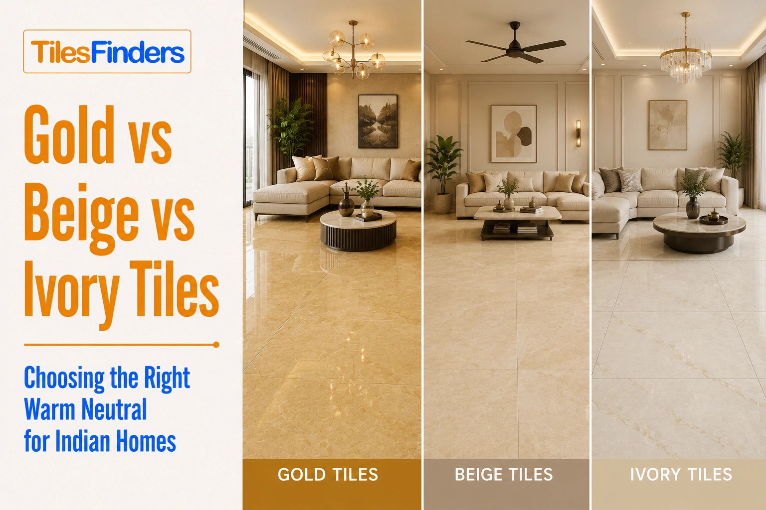
Gold vs Beige vs Ivory Tiles: Choosing the Right Warm Neutral for Indian Homes
Compare gold, beige, and ivory tiles for Indian homes based on lighting, Vastu, room suitability, maintenance, and design style to confidently choose the perfect warm neutral flooring.
- Defining the Three Tones: What Gold, Beige, and Ivory Actually Look Like
- How Gold, Beige, and Ivory Read in Indian Light Conditions
- Room-by-Room: Which Warm Neutral Tile to Choose
- Full Comparison: Gold vs Beige vs Ivory at a Glance
- How to Choose: Three Questions to Ask
- Indian Market Summary: Three Tones, Three Specifications
- Compare Gold, Beige, and Ivory Tile Designs on TilesFinders
Gold tiles bring warmth and Vastu appeal, beige offers the best all-round versatility, and ivory creates a bright, elegant look. Choose the right warm neutral based on your room's lighting, furniture, maintenance needs, and interior style.
Gold, beige, and ivory are the three most requested warm neutral tile tones in Indian homes, and they are frequently confused with each other in showrooms and online tile catalogs. Each one reads differently in Indian light conditions, pairs differently with Indian wall finishes and furniture, and carries a different design temperature - from the assertive warmth of gold through the settled earthiness of beige to the restrained elegance of ivory.
This guide breaks down the visual, practical, and design differences between the three tones, room by room, and provides clear recommendations for selecting the appropriate tone based on the room's lighting, size, furniture, and design brief.
Defining the Three Tones: What Gold, Beige, and Ivory Actually Look Like
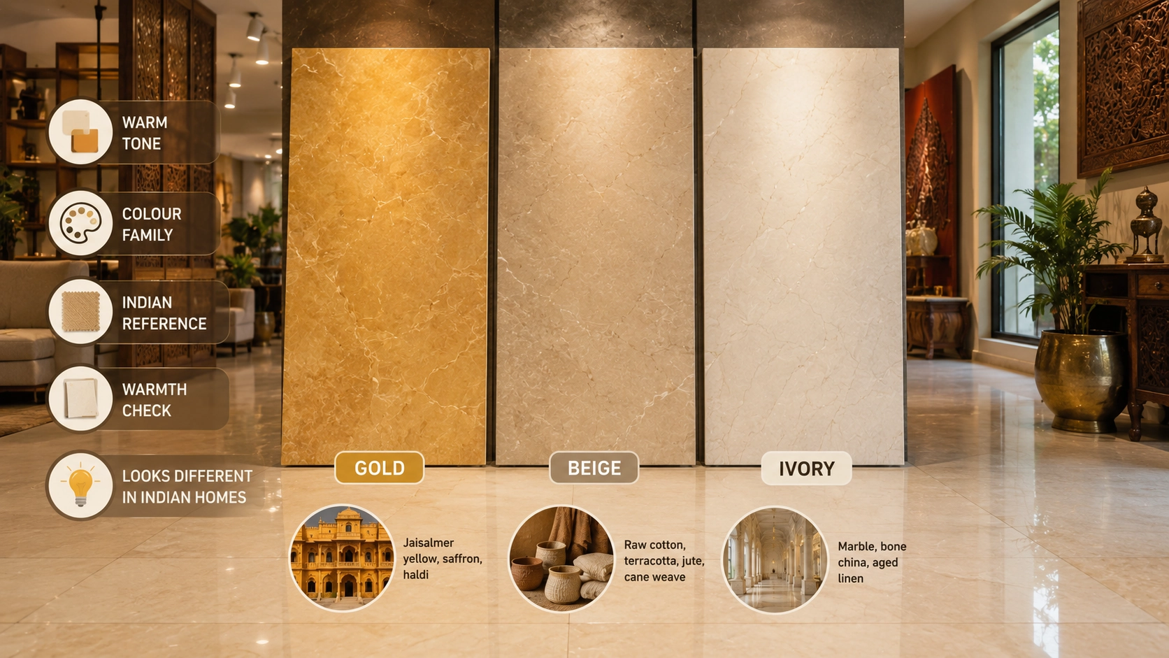
Before comparing design applications, it helps to be precise about what each tone is. In the Indian tile market, the three terms are used loosely and sometimes interchangeably. These definitions are the practical starting point.
| Tone | Description | Undertone | Munsell / Colour Family | Indian Design Reference |
| Gold | A warm, saturated yellow-amber tone. Clearly warm and energetic. Not subtle. The gold tone reads as a colour statement, not a neutral background. | Yellow-amber. Strong warm pull. | Hue in the yellow-to-orange range, moderate to high saturation. | Indian sandstone (Jaisalmer yellow), saffron, haldi. The floor colour of Rajasthani havelis and temple courtyards. |
| Beige | A warm grey-brown neutral. Sits between sand, tan, and light brown. More settled than gold, less cool than greige. Reads as the colour of natural materials - raw linen, unbleached cotton, dried grass. | Warm brown-grey. Low saturation, earthy. | Yellow-red hue family, low saturation, medium to high value (lightness). | Raw cotton fabric, terracotta clay in its natural unfired state, jute, and cane weave. The palette of natural Indian textiles. |
| Ivory | A slightly warm white. Not as yellow as cream, not as cold as pure white. The warmth is subtle - visible in comparison with white, not assertive on its own. | Very slight yellow-beige. Nearly neutral. | Near-white with a barely perceptible yellow-red component. | Marble, bone china, aged linen. The palette of classical Indian formal spaces - durbar halls, palace interiors, high-ceiling reception rooms. |
Note: In Indian tile showrooms, 'cream' tiles are often labelled as ivory, and 'off-white' tiles are sometimes marketed as cream or ivory. The practical test: hold the tile against a standard white sheet of paper. If you can see warmth in the tile relative to the paper, it is ivory or cream. If the tile has a visible yellow or amber tone even without comparison, it is beige or gold. The distinction matters because these tones behave very differently in rooms with Indian wall finishes, lighting, and furniture.
If you're considering warm yellow or amber flooring, our Golden Tiles Guide explains everything from Vastu significance and ideal room placement to finishes, tile sizes, maintenance, and practical buying tips for Indian homes. It helps you choose the right golden tile without compromising on style or functionality.
How Gold, Beige, and Ivory Read in Indian Light Conditions
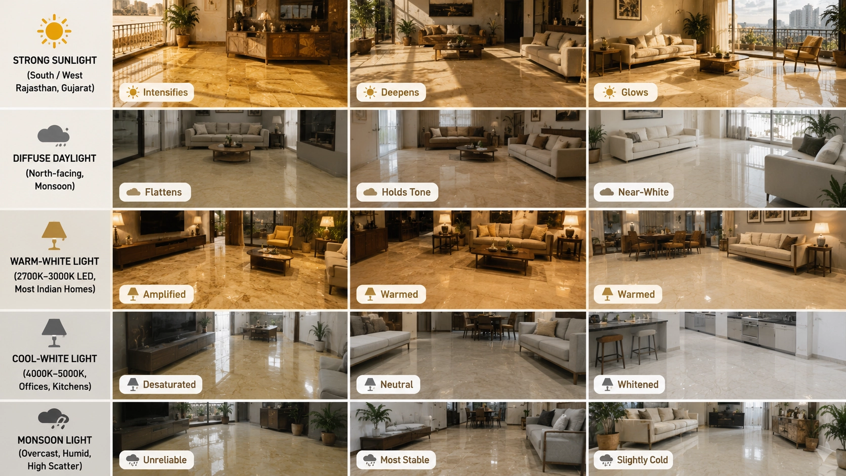
Indian light is not uniform. The direction, intensity, and colour of natural light vary significantly between a north-facing Mumbai apartment, a south-facing Jaipur house, a ground-floor flat in a dense urban street in Chennai, and a sea-facing villa in Goa. The same tile tone reads differently in each of these contexts.
| Light Condition | Gold Tile | Beige Tile | Ivory Tile |
| Strong direct sunlight (south or west facing, Rajasthan, Gujarat summers) | Intensifies. Can read as orange or amber in direct afternoon sun. Strong visual statement. | Deepens to a warm tan. Looks rich and earthy. Works well in high-sunlight rooms. | Glows warmly. Reads closer to cream or soft gold under strong direct sun. Most flattering in full sun. |
| Diffuse daylight (north-facing room, overcast monsoon day) | Flattens and can read as dull yellow-grey. Loses its warmth in cool overcast light. | Holds its tone well. The brown-grey undertone means beige is more colour-stable across lighting conditions than gold. | Reads as near-white or pale cream. Loses its subtle warmth and can appear cold in low-light north-facing rooms. |
| Warm-white artificial light (2700K to 3000K LED, most Indian homes) | Amplified. Gold reads as rich and warm. Most flattering lighting condition for gold tiles. | Warmed. Beige reads as sand-amber under warm-white light - slightly richer than in daylight. | Warmed. Ivory reads as cream or soft gold under warm-white light. Gains warmth, but it lacks in daylight. |
| Cool-white artificial light (4000K to 5000K, offices, some kitchens) | Desaturated. Gold reads as pale yellow or greenish in cool-white light. Avoid this lighting with gold tiles. | Neutral. Beige reads as pale grey-brown under cool light. Loses warmth but does not clash. | Whitened. Ivory reads as near-white in cool light. Acceptable in a kitchen or bathroom where cool-white is standard. |
| Indian monsoon interior light (overcast, humid, high ambient scatter) | Unreliable. Gold can shift from warm amber (breaks in cloud) to dull yellow-grey (overcast) within an hour. | Most stable. Beige holds its readable warmth better than gold or ivory under variable monsoon light. | Slightly cold. Ivory reads as pale and slightly clinical under heavy monsoon overcast. A warm-white lamp compensates. |
Verdict: Beige is the most lighting-stable of the three warm neutral tones in Indian conditions, performing consistently across monsoon, summer, north-facing, and warm-light contexts. Gold is the most lighting-sensitive, at its best under warm artificial light and direct sunlight, at its worst under cool or overcast light. Ivory is the most context-dependent, appearing as warm cream in good light and near-cold-white in low light.
Room-by-Room: Which Warm Neutral Tile to Choose
Living Room
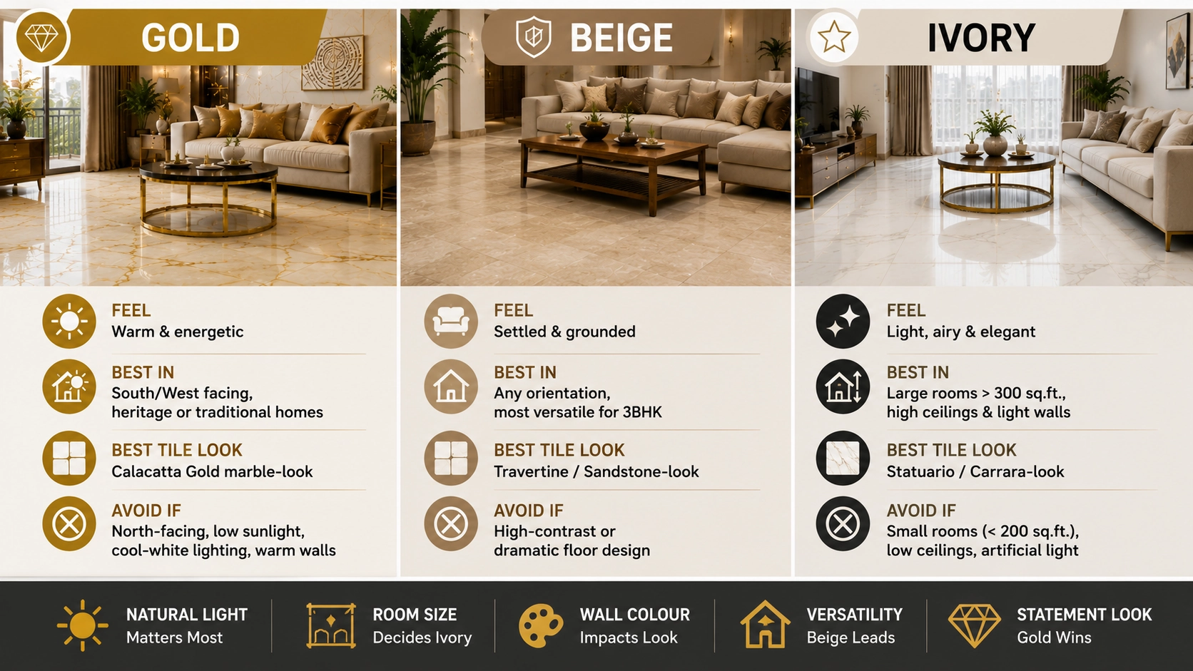
| Factor | Gold | Beige | Ivory |
| Visual effect on the room | Makes the room feel warm and energetic. A statement floor that the eye registers as a colour. | Makes the room feel settled and grounded. A neutral that recedes and lets furniture define the space. | Makes the room feel light, airy, and formal. The most elegant of the three is in a large, well-lit living room. |
| Best living room type | South or west-facing rooms with strong natural light. Heritage-style or traditional Indian interiors. Vastu-aligned homes where the golden floor is an intentional design choice. | Any orientation. The most versatile of the three for a standard Indian 3BHK living room. Works in modern, transitional, and heritage interiors. | Large living rooms above 300 sq. ft. with high ceilings and white or light grey walls. Formal, contemporary, or minimalist interiors. |
| Best tile design | Calacatta Gold marble-look GVT at 600x1200 mm or 800x1600 mm. | Travertine-look or sandstone-look GVT at 600x600 mm or 600x1200 mm. | Statuario or Carrara-look GVT at 600x1200 mm or 800x1600 mm. A very light cream marble-look. |
| Avoid if | The living room is north-facing or receives limited direct sunlight. Cool-white lighting is planned. Walls are warm-orange or yellow. | The design brief calls for a polished, high-contrast, or dramatic floor. Beige reads as practical rather than aspirational. | The room is small (under 200 sq. ft.), has low ceilings, or receives mostly artificial light. Ivory can read as lacking character in compact, dark rooms. |
| Price range (GVT, Morbi) | Rs. 90 to Rs. 220/sq.ft (gold-vein marble-look to sand-gold travertine) | Rs. 70 to Rs. 160/sq.ft (sandstone-look to travertine-look) | Rs. 80 to Rs. 200/sq.ft (cream marble-look to Statuario-look) |
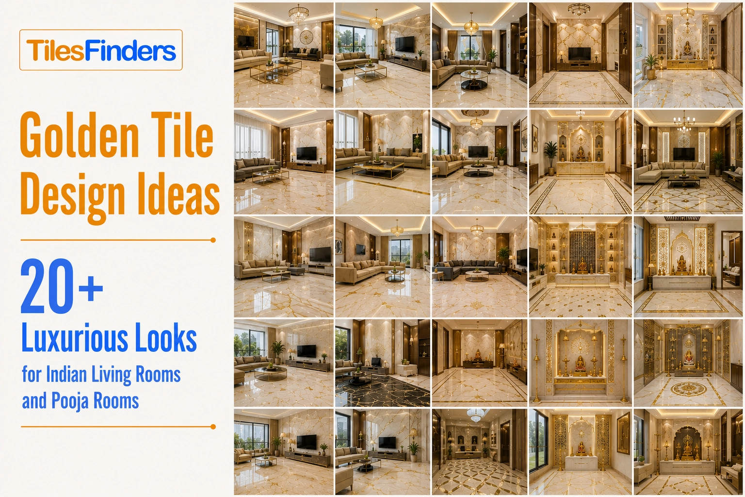
Need inspiration before making your final choice? Explore our Golden Tile Ideas featuring 20+ luxurious living room and pooja room designs, along with modern décor combinations, furniture pairings, lighting ideas, and real Indian home inspirations to help you visualize the perfect space.
Kitchen
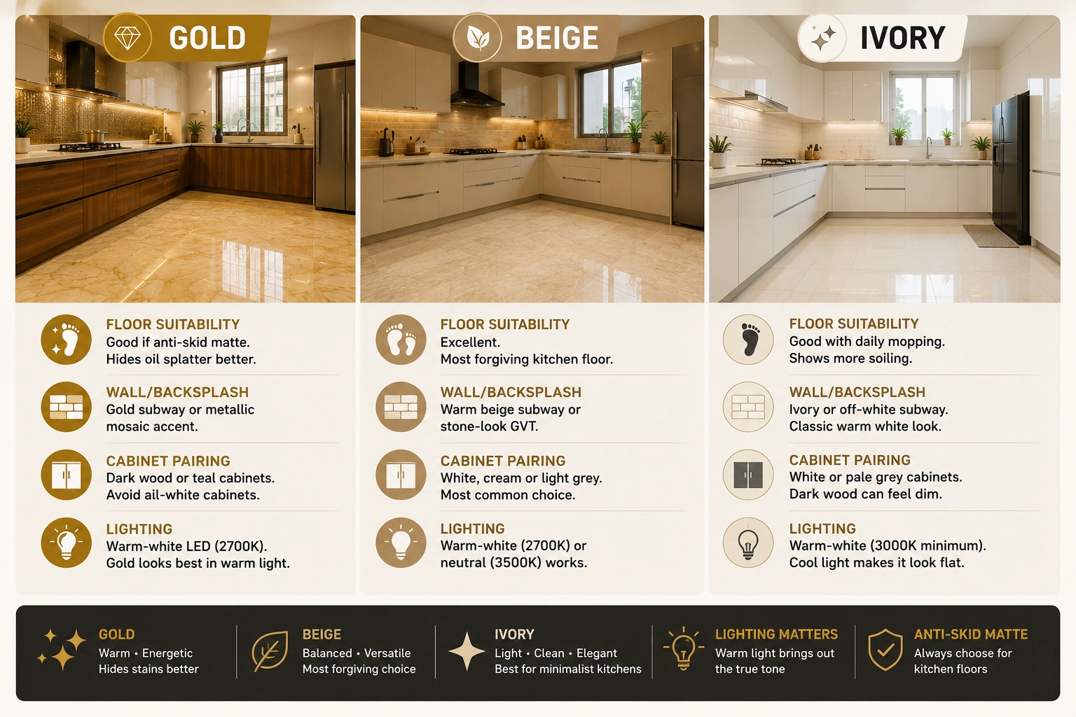
| Factor | Gold | Beige | Ivory |
| Floor suitability | Good if anti-skid matte specified. Warm gold tone hides oil splatter and minor soiling better than ivory. | Excellent. Beige is the most forgiving kitchen floor colour in Indian households - warm enough to not show every mark, light enough to not feel heavy. | Good in a clean, minimalist kitchen with daily mopping. More visible soiling between washes than beige. |
| Wall/backsplash | Gold-tone subway tile or metallic gold mosaic accent strip. Works well behind a cooking range as a warm focal point. | Warm beige subway tile or stone-look GVT in an earthy tone. The most harmonious kitchen backsplash for Indian kitchens with dark or mid-toned cabinets. | Ivory or off-white subway tile. Creates the classic all-white kitchen look adapted for Indian settings, where a touch of warmth prevents the kitchen from reading clinical. |
| Cabinet pairing | Dark walnut, mango wood, or teal-painted cabinets. Gold tone floors with white cabinets can read as too bright without a dark anchor. | White, cream, or light grey cabinets. A beige floor with white upper cabinets is the most widely replicated Indian modular kitchen specification. | White or pale grey cabinets only. An ivory floor with dark wood cabinets can make the kitchen feel dim. |
| Lighting | Warm-white under-cabinet LED at 2700K. Gold reads best under warm light - essential in a kitchen where the light source is close to the countertop and floor plane. | Either warm-white (2700K) or neutral (3500K) works. Beige is the least lighting-sensitive of the three in a kitchen. | Warm-white recommended (3000K minimum). Cool kitchen light desaturates ivory to near-white and loses the warm tone that differentiates it from standard white tile. |
Bedroom
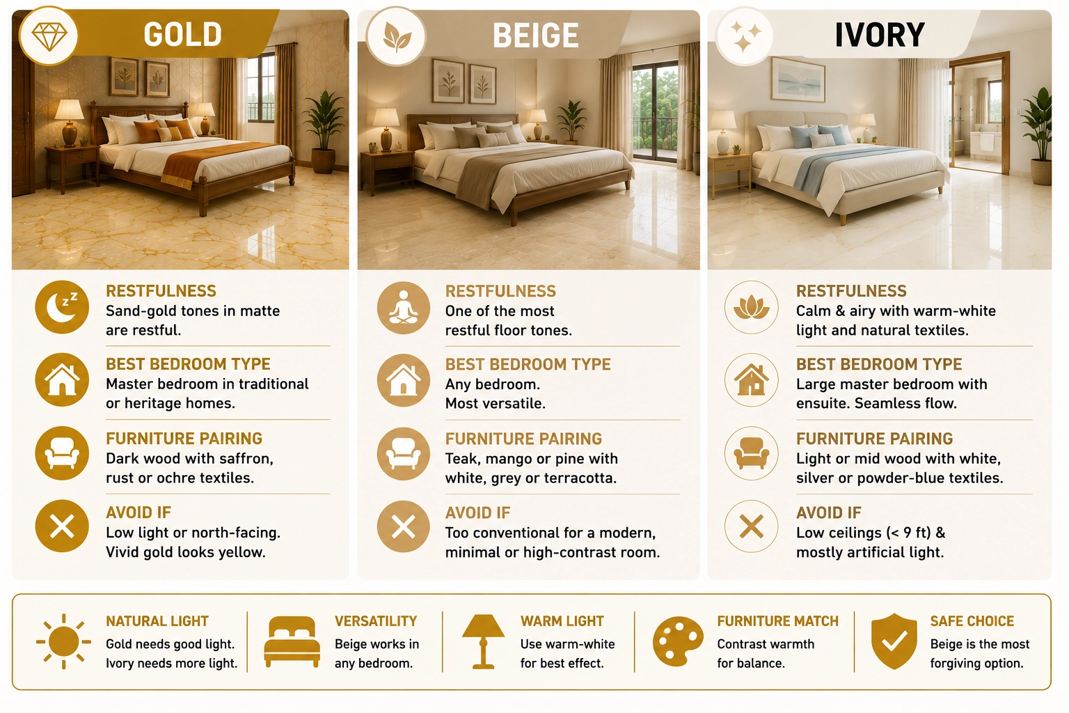
| Factor | Gold | Beige | Ivory |
| Restfulness | Can be stimulating if vivid golden yellow is chosen. Sand-gold and amber GVT in matte finish are the correct golden tones for a bedroom - not bright yellow. | Excellent. Beige is one of the most restful floor tones in colour psychology. Warm, settled, and non-stimulating. | Good. Ivory creates a calm, airy bedroom when combined with warm-white lighting and natural textiles. |
| Best bedroom type | Master bedroom in a home with a traditional or heritage design brief. Or a bedroom positioned in the northeast of the home, where Vastu supports warm earth tones. | Any bedroom. Beige is the most universally appropriate bedroom floor tone in the Indian residential context. | A large master bedroom with an ensuite bathroom where the ivory floor can flow from bedroom to bathroom without a joint colour break. |
| Furniture pairing | Dark teak, walnut, or wenge with saffron, rust, or ochre textiles. | Teak, mango, or pine with white, grey, linen, or terracotta textiles. Any furniture tone that is not the same warmth level as the beige floor. | Light or mid-toned wood with white, silver, or powder-blue textiles. Or dark charcoal upholstery for contrast. |
| Avoid if | The bedroom receives limited natural light or is north-facing. Vivid golden yellow floor in a dark bedroom reads as yellow paint. | The design brief calls for a contemporary, minimal, or high-contrast bedroom. Beige can read as conventional in a room that aims for a design-forward character. | The bedroom has low ceilings (below 9 ft) and receives mostly artificial light. Ivory's warmth disappears in these conditions. |
Bathroom
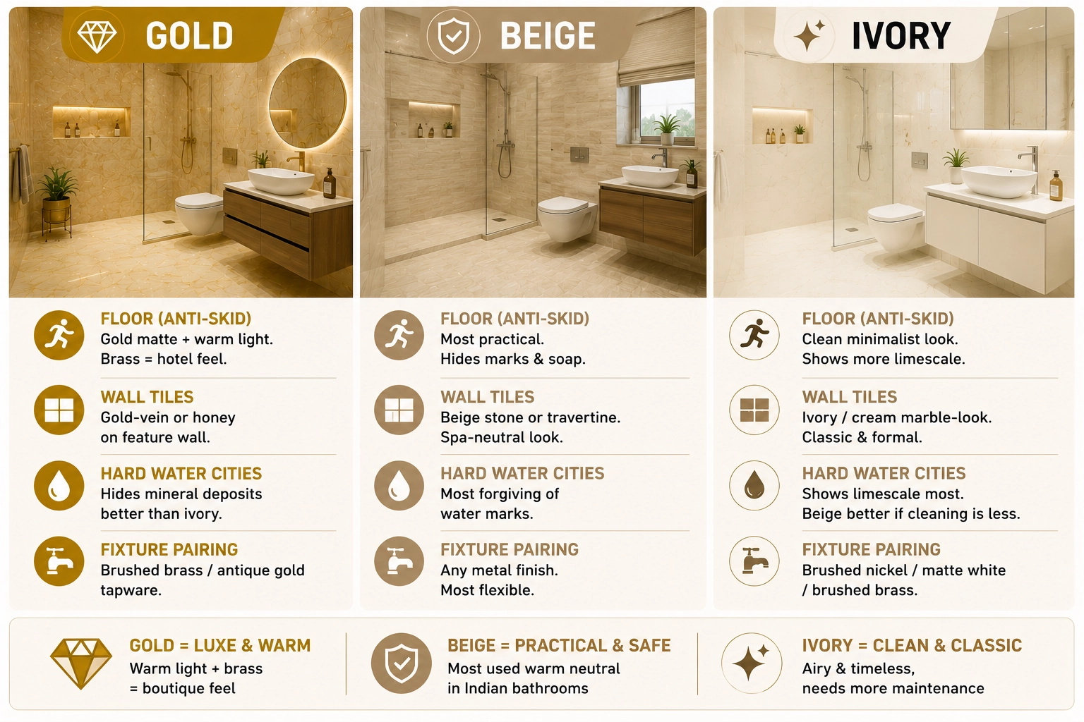
| Factor | Gold | Beige | Ivory |
| Floor (anti-skid matte) | Gold-tone anti-skid matte GVT works well in a bathroom that has warm-white lighting. The gold tone with brass tapware creates a boutique hotel feel. | Beige anti-skid matte GVT is the most practical and widely used warm neutral for Indian bathroom floors. Hides soap residue and minor marks between cleans. | Ivory anti-skid matte works in a clean, minimalist Indian bathroom. More visible limescale and water marks than beige between cleans in hard-water cities like Delhi and Bengaluru. |
| Wall tiles | Gold-vein marble-look GVT or honey amber GVT on the feature wall. Warm and luxurious under warm-white bathroom lighting. | Beige stone-look or travertine-look GVT on the main bathroom wall. Creates a spa-neutral bathroom environment. | Ivory or cream marble-look GVT for a classic, formal bathroom wall. Works best with frameless mirrors and minimal fixtures. |
| Hard water cities (Delhi, Bengaluru, Hyderabad) | Gold floor hides mineral deposits better than ivory. Regular mopping sufficient in most Indian bathrooms. | Beige is the most forgiving of water mark visibility in hard-water cities. The brown-grey undertone camouflages mineral residue between cleans. | Ivory shows limescale and hard water staining most clearly of the three. In hard-water cities, specify beige for the bathroom floor over ivory if cleaning frequency is a concern. |
| Fixture pairing | Brushed brass or antique gold tapware. Gold tile floor with chrome tapware creates a colour temperature conflict. | Any metal finish. Beige is the most fixture-flexible of the three neutral tones. | Brushed nickel, matte white, or brushed brass. Ivory and chrome read as clean and formal. Ivory and brass read as warm and classical. |
Full Comparison: Gold vs Beige vs Ivory at a Glance
| Criteria | Gold | Beige | Ivory |
| Design temperature | Warm and assertive. A colour statement floor. | Warm and settled. A neutral background floor. | Warm and restrained. An elegant, near-neutral floor. |
| Most stable in Indian light | Under warm-white artificial light and strong direct sunlight only. | Across all lighting conditions, the most stable warm neutral is in Indian settings. | Under warm-white artificial light and strong daylight. Loses warmth in overcast or cool light. |
| Best orientation | South or west-facing. Needs strong light to read correctly. | Any orientation. North, south, east, or west. | South or east-facing rooms with generous natural light. |
| Vastu alignment | Strongly auspicious. Northeast, east-facing entrance, puja room, kitchen. | Suitable for the south and southwest zones. Earth element harmony. | Associated with purity and formal spaces. Study rooms, guest reception areas. |
| Interior style fit | Traditional Indian, heritage, Vastu-conscious, maximalist, warm. | Modern Indian, transitional, Japandi, wabi-sabi, contemporary neutral. | Minimalist, contemporary formal, Indo-colonial, classical. |
| Soiling visibility | Gold hides cooking oil splatter and minor soiling better than ivory. | The lowest soiling visibility of the three is in Indian households. | Highest soiling and limescale visibility. Needs more frequent cleaning. |
| Furniture palette | Dark teak, wenge, brass, saffron, rust, deep jewel tones. | Any palette - the most furniture-flexible warm neutral. | Light or dark contrasting tones only. Mid-toned furniture disappears into ivory. |
| Price range (GVT, Morbi) | Rs. 65 to Rs. 220/sq.ft depending on design and format. | Rs. 60 to Rs. 180/sq.ft. Widest range of available designs. | Rs. 70 to Rs. 200/sq.ft. Narrower design range than beige at entry and mid budgets. |
| Recommended for | Puja rooms, east-facing living rooms, heritage homes, statement floors. | 3BHK apartments, kitchen floors, any room, any orientation. | Formal living rooms, master bedrooms, hotel-style interiors, large-format slab floors. |
How to Choose: Three Questions to Ask
Question 1: What direction does the main room window face?
South or west-facing rooms receive strong direct sunlight for most of the day. All three tones work here, but gold is at its best in these conditions. North-facing rooms receive diffuse, cool light. Beige is the most reliable choice here. East-facing rooms receive warm morning light that suits all three tones, with ivory looking particularly good in the first half of the day.
Question 2: What is the furniture palette?
Dark furniture (walnut, wenge, teak) in warm or jewel tones (rust, mustard, deep green): gold floor. Mixed or neutral furniture palette (grey upholstery, white and wood combination, natural textiles): beige floor. High-contrast or cool-toned furniture (charcoal, white, black, silver): ivory floor or beige floor. If the furniture palette is warm mid-toned wood with no strong accent colour, avoid ivory, which will blend into the furniture and lose both elements.
Question 3: How much natural light does the room receive?
- Abundant natural light (south or west-facing, open plan above 300 sq.ft): All three tones work. Gold and ivory both need good light to read correctly. Choose based on the design brief and furniture.
- Moderate natural light (east-facing, standard 3BHK living room with one window wall): Beige or ivory. Gold requires supplemental warm-white artificial light in the evenings to maintain its correct tone.
- Limited natural light (north-facing, ground floor in dense urban street, rooms with small windows): Beige only. Gold reads as dull yellow-grey; ivory reads as near-white or slightly cold. Beige holds its warm tone under artificial light without degrading.
Pro tip: Take a 30x30 cm sample of the shortlisted tile and place it on the floor of the actual room for at least 24 hours before ordering. View it at different times of day: 8 am (morning light), 1 pm (peak daylight), 7 pm (evening artificial light), and 10 pm (full artificial light only). The tone that looks right across all four conditions is the correct choice. A tile that reads well only at one time of day will eventually read wrong for most of your waking hours in the room.
Indian Market Summary: Three Tones, Three Specifications
| Tone | IS 15622:2006 Classification | Most Common Morbi GVT Design | Primary Price Entry Point | Stock Availability |
| Gold | Water absorption 0.05% or below (vitrified). PEI 4 for floor use. | Sand-gold travertine-look or golden yellow plain GVT, 600x600 mm matte | Rs. 65 to Rs. 90/sq.ft at 600x600 mm | Wide. Gold-tone GVT is among the most stocked warm tone families in Morbi. |
| Beige | Water absorption 0.05% or below (vitrified). PEI 4 for floor use. | Beige stone-look or sandstone-look GVT, 600x600 mm or 600x1200 mm matte | Rs. 60 to Rs. 85/sq.ft at 600x600 mm | Widest availability. Beige is the highest-volume warm neutral tile colour in Morbi production. |
| Ivory | Water absorption 0.05% or below (vitrified). PEI 4 for floor use. | Cream marble-look or Statuario-look GVT, 600x1200 mm or 800x1600 mm matte | Rs. 80 to Rs. 110/sq.ft at 600x1200 mm | Good availability in marble-look designs. Fewer options in plain or textured-surface ivory than in beige or gold. |
Note: All three warm neutral tones are manufactured in Morbi, Gujarat. The climate note applicable to all three: GVT tiles at 0.05% water absorption need no sealing in any Indian season. In coastal cities (Mumbai, Kochi, Goa, Chennai) with monsoon humidity of 85 to 95% from June to September, the non-porous GVT surface stays stain-free without treatment, which is the single largest practical advantage over natural warm-tone Indian stone (Jaisalmer sandstone, Kota stone, honey limestone) in these climate zones.
Compare Gold, Beige, and Ivory Tile Designs on TilesFinders
The full range of gold-tone, beige, and ivory GVT tiles from Morbi, Gujarat manufacturers is on TilesFinders. Request physical samples of your shortlisted tiles across all three tones and view them in your actual room before placing a bulk order. Warm neutral tile decisions are the ones that look most different between the showroom and the installed floor.
FAQs
Gold tiles have a warm, saturated yellow-amber tone, a clear colour statement. Beige tiles are a warm grey-brown neutral at low saturation, earthy, settled, and versatile. Ivory tiles are slightly warm, near-white, elegant, and restrained. All three are available as GVT at 0.05% water absorption from Morbi manufacturers, but they behave very differently in Indian light conditions and with different furniture palettes.
Beige is the most universally reliable warm neutral for an Indian living room because it performs consistently across all orientations and lighting conditions. Gold is the best choice for a south or west-facing living room with strong natural light and a traditional or heritage Indian design brief. Ivory works best in a large, well-lit formal living room where white walls and light ceilings complement the near-neutral tone.
Beige is the most forgiving warm neutral for an Indian kitchen floor. The warm brown-grey undertone hides oil splatter, cooking residue, and minor soiling better than ivory, and is less sensitive to lighting changes than gold. Specify beige in anti-skid matte finish at 300x600 mm or 600x600 mm for a standard Indian modular kitchen.
Gold GVT floor tiles hide cooking oil and minor food soiling better than ivory because the warm amber tone masks these residues. Beige hides the most soiling of the three. Ivory shows limescale, hard water deposits, and food staining most clearly and requires the most frequent mopping to maintain appearance. In Indian kitchens with heavy daily cooking, specify beige over ivory.
Gold and yellow tones are the most auspicious in Vastu Shastra, particularly for northeast-facing rooms, east-facing entrance areas, and puja rooms, where gold is associated with divine energy and prosperity. Beige and earth tones suit south and southwest rooms, associated with the earth element and stability. Ivory is appropriate for formal spaces, study rooms, and guest reception areas where purity and clarity are the intended qualities.
Yes, if the two tones are separated by a room or zone rather than mixed on the same floor. A common approach in Indian homes is an ivory or cream marble-look floor in the formal living room and a gold or beige floor in adjacent private rooms. The transition reads well when each room has a clear visual boundary, a doorway, a change in floor level, or a different format or finish.
White, off-white, warm grey (greige), or a soft terracotta wall colour works best with a beige floor tile. The wall should be lighter or contrasting to the beige floor in terms of tone depth, not matched to it. A beige floor with a beige wall at the same saturation level creates a monochrome room that reads as flat. Greige walls paired with beige floor tiles is the most widely used combination in contemporary Indian apartment interiors.
Beige has the widest design range from Morbi, Gujarat manufacturers, spanning sandstone-look, travertine-look, plain matte, sugar finish, and textured matte across every standard format from 300x300 mm to 800x1600 mm. Gold-tone tiles have a wide range in the living room segment, but fewer options at the 300x300 mm and 400x400 mm sizes. Ivory has a good range in marble-look and cream-tone designs, but fewer options in plain or textured-surface formats.

See our tile guides first
Set TilesFinders as a preferred source and our buying guides surface ahead of the rest for you.
Add as preferred sourceTakes one tap. Nothing to install.
What Readers Say
I was about to redo my parking area with the wrong tile size until I read this. The layout comparisons saved me from a costly mistake.
We reference TilesFinders guides while briefing clients on material selection. The size and pattern breakdowns are accurate and easy to explain visually.
On site, I get asked about grout spacing all the time. This article gave me a solid reference I now share with my team before every job.
Finally a guide that doesn't just push generic advice. The oil stain removal steps actually worked on our clubhouse driveway tiles.
I run a small construction firm and now send this link to clients directly when they ask about entrance tile sizing. Saves me an hour of explaining.
Good practical detail, though I wish there were more examples for compact apartment entrances specifically, not just villas.
My mother-in-law wanted marble, I wanted vitrified. This blog gave us the neutral comparison we needed to actually decide together.
Detailed without being overwhelming. I appreciated that it covered both cost and maintenance, not just the aesthetics.
Used the algae and hard water removal tips on our terrace tiles after the monsoon. Worked better than what our regular cleaner was doing.
As someone who sources tiles for multiple builder projects, I find these comparisons genuinely useful for vendor conversations, not just consumer content.
Recommended this to a client who kept second-guessing the entrance design. The small vs large layout section settled the debate instantly.
Straightforward and honest, no unnecessary jargon. Would like to see a similar breakdown for outdoor pool-deck tiles next.
We've bookmarked several TilesFinders guides for our design handbook. Reliable source when clients want data, not just opinions.
Two paths, one marketplace.
Get free quotes from verified suppliers.
Share your room, budget, and style. Suppliers in Morbi respond within hours.
Get Free QuotesList your business, reach real buyers.
Put your showroom in front of homeowners searching for tiles right now.
List Your Business