Earth Tone Tiles Trend in India 2026
Discover the 2026 earth-tone tile trend. Explore how terracotta, sage green, and warm beige tiles create grounded, organic, and comforting interiors.

Interior design in 2026 is shifting away from cold whites and stark greys toward warmer, nature-inspired palettes. From beige and brown floor tiles in living rooms to terracotta patios and calming green feature walls, earth-tone tiles create interiors that feel grounded, organic, and visually comforting.
Terracotta Tiles: Bringing sun-baked warmth into modern homes
Terracotta is emerging as one of the defining colours of the 2026 earth-tone movement. Inspired by traditional clay and sun-baked soil, this colour instantly adds warmth and a grounded feel to modern interiors.
Unlike cool greys, terracotta tones make spaces feel lived-in and welcoming, reconnecting contemporary apartments with natural materials and traditional Indian aesthetics.
For flooring, many designers prefer 600x600 terracotta floor tiles design because the square layout recreates the classic grid associated with traditional quarry tiles. This format feels balanced and symmetrical, making the colour appear authentic rather than decorative.
Terracotta shades work particularly well in semi-outdoor areas. For example, terracotta colour tiles for the living room can extend naturally into patios, balconies, or courtyard spaces, creating a continuous indoor-outdoor transition.
To maintain the raw clay aesthetic, these tiles should ideally have a matte or rustic finish, which also improves slip resistance for outdoor environments.
Sage & Olive Green: The calming biophilic palette
Green tones are becoming an essential part of the earth-tone trend. Instead of bold emerald or deep forest shades, designers are moving toward softer hues like sage and olive.
These colours visually connect indoor spaces with nature, creating a relaxed and calming atmosphere similar to spa interiors.
A common application involves installing 300x600 olive green wall tiles on feature walls. This rectangular format allows creative layouts such as vertical stacking or staggered brick patterns, which add subtle texture to the wall surface.
Olive and sage tiles are especially popular in:
- bathroom vanity walls
- shower enclosures
- kitchen backsplashes
When combined with neutral flooring, they bring a refreshing natural element into otherwise minimal interiors.
Greige & Beige: The new luxury neutral
Pure grey interiors are gradually fading in popularity, while warm neutrals are taking their place.
Beige and greige (a blend of grey and beige) provide a balanced background that feels softer and more luxurious than stark white surfaces. These tones allow furniture, wood textures, and fabrics to stand out without overwhelming the space.
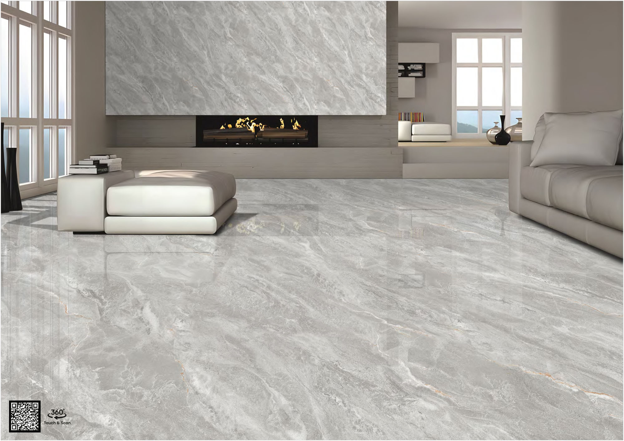
For expansive interiors, designers often use larger tile surfaces such as 800x1600 earth tone floor tiles. The wider tile size reduces grout lines and helps the floor appear more continuous, allowing the colour to resemble a natural stone slab rather than a segmented tiled surface.
A well-planned beige and brown floor tile design works particularly well in living rooms because it creates a warm foundation while remaining neutral enough to match different furniture styles.
Rich Brown: Creating depth and comfort in bedrooms
Deep brown shades are another key element of the earth-tone palette. These colours resemble natural timber and soil, creating a strong sense of warmth and security within a room. Many homeowners now prefer a dark brown floor tile design because it brings depth while still feeling natural and grounded.
Brown floors feel especially comforting in private spaces such as bedrooms, where a darker tone can create a cosy and intimate environment.
Many designers use rectangular tiles to enhance this effect. When installed in a 1:2 proportion, tiles can visually elongate the room and emphasise architectural depth.
Brown tiles are commonly used in:
- master bedroom floors
- feature walls behind TV units
- wood-look flooring in lounge corners
This darker tone works best when balanced with warm lighting and neutral furniture.
Design Rules for 2026: Executing the earth tone trend correctly
Earth-tone interiors succeed when colours and finishes mimic natural materials.
Matte over gloss
Highly reflective tiles can make earthy colours appear artificial. Matte, stone finish tiles, carving, or sugar-finish surfaces absorb light softly and resemble real stone, clay, or wood, helping the colour appear more natural and grounded.
Grout matching
Using bright white grout can create a distracting grid across the floor. Designers usually prefer colour-matched epoxy grout so the tile surface appears continuous and natural.
FAQs
Not necessarily. When used in larger tile formats such as 800x1600 earth tone floor tiles or elongated rectangular sizes, grout lines are minimised, which helps maintain a spacious visual effect.
Yes. This approach is often called the layered earth palette. Soft greens pair naturally with beige and brown tones, creating a balanced environment similar to natural landscapes.
Modern matte vitrified tiles are non-porous and resistant to stains. While textured finishes provide grip, they still remain easy to maintain with regular sweeping and mopping.

See our tile guides first
Set TilesFinders as a preferred source and our buying guides surface ahead of the rest for you.
Add as preferred sourceTakes one tap. Nothing to install.
What Readers Say
I was about to redo my parking area with the wrong tile size until I read this. The layout comparisons saved me from a costly mistake.
We reference TilesFinders guides while briefing clients on material selection. The size and pattern breakdowns are accurate and easy to explain visually.
On site, I get asked about grout spacing all the time. This article gave me a solid reference I now share with my team before every job.
Finally a guide that doesn't just push generic advice. The oil stain removal steps actually worked on our clubhouse driveway tiles.
I run a small construction firm and now send this link to clients directly when they ask about entrance tile sizing. Saves me an hour of explaining.
Good practical detail, though I wish there were more examples for compact apartment entrances specifically, not just villas.
My mother-in-law wanted marble, I wanted vitrified. This blog gave us the neutral comparison we needed to actually decide together.
Detailed without being overwhelming. I appreciated that it covered both cost and maintenance, not just the aesthetics.
Used the algae and hard water removal tips on our terrace tiles after the monsoon. Worked better than what our regular cleaner was doing.
As someone who sources tiles for multiple builder projects, I find these comparisons genuinely useful for vendor conversations, not just consumer content.
Recommended this to a client who kept second-guessing the entrance design. The small vs large layout section settled the debate instantly.
Straightforward and honest, no unnecessary jargon. Would like to see a similar breakdown for outdoor pool-deck tiles next.
We've bookmarked several TilesFinders guides for our design handbook. Reliable source when clients want data, not just opinions.
Two paths, one marketplace.
Get free quotes from verified suppliers.
Share your room, budget, and style. Suppliers in Morbi respond within hours.
Get Free QuotesList your business, reach real buyers.
Put your showroom in front of homeowners searching for tiles right now.
List Your Business