500x500 Tile Design Ideas: 20+ Traditional and Modern Layouts for Indian Homes
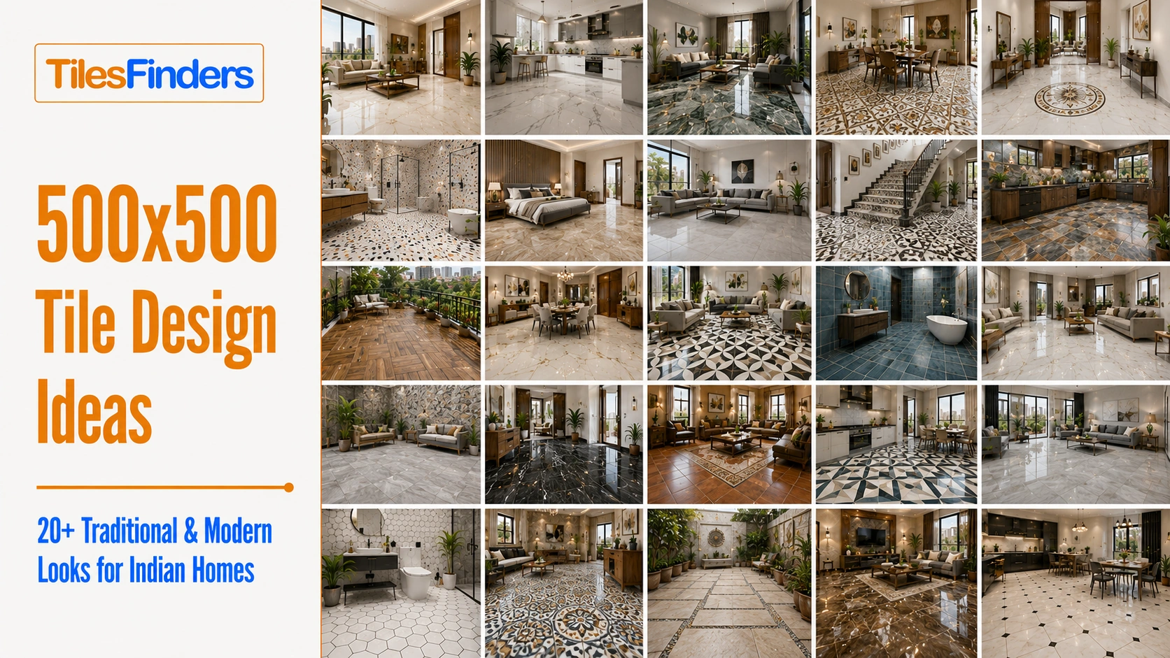
From classic grids to bold checkerboards, this 500x500 tile guide explores 20+ layouts for Indian homes, with smart combinations, room-wise ideas, wastage tips and installation pointers.
- Before You Choose a Layout
- Layout One: Straight Grid
- Layout Two: Diagonal
- Layout Three: Checkerboard
- Layout Four: Border and Field
- Layout Five: Offset and Brick
- Layout Six: Accent and Highlighter Inserts
- Layout Seven: Zoned and Two-Material
- Layout Matched to Room
- Overage by Layout
- Plan the Layout Before You Choose the Tile
500x500 tiles can look completely different depending on the layout: straight grid, diagonal, checkerboard, border, offset or decorative inserts. The right choice depends on room size, edge cuts, function and desired visual effect. For most Indian homes, straight grids offer the lowest waste, diagonals make smaller spaces feel wider, borders solve awkward edge cuts, and one-third offsets are safer than 50% offsets for avoiding lippage.
With a square tile, the design decision isn't really about the tile. It is the layout. The same 500x500 tile laid as a straight grid, on the diagonal, as a checkerboard, or inside a border reads as four completely different floors. This guide is organised by layout rather than by room, with twenty complete recipes covering both traditional and modern treatments, each naming what to pair it with and the mistake that undoes it.
Before You Choose a Layout
| Do | Don't |
| Set out from the room's centre line so edge cuts are symmetrical | Start tight against one wall, which pushes all the error to the far side |
| Aim for edge cuts above 250 mm, half a tile | Accept slivers under 100 mm, which break during laying and look like errors |
| Use a one-third offset if you want a brick pattern at this size | Use a 50% offset on any tile above 600 mm, where bow makes lippage worse |
| Confirm anti-skid rating separately for every wet-area floor | Assume a matte look means a floor is safe underfoot when wet |
| Order single batch, shade code and calibre together | Plan to top up later, since calibre mismatch shows as uneven joints |
If you are still deciding whether 500x500 mm is the right format for your room, start with this 500x500 Tiles in India guide. It covers the practical side of the format, including room-size calculations, edge cuts, coverage, overage and where these mid-size tiles work best.
Layout One: Straight Grid
Joints aligned in both directions. The quietest layout, and the one that shows off the tile rather than the pattern. It also produces the fewest cuts, which makes it the most economical choice in a tightly measured room.
Idea 1: Warm Greige Straight Grid, Modern Living Floor
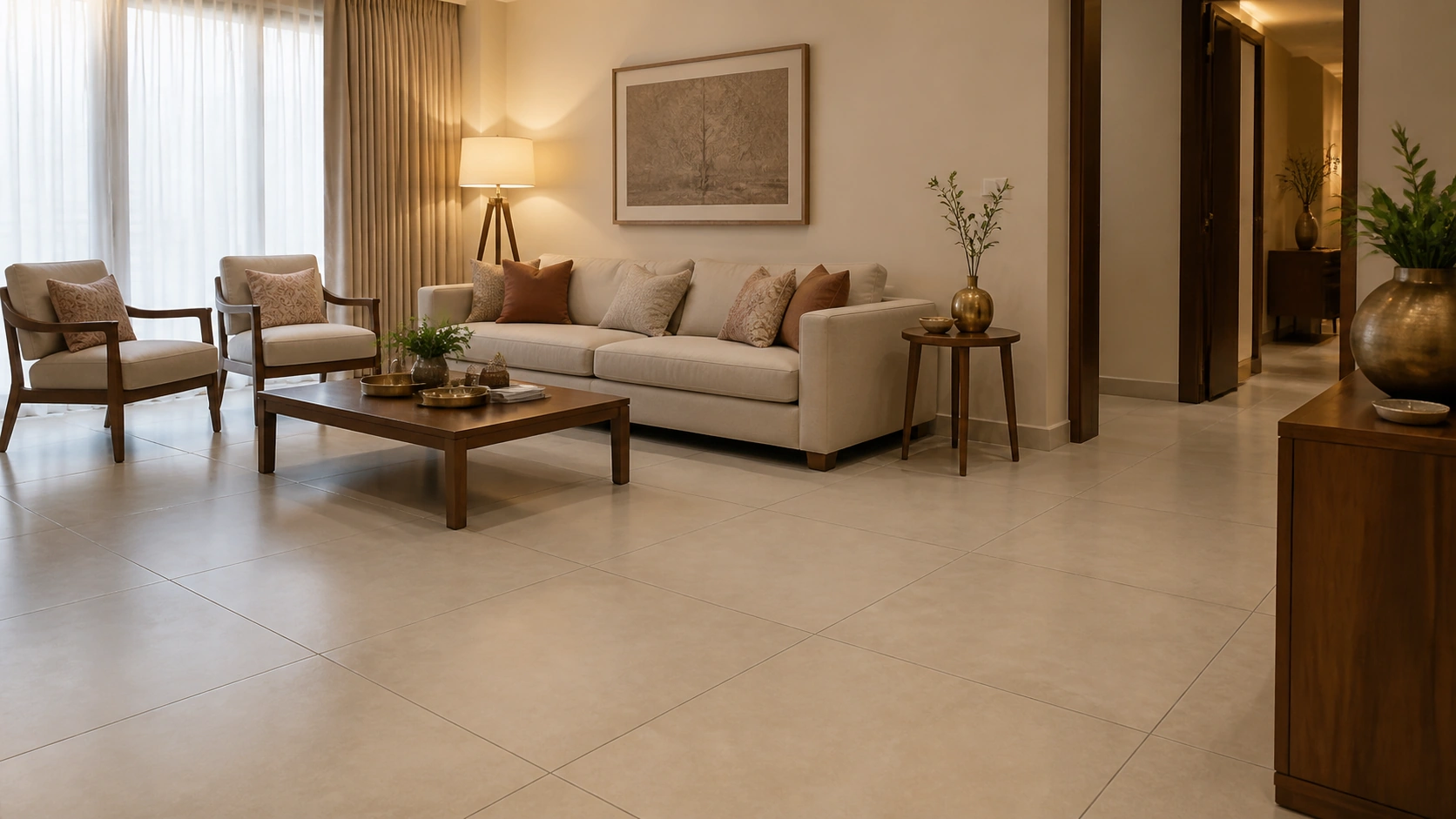
Matte GVT, warm greige | 500x500 mm, rectified | Matte | Rs. 75 to Rs. 120/sq.ft
The most broadly useful floor in this guide. A quiet mid-tone in a straight grid disappears under furniture and lets the room's contents carry the interest.
Pair with: Tone-matched grout in a narrow joint, warm white walls, and brushed brass or bronze hardware at 3000K lighting.
Avoid: Contrast grout, which turns a deliberately quiet floor into a visible grid and defeats the reason for choosing a plain tone.
Idea 2: Terracotta Straight Grid, Traditional Veranda
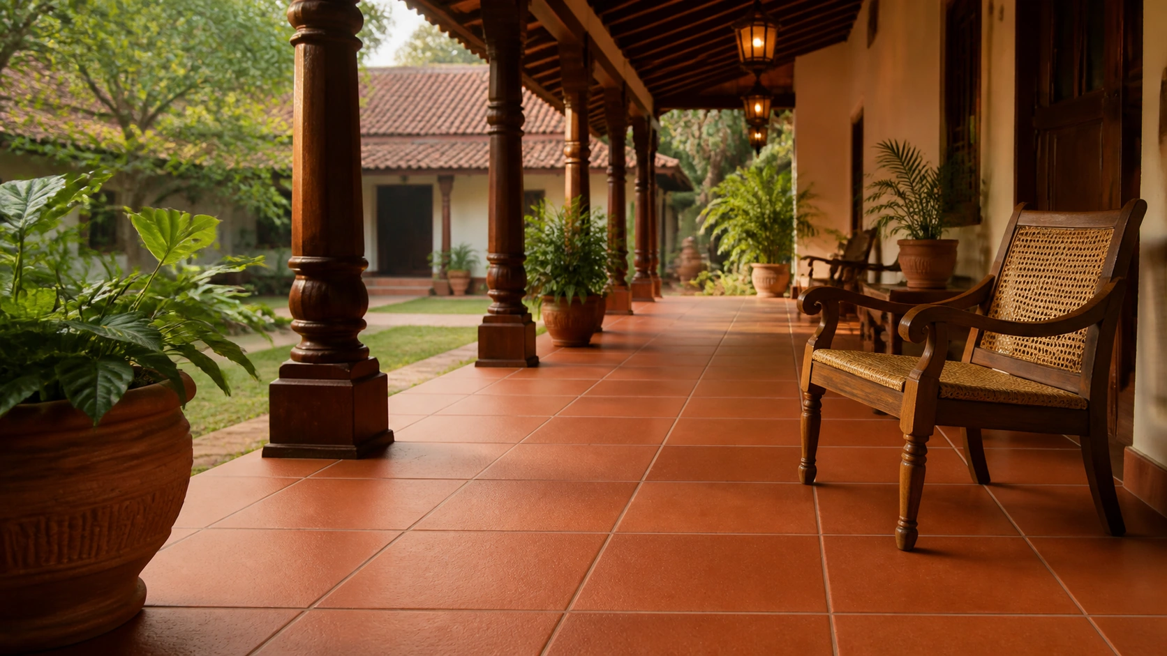
Anti-skid GVT, warm terracotta | 500x500 mm | Anti-skid matte, R10 | Rs. 78 to Rs. 130/sq.ft
Terracotta in a simple grid is the most traditionally Indian floor here, suiting a veranda, a courtyard edge, or a home whose architecture is already period in character.
Pair with: Deeper terracotta-toned grout, natural wood and cane furniture, and confirmed R10 or R11 rating depending on rain exposure.
Avoid: Pale grey grout against terracotta, which reads as a modern correction against a deliberately traditional floor.
Idea 3: Ivory Straight Grid, Compact Bathroom
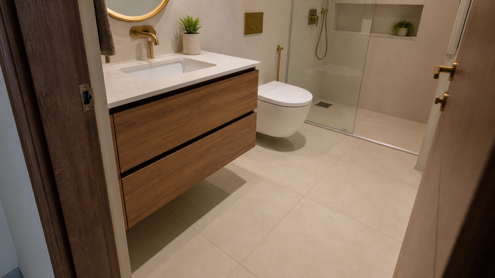
Anti-skid GVT, ivory | 500x500 mm | Anti-skid matte, wet COF 0.4 minimum | Rs. 70 to Rs. 115/sq.ft
A pale grid keeps a small bathroom open, and the straight layout minimises cuts around the fixtures that make bathroom tiles wasteful.
Pair with: Epoxy grout in a tone slightly darker than the tile, which resists the staining that ruins pale bathroom grout within a few years.
Avoid: Pale cement grout, which discolours visibly in a wet room and is the most common regret in a light-toned bathroom.
Layout Two: Diagonal
Tiles turned 45 degrees to the walls. The eye follows the longest line across the room, which is the diagonal, so the space reads wider than it measures. It is also the most cut-intensive layout here, and every perimeter tile becomes a triangle.
Budget the extra material honestly: A diagonal layout raises wastage meaningfully because every edge tile is cut on the bias and the offcut is rarely reusable elsewhere. Where a straight grid in a simple room might need 5 to 7% overage, the same room on the diagonal is closer to 12 to 15%. Order that upfront rather than discovering it partway through laying. |
Idea 4: Warm Beige Diagonal, Small Room Widening
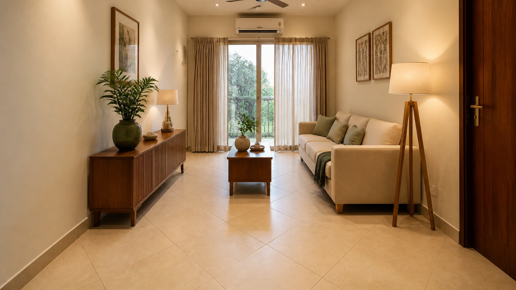
Matte GVT, warm beige | 500x500 mm, rectified | Matte | Rs. 75 to Rs. 120/sq.ft
The classic use of the diagonal, in a narrow or small room where the layout's widening effect does genuine work rather than being decorative.
Pair with: Tone-matched grout so the diagonal reads as direction rather than as a lattice, plus 12 to 15% overage ordered upfront.
Avoid: A strongly contrasting grout, which turns the diagonal into an insistent diamond lattice that shrinks the room it was meant to widen.
Idea 5: Grey Stone-Look Diagonal, Modern Entrance Hall
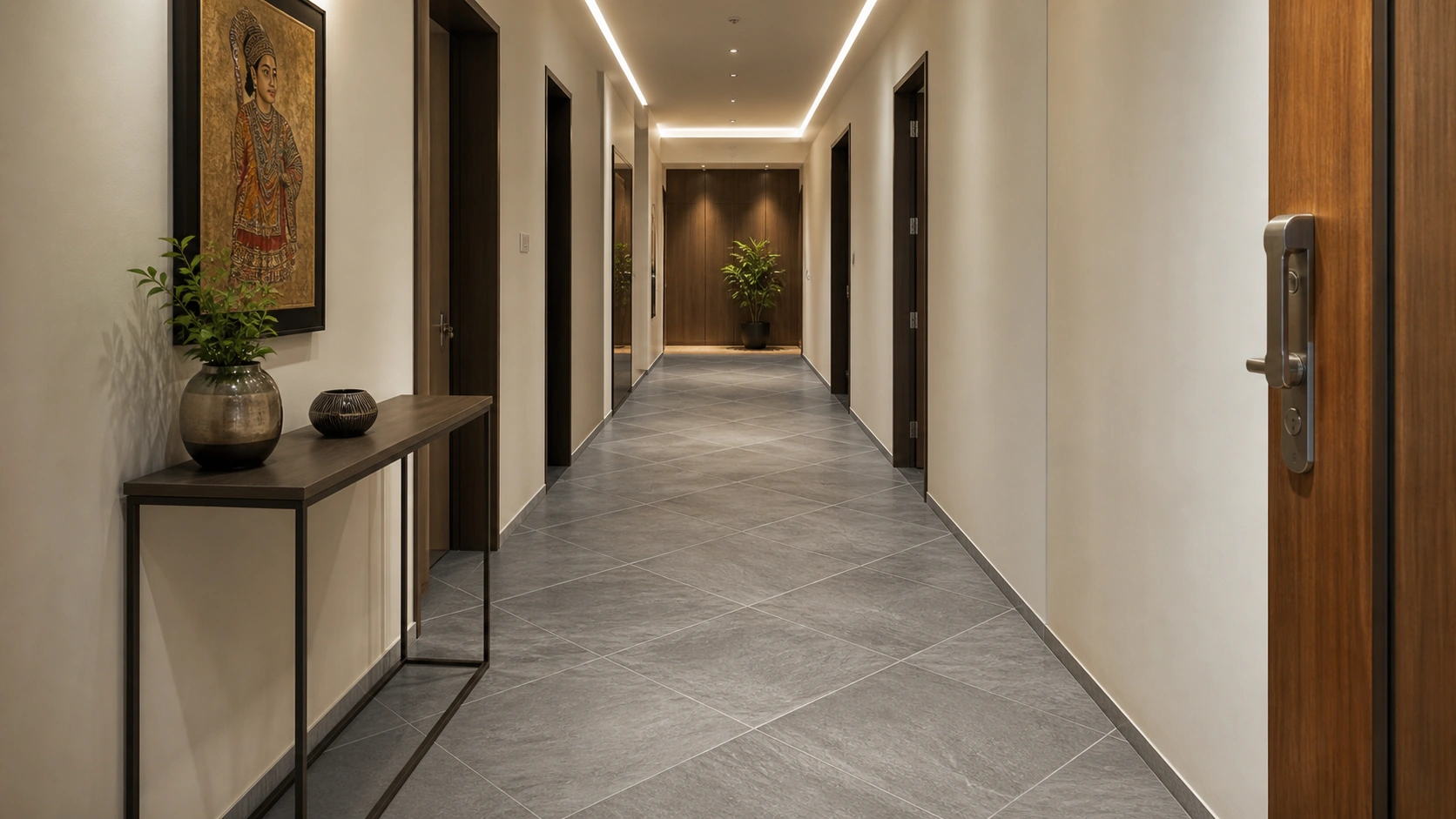
Matte GVT, grey stone-look | 500x500 mm, rectified | Matte | Rs. 85 to Rs. 135/sq.ft
A diagonal in an entrance hall pulls the eye forward into the house, which makes a modest hallway feel like a route rather than a box, especially with well-planned hallway tiles.
Pair with: A consistent diagonal direction carried through into any adjoining passage, and matte black or steel hardware.
Avoid: Changing the diagonal direction at a doorway, which stops the eye dead and makes two small spaces from one flowing one.
Idea 6: White and Grey Diagonal Checker, Traditional Formal Room
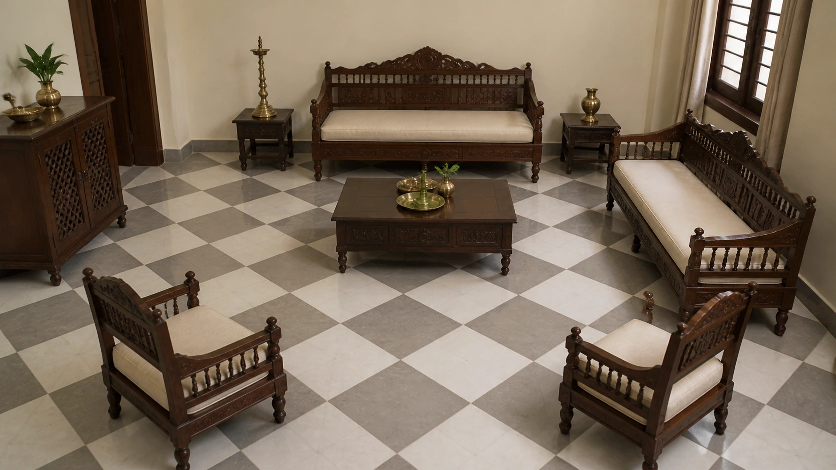
Matte GVT, white and grey | 500x500 mm | Matte | Rs. 80 to Rs. 130/sq.ft combined
A two-tone diagonal is the most formal traditional floor in this guide, reading as a classical chequer without the severity of a straight black and white.
Pair with: Grout matched to the darker of the two tones, which lets the pattern dominate rather than the joints.
Avoid: Using this across an open-plan area, where the pattern's formality fights a casual living space.
From The Marketplace
Popular tiles right now
Layout Three: Checkerboard
Two tones alternating in a straight grid. The most graphic layout available in a square format, and the one that most strongly declares a design intention.
Idea 7: Black and White Checkerboard, Traditional Foyer
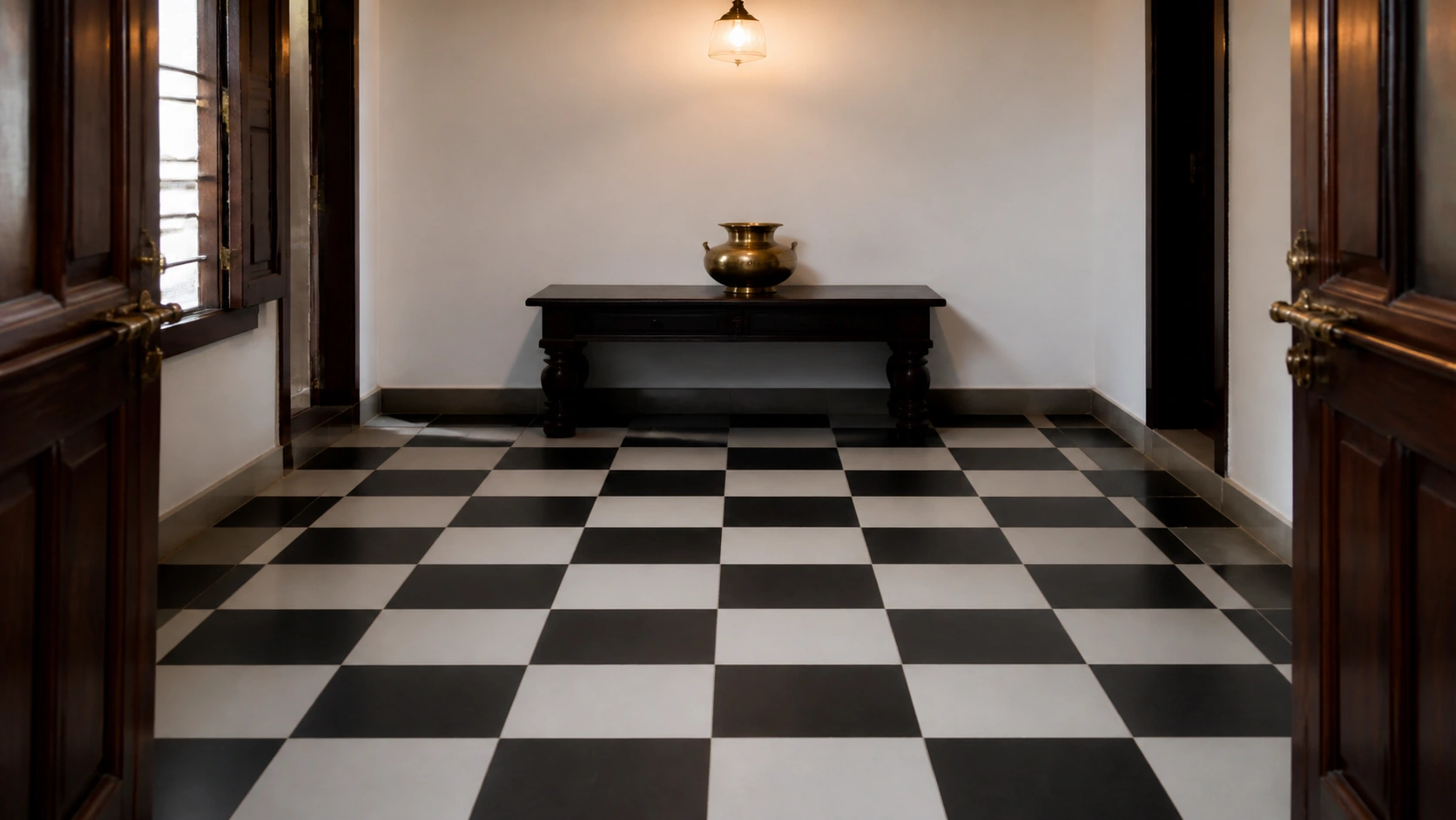
Matte GVT, black and white | 500x500 mm | Matte | Rs. 80 to Rs. 135/sq.ft combined
The most recognisable traditional floor pattern there is, and it works best in a contained space such as a foyer or powder room where its intensity is framed by walls.
Pair with: Mid-grey grout, which sits between both tones and avoids emphasising either, plus plain walls that let the floor carry the room.
Avoid: Running it through a large open living area, where the pattern becomes exhausting across a big uninterrupted floor.
Idea 8: Terracotta and Cream Checkerboard, Heritage Courtyard
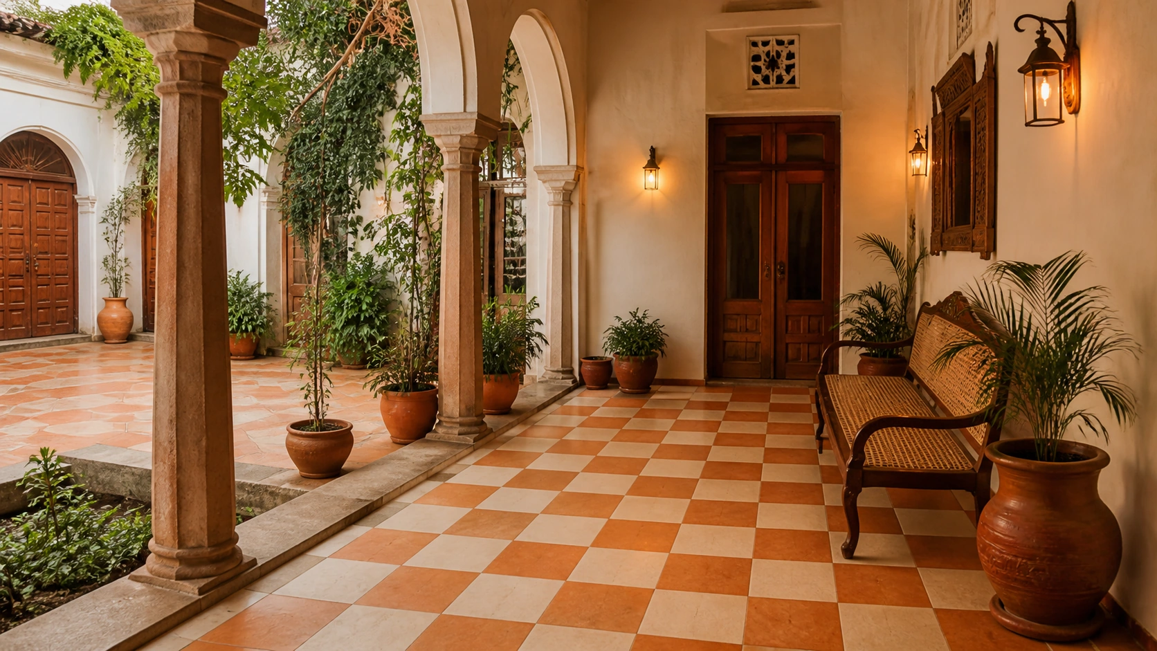
Anti-skid GVT, terracotta and cream | 500x500 mm | Anti-skid matte, R10 | Rs. 82 to Rs. 138/sq.ft combined
A softer traditional chequer in warm tones, which suits an Indian courtyard or covered veranda far better than the harder black and white version.
Pair with: Warm-toned grout, terracotta planters, and confirmed anti-skid rating for the semi-exposed position.
Avoid: Cool grey grout, which chills a deliberately warm heritage palette.
Idea 9: Two-Grey Tonal Checkerboard, Modern Kitchen
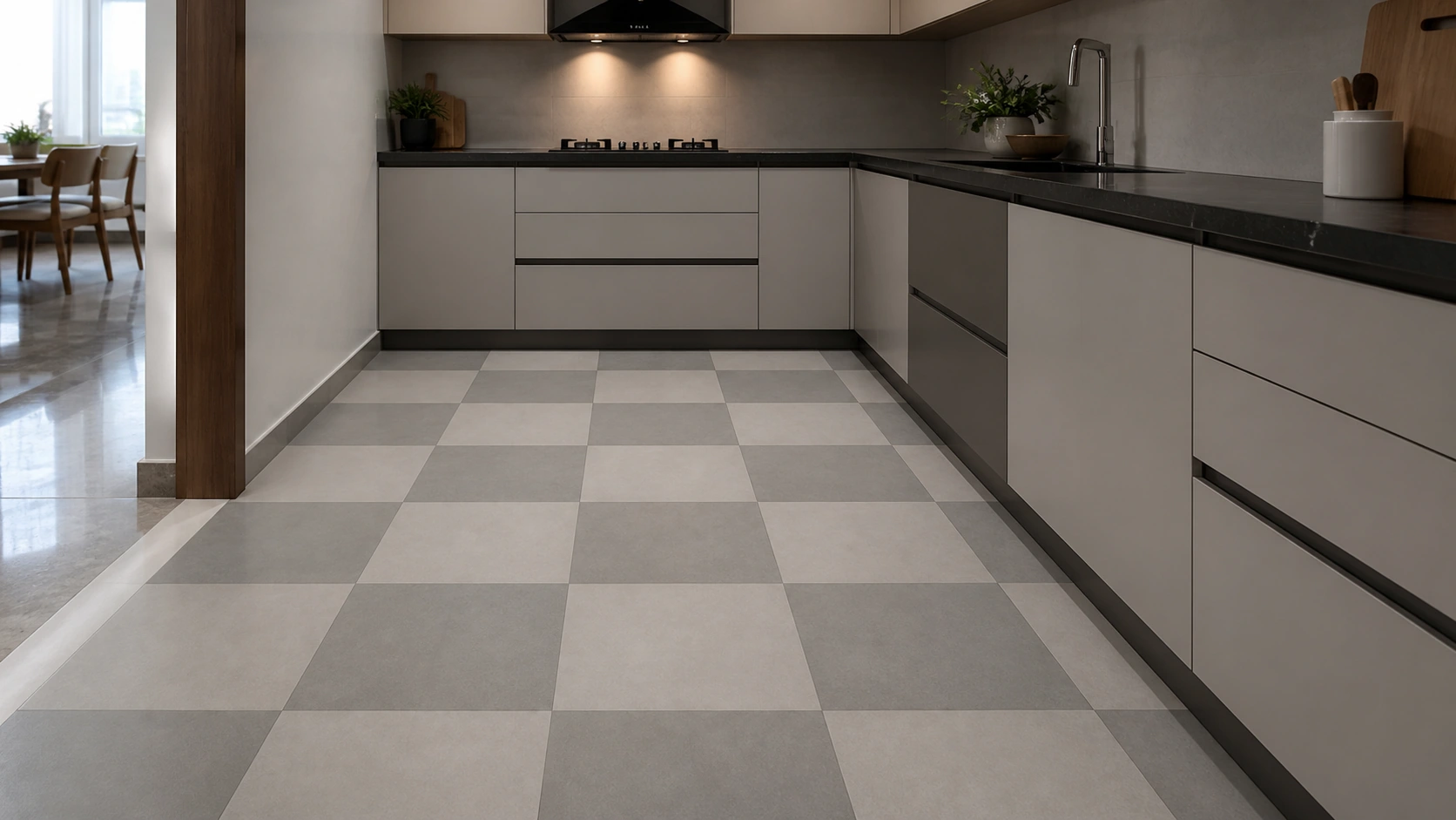
Matte GVT, light and mid grey | 500x500 mm, rectified | Matte | Rs. 82 to Rs. 135/sq.ft combined
A checkerboard using two close tones rather than opposites gives the pattern's rhythm without its drama, which makes it viable in a kitchen you use daily.
Pair with: Grout matched to the lighter tone, and handleless or minimal cabinetry so the floor is the only patterned element.
Avoid: Adding a patterned backsplash, which competes directly with a patterned floor in a room where both are in view constantly.
Layout Four: Border and Field
A plain central field framed by a contrasting border course. This is the layout that solves an arithmetic problem as well as a design one, because the border absorbs the awkward remainder at the room's edge.
The layout that turns bad arithmetic into a design feature: If your room leaves an unworkable sliver at the edges, a border course is the elegant answer. Rather than fighting to make full tiles reach the wall, you deliberately place a narrower border band around the perimeter and size it to absorb whatever remainder the room produces. The cut stops being an error and becomes a designed edge. This is why border layouts persist in Indian homes: they are forgiving of rooms that are neither square nor conveniently dimensioned. |
Idea 10: Cream Field with Terracotta Border, Traditional Living Room
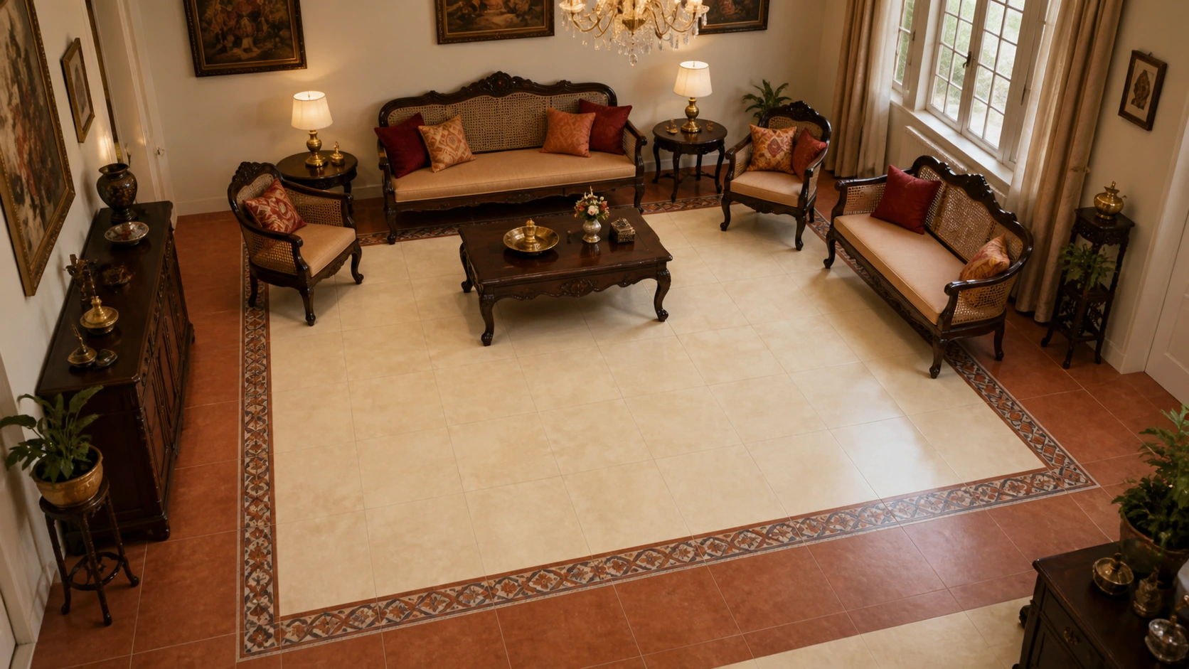
Matte GVT, cream field with terracotta border | 500x500 mm field | Matte | Rs. 80 to Rs. 135/sq.ft
The traditional Indian drawing-room floor, where a warm border frames a calm field, and the room reads as deliberately composed.
Pair with: A border width sized to absorb the room's actual remainder, and furniture placed to sit within the field rather than across the border.
Avoid: A border of fixed width chosen before measuring, which forfeits the layout's main practical advantage.
Idea 11: Grey Field with Charcoal Border, Modern Dining
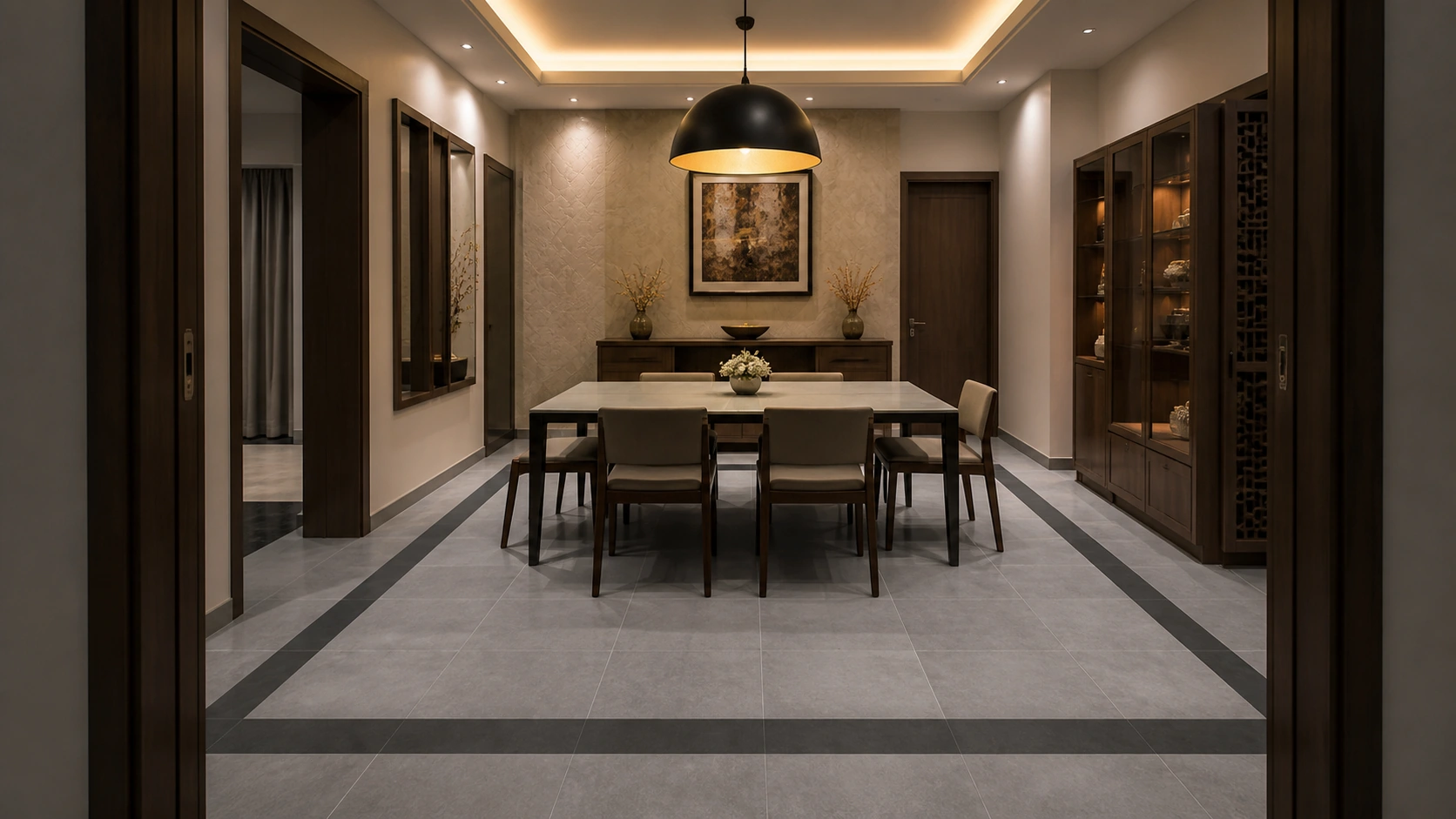
Matte GVT, grey field with charcoal border | 500x500 mm field | Matte | Rs. 85 to Rs. 140/sq.ft
A tonal border in a darker shade of the same colour gives the layout's structure in a contemporary register, without the ornamental reading of a contrasting border.
Pair with: A dining table centred within the field so the border frames it, and pendant lighting aligned to the same centre.
Avoid: Furniture straddling the border line, which breaks the frame the layout exists to create.
Idea 12: Ivory Field with Wood-Look Border, Transitional Bedroom
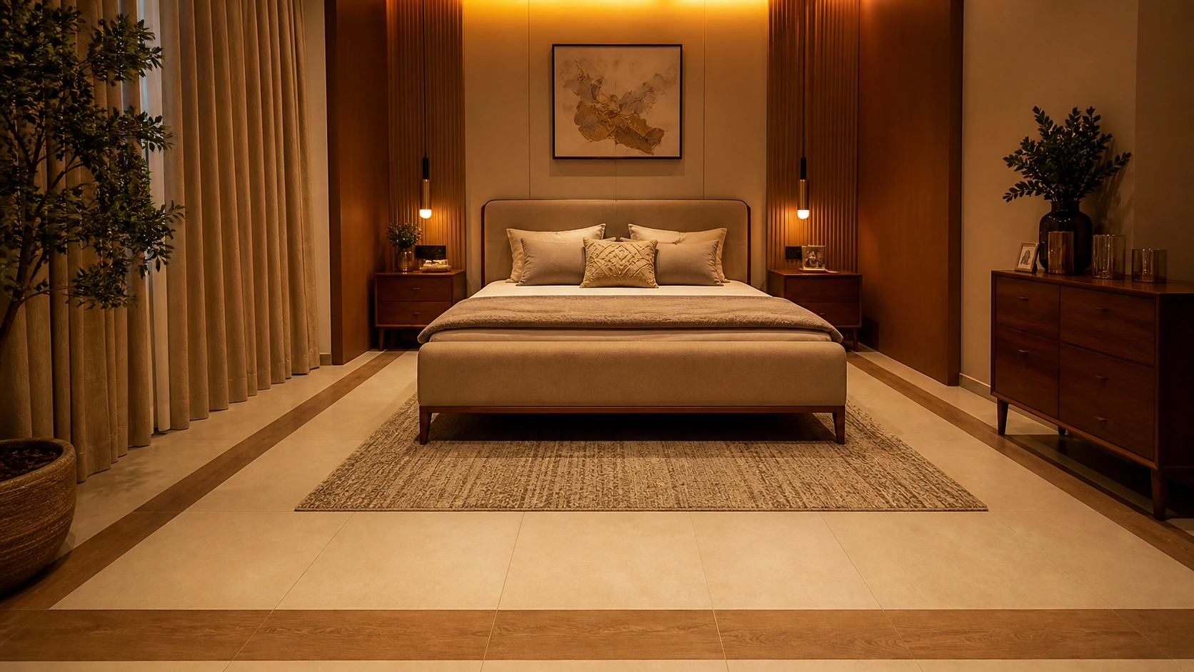
Matte GVT, ivory field with wood-look border | 500x500 mm field | Matte | Rs. 88 to Rs. 145/sq.ft
A wood-look border around a pale field softens a tiled bedroom, giving warmth at the room's edges where feet land first, especially when paired with wood tile.
Pair with: A rug sized to sit inside the field, and warm 2700K lighting which flatters both the ivory and the wood tone.
Avoid: A cool white light temperature, which drains the warmth from both the wood-look border and the ivory field.
Layout Five: Offset and Brick
Rows shifted relative to each other. At 500 mm, this is workable, but the offset amount matters more than most people realise.
Use a one-third offset, not a half: Every pressed tile carries a very slight centre bow, and a 50% brick offset places the high centre of one tile against the low corners of its neighbours, which maximises the height difference at each joint. At 500 mm the effect is milder than on large formats, but it is still the reason a brick-laid floor can develop edges you can feel. A one-third offset places the bow against a flatter part of the neighbouring tile and measurably reduces lippage, at no extra cost. On any tile above 600 mm, treat one-third as the maximum rather than the preference. |
Idea 13: Sand-Tone Third Offset, Modern Utility Floor
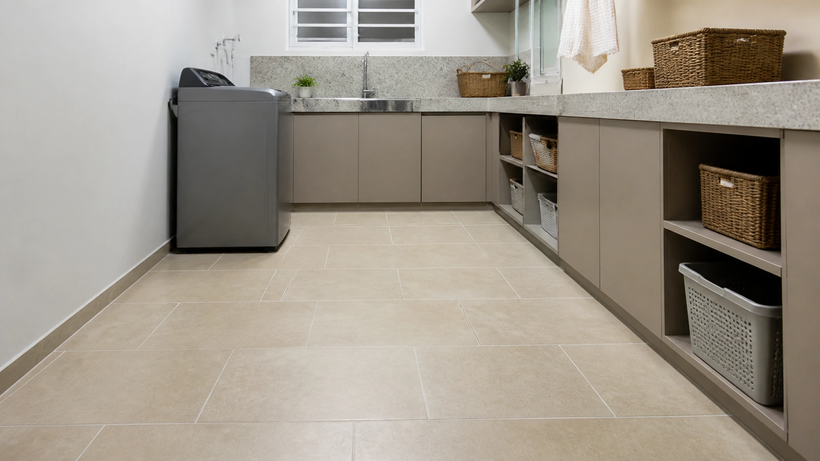
Anti-skid GVT, sand tone | 500x500 mm | Anti-skid matte | Rs. 72 to Rs. 118/sq.ft
A gently offset grid in a utility or wash area breaks the rigidity of a straight layout without introducing pattern, which suits a working room.
Pair with: A one-third offset, levelling clips during installation, and epoxy grout given the constant water exposure.
Avoid: A 50% offset, which stacks the tile bow against neighbouring corners and produces the rigid edges this layout is prone to.
Idea 14: Warm Grey Third Offset, Contemporary Balcony
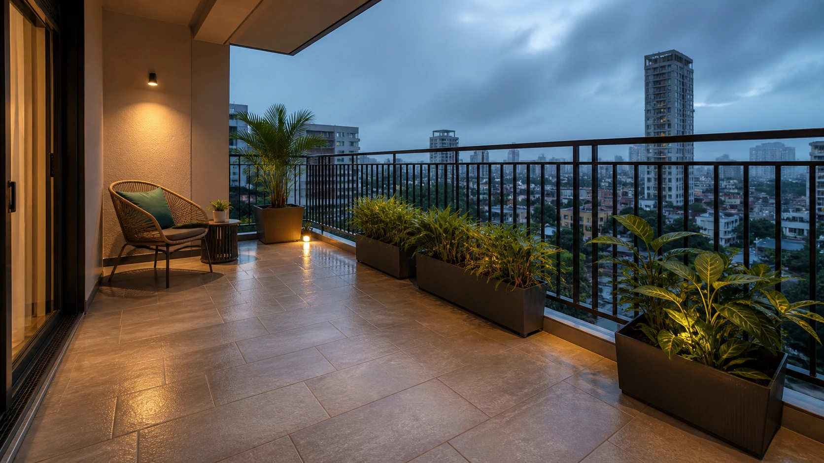
Anti-skid GVT, warm grey | 500x500 mm | Anti-skid matte, R11 outdoor | Rs. 80 to Rs. 132/sq.ft
An offset layout on a balcony reads as informal and outdoor-appropriate, and the format cuts economically around railings and drainage falls.
Pair with: R11 rating confirmed for exposed positions, a drainage fall planned before laying, and outdoor-rated grout.
Avoid: R10 on a fully exposed balcony in a heavy monsoon region, where sustained rain demands the higher rating.
Layout Six: Accent and Highlighter Inserts
A plain field interrupted by occasional decorative tiles. The most budget-efficient way to introduce pattern, since only a small number of tiles carry the cost.
Idea 15: Plain Field with Scattered Moroccan Inserts, Traditional Kitchen
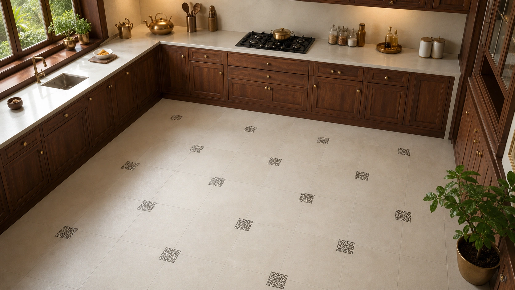
Matte GVT plain field with patterned inserts | 500x500 mm | Matte | Rs. 78 to Rs. 150/sq.ft blended
Scattering a small number of patterned tiles through a plain field gives a kitchen character at a fraction of the cost of a fully patterned floor.
Pair with: A scatter planned on paper before laying so it looks random rather than accidental, and inserts limited to roughly one in eight tiles.
Avoid: Letting the installer scatter inserts by eye during laying, which reliably produces visible clustering.
Idea 16: Plain Field with Central Medallion, Formal Traditional Room
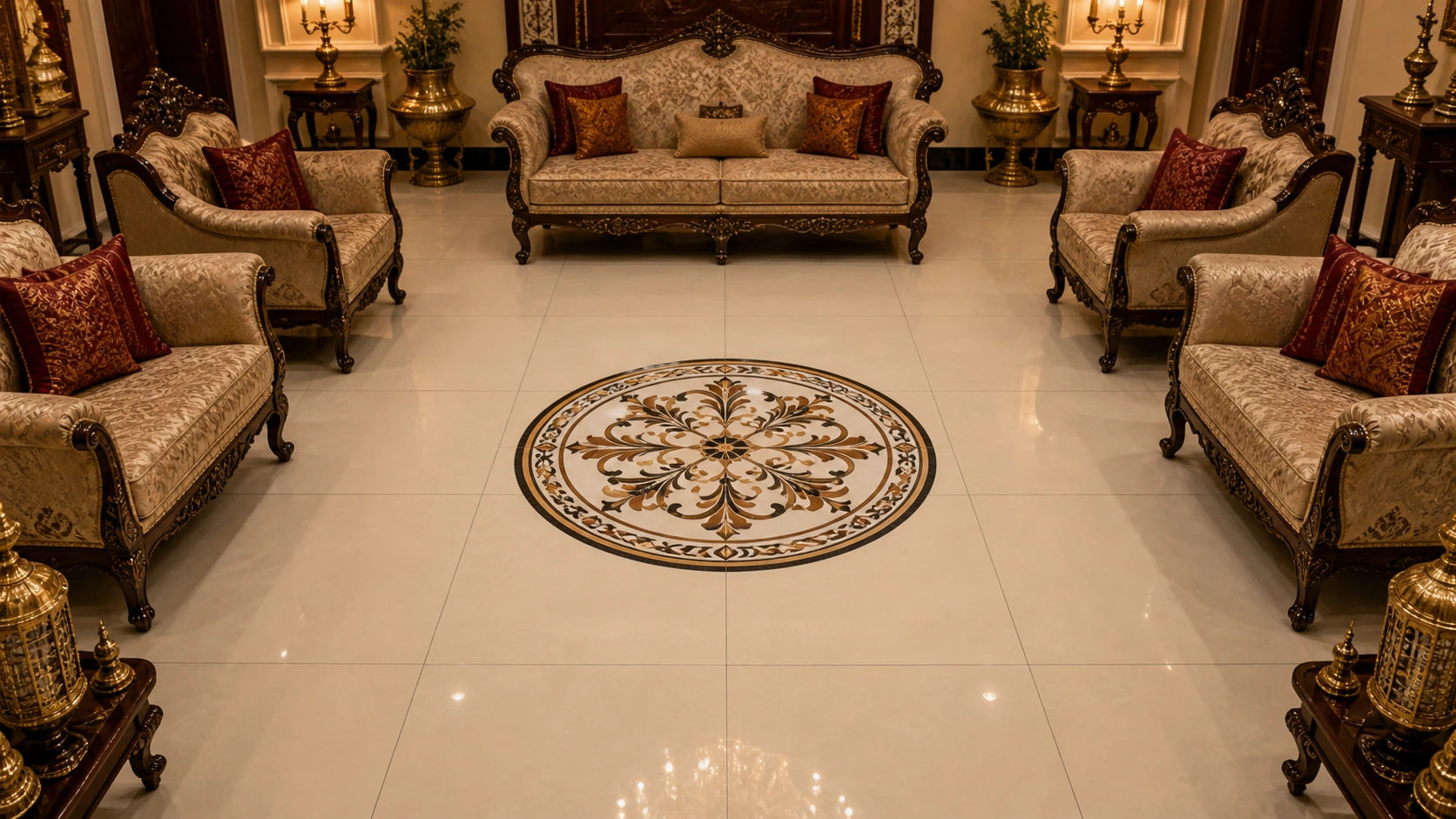
Matte GVT plain field with medallion | 500x500 mm field | Matte | Rs. 85 to Rs. 165/sq.ft
A single decorative medallion at the room's centre is the most classical treatment here, appropriate in a formal reception room or a large foyer.
Pair with: The medallion centred on the room's actual visual centre rather than its geometric centre, and no furniture placed over it.
Avoid: Placing a coffee table or rug directly on top of the medallion, which hides the one element you paid a premium for.
Idea 17: Plain Field with Perimeter Highlighter Course, Modern Bathroom
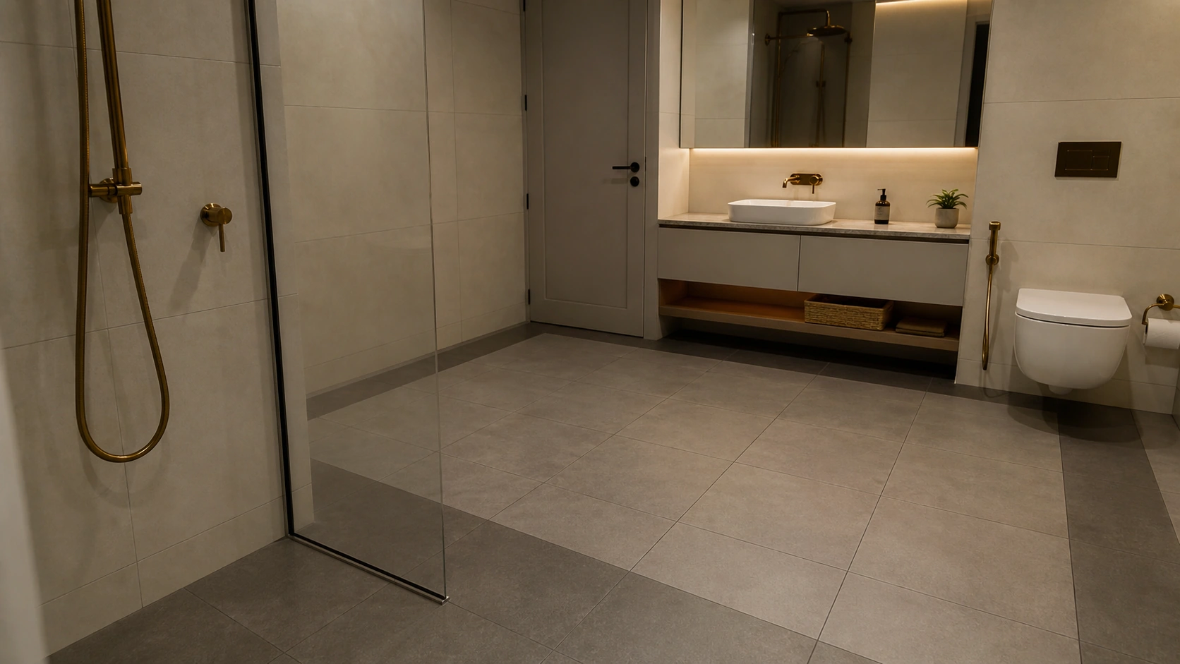
Anti-skid GVT plain field with highlighter course | 500x500 mm | Anti-skid matte | Rs. 80 to Rs. 145/sq.ft
A single highlighter course running around the room at the field's edge gives a bathroom definition without committing to a full border layout.
Pair with: The highlighter course confirmed to the same anti-skid rating as the field, since it is walked on identically.
Avoid: Choosing a highlighter on appearance alone, which frequently introduces a glossy tile into a wet floor.
Layout Seven: Zoned and Two-Material
Different treatments in different parts of one continuous space, used to define function without building walls.
Idea 18: Terracotta Cooking Zone, Grey Dining Zone
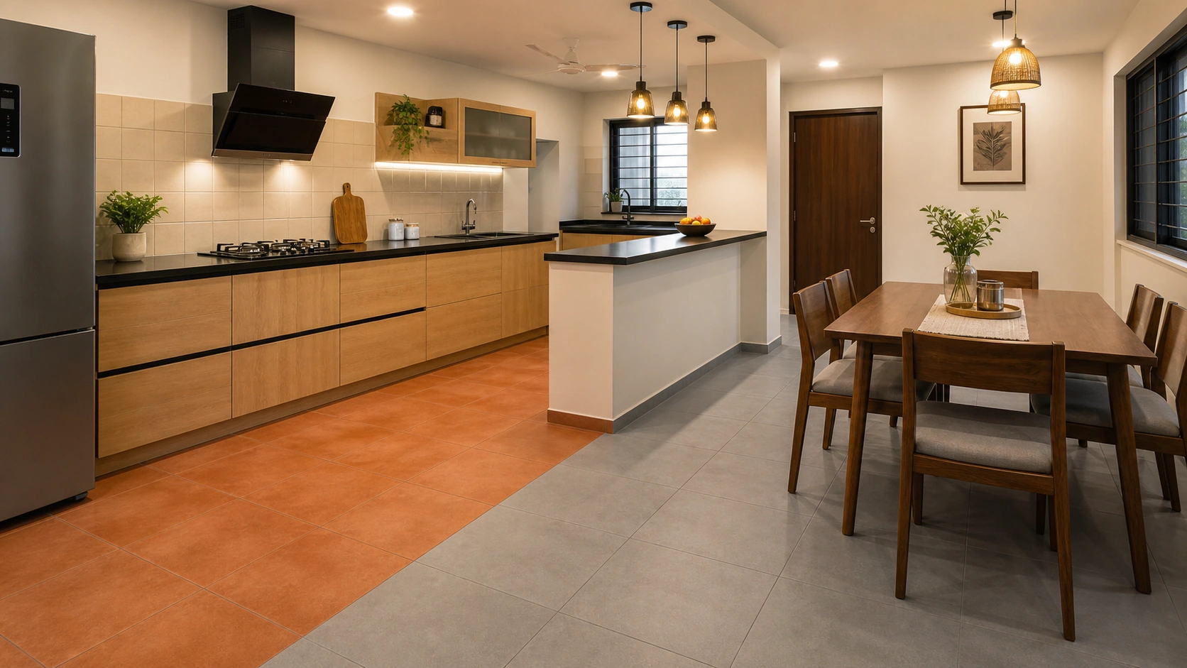
Anti-skid GVT, terracotta and grey | 500x500 mm | Anti-skid matte | Rs. 78 to Rs. 130/sq.ft
Assigning one tone to the cooking zone and another to the dining side of an open kitchen defines the two functions without a step, a divider, or a change of level.
Pair with: A clean straight transition line aligned to a real architectural feature such as a beam or a cabinet run.
Avoid: A transition line placed arbitrarily mid-floor, which reads as a mistake rather than as zoning.
Idea 19: Tile Field with Wood-Look Insert Zone, Modern Living
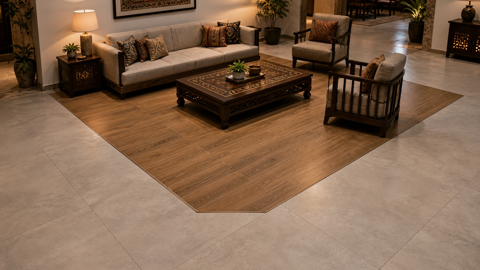
Matte GVT with wood-look plank insert zone | 500x500 mm field | Matte | Rs. 85 to Rs. 150/sq.ft
A wood-look inset area within a tiled field marks out a seating zone, giving the warmth of timber where people sit and the practicality of tile everywhere else.
Pair with: Matched tile thicknesses so both surfaces sit flush, confirmed with the supplier before ordering.
Avoid: Mismatched thicknesses, which produce a step at the junction that is both visible and a trip hazard.
Idea 20: Continuous Field, Indoor to Balcony Threshold
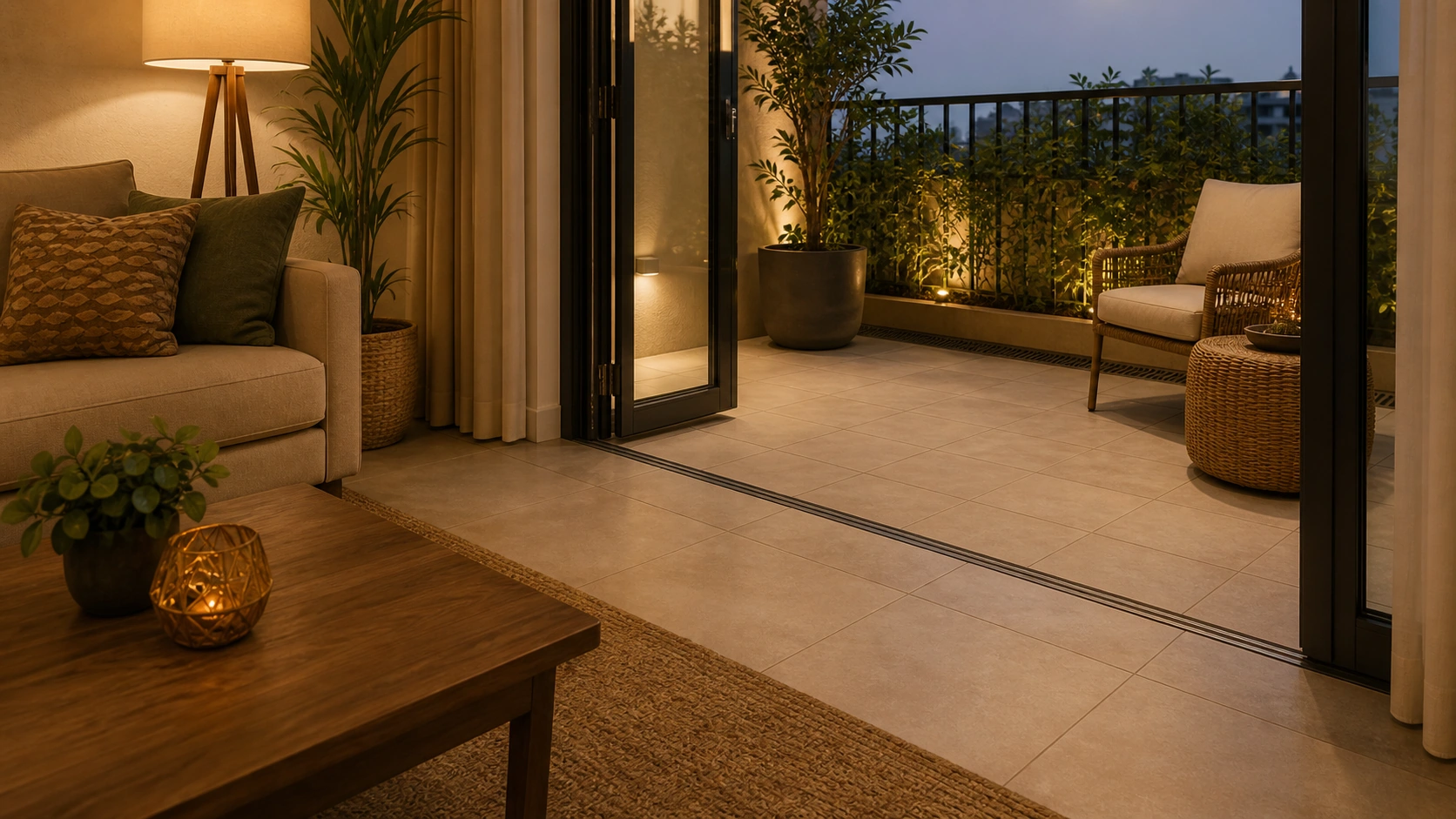
Matte GVT indoors, anti-skid R11 outdoor variant | 500x500 mm | Matte indoor, anti-skid outdoor | Rs. 78 to Rs. 135/sq.ft
Carrying a coordinated tone across the threshold makes a balcony read as an extension of the living room rather than a separate outdoor box.
Pair with: A matched tone in two different ratings, indoor matte and outdoor R11, with the drainage fall starting at the threshold.
Avoid: Using the indoor tile outdoors to keep the match exact, which is unsafe on a rain-exposed balcony, however well it matches.
Layout Matched to Room
| Room | Best Layouts | Avoid |
| Small bathroom | Straight grid, highlighter course | Diagonal, which multiplies cuts around fixtures |
| Kitchen | Straight grid, tonal checkerboard, zoning | High-contrast checkerboard with a patterned backsplash |
| Living room | Straight grid, border and field | Full checkerboard across a large open floor |
| Formal foyer | Checkerboard, central medallion, diagonal | Plain grid, which wastes the room's ceremonial role |
| Narrow passage | Diagonal, carried in one direction | Changing direction at doorways |
| Balcony and terrace | Third offset, continuous threshold | Any layout without confirmed outdoor anti-skid rating |
| Utility and wash area | Straight grid, third offset | Decorative inserts, which complicate a working floor |
Overage by Layout
| Layout | Overage to Order | Why |
| Straight grid, simple room | 5 to 7% | Fewest cuts, and offcuts frequently reusable at the opposite edge |
| Straight grid, fixture-heavy room | 8 to 10% | Cuts around drains, cabinets and fixtures rarely reuse |
| Third offset | 7 to 9% | Row starts and ends generate cuts that do not always pair |
| Border and field | 8 to 10% | Two components to balance, and the border is cut to fit the remainder |
| Checkerboard | 8 to 10% | Two tones must be ordered in matched quantities, limiting substitution |
| Diagonal | 12 to 15% | Every perimeter tile is cut on the bias, and offcuts are rarely reusable |
Plan the Layout Before You Choose the Tile
500x500 mm ranges can be browsed on TilesFinders across matte, anti-skid and textured finishes in GVT, porcelain and ceramic, and once you know which layout your room suits, you can filter to the rating and tone the layout actually needs.
FAQs
The diagonal, because the eye follows the longest line across the room. It works best in narrow or small rooms where the widening effect does real work, and it needs 12 to 15% overage since every perimeter tile is cut on the bias.
Every pressed tile has a slight centre bow, and a 50% offset places that high centre against the low corners of neighbouring tiles, maximising the height difference at each joint. A one-third offset reduces that at no additional cost.
Border and field. The border course is sized to absorb whatever remainder the room produces, so the cut becomes a designed edge rather than an error. This is why border layouts remain common in Indian homes, where rooms are frequently neither square nor conveniently dimensioned.
Generally not. The pattern's intensity works best in a contained space such as a foyer or powder room where walls frame it. Across a large open floor, it becomes exhausting. A two-tone tonal checkerboard using close shades is a more liveable alternative.
12 to 15%, against 5 to 7% for a straight grid in a simple room. Every edge tile is cut on the bias, and the offcut is rarely reusable, which is the main hidden cost of the diagonal.
Yes, and an inset wood-look zone within a tiled field works well for defining a seating area. Confirm matched thicknesses with the supplier before ordering, since a mismatch produces a step at the junction that is both visible and a trip hazard.
Plan the scatter on paper before laying begins, and keep inserts to roughly one in eight tiles. Left to the installer's eye during laying, inserts reliably cluster in some areas and leave others empty.
Yes, always. A highlighter course in a bathroom is walked on exactly like the field around it, so choosing one on appearance alone frequently introduces a glossy tile into a wet floor.
A straight grid in a simple rectangular room, at 5 to 7% overage, because it generates the fewest cuts and offcuts from one edge, can often be used at the opposite edge.


See our tile guides first
Set TilesFinders as a preferred source and our buying guides surface ahead of the rest for you.
Add as preferred sourceTakes one tap. Nothing to install.
What Readers Say
I was about to redo my parking area with the wrong tile size until I read this. The layout comparisons saved me from a costly mistake.
We reference TilesFinders guides while briefing clients on material selection. The size and pattern breakdowns are accurate and easy to explain visually.
On site, I get asked about grout spacing all the time. This article gave me a solid reference I now share with my team before every job.
Finally a guide that doesn't just push generic advice. The oil stain removal steps actually worked on our clubhouse driveway tiles.
I run a small construction firm and now send this link to clients directly when they ask about entrance tile sizing. Saves me an hour of explaining.
Good practical detail, though I wish there were more examples for compact apartment entrances specifically, not just villas.
My mother-in-law wanted marble, I wanted vitrified. This blog gave us the neutral comparison we needed to actually decide together.
Detailed without being overwhelming. I appreciated that it covered both cost and maintenance, not just the aesthetics.
Used the algae and hard water removal tips on our terrace tiles after the monsoon. Worked better than what our regular cleaner was doing.
As someone who sources tiles for multiple builder projects, I find these comparisons genuinely useful for vendor conversations, not just consumer content.
Recommended this to a client who kept second-guessing the entrance design. The small vs large layout section settled the debate instantly.
Straightforward and honest, no unnecessary jargon. Would like to see a similar breakdown for outdoor pool-deck tiles next.
We've bookmarked several TilesFinders guides for our design handbook. Reliable source when clients want data, not just opinions.
Two paths, one marketplace.
Get free quotes from verified suppliers.
Share your room, budget, and style. Suppliers in Morbi respond within hours.
Get Free QuotesList your business, reach real buyers.
Put your showroom in front of homeowners searching for tiles right now.
List Your Business