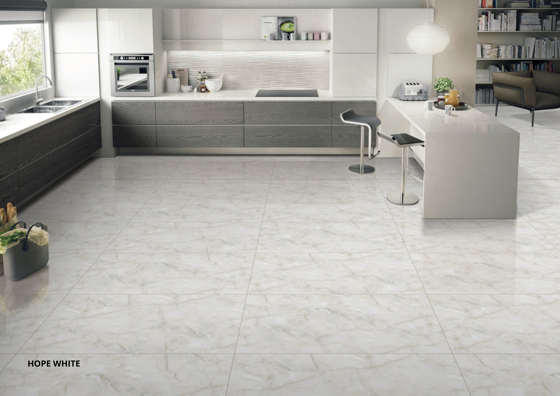

Top Kitchen Tile Colour Combinations That Transform Your Space
Choosing the right kitchen tile colour is critical. Options range from timeless Black & White...
Loading designs...
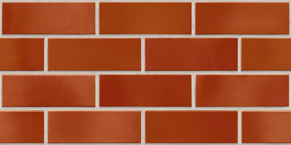
Orange kitchen tiles sit at the most saturated end of the warm colour spectrum available in the Indian tile range. From vivid amber-orange at the bright end to burnt orange, rust, and deep copper at the rich end, orange kitchen tiles are the colour choice for a kitchen where the tile is meant to be noticed. No other kitchen tile colour demands as much design discipline as orange: used on one surface with the right cabinet colour and the right grout, orange reads as bold and considered. Used across multiple surfaces or against the wrong cabinet, it overwhelms the kitchen entirely.
This page covers orange kitchen tiles across every surface in the kitchen tiles range, from the ceramic backsplash tile in a vivid orange glaze to burnt orange GVT in matte finish on the kitchen floor. The shade distinction matters: vivid orange and burnt orange read differently in an Indian kitchen, pair with different cabinet colours, and suit different kitchen styles. Both are covered here with the specific sizes, finishes, and design rules that determine whether orange becomes the statement surface it is meant to be.
These three shades are close enough that buyers frequently search for all three interchangeably. They describe different colours on a tile glaze, and the distinction matters for cabinet pairing and for how the tile reads in a kitchen:
| Colour | Glaze Character | How It Reads in a Kitchen | Cabinet Pairing | Kitchen Style |
| Vivid orange | Bright yellow-orange; high saturation; the most intense colour in the warm range | Energetic and bold; the strongest colour statement; reads from across the room | White only; any other cabinet colour competes with the orange | Contemporary, cafe-style, or designed accent kitchens |
| Amber orange | Warm golden-orange; slightly less saturated than vivid; honey quality | Warm and rich; less demanding than vivid; easier to pair | White, cream, or light timber | Transitional, farmhouse, or warm contemporary |
| Burnt orange | Deep reddish-orange; darker and earthier than amber; close to rust | Rich and grounded; the most sophisticated orange; reads as a designed surface rather than a bold colour choice | White, cream, or aged timber | Farmhouse, heritage, and warm contemporary kitchens |
| Rust | Very dark brownish-orange; right at the boundary with brown | Earthy and serious; reads close to brown at a distance; reveals orange in direct light | Cream, off-white, or aged timber | Rustic, farmhouse, or heritage bungalow kitchens |
| Terracotta (for reference) | Reddish-clay orange; more red than orange; the classic Indian earth colour | Traditional and warm; reads as an earth material rather than a vivid colour | Cream, white, or aged timber | Traditional Indian, farmhouse, transitional |
The practical rule for most Indian kitchens: burnt orange is the most usable orange shade because it reads as warm and rich without the visual intensity that vivid orange brings to a small or enclosed space. Vivid orange works on the backsplash as an accent surface against white cabinets in a well-lit kitchen. On a full wall or on the floor of a standard-size kitchen, vivid orange needs careful assessment of the kitchen's natural light before committing.
Orange is the most light-responsive colour in the warm kitchen tile range. The same orange tile reads differently under warm LED, cool LED, and natural daylight, and that variation is more extreme for orange than for any other kitchen tile colour except blue:
The practical test before ordering any orange kitchen tile: view a full tile sample in the kitchen's actual installed lighting at the time of day when the kitchen is most used. No other colour in the kitchen tile range is more affected by lighting than orange.
Orange kitchen wall tiles are most effective in the backsplash zone where the colour reads at eye level and is contained between the counter and overhead cabinets. A full kitchen wall in orange above the dado works only in large or open-plan kitchens with strong natural light and white or cream cabinets throughout.
Ceramic in 12x18 (300x450) or 12x24 (300x600) in an orange or burnt orange gloss or sugar finish is the standard orange kitchen backsplash tile. These are wall-only sizes and must not be placed on kitchen floors. Gloss finish gives orange its full saturation and is the easiest to wipe clean from cooking oil near the backsplash. Sugar finish gives a softer surface that reads less intensely than flat gloss, which makes it a practical choice for vivid orange, where the buyer wants the colour without the full reflective intensity.
Ceramic orange tiles for kitchen walls are available from manufacturers in Morbi and Gujarat in both vivid orange and burnt orange glazes. Prices run from Rs. 50 to Rs. 90 per sq.ft for standard gloss or sugar finish in 12x24. For the surface-by-surface wall tile specification that covers finish, size, and zone rules for all kitchen wall tiles, the kitchen wall tiles page covers those in detail.
GVT in 2x2 (600x600) in a burnt orange or deep amber colour is the specification for a full-height kitchen wall in an orange shade. The GVT glaze holds colour more consistently across large production runs than ceramic tiles, which matters on a full wall where boxes from different batches are used. On the wall, gloss finish is safe; the no-gloss-on-floors constraint does not apply to vertical surfaces. GVT in a burnt orange polished glossy finish in 2x4 on one kitchen wall in an open-plan space reads as a warm, considered feature wall. GVT orange in 2x2 runs from Rs. 90 to Rs. 175 per sq. ft.,t depending on shade depth and finish.
The orange kitchen backsplash is where the colour makes the strongest impression with the least risk of overwhelming the kitchen. Three contained approaches give three distinct results:
Two to three rows of vivid orange gloss ceramic in 12x24, laid in a horizontal grid bond with white grout, between white overhead cabinets and a white or light grey countertop. The orange reads as a deliberate, graphic colour accent. The white grout adds a visible grid that gives the surface structure. This is the boldest orange backsplash approach and works best in a kitchen with strong natural or artificial light and no other warm colours in the palette.
Burnt orange gloss ceramic in 12x18, laid in a horizontal brick bond with off-white or cream grout, gives a warmer, less intense backsplash than vivid orange. The brick bond format adds pattern to the colour, which reduces the intensity of the burnt orange by giving the eye multiple elements to focus on rather than a uniform field of one colour. This is the most versatile orange backsplash approach and suits farmhouse, transitional, and warm contemporary kitchens with cream or white cabinets.
A single contained panel of orange tile, 600 to 900mm wide, behind the hob or behind open kitchen shelves, with plain white or cream tile on the remaining backsplash. The orange panel reads as an inset design accent rather than a surface-wide colour decision. This is the lowest-commitment orange kitchen tile application and the easiest to coordinate with a kitchen that already has other warm materials, such as timber shelves, brass fixtures, or a warm countertop.
Burnt orange is the shade of orange that most consistently works across the range of Indian kitchen sizes, lighting conditions, and cabinet colour combinations. It sits at the point where orange has enough red and brown to read as an earth colour in warm light and a rich, saturated colour in neutral light, without tipping into the brightness of vivid orange or the brownness of rust.
Burnt orange GVT in matte finish in 2x2 is the most commonly specified burnt orange kitchen tile for floors and for full-height walls in Indian mid-range kitchens. The matte surface reads as a natural material rather than a coloured tile, which reduces the visual weight of the orange on a large surface. Burnt orange ceramic in 12x24 gloss is the standard backsplash tile in the burnt orange shade.
Burnt orange tiles work with three cabinet colour families that do not suit vivid orange: cream and ivory cabinets (the warm cream and the earthier burnt orange read from the same colour family), aged timber (the warm wood tone and the reddish-orange read together as natural materials), and dark timber as an upper cabinet contrast with burnt orange on the floor (the deep wood above and the warm earth below creates a layered warm palette that reads as a heritage or farmhouse kitchen).
An orange kitchen floor is a strong design decision that changes the entire visual register of the kitchen. Unlike an orange backsplash, which reads as an accent, an orange floor reads as the dominant surface in the room. The matte surface of a GVT floor tile in orange makes the colour more livable than a glossy surface would, but the colour itself still reads with significant visual weight from the kitchen entry.
GVT in matte or matte carving finish in 2x2 in a burnt orange or amber colour is the correct specification for a kitchen floor with orange tiles. The GVT body has water absorption of 0.05%, which handles Indian monsoon humidity and daily cooking water on the floor. The matte surface is anti-skid, which is the floor safety requirement for a kitchen floor regardless of tile colour.
Note: Gloss, high gloss, and satin matte finishes must not be used on kitchen floors. Orange kitchen floor tiles must be in matte or matte carving finish only. This applies to GVT and all other tile bodies regardless of colour.
For the complete kitchen floor specification covering all tile bodies, finishes, and size rules, the kitchen floor tiles page covers those constraints in full.
| Orange Shade | Cabinet Colour | Countertop | Fixture Finish | Grout Colour | What It Reads As |
| Vivid orange | White only; any other cabinet colour competes | White or light grey quartz | Chrome or matte black | White (backsplash); off-white (floor) | Graphic and bold; the orange is the centrepiece |
| Amber orange | White, cream, or light timber | White, warm beige, or light stone quartz | Brass or chrome | Off-white or cream | Warm and considered, the amber reads as a rich accent |
| Burnt orange | White, cream, aged timber, or off-white | Warm beige quartz, Kota stone look, or travertine | Brass or antique bronze | Cream or off-white on backsplash; warm tan on floor | Earthy and rich; reads as a natural material colour |
| Rust | Cream or aged timber only | Warm stone look or beige quartz | Antique bronze or copper | Cream or natural mortar tone | Traditional and deeply warm; close to the farmhouse aesthetic |
The one consistent rule across all orange kitchen tile shades: white or off-white cabinets are the safest partner. Orange is a high-saturation colour that benefits from a cool, neutral cabinet above or beside it. The contrast between the orange tile surface and the white cabinet is what gives the orange its design tension. Reducing that contrast by using cream, grey, or timber reduces the impact of the orange without making the combination warmer; it makes it muddier.
| Size | Alias | Body | Surface | Best Orange Application | Price (Rs./sq.ft) |
| 300x450 | 12x18 | Ceramic | Wall and backsplash only; never floor | Orange subway-style backsplash in a horizontal brick bond | Rs. 50 to Rs. 85 |
| 300x600 | 12x24 | Ceramic | Wall and backsplash only; never floor | Standard orange backsplash; single feature panel behind hob | Rs. 50 to Rs. 90 |
| 600x600 | 2x2 | GVT | Wall and floor (matte for floors) | Orange floor tile; full-height orange wall in a designed kitchen | Rs. 90 to Rs. 175 |
| 600x1200 | 2x4 | GVT | Wall and floor (matte for floors) | Orange feature wall in open-plan kitchen; fewer joins than 2x2 | Rs. 110 to Rs. 195 |
| 600x600 | 2x2 | Porcelain (matte) | Floor (primary); wall (secondary) | Orange kitchen floor where lighter tile weight is needed | Rs. 55 to Rs. 115 |
Note: 300x450 and 300x600 sizes are wall and backsplash only. They must not be used on kitchen floors regardless of colour or finish. For an orange kitchen floor, use GVT 2x2 or porcelain 600x600 in matte finish only.
| Requirement | Recommended Tile | Size | Finish | Price (Rs./sq.ft) |
| Vivid orange backsplash, white cabinets | Vivid orange gloss ceramic | 12x24 | Gloss | Rs. 55 to Rs. 90 |
| Burnt orange backsplash, farmhouse kitchen | Burnt orange gloss or sugar ceramic | 12x18 or 12x24 | Gloss or Sugar | Rs. 50 to Rs. 90 |
| Orange feature panel, behind the hob | Amber or burnt orange gloss ceramic | 12x24 | Gloss | Rs. 55 to Rs. 90 |
| Orange kitchen floor, contemporary | Burnt orange GVT matte | 2x2 | Matte | Rs. 90 to Rs. 165 |
| Orange kitchen floor, earthy tone | Rust or amber GVT matte carving | 2x2 or 2x4 | Matte Carving | Rs. 100 to Rs. 185 |
| Full orange wall, open-plan kitchen | Burnt orange GVT glossy or matte | 2x4 | Glossy (wall only) or Matte | Rs. 110 to Rs. 195 |
| Burnt orange floor, large open kitchen | Burnt orange GVT matte | 2x4 | Matte | Rs. 110 to Rs. 190 |
| Budget orange backsplash | Vivid orange gloss ceramic, smaller size | 12x18 | Gloss | Rs. 50 to Rs. 80 |
GVT in burnt orange or amber carries a water absorption of 0.05%, which qualifies it under IS 15622 for vitrified tiles. In Indian kitchens that experience monsoon humidity from June to September every year, this absorption level means the GVT tile body neither expands from moisture uptake nor contracts on drying across the seasons. The adhesive bond stays stable. The sealed glaze on the tile face prevents cooking oil and turmeric staining from penetrating the body, making burnt orange GVT in matte finish one of the lowest-maintenance warm colour choices for a kitchen floor in Indian conditions. Epoxy grout at the joints between the floor tiles prevents oil staining in the grout lines during heavy cooking periods.
Ceramic in 12x24 (300x600) in vivid orange, amber, and burnt orange glaze finishes are produced by manufacturers across Morbi at Rs. 50 to Rs. 90 per sq.ft in gloss and sugar finish. GVT in 2x2 (600x600) in the burnt orange and amber shade family, which complies with IS 13630 water absorption classifications for vitrified tile bodies, runs from Rs. 90 to Rs. 175 per sq.ft from Gujarat-based producers. GVT in 2x4 (600x1200) for feature walls and larger kitchen floors in the orange colour family runs from Rs. 110 to Rs. 195 per sq.ft. Confirm shade availability with the manufacturer before specifying a large floor or wall order in any specific orange shade.
Vivid orange for a backsplash statement, amber for a warm accent wall, and burnt orange for a floor that grounds the kitchen in the warmest colour in the Indian tile range, all available in ceramic and GVT from verified manufacturers across Morbi and Gujarat on TilesFinders. Ceramic orange in 12x24 for the backsplash starts from Rs. 50 per sq ft; GVT in 2x2 in burnt orange and amber for floors and walls runs from Rs. 90 to Rs. 175 per sq ft. Order a full tile sample and view it in the kitchen's own lighting before committing to any orange shade.
Vivid orange kitchen tiles have a bright yellow-orange glaze with high saturation that reads as a strong colour statement in any lighting. Burnt orange tiles have a deeper, reddish-orange glaze with more brown and red in the tone, giving a richer and more earthy reading. Burnt orange is more versatile for Indian kitchens because it pairs with cream and timber cabinets, works in north-facing kitchens, and reads as a natural material colour rather than a bold accent.
Yes, if specified as GVT or porcelain in matte or matte carving finish. GVT 2x2 in burnt orange or amber matte is the correct kitchen floor tile body for the orange colour family. Glossy orange tiles must not be used on kitchen floors. Ceramic 12x18 and 12x24 are wall-only sizes and cannot go on floors regardless of colour.
White or off-white cabinets are the strongest pairing for all orange kitchen tile shades. The contrast between the white cabinet and the orange tile reads as deliberate and designed. Cream cabinets work with burnt orange but not vivid orange. Avoid grey, dark timber, or coloured cabinets with any orange tile; the combinations read as colour conflicts rather than warm accents.
Vivid orange in a north-facing kitchen with cool diffused light can read as flat or less intense than expected, because the cool light suppresses rather than enriches the warm orange. Burnt orange performs better in north-facing kitchens because its inherent warmth does not depend on warm light to read correctly. Always view a full tile sample in the kitchen's actual lighting before ordering any orange tile for a north-facing space.
Off-white or cream grout for burnt orange and amber tiles gives the most cohesive result. The warm grout reads as natural mortar alongside the earthy orange tile. White grout with vivid orange tiles creates a stronger contrast grid. Dark grey grout with orange tiles creates a cool-warm conflict at every joint that reads as unresolved. Epoxy grout on the orange backsplash resists cooking oil staining in the grout lines.
An orange kitchen floor works best in large kitchens above 120 sq. ft. or open-plan kitchen-dining spaces, with white or off-white cabinets, in south-facing or east-facing rooms with good natural light. It is less suitable for small kitchens under 80 sq. ft., north-facing kitchens, or kitchens with strongly coloured cabinets. Burnt orange in matte GVT 2x2 is the most practical floor specification in the orange colour family.
Yes. Ceramic in 12x24 in vivid orange, amber, and burnt orange glazes is available from manufacturers in Morbi and Gujarat at Rs. 50 to Rs. 90 per sq.ft. GVT in 2x2 in burnt orange and amber shades for floor and wall use runs from Rs. 90 to Rs. 175 per sq.ft. Stock availability for vivid orange ceramic is wider than for burnt orange or rust GVT; confirm availability before placing a large order in any specific shade.
Not if it is used on one surface with white or off-white cabinets. An orange backsplash strip in ceramic 12x24 gloss with white cabinets reads as a bold, considered accent. Orange on multiple surfaces, with non-white cabinets, or in a small north-facing kitchen, is where the colour becomes too much. The design rule for orange is containment: one surface, one tone, the rest of the kitchen in quiet neutrals.