Turquoise vs Teal vs Aqua Green Tiles: Choosing the Right Blue-Green for Indian Coastal Homes
Turquoise, teal, and aqua green tiles are compared for Indian coastal homes, covering colour intensity, room scale, design character, fixture pairings, and the best tone for each space.
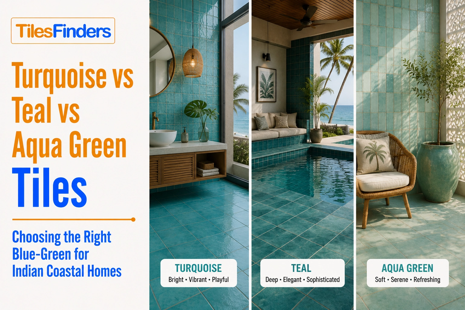
Choose turquoise for vivid Mediterranean drama, teal for a deeper and more sophisticated blue-green, and aqua green for the softest, most forgiving option at full-room scale. Match the tone to the room size and design brief, then confirm the exact shade, physical sample, and anti-skid rating before ordering.
Three blue-green tones sit close together on the colour wheel and get confused constantly in tile selection: turquoise, teal, and aqua green, each carrying a genuinely different visual weight and design association. This guide compares all three directly for Indian coastal and Mediterranean-inspired home design.
From The Marketplace
Popular tiles right now


The Three Tones Defined
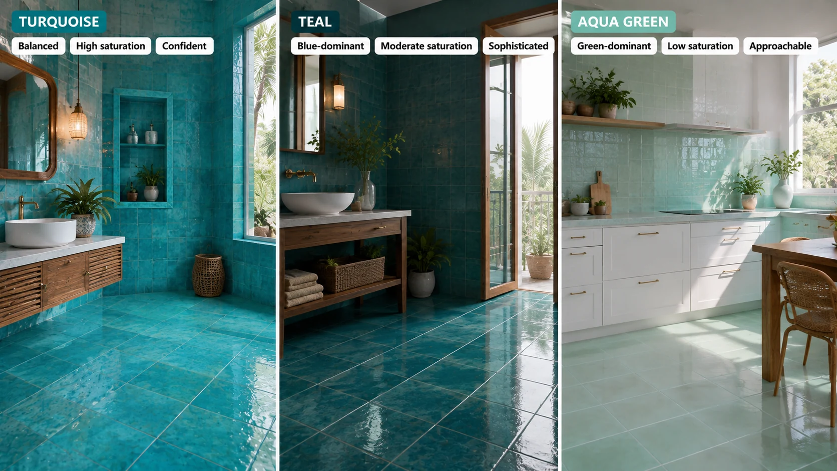
| Tone | Colour Balance | Saturation | Character |
| Turquoise | Evenly balanced between blue and green | High, vivid and gemstone-referencing | Confident, immediately recognisable, the most Mediterranean-coded of the three |
| Teal | Blue-dominant, deeper than turquoise | Moderate to high, but darker and more muted | Sophisticated, formal, reads as a considered colour choice rather than purely decorative |
| Aqua green | Green-dominant, paler than turquoise | Low to moderate, soft and watery | Fresh, light, the most approachable and easiest to use at full-room scale |
Three-Way Comparison
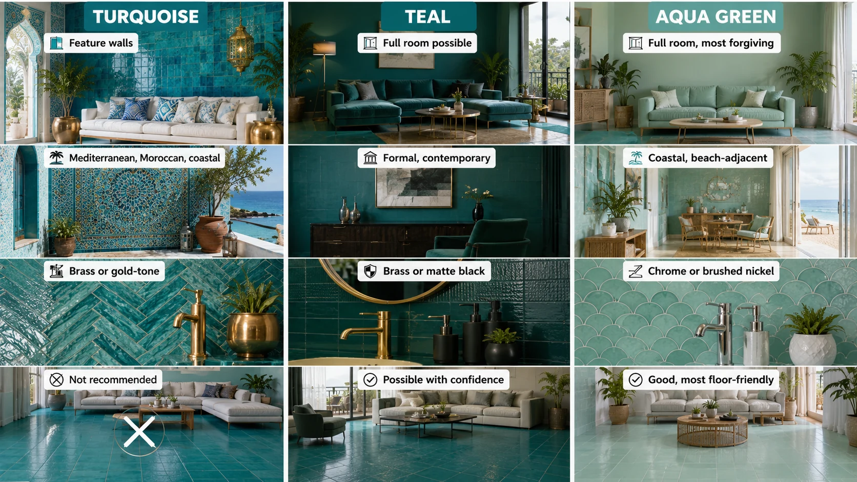
| Factor | Turquoise | Teal | Aqua Green |
| Best room scale | Feature walls, contained accent zones | Full room application possible given lower visual intensity than turquoise | Full room application, the most forgiving of the three at scale |
| Cultural and design reference | Mediterranean, Moroccan, coastal | Formal, contemporary, less tied to a specific cultural reference | Coastal, beach-adjacent, fresh and casual |
| Best paired metal finish | Brass or gold-tone for warmth | Brass or matte black for a formal register | Chrome or brushed nickel for a fresh, light register |
| Suitability for full living room floor | Not recommended | Possible with a confident, formal brief | Good, the most floor-friendly of the three |
The decision in one line: Choose turquoise for maximum Mediterranean and coastal drama in a contained zone. Choose teal for a more formal, sophisticated blue-green that can carry a larger room. Choose aqua green tile for the softest, most forgiving full-room blue-green application, particularly in a compact or light-limited space.
Which Tone for Which Room
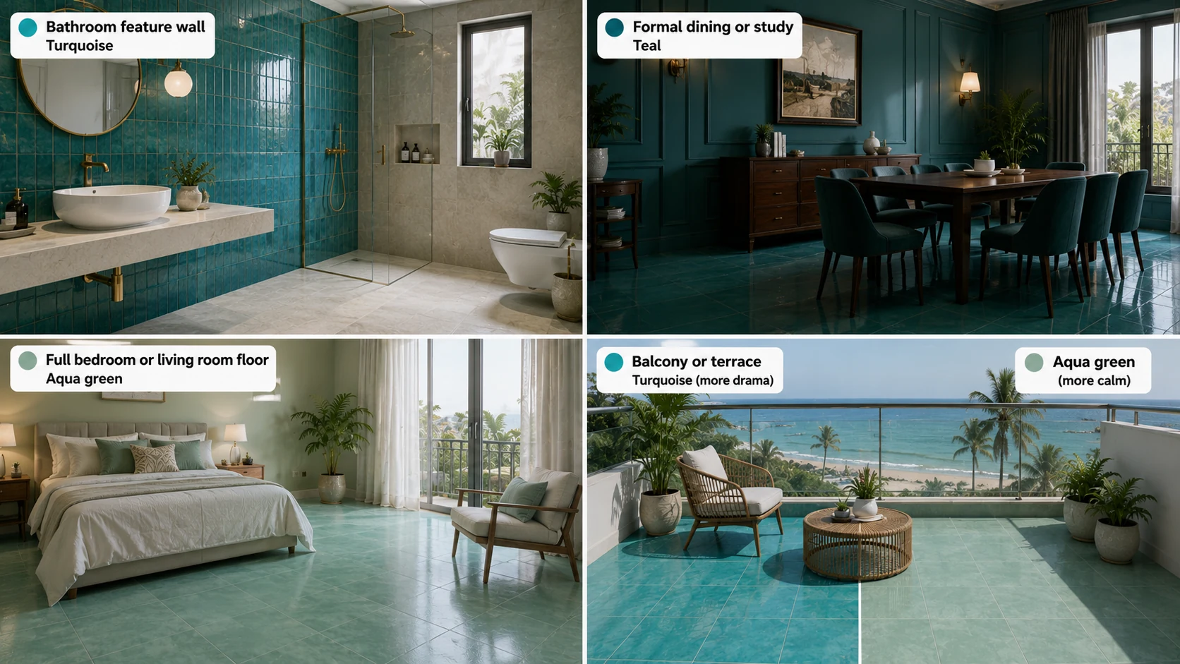
- Bathroom feature wall wanting maximum colour drama: turquoise, the correct choice when the brief specifically wants Mediterranean saturation.
- Formal dining room or study wanting a sophisticated blue-green: teal, deep enough to read as a considered material decision rather than a purely decorative colour choice.
- Full bedroom or living room floor wanting a calm blue-green: aqua green, the most forgiving of the three at full-room scale given its lower saturation.
- Balcony or terrace wanting direct coastal reference: turquoise or aqua green, both carrying strong coastal association, with turquoise delivering more drama and aqua green more calm.
If turquoise is the preferred choice, its broader application deserves a closer look. The guide to Turquoise Tiles in India covers coastal and Mediterranean styling, suitable room applications, tonal ranges, and the practical specifications to check before ordering. It is useful for narrowing down where this vivid blue-green works best in an Indian home.
Buying Checklist
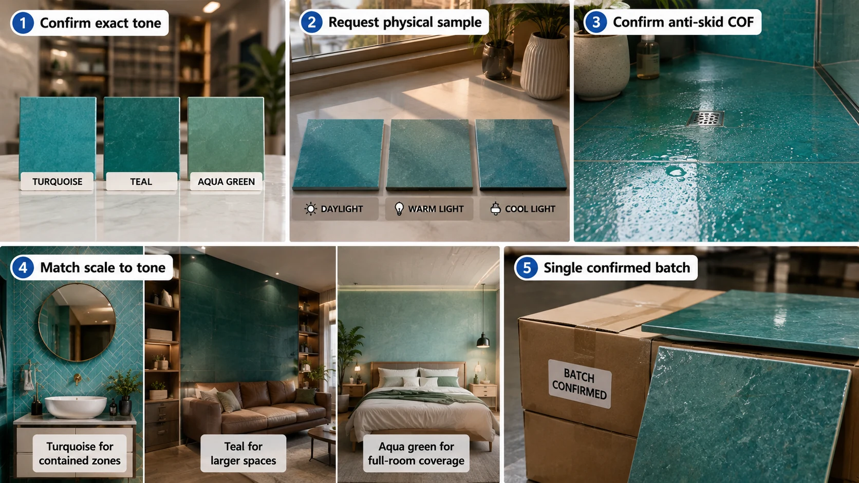
- Confirm the exact tone before ordering, since turquoise, teal, and aqua green are sometimes used loosely or interchangeably in product naming across Indian manufacturers.
- Request a physical sample under your actual planned lighting, since these three closely related tones can shift meaningfully under different light temperatures.
- Confirm anti-skid COF separately for any floor application regardless of which of the three tones is chosen.
- Match room scale to tone intensity: turquoise for contained zones, teal and aqua green for larger or full-room coverage.
- Order from a single confirmed batch, since all three are saturated colours that show batch inconsistency more visibly than muted neutrals.
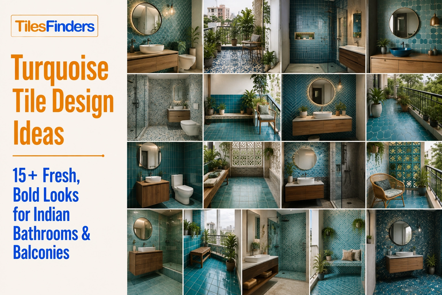
For more visual inspiration, explore practical turquoise combinations by room and application. Turquoise Tile Design Ideas covers bathroom walls, floors, balconies, backsplashes, powder rooms, and tonal combinations, making it easier to translate the colour comparison into an actual design direction.
Blue-Green GVT in India: 2026 Manufacturing Context
Turquoise, teal, and aqua green GVT are all produced across Morbi, Gujarat and other Indian ceramic tile manufacturing centres, generally within the same saturated-colour product ranges. Product naming across manufacturers can vary, with some brands using turquoise and aqua interchangeably, making a physical sample comparison the most reliable way to confirm the exact tone before a large order.
Compare All Three Blue-Greens on TilesFinders
Turquoise, teal, and aqua green GVT can be sampled and compared side by side on TilesFinders, helping you confirm the exact tone and its room-scale suitability before committing to a full project order.
FAQs
Turquoise is evenly balanced between blue and green at high saturation, while teal is blue-dominant and deeper, reading as more formal and sophisticated. Turquoise carries a stronger Mediterranean and coastal association than teal.
No, though the two are sometimes used loosely in product naming. Aqua green is green-dominant and paler than turquoise, with lower overall saturation, making it more suitable for full-room application than turquoise's higher intensity.
Aqua green is the most forgiving of the three at full-room scale given its lower saturation, followed by teal for a more formal full-room brief. Turquoise is generally better reserved for contained accent zones rather than full-floor coverage.
Turquoise carries the strongest and most immediate Mediterranean and Moroccan design reference of the three, given its vivid, gemstone-adjacent saturation.
Brass or matte black both suit teal's more formal, sophisticated register, depending on whether the brief wants warmth or a cooler, more contemporary read.
Yes, commonly in different rooms matched to each space's specific brief, such as turquoise in a bathroom feature wall and aqua green across an adjoining bedroom floor, since all three share a related but distinct colour identity.
Turquoise, teal, and aqua sit close together on the colour wheel, and product naming conventions vary between Indian tile manufacturers, making a physical sample comparison the most reliable way to confirm the exact tone before ordering.
Aqua green, given its lower saturation and greater forgiveness at full-room scale, making it the least risky starting point for a household new to working with blue-green tile.


See our tile guides first
Set TilesFinders as a preferred source and our buying guides surface ahead of the rest for you.
Add as preferred sourceTakes one tap. Nothing to install.
What Readers Say
I was about to redo my parking area with the wrong tile size until I read this. The layout comparisons saved me from a costly mistake.
We reference TilesFinders guides while briefing clients on material selection. The size and pattern breakdowns are accurate and easy to explain visually.
On site, I get asked about grout spacing all the time. This article gave me a solid reference I now share with my team before every job.
Finally a guide that doesn't just push generic advice. The oil stain removal steps actually worked on our clubhouse driveway tiles.
I run a small construction firm and now send this link to clients directly when they ask about entrance tile sizing. Saves me an hour of explaining.
Good practical detail, though I wish there were more examples for compact apartment entrances specifically, not just villas.
My mother-in-law wanted marble, I wanted vitrified. This blog gave us the neutral comparison we needed to actually decide together.
Detailed without being overwhelming. I appreciated that it covered both cost and maintenance, not just the aesthetics.
Used the algae and hard water removal tips on our terrace tiles after the monsoon. Worked better than what our regular cleaner was doing.
As someone who sources tiles for multiple builder projects, I find these comparisons genuinely useful for vendor conversations, not just consumer content.
Recommended this to a client who kept second-guessing the entrance design. The small vs large layout section settled the debate instantly.
Straightforward and honest, no unnecessary jargon. Would like to see a similar breakdown for outdoor pool-deck tiles next.
We've bookmarked several TilesFinders guides for our design handbook. Reliable source when clients want data, not just opinions.
Two paths, one marketplace.
Get free quotes from verified suppliers.
Share your room, budget, and style. Suppliers in Morbi respond within hours.
Get Free QuotesList your business, reach real buyers.
Put your showroom in front of homeowners searching for tiles right now.
List Your Business