Traditional Tile Patterns Inspired by Rath Yatra Colours
Bring the vibrant colours of Rath Yatra into your home with traditional tile patterns, festive border designs, and practical GVT flooring ideas for puja rooms, foyers, courtyards, and living spaces.
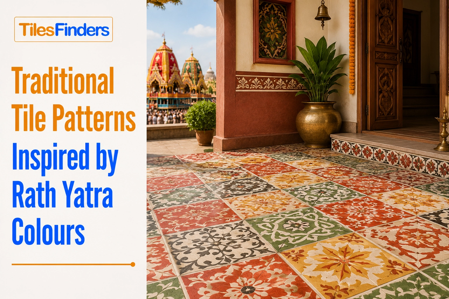
Inspired by the colours of Rath Yatra, this guide explores festive tile palettes, border designs, and geometric patterns that suit Indian homes while respecting traditional aesthetics. It also covers the best room applications, buying tips, and practical specifications to help you choose durable, culturally inspired GVT flooring for modern Indian interiors.
Rath Yatra, the annual chariot festival centred on Lord Jagannath and celebrated most famously in Puri, Odisha, carries one of the most recognisable and joyful colour palettes in Indian cultural life: the deep reds and golden yellows of the chariot canopies, the whites and blacks associated with the deities, and the saffron and vermilion of ceremonial cloth. These colours, worn by millions of pilgrims and painted across the towering wooden chariots each year, translate naturally into a warm, festive palette for Indian home design.
This guide draws on the documented colour language of Rath Yatra, chariot canopy tones, ceremonial textile colours, and the festival's broader visual identity to suggest tile colour palettes, borders, and geometric patterns for Indian homes. It focuses on colour and general pattern language rather than any sacred or iconographic imagery, since floor tiles are a walked-on surface and are not the appropriate place for religious symbols or deity representations.
The Rath Yatra Colour Palette
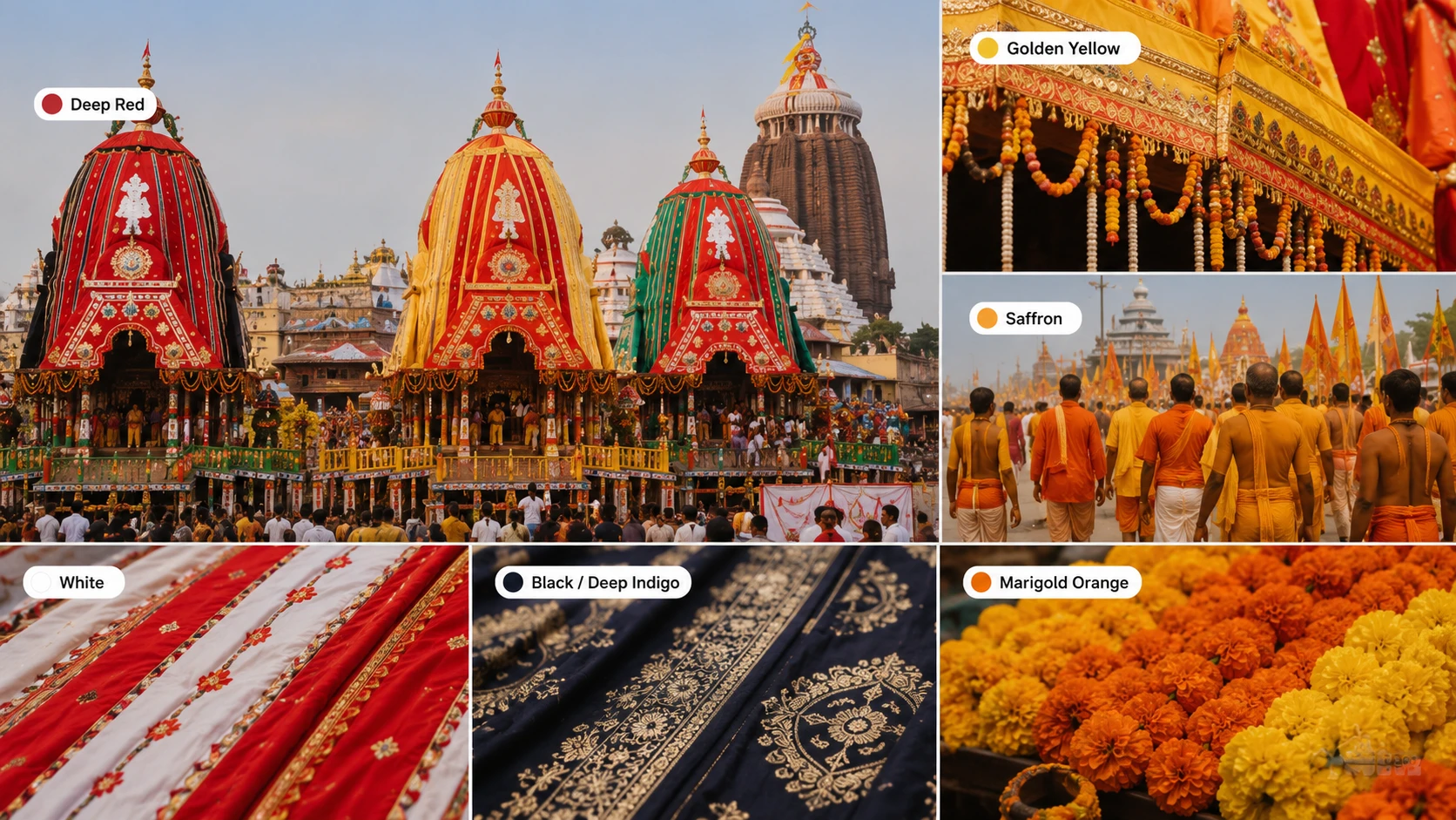
The visual identity of Rath Yatra draws from several distinct but related colour sources: the traditional deity-associated colours, the canopy and chariot colours, and the ceremonial textile and floral colours carried by pilgrims and used in decoration.
| Colour Source | Colour Description | Traditional Association |
| Deep red | A rich, saturated red, close to vermilion or deep crimson | The dominant colour of the chariot canopies and processional cloth |
| Golden yellow | A warm, bright golden-yellow | Associated with the canopy borders and ceremonial decoration |
| Saffron | A warm orange-yellow, between gold and true orange | The colour of the pilgrim cloth and the ceremonial flags carried during the procession |
| White | A clean, bright white | Associated with purity in the broader festival colour language and used in canopy striping |
| Black or deep indigo | A very dark, near-black tone with a slight blue undertone | A traditional deity-associated colour referenced in devotional art and textiles |
| Marigold orange | A warm, saturated orange | The colour of marigold garlands is used extensively in festival decoration |
Note: This guide translates the festival's colour palette into a home tile design. It does not suggest reproducing deity forms, chariot imagery, or any sacred iconography on floor tiles, since a floor is walked on and such imagery would not be appropriate there. Colour, stripe, and geometric border patterns are the respectful and design-appropriate way to bring this festival's visual warmth into a home.
Tile Pattern Ideas Using the Rath Yatra Palette
Idea 1: Red and Gold Striped Border Living Room
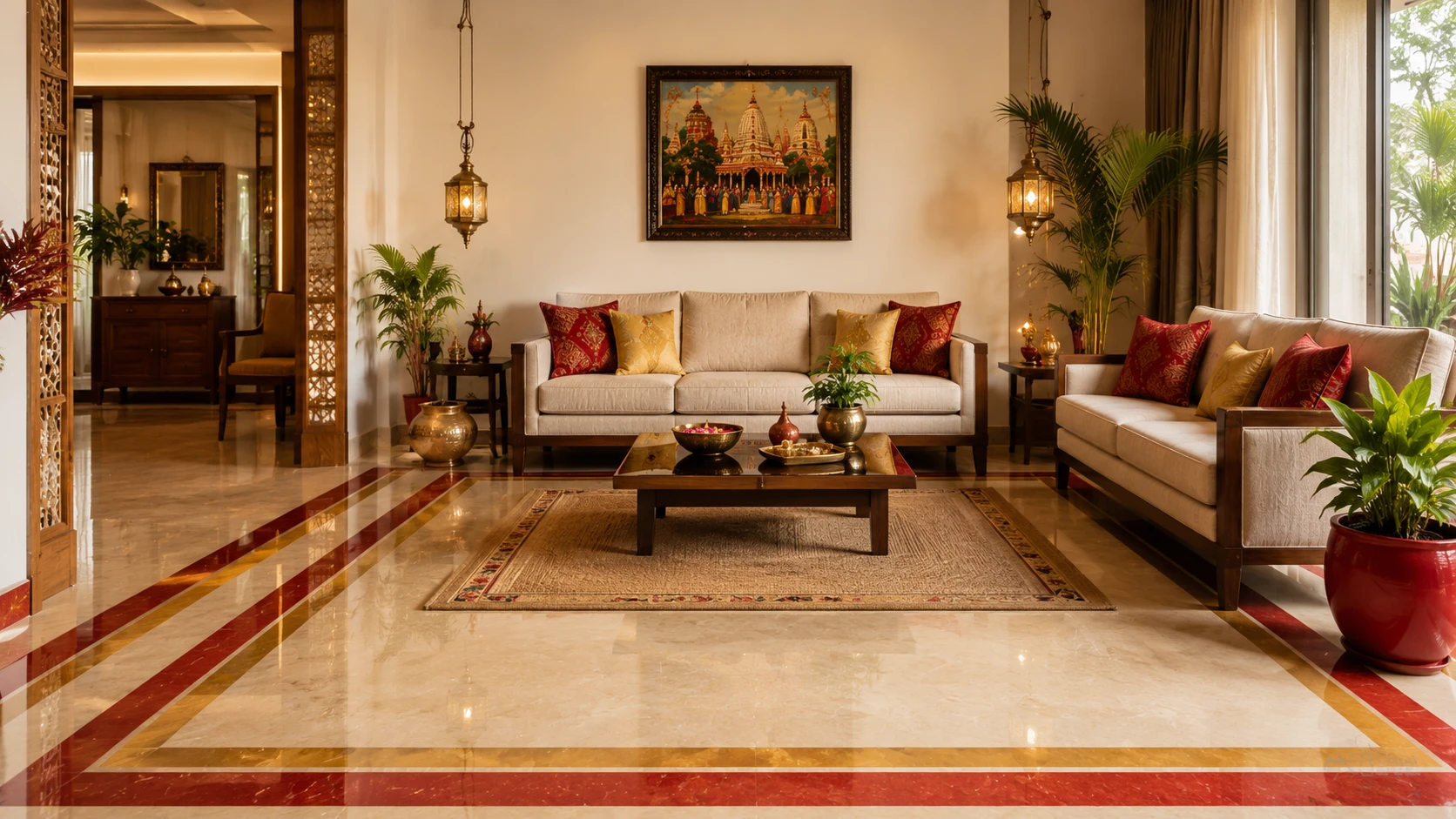
Deep red GVT field + golden yellow border stripe | 2x2 or 24x24 (600x600 mm) field, 1x2 (300x600 mm) border | Matte or anti-skid matte | Rs. 80 to Rs. 140/sq.ft combined
A deep red field floor with a golden yellow border stripe running two tiles deep at the room perimeter echoes the classic canopy colour pairing seen throughout the festival. This design suits a living room or formal reception area with a warm, celebratory brief, and the striped border reads as festive without any literal imagery.
Idea 2: Saffron and White Diagonal Diamond Pattern
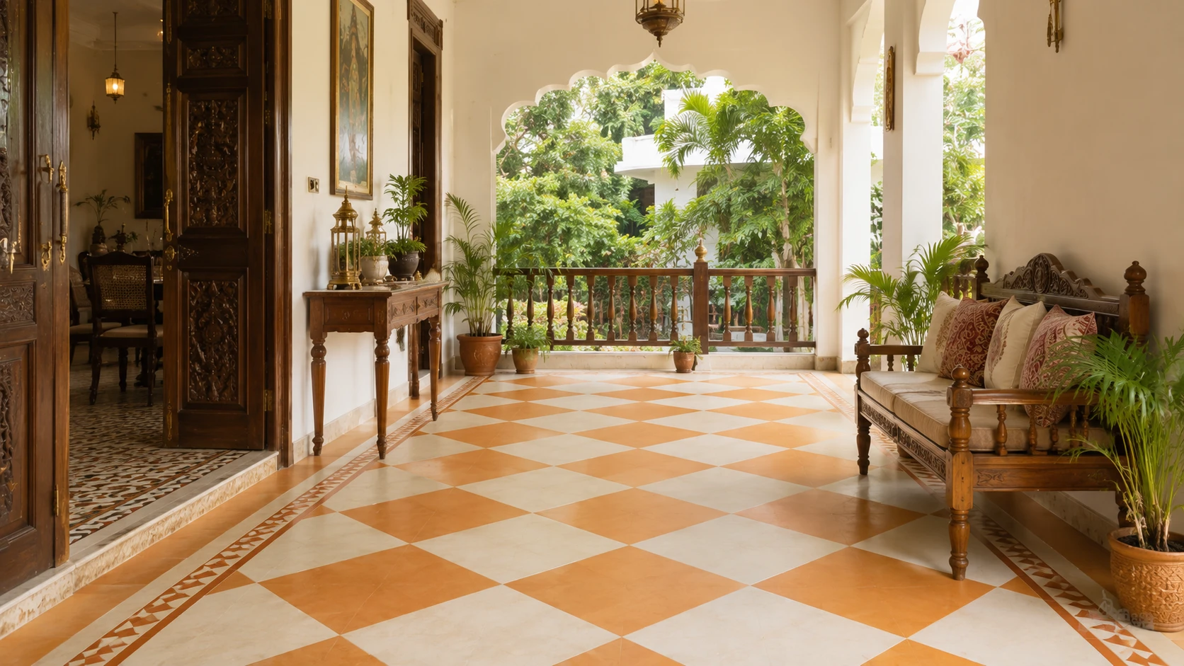
Saffron-orange GVT + white GVT | 1x1 or 12x12 (300x300 mm) diagonal | Anti-skid matte | Rs. 65 to Rs. 115/sq.ft combined
A diagonal diamond pattern alternating saffron and white tiles at a compact scale creates a warm, auspicious floor suited to a puja room, entrance foyer, or festival-decorated common area. This colour combination and diagonal pattern are already a recognised traditional Indian floor design language, and the saffron-white pairing directly references the festival's pilgrim cloth colours.
Idea 3: Golden Yellow Field with Deep Red Perimeter Frame
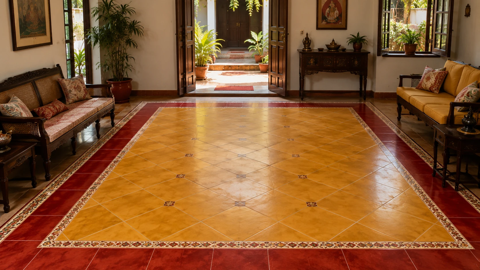
Golden yellow GVT field + deep red border | 2x2 or 24x24 (600x600 mm) field, 1x2 (300x600 mm) border | Matte | Rs. 75 to Rs. 135/sq.ft combined
A golden yellow field framed by a deep red border, the inverse colour arrangement of Idea 1, suits a puja room or festival-decoration common area where the golden tone should dominate. This combination is one of the most traditionally auspicious colour pairings in Indian home design, generally independent of any specific festival reference.
Idea 4: Marigold Orange Courtyard Floor
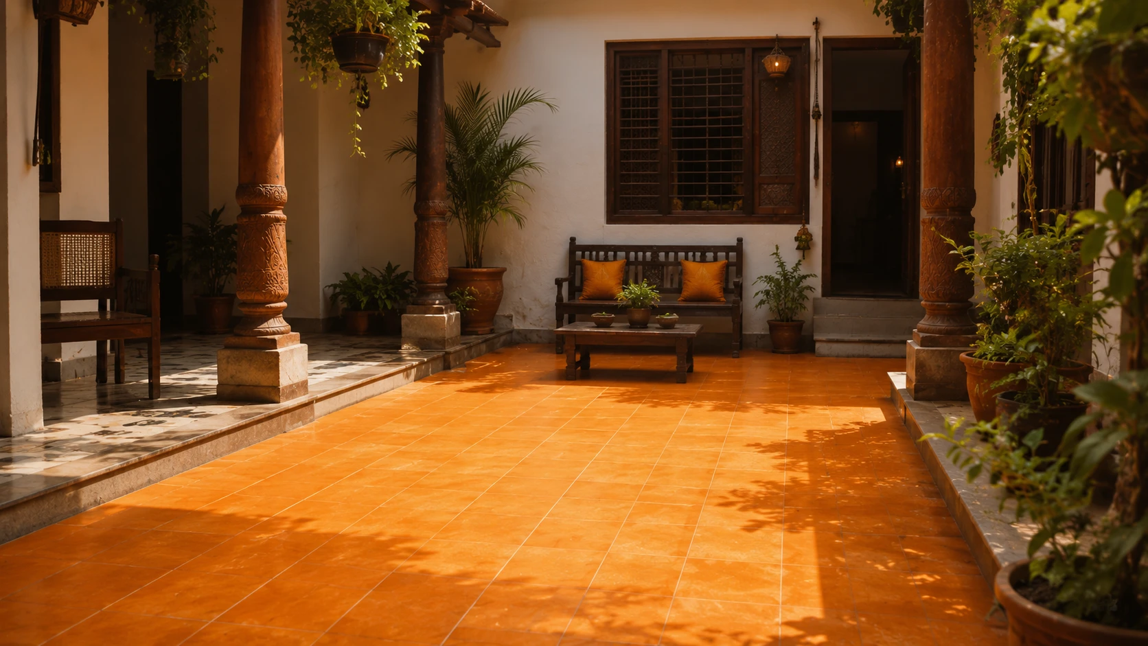
Marigold orange anti-skid GVT | 16x16 (400x400 mm) | Anti-skid matte | Rs. 65 to Rs. 115/sq.ft
A marigold orange anti-skid floor for a covered courtyard or verandah in an independent home evokes the warm floral colour central to festival decoration across India, not exclusively Rath Yatra. This is a warm, welcoming outdoor-adjacent floor suited to a home that regularly hosts gatherings and festival celebrations.
Idea 5: Black and Gold Geometric Accent Border
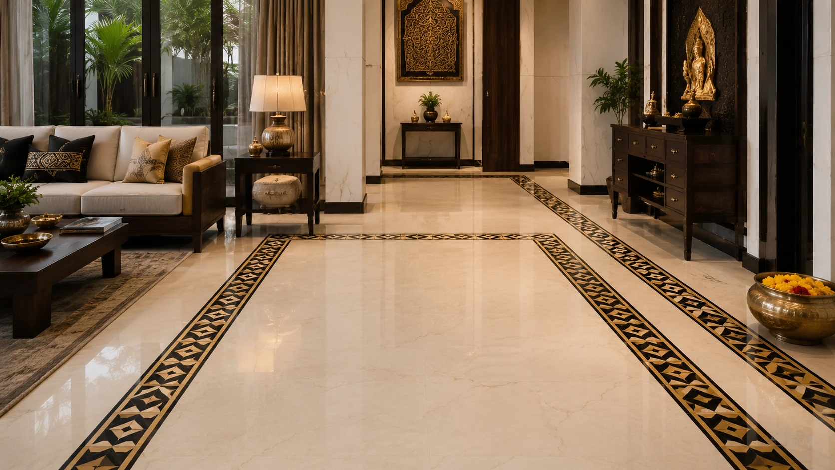
Black or deep indigo GVT + golden yellow accent tiles | 2x2 or 24x24 (600x600 mm) field, geometric cut inlay | Matte | Rs. 90 to Rs. 155/sq.ft combined
A geometric accent border combining a deep black or indigo tone with golden yellow cut inlay pieces creates a striking, formal pattern suited to a foyer or reception area. The dark and gold combination is a widely used formal Indian pairing, and referencing it here connects to the deity-associated black tone within the broader festival colour tradition.
Idea 6: White and Red Striped Corridor
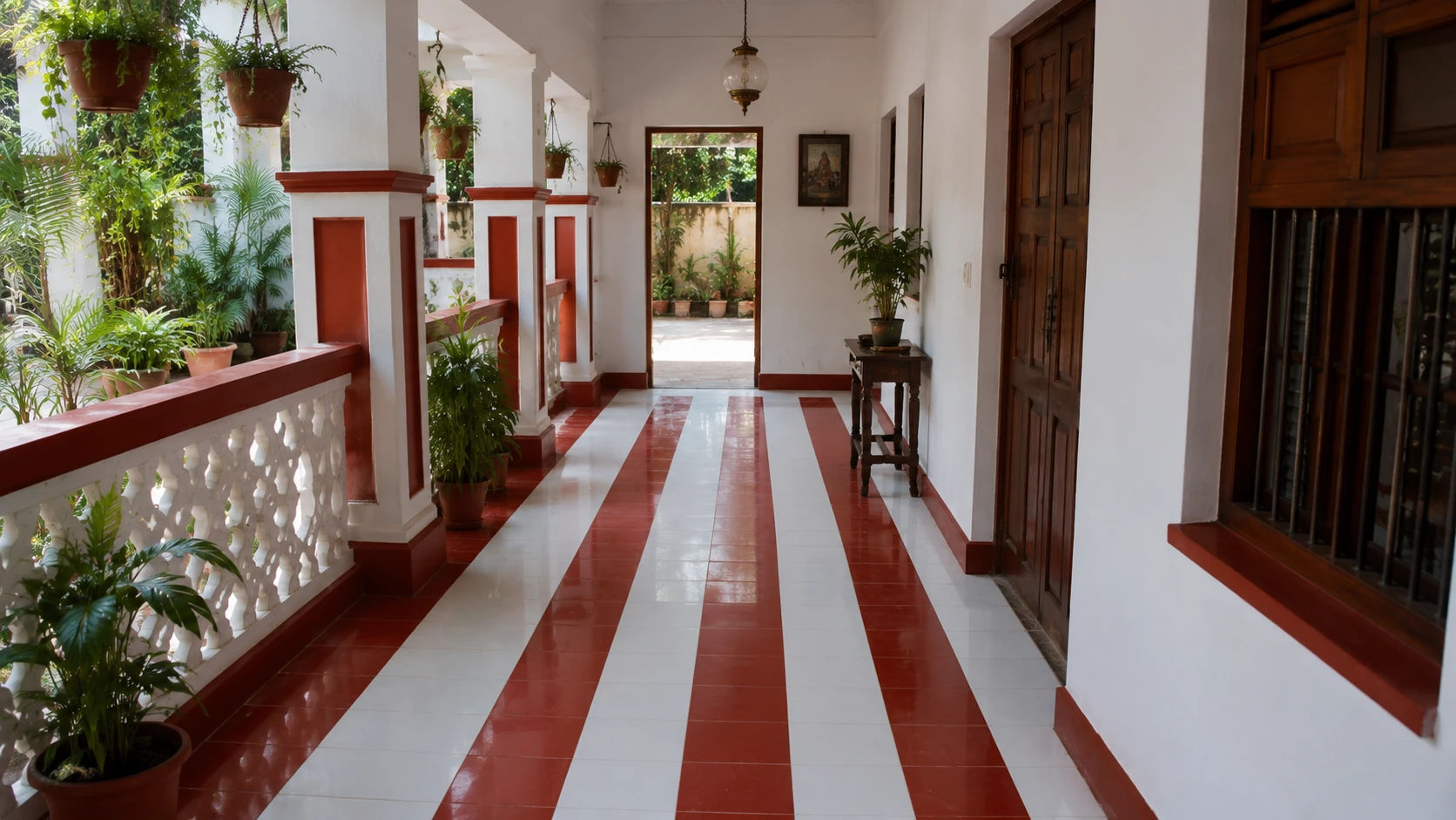
White GVT + deep red stripe accent | 1x2 (300x600 mm) plank with stripe insert | Matte | Rs. 80 to Rs. 140/sq.ft combined
A white plank floor with a narrow, deep red stripe insert running along the length of the corridor references the canopy striping seen on the festival chariots. The directional plank format suits a corridor application, and the stripe adds a considered, celebratory accent to an otherwise functional transitional space.
Where This Palette Works Best in Indian Homes
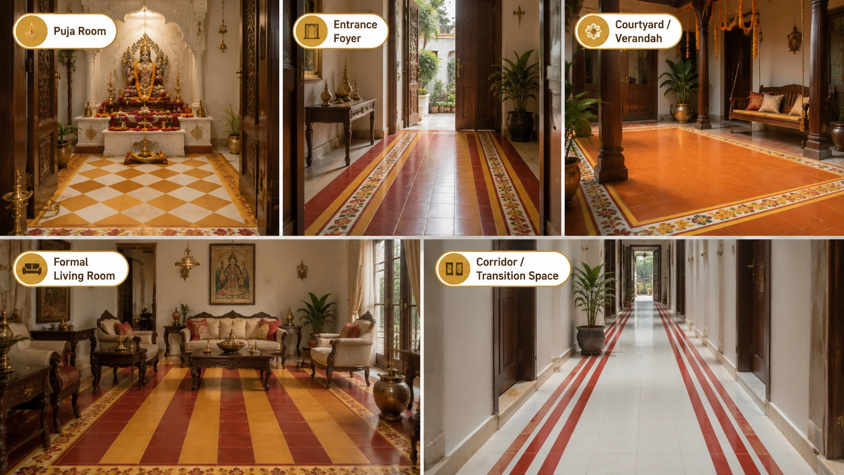
| Room | Suitability | Recommended Idea |
| Puja room | Excellent. The warm, auspicious colour language of the festival palette aligns naturally with the traditional colour priorities for a sacred home space. | Saffron and white diamond (Idea 2), golden field with red frame (Idea 3) |
| Entrance foyer | Very good. A warm, welcoming palette suited to a home's arrival point. | Red and gold striped border (Idea 1), black and gold geometric border (Idea 5) |
| Covered courtyard or verandah | Very good, particularly in a home that regularly hosts festival gatherings. | Marigold orange courtyard floor (Idea 4) |
| Formal living room | Good, for a household with a warm, maximalist Indian design brief. | Red and gold striped border (Idea 1) |
| Corridor or transition space | Good, as an accent rather than the full floor treatment. | White and red striped corridor (Idea 6) |
Buying Guide for Festival-Palette Tile Designs
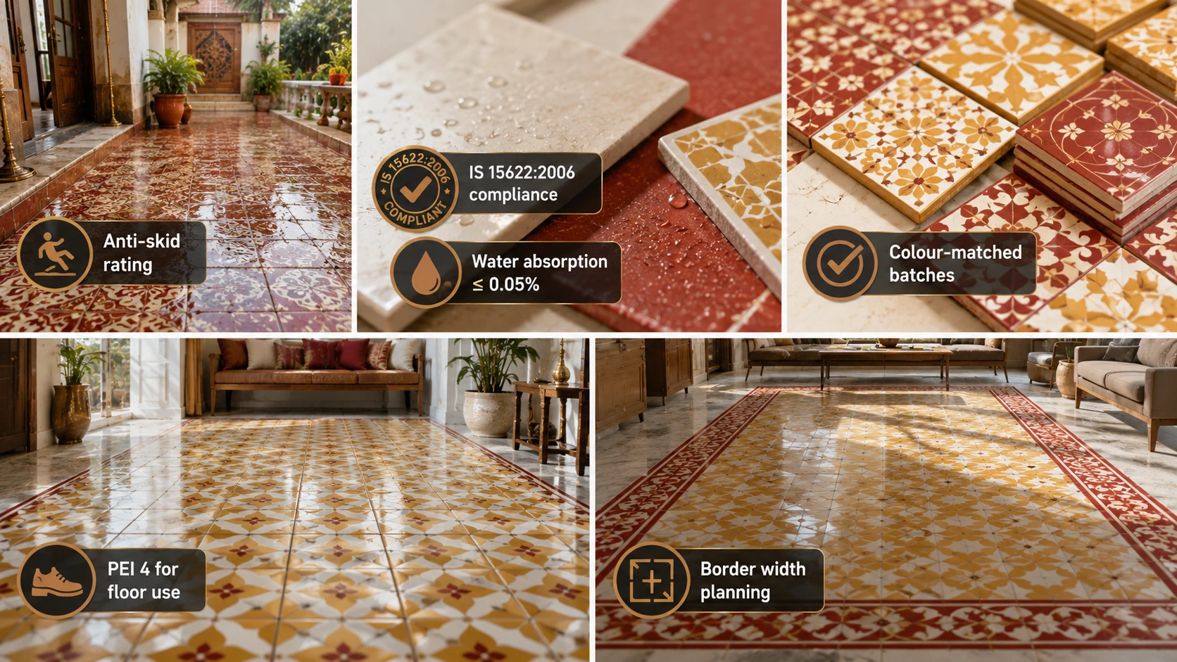
- Confirm anti-skid rating for any wet-area or entrance floor application, since foyer and courtyard applications commonly receive wet footwear traffic.
- Confirm IS 15622:2006 compliance and water absorption at 0.05% or below for GVT.
- Order border and field tiles from batches that are colour-matched together, since the saturated reds, golds, and whites in this palette show batch inconsistency more visibly than muted neutral tones.
- Confirm PEI 4 for any floor application with regular foot traffic.
- Plan the border or stripe width relative to the room's proportions before ordering. A border that is too narrow reads as an afterthought; one that is too wide overwhelms the field colour. Two tiles deep is a reliable starting proportion for most room sizes.
Festival-Colour GVT Tiles in India: Manufacturing Context
Deep red, golden yellow, saffron, white, and black GVT tiles across the sizes referenced in this guide are manufactured in Morbi, Gujarat, under IS 15622:2006 at water absorption 0.05% or below. Saturated solid-colour tiles in this palette are generally available at 1x1 or 12x12 (300x300 mm) and 2x2 or 24x24 (600x600 mm) from most manufacturers, while border and strip formats such as 1x2 (300x600 mm) in matching or complementary tones require confirming availability with the specific supplier before finalising a combined field-and-border order.
This colour language, warm reds, golds, saffron, and white, appears across Indian festival design more broadly, from Diwali to regional harvest festivals, and tile designs built around it suit homes that celebrate festivals with decoration and gatherings throughout the year, not exclusively during Rath Yatra itself.
Browse Festival-Palette Tiles on TilesFinders
Deep red, golden yellow, saffron, white, and black GVT tiles for border, field, and accent applications are available on TilesFinders from verified Morbi manufacturers. Confirm batch colour matching for any combined field-and-border order before placing a bulk purchase.
FAQs
Deep red and golden yellow dominate the chariot canopy colours, saffron is associated with ceremonial cloth and flags, white and black or deep indigo are traditional deity-associated colours in devotional art, and marigold orange is prominent in festival floral decoration. Together,r these form a warm, celebratory palette widely referenced in Indian design during festival seasons.
Yes, using the colour palette associated with a festival in home design, borders, stripes, and geometric patterns, is a common and respectful design practice in India. This guide focuses specifically on colour and general pattern language rather than any sacred imagery, since deity forms or chariot representations would not be appropriate on a walked-on floor surface.
The puja room is the most naturally suited application, since the warm, auspicious colour language aligns with traditional priorities for a sacred home space. Entrance foyers and covered courtyards, particularly in homes that regularly host festival gatherings, are also strong applications.
1x1 or 12x12 (300x300 mm) laid on a diagonal is the traditional scale for this pattern, suited to puja rooms and compact foyers. The small format allows the diamond pattern to read clearly without overwhelming a modestly sized room.

See our tile guides first
Set TilesFinders as a preferred source and our buying guides surface ahead of the rest for you.
Add as preferred sourceTakes one tap. Nothing to install.
What Readers Say
I was about to redo my parking area with the wrong tile size until I read this. The layout comparisons saved me from a costly mistake.
We reference TilesFinders guides while briefing clients on material selection. The size and pattern breakdowns are accurate and easy to explain visually.
On site, I get asked about grout spacing all the time. This article gave me a solid reference I now share with my team before every job.
Finally a guide that doesn't just push generic advice. The oil stain removal steps actually worked on our clubhouse driveway tiles.
I run a small construction firm and now send this link to clients directly when they ask about entrance tile sizing. Saves me an hour of explaining.
Good practical detail, though I wish there were more examples for compact apartment entrances specifically, not just villas.
My mother-in-law wanted marble, I wanted vitrified. This blog gave us the neutral comparison we needed to actually decide together.
Detailed without being overwhelming. I appreciated that it covered both cost and maintenance, not just the aesthetics.
Used the algae and hard water removal tips on our terrace tiles after the monsoon. Worked better than what our regular cleaner was doing.
As someone who sources tiles for multiple builder projects, I find these comparisons genuinely useful for vendor conversations, not just consumer content.
Recommended this to a client who kept second-guessing the entrance design. The small vs large layout section settled the debate instantly.
Straightforward and honest, no unnecessary jargon. Would like to see a similar breakdown for outdoor pool-deck tiles next.
We've bookmarked several TilesFinders guides for our design handbook. Reliable source when clients want data, not just opinions.
Two paths, one marketplace.
Get free quotes from verified suppliers.
Share your room, budget, and style. Suppliers in Morbi respond within hours.
Get Free QuotesList your business, reach real buyers.
Put your showroom in front of homeowners searching for tiles right now.
List Your Business