Sandune Tiles in India: Warm Desert-Tone Design Guide for Modern Minimalist Homes
Discover Sandune tiles for warm, minimalist Indian interiors, with practical guidance on shades, room suitability, furniture pairings, finishes, and selection tips for a cohesive look.
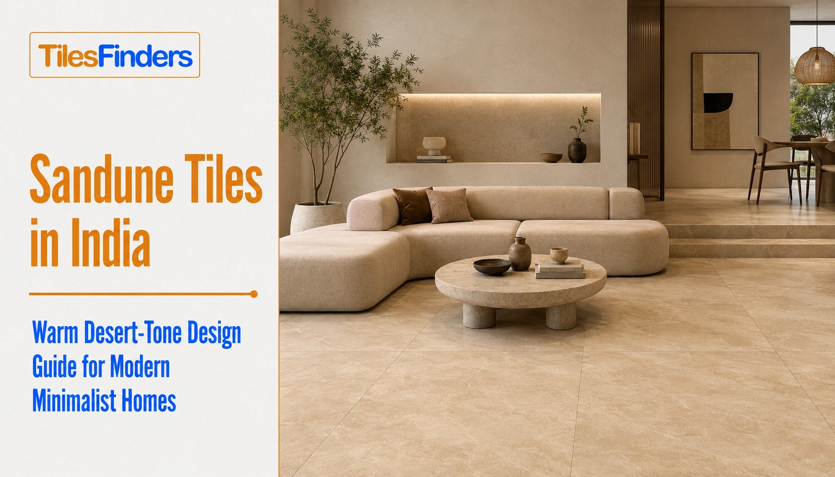
Sandune tiles bring a warm, golden-tan desert tone that adds depth to minimalist Indian interiors without overwhelming the space. They work especially well for living rooms, bedrooms, open-plan floors, and selected bathroom walls, with the right finish and undertone.
Sandune sits in its own specific register within the warm neutral family, a soft, golden-tan tone that references the graduated colour of an actual dune rather than the flatter, cooler read of standard beige or greige tiles. This guide covers what makes sandune colour tiles distinct, where the tone belongs, and how to pair it correctly for a genuinely minimalist Indian interior.
Quick take: Sandune tiles are a warm, golden-tan neutral, distinct from plain beige tiles or grey-leaning greige tiles by its visible warmth and soft tonal gradient. It works as a full-room neutral in a way bolder warm tones cannot, priced roughly Rs. 70 to Rs. 180 per sq.ft across matte, satin matte, and anti-skid finish tiles.
What Makes Sandune Tiles Distinct
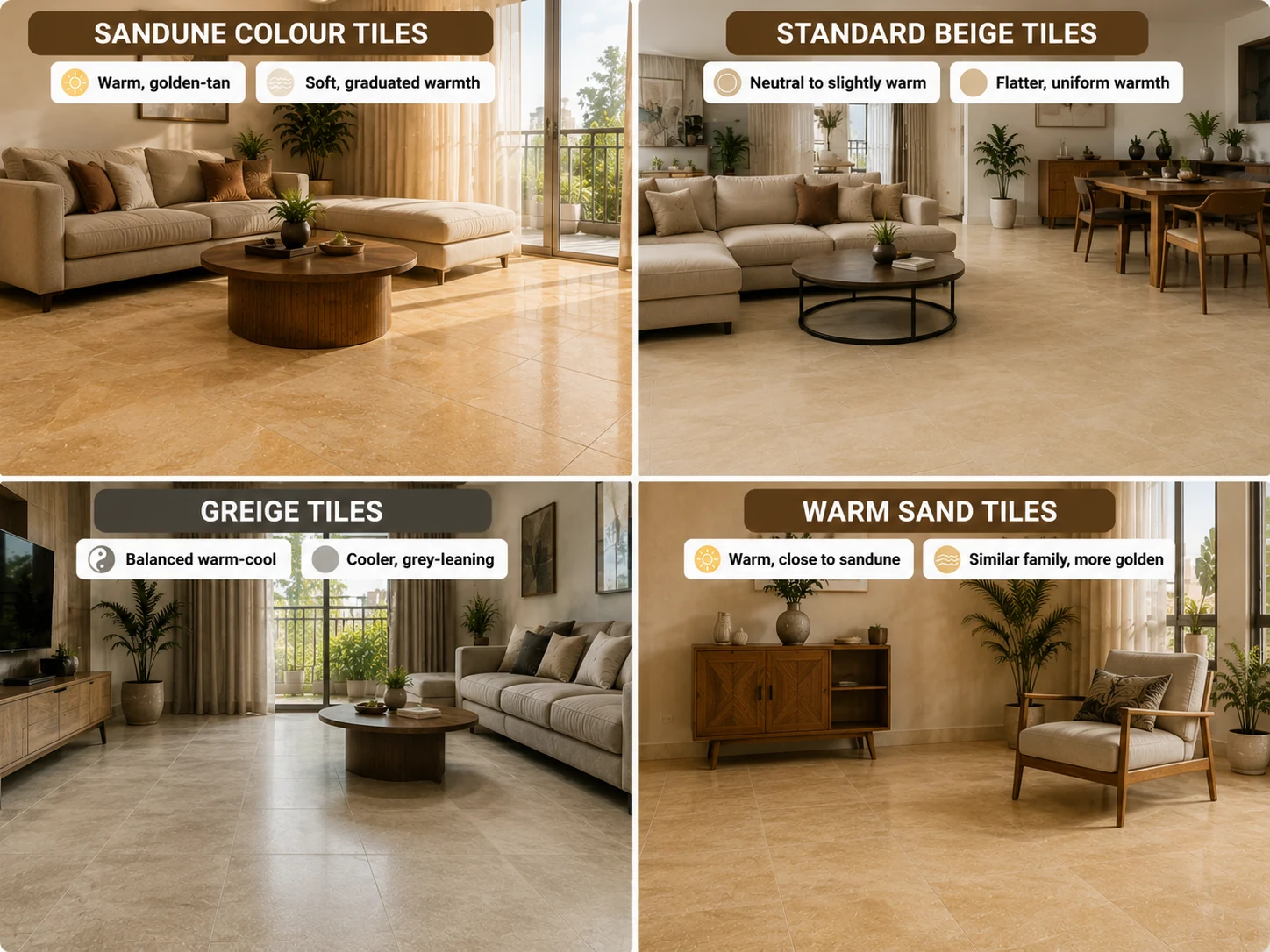
| Tone | Undertone | Visual Character |
| Sandune colour tiles | Warm, golden-tan | Soft, graduated warmth referencing actual desert sand, neither flat nor high-contrast |
| Standard beige tiles | Neutral to slightly warm | Flatter, more uniform warmth without Sandune's graduated quality |
| Greige tiles | Balanced warm-cool | Cooler and more grey-leaning than Sandune, a different neutral register entirely |
| Warm sand tiles | Warm, close to Sandune | Similar family, though Sandune specifically references the deeper, more golden end of this warm-neutral range |
Why Sandune Works for Minimalist Interiors
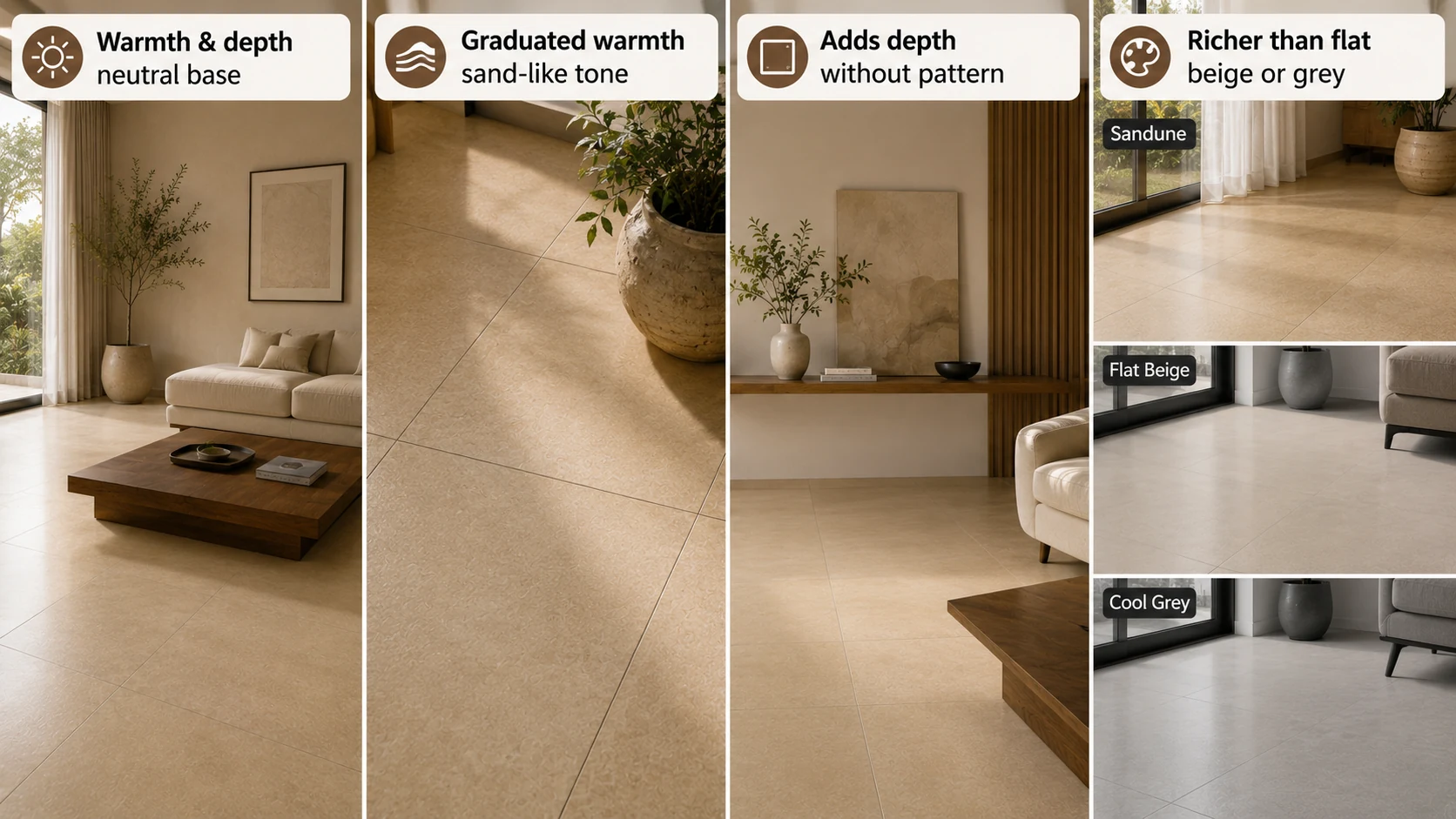
The minimalist logic behind this specific tone: A genuinely minimalist room depends on its neutral base carrying real warmth and depth, since there is no pattern, colour accent, or ornamentation to add visual interest elsewhere. Sandune colour tiles deliver that depth through their graduated, sand-like warmth rather than through print or texture, which is precisely why the tone reads as considered rather than plain in a room stripped back to its essentials. A flatter beige or a cooler grey does not carry the same quiet richness at minimalist scale.
From The Marketplace
Popular tiles right now
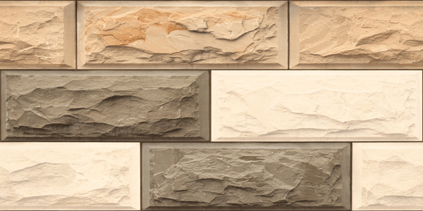
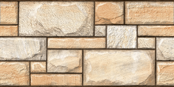
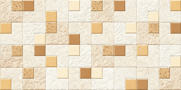
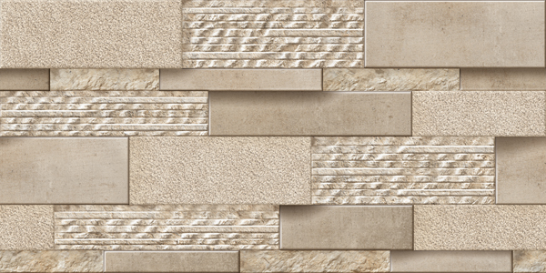
Sandune Tonal Range
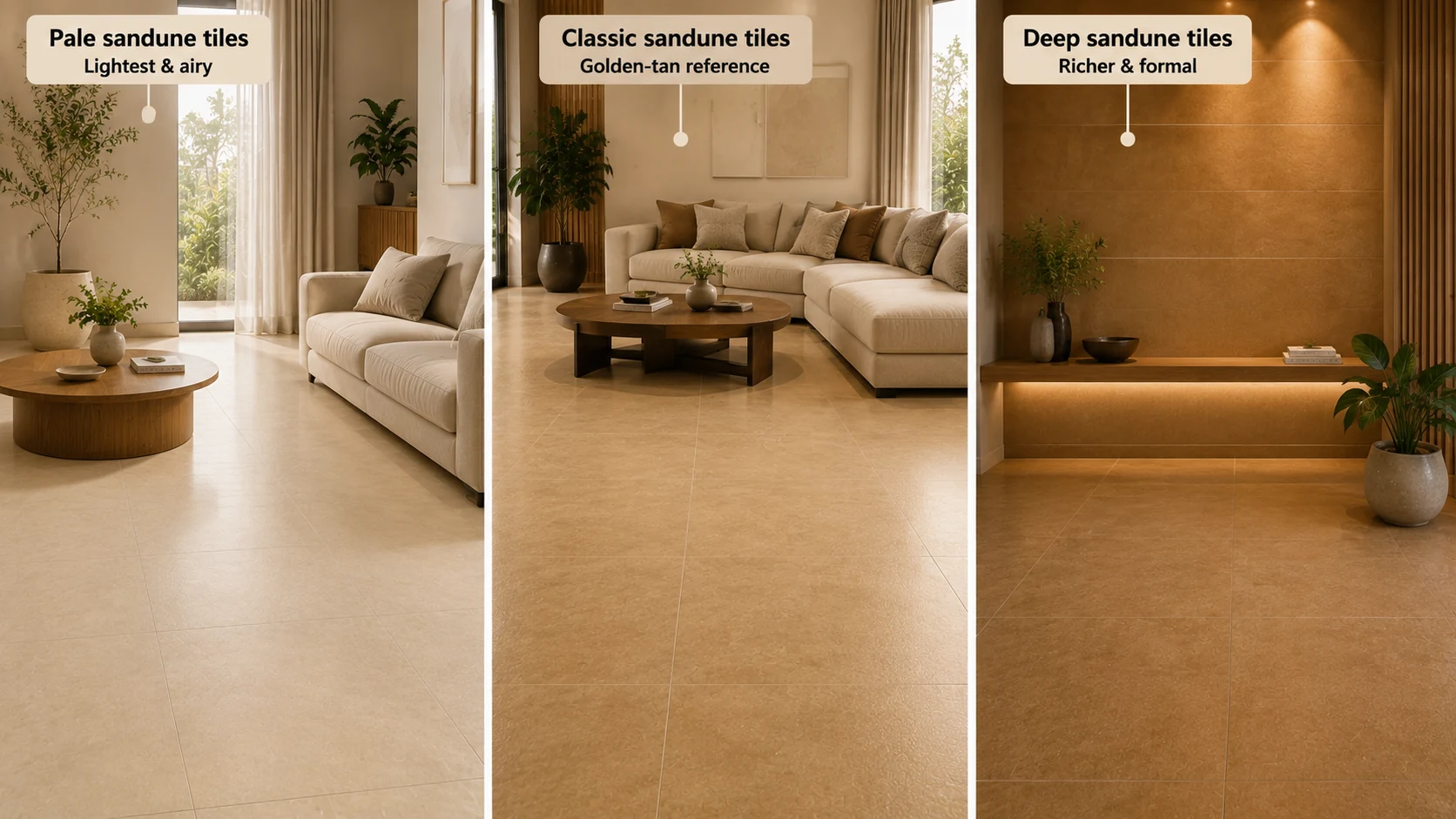
| Shade | Character | Best Application |
| Pale sandune tiles | The lightest, most approachable end of the range | Full-room floor tiles, compact spaces wanting a light, airy neutral |
| Classic sandune tiles | The core golden-tan reference tone | Living room floor tiles, bedroom floor tiles, general minimalist application |
| Deep Sandune tiles | Richer, more formal, closer to a warm caramel | Accent walls, borders, smaller statement zones |
Where Sandune Tiles Genuinely Work
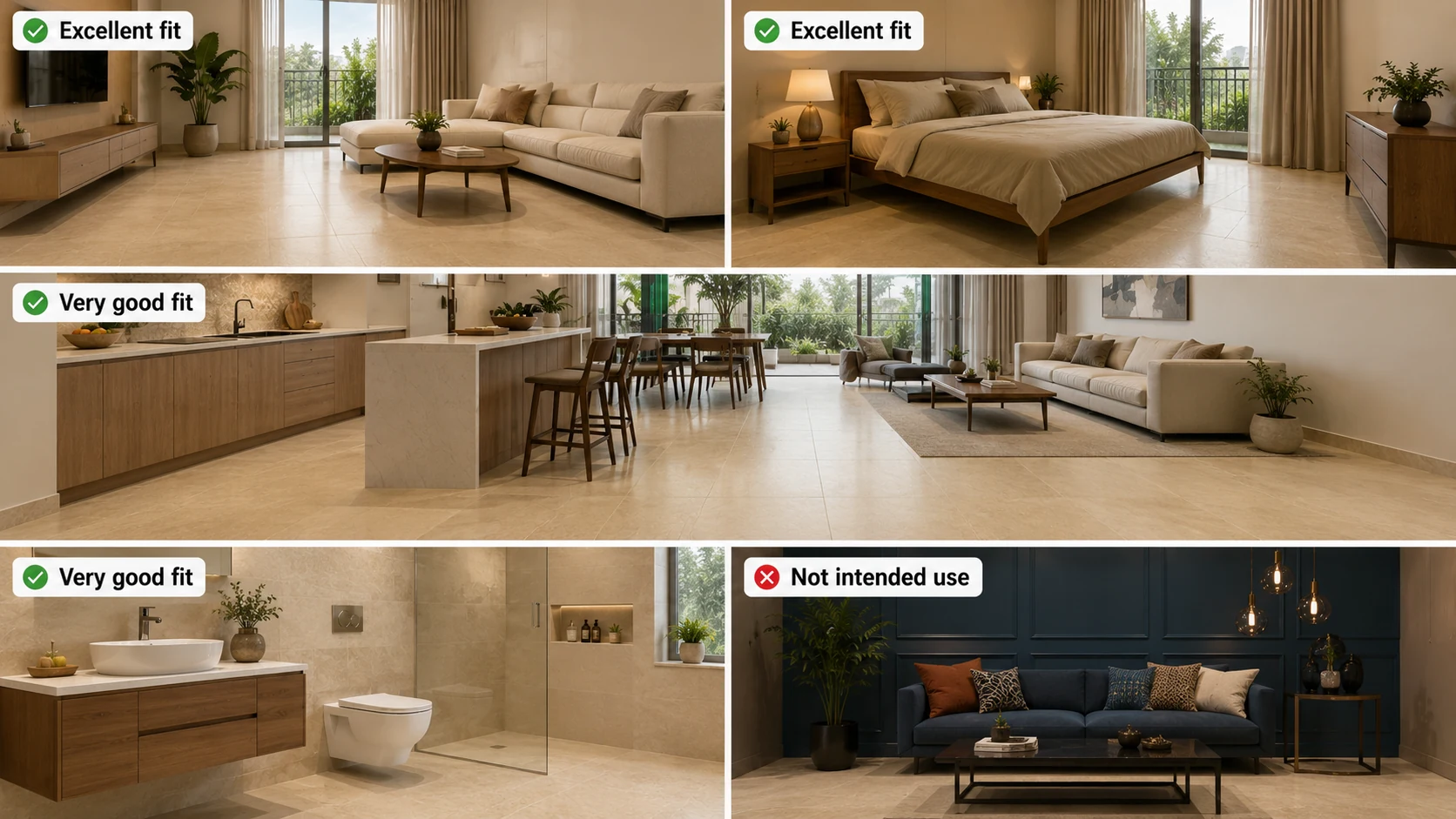
| Application | Suitability | Why |
| Minimalist living room floor tiles | Excellent | The tone's graduated warmth carries a stripped-back room without needing additional pattern or colour. |
| Bedroom floor tiles | Excellent | A calm, warm neutral suited to a restful room, working with light or dark wood furniture equally well.l |
| Open-plan kitchen and living floor tiles | Very good | Consistent warmth across a large connected space without the maintenance demand a bolder colour would carry |
| Bathroom wall tiles, dry zone | Very good | Brings warmth to a bathroom that might otherwise rely entirely on cool, flat surfaces |
| Bold accent or statement application | Not the intended use | Sandune is considered neutral, not a colour designed to carry a room's visual drama alone. |
Pairing Sandune Correctly
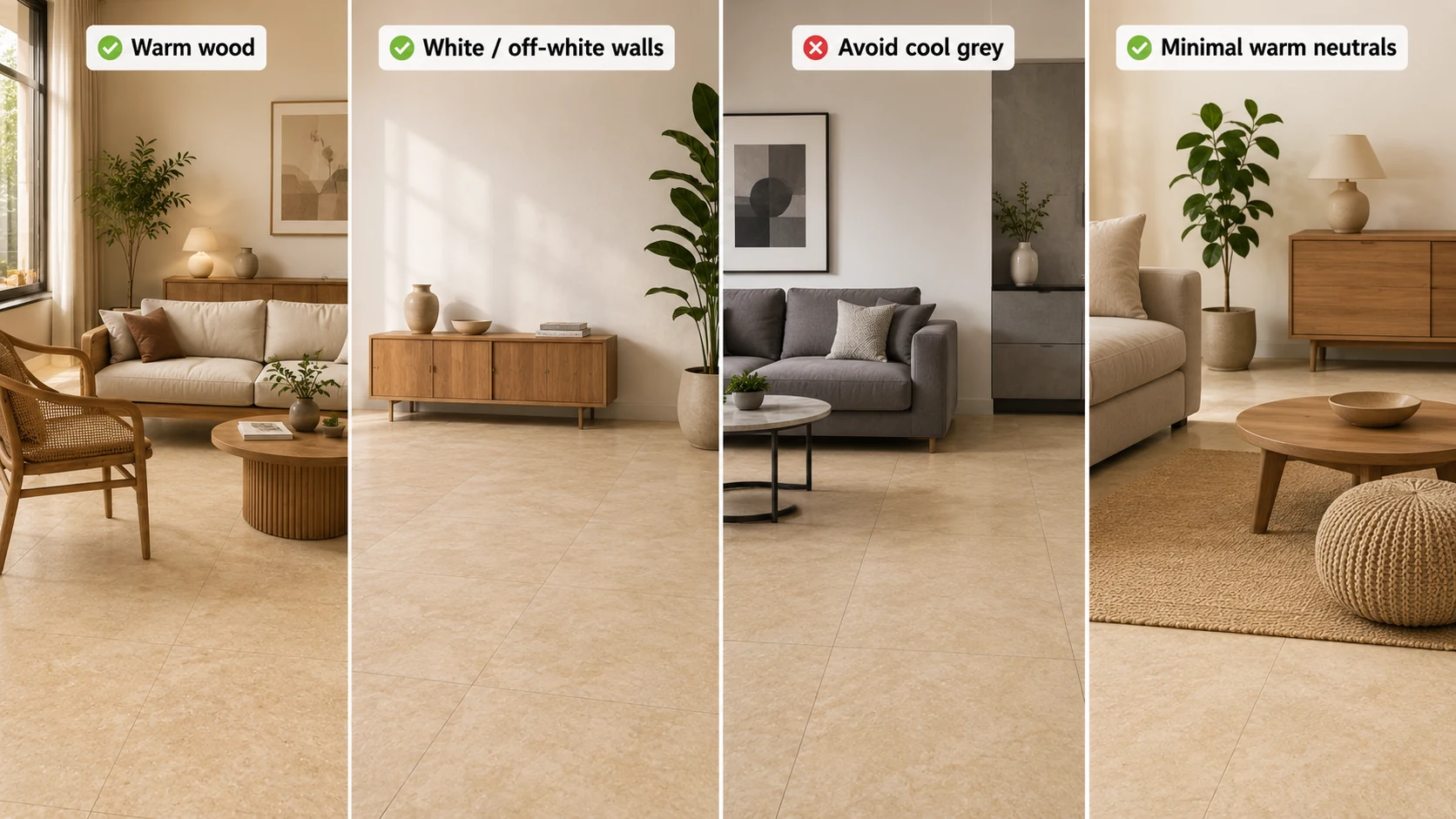
- Pair with warm or natural wood furniture for the most cohesive minimalist result, since Sandune's warmth reads best alongside materials sharing a similar undertone.
- Use white or off-white walls to let the floor tiles carry the room's warmth without competing for visual attention.
- Avoid pairing with cool-toned grey accents, which can fight sandune's warm undertone rather than complementing it.
- Keep accessories and textiles minimal and in the same warm-neutral family, reinforcing rather than interrupting the room's considered simplicity.
Buying Checklist
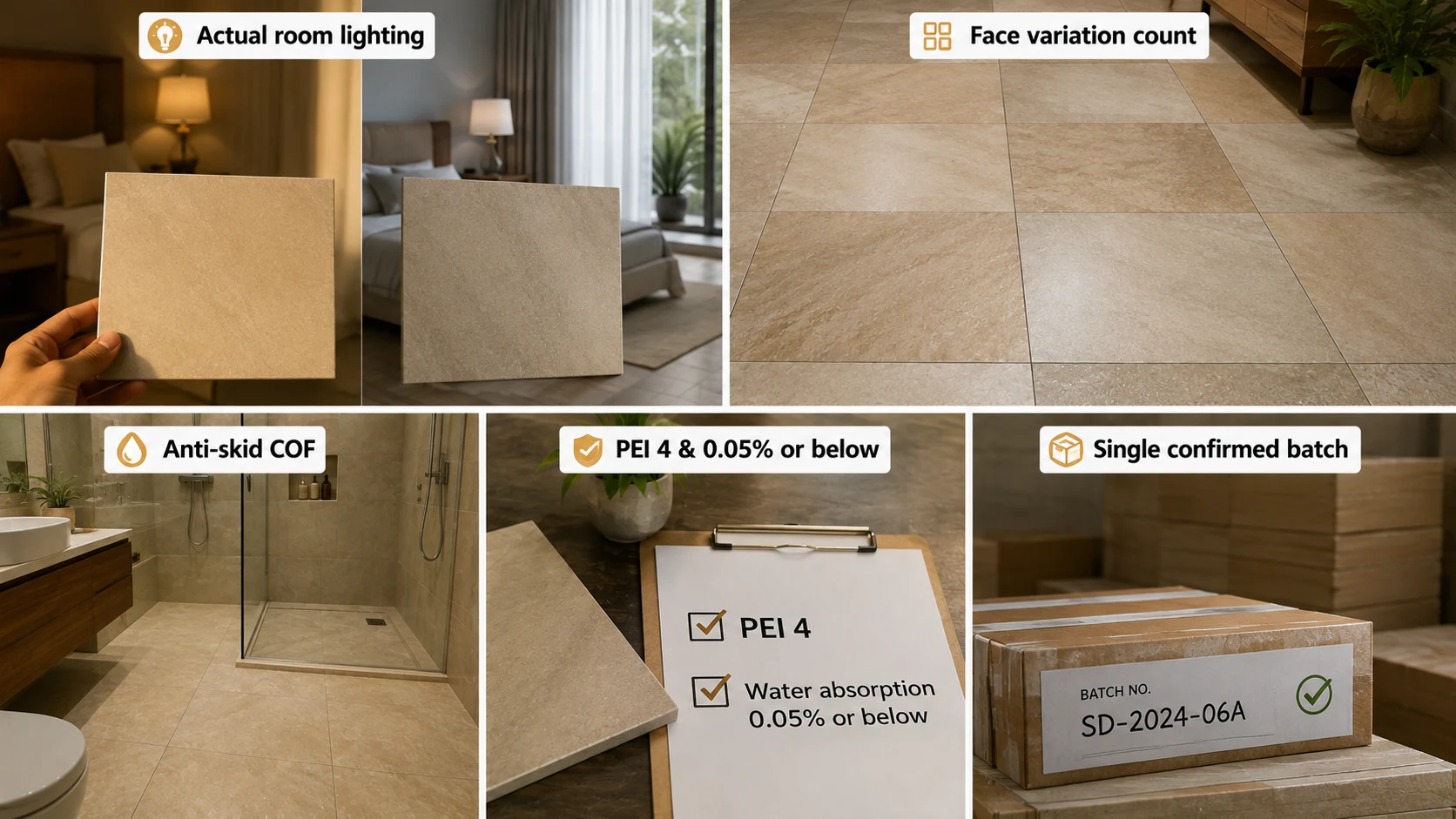
- Request a physical sample under your actual room lighting, since sandune's graduated warmth can read differently under warm-white versus cool-white light sources.
- Confirm face variation count, since the tone's visual interest depends on genuine gradient variation between tiles rather than a flat, repeating print.
- Confirm anti-skid COF for any bathroom or wet-area application.
- Confirm PEI 4 and water absorption at 0.05% or below for any floor tile purchase.
- Order from a single confirmed batch, since warm-toned tiles show batch inconsistency more visibly than cooler neutrals.
Sandune Tiles in India: 2026 Manufacturing Context
Sandune colour tiles are produced across Morbi, Gujarat and other Indian ceramic manufacturing centres as part of standard warm-neutral GVT ranges, with the specific graduated, sand-like print quality varying somewhat between manufacturers. Request a multi-tile layout sample rather than a single tile swatch when evaluating this tone, since its defining visual gradient is only fully visible once several tiles are viewed together, and request the manufacturer's published face variation count in writing before ordering at scale.
Explore Sandune Tiles on TilesFinders
Pale, classic, and deep sandune colour tiles for living rooms, bedrooms, and bathroom walls can be compared by tone and finish on TilesFinders, with sample layout previews available before you commit to a full-room order.
FAQs
Sandune is a warm, golden-tan neutral tile colour with a soft, graduated tonal quality referencing an actual dune, distinct from flatter beige tiles or cooler greige tiles.
Related but distinct. Sandune sits within the warm neutral family but carries a more golden, graduated warmth than standard beige tiles, and reads noticeably warmer than greige tiles, which lean cooler and more grey.
Yes, particularly well suited, since a minimalist room depends on its neutral base carrying real warmth and depth in the absence of pattern or colour accents, and sandune's graduated tone delivers that depth without introducing ornamentation.
Warm or natural wood furniture pairs most cohesively, since sandune's warmth reads best alongside materials sharing a similar undertone, while white or off-white walls let the floor carry the room's warmth without competition.
Yes, particularly on dry-zone walls, bringing warmth to a bathroom that might otherwise rely entirely on cool, flat surfaces. Confirm anti-skid COF separately for any floor application.
Sandune colour tiles range from roughly Rs. 70 to Rs. 180 per sq.ft depending on finish, format, and tonal depth, with deep sandune and larger formats generally at the upper end of that range.
Sandune works well as a full-room neutral, unlike a bolder warm tone, given its considered, non-competing character. Deep Sandune specifically suits a smaller accent zone or border rather than full-room coverage.
Request a multi-tile layout sample rather than a single swatch, since the tone's defining gradient quality is only fully visible once several tiles are viewed together, and evaluate under your actual room lighting rather than showroom lighting alone.


See our tile guides first
Set TilesFinders as a preferred source and our buying guides surface ahead of the rest for you.
Add as preferred sourceTakes one tap. Nothing to install.
What Readers Say
I was about to redo my parking area with the wrong tile size until I read this. The layout comparisons saved me from a costly mistake.
We reference TilesFinders guides while briefing clients on material selection. The size and pattern breakdowns are accurate and easy to explain visually.
On site, I get asked about grout spacing all the time. This article gave me a solid reference I now share with my team before every job.
Finally a guide that doesn't just push generic advice. The oil stain removal steps actually worked on our clubhouse driveway tiles.
I run a small construction firm and now send this link to clients directly when they ask about entrance tile sizing. Saves me an hour of explaining.
Good practical detail, though I wish there were more examples for compact apartment entrances specifically, not just villas.
My mother-in-law wanted marble, I wanted vitrified. This blog gave us the neutral comparison we needed to actually decide together.
Detailed without being overwhelming. I appreciated that it covered both cost and maintenance, not just the aesthetics.
Used the algae and hard water removal tips on our terrace tiles after the monsoon. Worked better than what our regular cleaner was doing.
As someone who sources tiles for multiple builder projects, I find these comparisons genuinely useful for vendor conversations, not just consumer content.
Recommended this to a client who kept second-guessing the entrance design. The small vs large layout section settled the debate instantly.
Straightforward and honest, no unnecessary jargon. Would like to see a similar breakdown for outdoor pool-deck tiles next.
We've bookmarked several TilesFinders guides for our design handbook. Reliable source when clients want data, not just opinions.
Two paths, one marketplace.
Get free quotes from verified suppliers.
Share your room, budget, and style. Suppliers in Morbi respond within hours.
Get Free QuotesList your business, reach real buyers.
Put your showroom in front of homeowners searching for tiles right now.
List Your Business