Monochrome Tile Pairing Guide: Grout, Trim and Furniture Colour Combinations for Indian Rooms
Learn how to pair monochrome tiles with the right grout, skirting, trim, furniture, and metal finishes. This practical guide helps create balanced black, white, grey, and bold single-colour interiors.
- The Grout Rule for Monochrome Schemes
- Edge Trim and Skirting Colour
- Furniture and Textile Colour Pairing by Monochrome Family
- Metal Fixture Finish by Monochrome Family
- Common Pairing Mistakes
- Sourcing Matched Grout, Trim, and Tile in India: 2026 Context
- Browse Monochrome Tile and Trim on TilesFinders
A successful monochrome room depends on more than tile colour. Match grout, trim, skirting, furniture, and fixtures carefully to maintain tonal consistency and achieve a clean, cohesive interior.
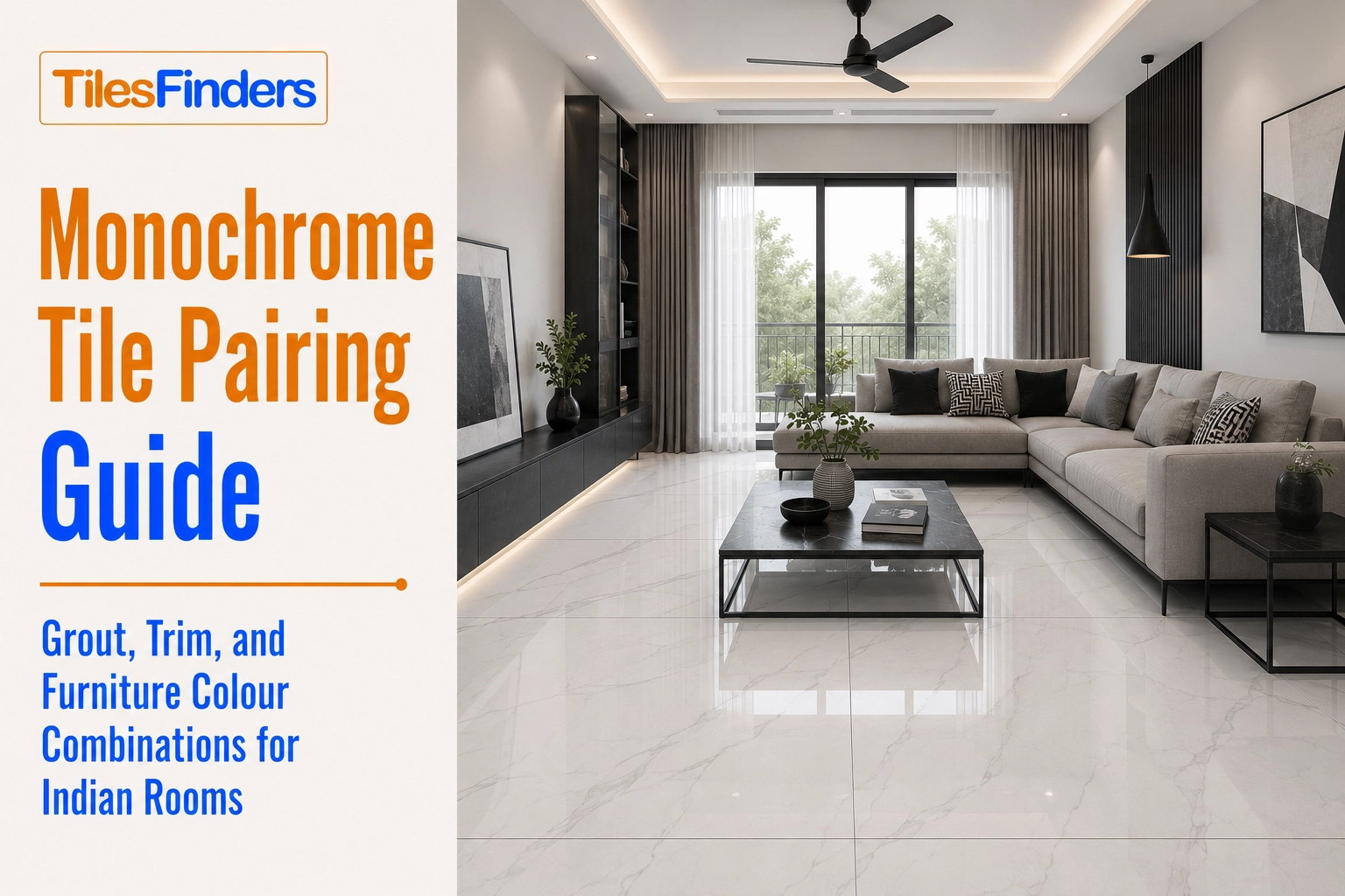
A monochrome tile scheme is only as good as its supporting details. The grout colour, the edge trim finish, and the furniture tone chosen alongside the tile either reinforce a monochrome scheme's tonal discipline or quietly undermine it. This guide is a practical pairing reference covering exactly those three decisions for black, white, grey, and bold single-hue monochrome rooms in Indian homes.
The Grout Rule for Monochrome Schemes
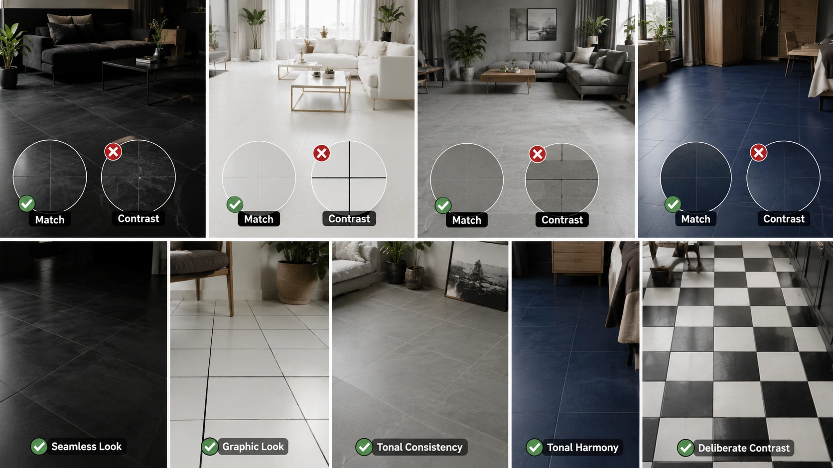
Grout is the one element in a monochrome room that touches every single tile joint, which makes it the detail most capable of either completing or breaking the tonal discipline the rest of the scheme has built.
| Tile Tone | Matched Grout Approach | Contrast Grout Approach | When to Use Which |
| All-black or near-black | Charcoal or dark grey grout, nearly invisible against the tile | White or pale grey grout, creating a visible grid pattern | Match for a seamless, continuous dark surface; contrast only as a deliberate graphic statement, most effective on a floor rather than a wall |
| All-white or near-white | Ivory or very pale grey grout, softly blending with the tile | Black or charcoal grout, creating starkly visible joints | Match for a calm, continuous light surface; contrast for a deliberately graphic, high-drama floor pattern such as a checkerboard |
| All-grey (any value) | Grout was toned to match the specific grey shade used | Rarely used; grey tiles with contrast grout tend to read as unfinished rather than deliberate | Match in almost all cases; grey is the family where tonal grout consistency matters most |
| Bold single hue (navy, forest green, terracotta) | Grout-toned within the same hue family as the tile | Not recommended except for a narrow accent border | Match for the full field; a contrast grout across a large hue-based floor breaks the tonal cohesion that the scheme depends on |
The core principle: Matched grout preserves the illusion of a continuous surface, which is what makes a monochrome tile floor read as considered stone or slab rather than assembled tile. Contrast grout is a legitimate design choice, but it should be a decision made deliberately for a specific graphic effect, a checkerboard, a bold geometric border, not a default that happens because white grout was the installer's standard stock.
Before choosing grout, trim, or furniture, it's worth understanding how a complete single-colour scheme works. Explore our Monochrome Tiles in India guide to learn how bold monochrome interiors are planned using the right colours, finishes, and textures for modern Indian homes.
From The Marketplace
Popular tiles right now




Edge Trim and Skirting Colour
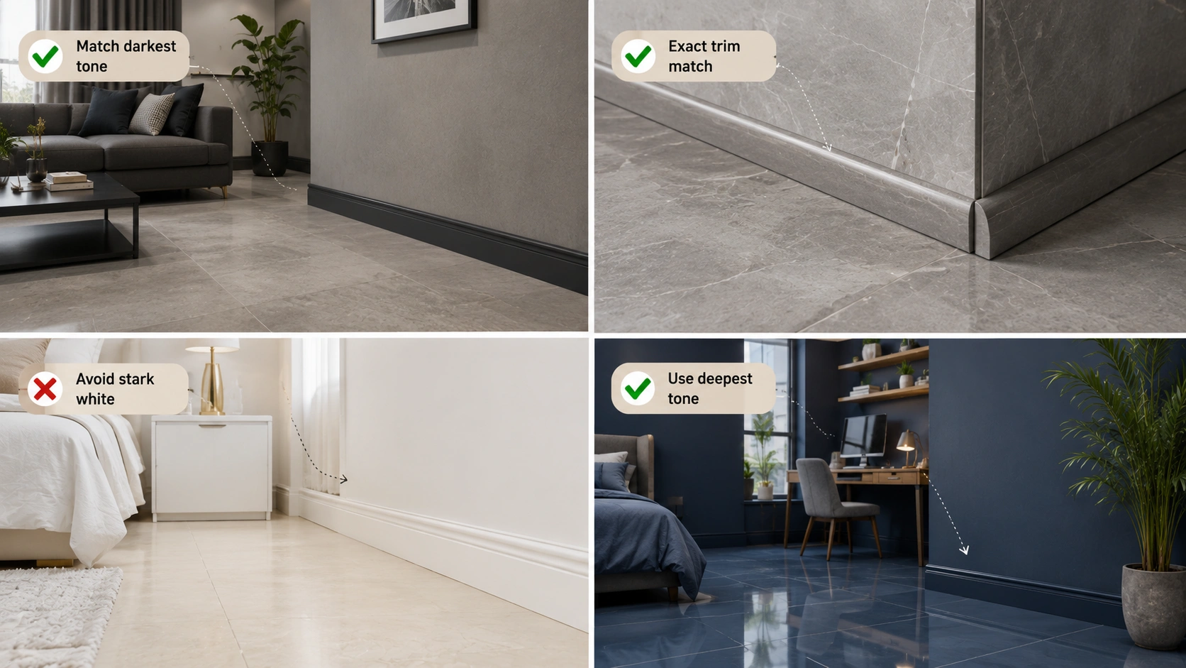
The edge trim where tile meets wall, and the skirting board that runs along the room's perimeter, are frequently specified as an afterthought after the main tile order, and this is where many otherwise well-planned monochrome rooms lose their tonal discipline.
- Match skirting to the darkest tone in the room's tonal range, not to the wall colour, when the brief is a seamless, grounded monochrome floor read. A charcoal skirting against a mid-grey floor and pale grey wall continues the tonal logic downward rather than interrupting it.
- Match trim profiles (bullnose, edge caps) to the tile colour exactly, not an approximate shade, since trim pieces are frequently sourced as a separate SKU from the main field tile and colour drift between the two is common if not specifically checked.
- For an all-white scheme, avoid stark white PVC or plastic skirting against a warm white or ivory tile, since the two whites rarely match exactly and the mismatch is more visible in an all-white room than in any mixed-colour scheme.
- For a bold single-hue scheme, request skirting in the deepest tone of the palette rather than in a neutral grey or white, keeping the perimeter detail inside the monochrome logic rather than introducing an unrelated neutral.
Furniture and Textile Colour Pairing by Monochrome Family
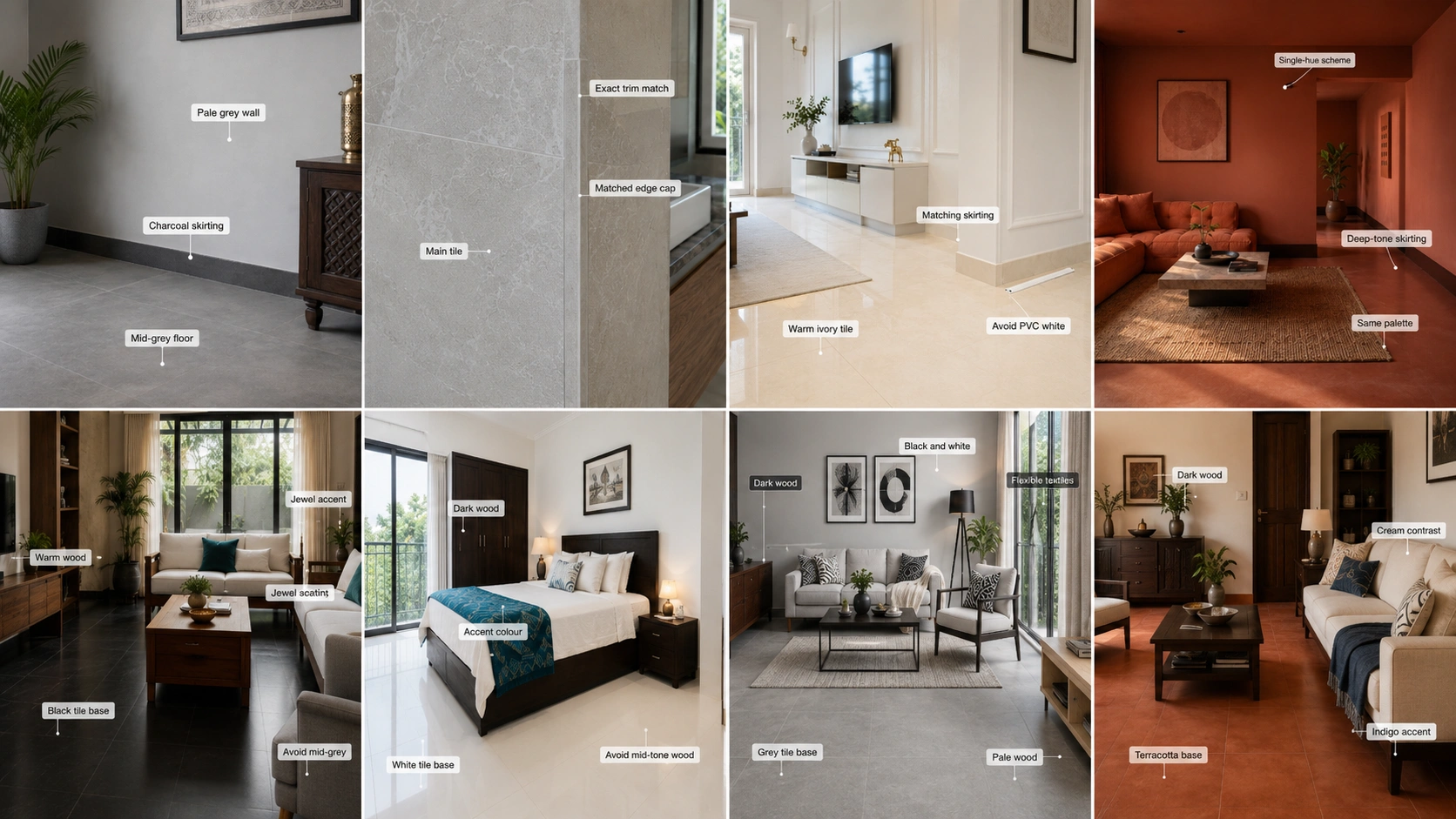
| Monochrome Family | Best Furniture Tone | Best Textile Approach | What to Avoid |
| All-black | Warm wood (teak, walnut) for contrast, or white and cream upholstery for maximum tonal contrast | Cream, white, or a single bold jewel-tone cushion accent | Mid-toned grey or beige furniture, which reads as indecisive against a committed black scheme |
| All-white | Dark wood or black furniture for definition, or very pale natural wood for a softer read | Any colour works as an accent since the white base is maximally neutral | Mid-toned warm wood, which can visually merge with a warm white floor and lose definition |
| All-grey | The most furniture-flexible family: dark wood, pale wood, black, or white all work | Any textile colour, grey is the most accommodating monochrome base for later textile changes | Very little to avoid; this is the safest family for furniture flexibility |
| Bold single hue (navy, forest green, terracotta) | Furniture in a complementary or neutral tone, dark wood for warmth, white or cream for contrast | A single textile accent in the tile's complementary colour, indigo textiles with a terracotta floor, or cream with a navy floor | Furniture or textiles in a competing bold hue, which fractures the single-colour discipline of the scheme |
Want to see these pairing principles in real spaces? Browse our Monochrome Tile Design Ideas for 20+ black, white, and grey room inspirations that put these grout, furniture, and trim combinations into practice.
Metal Fixture Finish by Monochrome Family
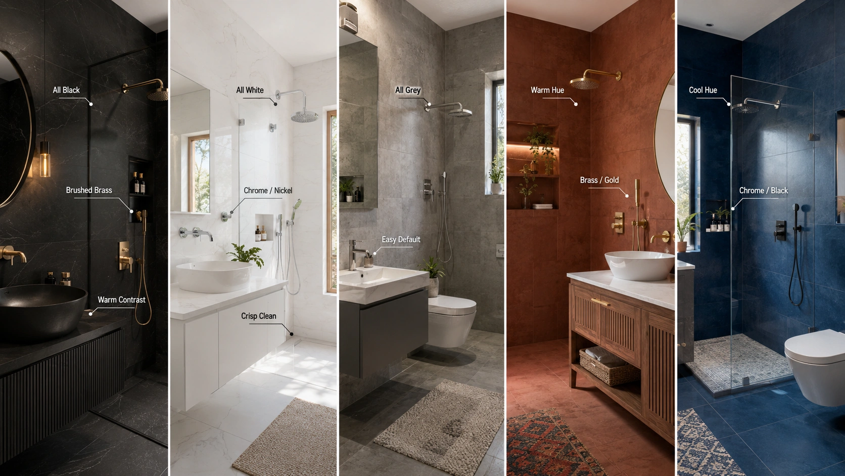
| Monochrome Family | Recommended Fixture Finish | Why |
| All-black | Brushed brass or antique gold for warmth, matte black for a fully committed monochrome look | Brass provides the warm counterpoint that keeps an all-black room from feeling cold; matte black doubles down for maximum drama |
| All-white | Chrome or brushed nickel for a clean, formal read, brushed brass for warmth | Chrome reinforces the crisp, clean character of white; brass softens it toward a more classical Indian reading |
| All-grey | Any finish works, brushed nickel is the most common default | Grey is neutral enough that fixture finish becomes a free design choice rather than a constrained one |
| Bold single hue | Brushed brass or antique gold for warm hues (terracotta, burgundy), chrome or matte black for cool hues (navy, forest green) | Match the fixture's warmth to the hue's own temperature rather than forcing a mismatched pairing. |
Common Pairing Mistakes
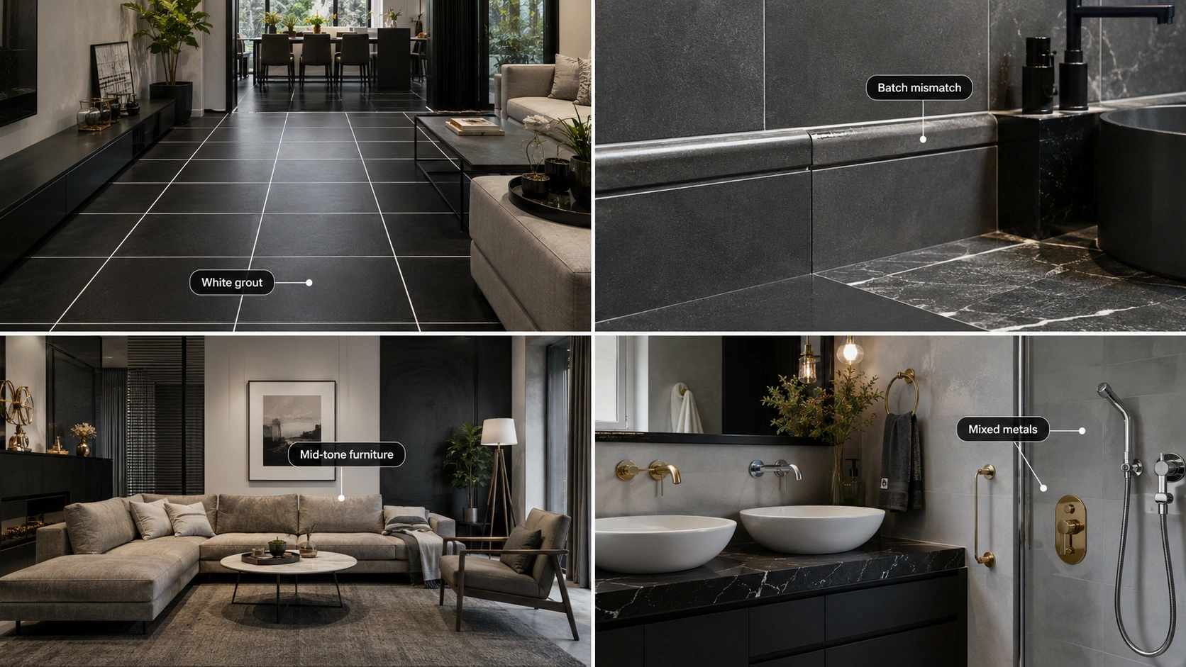
- Ordering white grout as a default without considering the tile tone. White grout is the standard stock option at many Indian tile suppliers and gets specified reflexively even on black, dark grey, or bold-hue floors where it breaks the intended tonal read.
- Sourcing trim and field tile from different batches without a side-by-side check. Trim pieces are frequently a slightly different production run than the main field tile, and the colour drift only becomes obvious once installed.
- Choosing mid-toned furniture for a black or white scheme. Mid-grey or beige furniture in a committed black or white room reads as an uncertain middle ground rather than a deliberate contrast, undermining the confidence the monochrome scheme is meant to project.
- Mixing warm and cool metal fixture finishes within the same monochrome room. Chrome and brass in the same space, unless done as a specific and confident design layering, tends to read as unplanned rather than intentional.
Sourcing Matched Grout, Trim, and Tile in India: 2026 Context
Indian grout manufacturers offer an expanding tonal range beyond the standard white and grey stock options, with charcoal, black, and warm-toned grouts increasingly available from major brands distributing across metro and tier-2 cities. When ordering trim and field tile together from a Morbi manufacturer, request both from the same production batch where possible, and confirm colour match with a physical side-by-side sample before committing to a full-room order, since trim SKUs are more prone to batch drift than the main field tile, given their smaller production runs.
Browse Monochrome Tile and Trim on TilesFinders
Black, white, grey, and bold single-hue tonal ranges with matched trim and grout guidance are available on TilesFinders. Request a physical side-by-side sample of field tile, trim, and grout together before finalising any monochrome order.
FAQs
Match in almost all cases, since matched grout preserves the continuous surface read that makes a monochrome floor look like considered stone rather than assembled tile. Contrast grout is a legitimate choice only when used deliberately for a specific graphic effect, such as a checkerboard, not as a default.
Charcoal or matte black skirting continues the tonal logic of the floor downward without interruption. Avoid a neutral grey or white skirting as a default, since it breaks the deep, continuous read that a committed black scheme is built around.
Dark wood or black furniture provides clear definition and contrast against an all-white base. Very pale natural wood is the softer alternative. Mid-toned warm wood is the one tone to avoid, since it can visually merge with a warm white floor and lose definition.
All-grey is the most furniture-flexible family, working with dark wood, pale wood, black, or white furniture equally well, making it the safest choice when the furniture plan is not yet finalised at the time of tile specification.
Brushed brass or antique gold provides a warm counterpoint that prevents an all-black room from feeling cold, while matte black fixtures double down on the drama for a fully committed monochrome look. Choose based on whether the brief wants warmth or maximum darkness.
Request trim and field tile from the same production batch where possible, and always confirm with a physical side-by-side sample before ordering the full quantity, since trim pieces are more prone to batch-to-batch colour drift given their smaller production runs compared to the main field tile.
Generally not recommended unless done as a specific, confident design layering decision. Mixing chrome and brass within the same monochrome room without a clear intention tends to read as unplanned rather than considered.
Grout was toned within the same hue family as the tile across the main field. A contrasting grout is acceptable only for a narrow accent border, not across the full floor, since a large-area contrast grout breaks the single-colour tonal cohesion the scheme depends on.


See our tile guides first
Set TilesFinders as a preferred source and our buying guides surface ahead of the rest for you.
Add as preferred sourceTakes one tap. Nothing to install.
What Readers Say
I was about to redo my parking area with the wrong tile size until I read this. The layout comparisons saved me from a costly mistake.
We reference TilesFinders guides while briefing clients on material selection. The size and pattern breakdowns are accurate and easy to explain visually.
On site, I get asked about grout spacing all the time. This article gave me a solid reference I now share with my team before every job.
Finally a guide that doesn't just push generic advice. The oil stain removal steps actually worked on our clubhouse driveway tiles.
I run a small construction firm and now send this link to clients directly when they ask about entrance tile sizing. Saves me an hour of explaining.
Good practical detail, though I wish there were more examples for compact apartment entrances specifically, not just villas.
My mother-in-law wanted marble, I wanted vitrified. This blog gave us the neutral comparison we needed to actually decide together.
Detailed without being overwhelming. I appreciated that it covered both cost and maintenance, not just the aesthetics.
Used the algae and hard water removal tips on our terrace tiles after the monsoon. Worked better than what our regular cleaner was doing.
As someone who sources tiles for multiple builder projects, I find these comparisons genuinely useful for vendor conversations, not just consumer content.
Recommended this to a client who kept second-guessing the entrance design. The small vs large layout section settled the debate instantly.
Straightforward and honest, no unnecessary jargon. Would like to see a similar breakdown for outdoor pool-deck tiles next.
We've bookmarked several TilesFinders guides for our design handbook. Reliable source when clients want data, not just opinions.
Two paths, one marketplace.
Get free quotes from verified suppliers.
Share your room, budget, and style. Suppliers in Morbi respond within hours.
Get Free QuotesList your business, reach real buyers.
Put your showroom in front of homeowners searching for tiles right now.
List Your Business