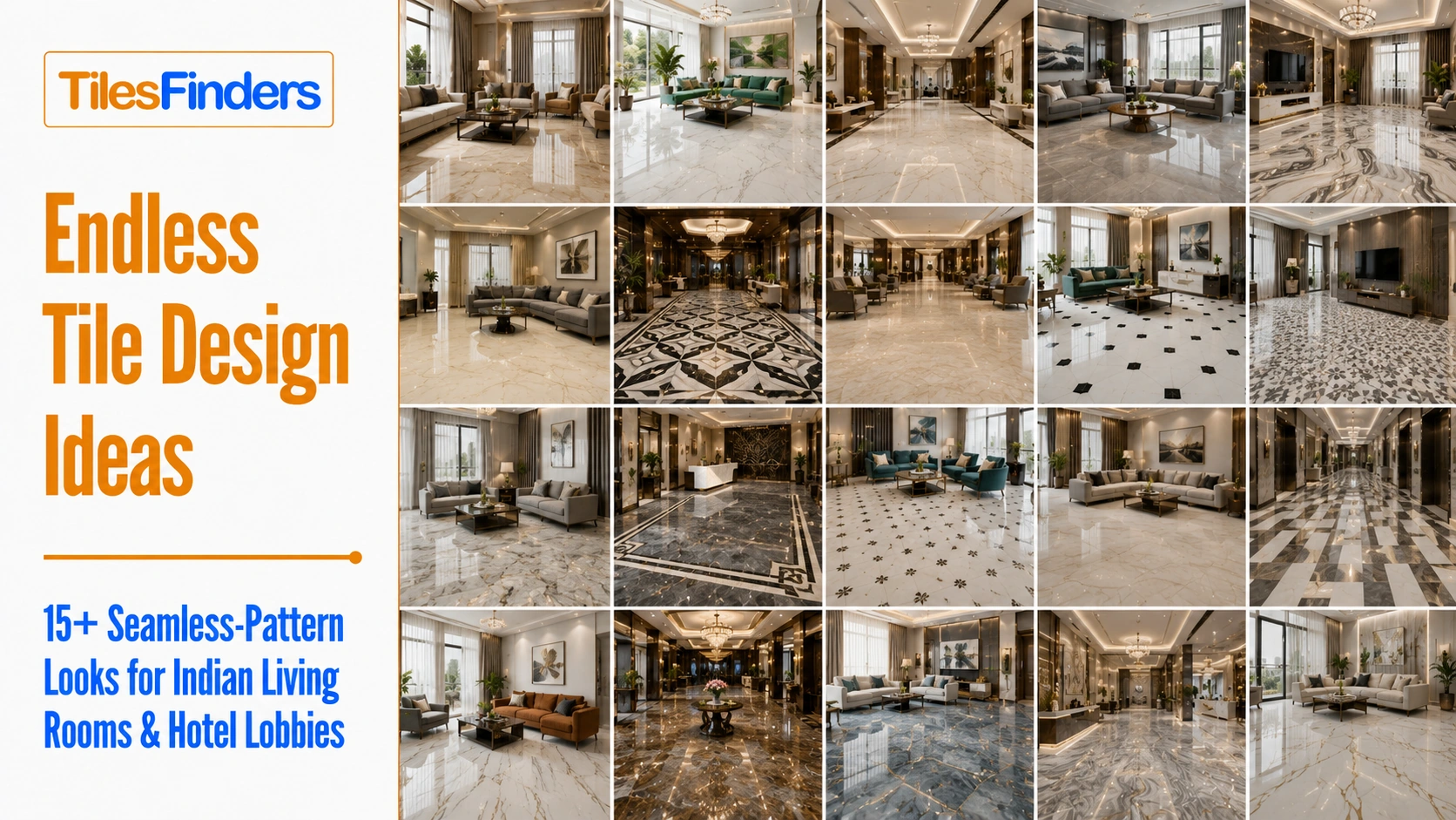
Endless Tile Design Ideas: 15+ Seamless-Pattern Looks for Indian Living Rooms and Hotel Lobbies
Transform Indian interiors with 18 endless tile design ideas featuring seamless patterns, smart lighting combinations, colour pairings, installation checks, and practical tips for large residential and commercial spaces.
- 3. Every tile box carries a shade code and a calibre code, and mixing them ruins floors
- 4. A sample held in your hand tells you almost nothing about a floor
- 5. A fully tiled room sounds harder than a carpeted one, and it is genuinely noticeable
- The Lighting Rule: Colour Temperature Changes the Tile
- Start Here: Match Your Goal to an Approach
- Goal One: Make the Room Feel Larger
- Goal Two: A Calm, Quiet Room
- Goal Three: Drama and a Clear Focal Point
- Goal Four: Premium Look, Controlled Budget
- Goal Five: Unify a Large Open-Plan Space
- Goal Six: A Memorable Commercial Arrival
- Four Field Tests to Run Before You Buy
- Delivery Day: The Ten-Minute Check That Prevents The Worst Failures
- Quick Reference: Lighting and Metal Pairing by Tile Tone
- What Not to Pair With an Endless Pattern
- Specification Baseline for Every Idea Above
- Find the Look That Matches Your Goal on TilesFinders
Discover how endless tile patterns can visually expand spaces while lighting, grout joints, installation accuracy, and tile selection determine the final effect. Choose the right pattern for your room size, layout, lighting, and usage before ordering materials.
Every idea below is a complete recipe: the tile plus the wall colour, metal finish, and lighting temperature that make it work, and the specific mistake that ruins it. But before the ideas, five things worth knowing about endless tile designs decide whether any of them succeed. Most disappointing tile floors were the right tile, chosen well, undone by one of these.
Five Things Nobody Tells You Before You Choose
1. Your window will expose every flaw in the floor, at one specific hour
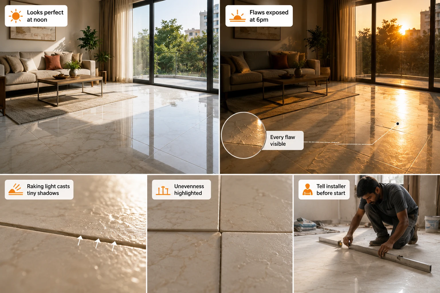
Critical lighting, the reason a floor looks perfect at noon and terrible at 6 pm: When light strikes a floor at a shallow, raking angle, from a low sun through a large window, or from a wall-washer close to the surface, it casts a tiny shadow off every height difference between adjacent tiles. Installers call this critical lighting, and it is why the same floor can look flawlessly flat under midday overhead light and visibly uneven two hours later. Nothing has changed except the angle. If your living room has a large west or east-facing window, low sun will rake across that floor daily, and you need a tighter installation tolerance than a room lit only from above. Tell your installer the room has critical lighting before he starts; it genuinely changes how carefully he will level. |
2. Narrower joints make unevenness more visible, not less
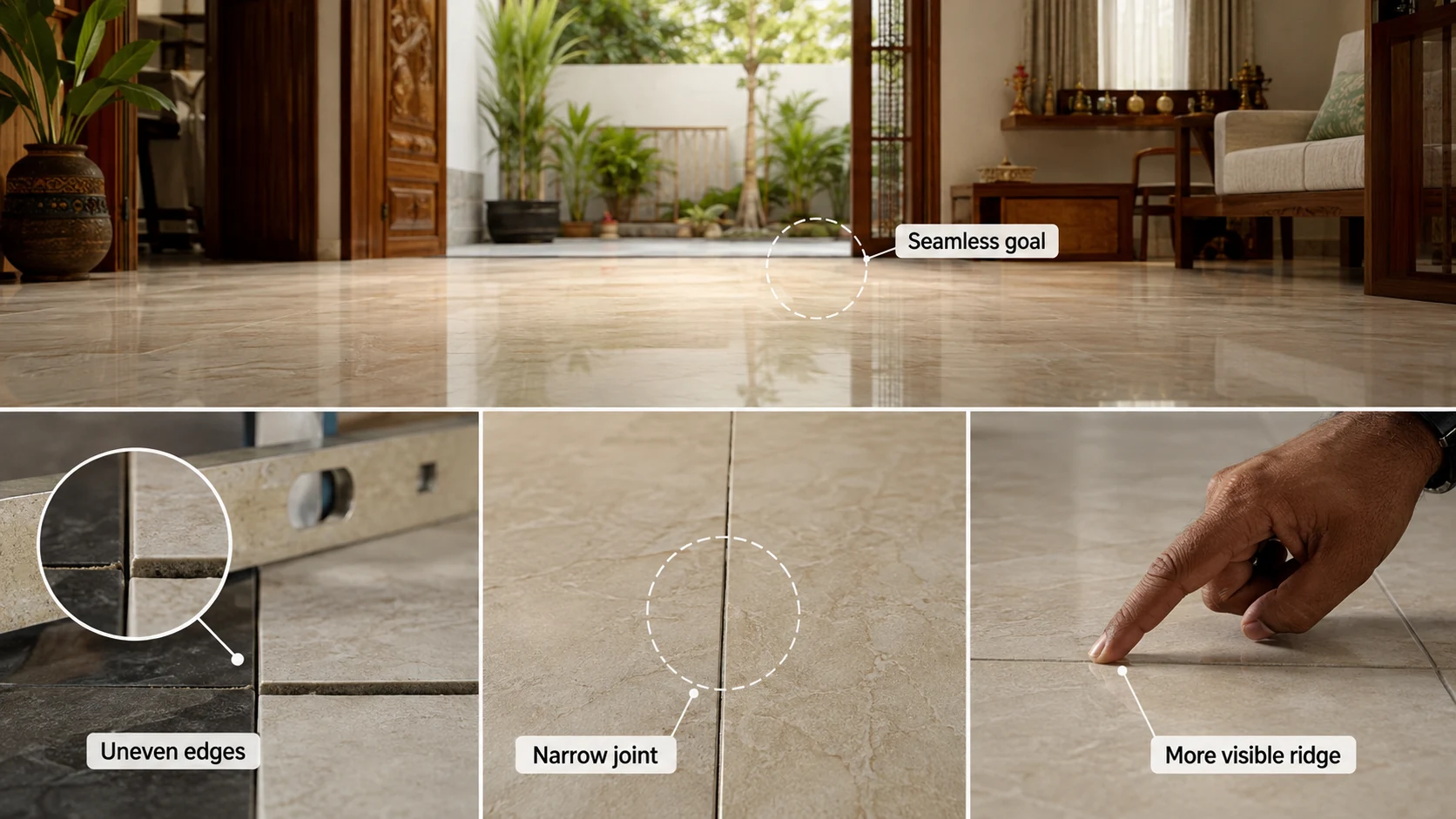
The tradeoff at the heart of seamless flooring: Everyone chasing a seamless look wants the narrowest possible grout joint. But the joint is also what absorbs small height differences between adjacent tiles. A wider joint gives the eye a soft transition across a step; a very narrow joint puts two tile edges almost in contact, so any height difference between them reads as a hard visible ridge you can feel underfoot. This is why narrow joints demand rectified tiles, a genuinely flat substrate, and a competent installer, all three. Specifying a 2mm joint over a wavy floor produces a worse result than a 3mm joint would have. Narrow joints are a reward for good preparation, not a substitute for it. |
3. Every tile box carries a shade code and a calibre code, and mixing them ruins floors
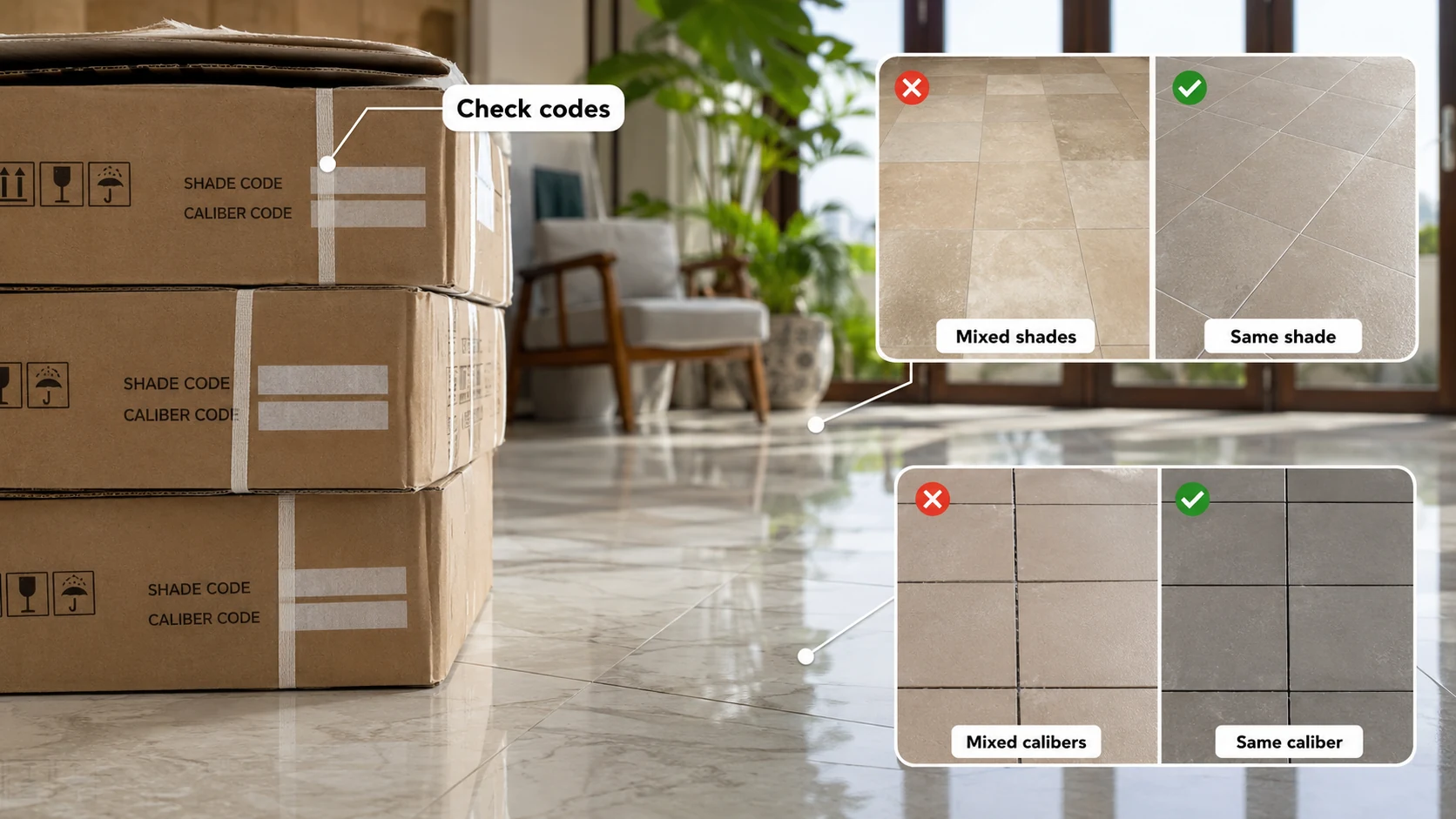
The two codes printed on the box that almost no buyer checks: Ceramic manufacturers print two separate codes on every carton. The shade code identifies the colour batch, and mixing shade codes produces visible tonal patches across a floor. The calibre code identifies the dimensional batch, because tiles are fired and shrink slightly, so a nominal 600x600 tile might actually measure fractionally different between production runs. Mixing calibres means laying tiles of genuinely different sizes next to each other, which forces the installer either to vary joint widths or to accept misaligned grout lines running across the room. Check that every carton delivered carries the same shade and calibre code, physically, on delivery day, before installation begins. This single check prevents one of the most expensive and least correctable tiling failures. |
4. A sample held in your hand tells you almost nothing about a floor
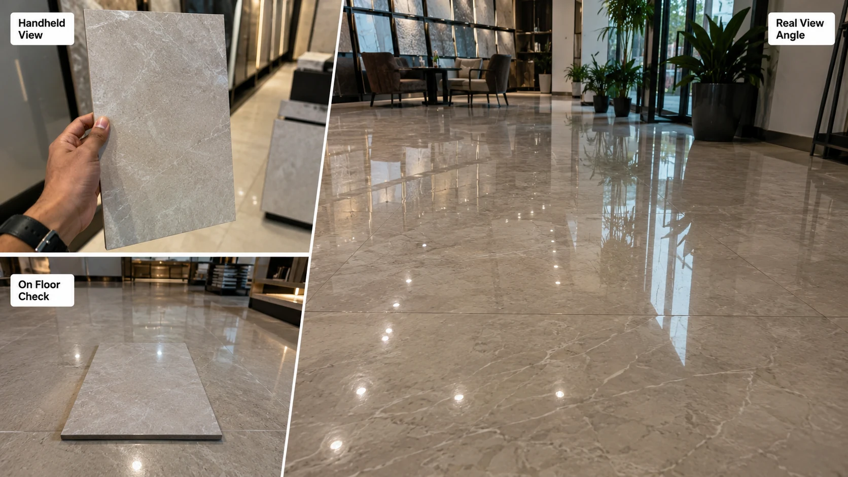
Why the showroom sample misleads, and the thirty-second fix: You will view your floor from roughly five and a half feet above it, at an oblique angle, walking. In the showroom, you view the sample held vertically at eye level, straight on, at arm's length. Those are completely different viewing conditions, and gloss behaves very differently between them: a surface that looks softly satin held in the hand can throw hard reflections when viewed at a shallow angle across a room. Put the sample on the showroom floor, walk six feet away, and look back at it. That is the only view that matches how you will actually see it every day. |
5. A fully tiled room sounds harder than a carpeted one, and it is genuinely noticeable
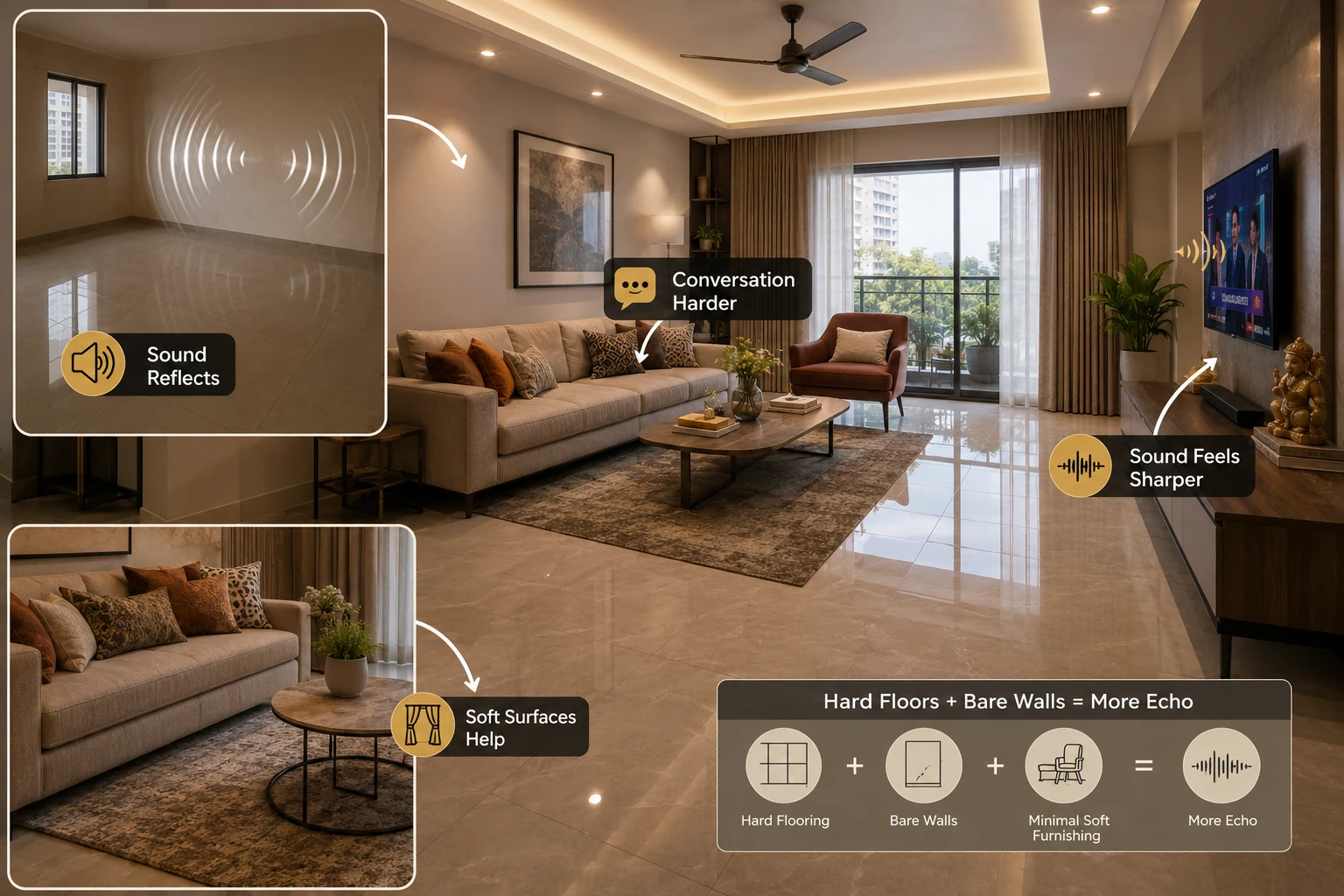
The consequence of hard flooring almost nobody plans for: Tile reflects sound rather than absorbing it, so a fully tiled room with bare walls has a longer reverberation time than a soft-furnished one. In a compact apartment living room, this reads as conversation feeling sharper and television sound feeling harsher, and in a large open-plan space it can genuinely make conversation across the room harder. This is not a reason to avoid tile; it is a reason to plan soft surfaces alongside it: curtains, upholstered seating, a rug at the seating group, or acoustic panels in a large space. Rooms that get tiled wall to wall with minimal soft furnishing routinely surprise their owners on this. |
If you are still deciding whether this pattern format is appropriate for your project, start with our guide to Endless Pattern Tiles in India. It explains how seamless-join designs work across large surfaces, where continuity actually adds value, and what installation conditions need to be confirmed before you buy.
From The Marketplace
Popular tiles right now
-8e6b9645-7a41-4f18-a657-2a13441444dc.jpg)
-ced0ab5e-ef76-4d92-ad67-07ffd85a157c.jpg)
-a60976bd-f04b-4ce1-b9af-2bfdbe62b68d.jpg)
-823ae148-b780-4ec1-8182-73b1b6dd7a4e.jpg)
-332d28e1-6786-43ab-98bf-510966cc4a72.jpg)
-b7419414-4f4c-41cc-ba0e-8bc90096e6ff.jpg)
-e4eac120-9a75-4b54-b53e-24755e73998e.jpg)
-b10232de-f354-4f6f-83f2-3ab5ea1b2203.jpg)
-9b9514c2-5c79-4fdc-9565-54dff6557cf5.jpg)
The Lighting Rule: Colour Temperature Changes the Tile
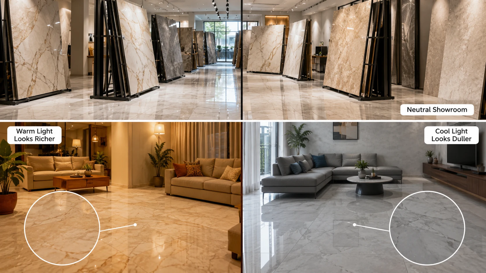
Why the same tile looks like two different products in two rooms: Light colour temperature, measured in kelvin, changes how a tile's undertone reads. Warm light at 2700K to 3000K pushes beiges, ivories, terracottas, and gold veining forward and makes them glow, but turns a cool grey concrete-look slightly muddy. Neutral light at 4000K keeps greys, whites, and cool marbles crisp and true, but drains warmth from a beige and can leave it looking washed out. Showrooms are almost always lit at 4000K or higher. If your home runs warm 2700K bulbs, a warm-toned tile will look considerably richer at home than it did in the showroom, and a cool grey will look duller. Decide your lighting temperature before you finalise the tile, not after. |
Start Here: Match Your Goal to an Approach
| What You Want | The Approach That Delivers It | Ideas |
| The room to feel larger | Pale continuous pattern, minimal contrast, narrow tone-matched joints | 1 to 3 |
| A calm, quiet, restful room | Concrete and cement-look families with subtle tonal drift | 4 to 6 |
| Genuine drama and a clear focal point | Bold veining or book-matched composition on one surface only | 7 to 9 |
| A premium look on a controlled budget | Pattern confined to one feature surface, plain tile elsewhere | 10 to 12 |
| A large open-plan space to feel unified | One continuous floor pattern running through zones | 13 to 15 |
| A memorable commercial arrival | Large-scale composition sized to the space, commercial rating confirmed | 16 to 18 |
Goal One: Make the Room Feel Larger
A visible joint grid gives the eye a repeating unit to measure the room against, and a room measured in units reads as a known, finite size. Suppress the grid and the surface loses its measuring marks.
Idea 1: Pale Ivory Marble-Look, Continuous Living Room Floor
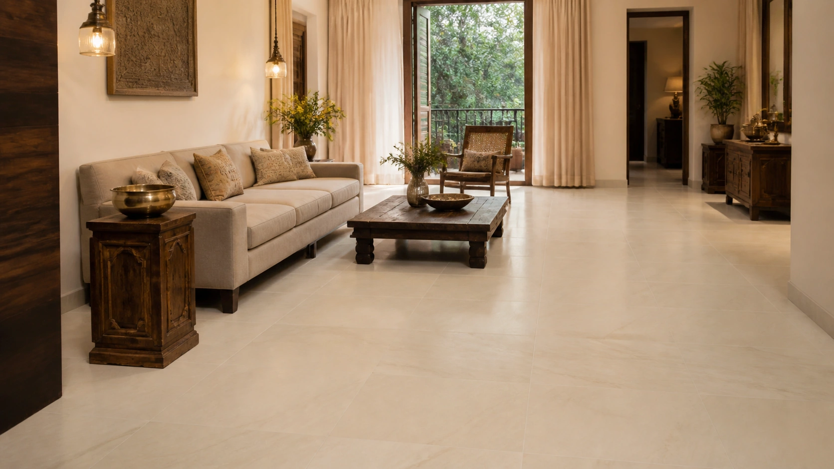
Endless pattern GVT, soft ivory veining | 2x2 or 24x24 (600x600 mm), rectified | Matte | Rs. 130 to Rs. 200/sq.ft
Soft, low-contrast veining across an open floor with tone-matched ivory grout in a narrow joint, the most reliable route to making a standard living room read as more generous than it is.
Pair with: Warm off-white or bone walls, brushed brass or antique gold fixtures, and 2700K to 3000K lighting, which brings out the ivory's warmth.
Avoid: Cool 4000K downlights, which drain the warmth from ivory and leave it looking grey despite the tile being correct.
Idea 2: Pale Concrete-Look, Wall-to-Wall Continuous
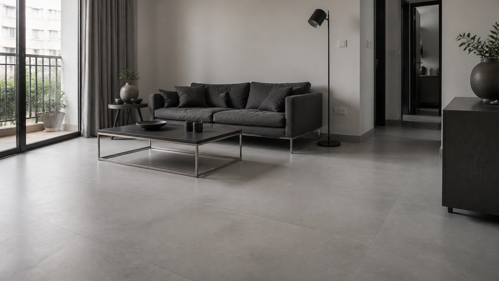
Endless pattern GVT, pale grey concrete-look | 32x32 (800x800 mm), rectified | Matte | Rs. 140 to Rs. 210/sq.ft
A larger format with almost no tonal contrast produces the fewest visual interruptions of any option here, particularly effective in rooms with limited natural light.
Pair with: Cool white or pale grey walls, matte black or brushed steel fixtures, and 3500K to 4000K neutral lighting which keeps the grey crisp rather than muddy.
Avoid: Warm 2700K lighting, which pushes cool concrete grey toward a dull yellow-brown and flattens the tonal drift entirely.
Idea 3: Warm White Travertine-Look, Living Room to Passage
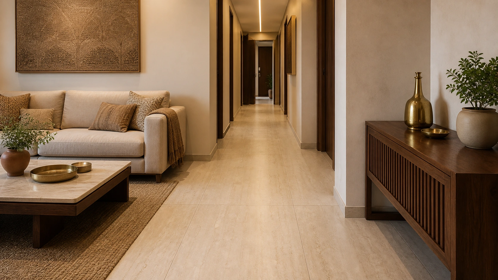
Endless pattern GVT, warm white linear travertine | 2x4 (600x1200 mm), rectified | Matte | Rs. 145 to Rs. 215/sq.ft
Running a linear pattern continuously from the living room into an adjoining passage extends the perceived depth of both spaces beyond their actual boundaries, making living room tiles feel more expansive and visually connected.
Pair with: Warm neutral walls, brushed brass or bronze, and 3000K lighting running along the passage rather than across it, reinforcing the directional pull.
Avoid: Breaking the run with a threshold strip at the doorway, which cancels the depth effect the continuity was chosen for.
Goal Two: A Calm, Quiet Room
Idea 4: Mid-Grey Concrete-Look, Full Floor
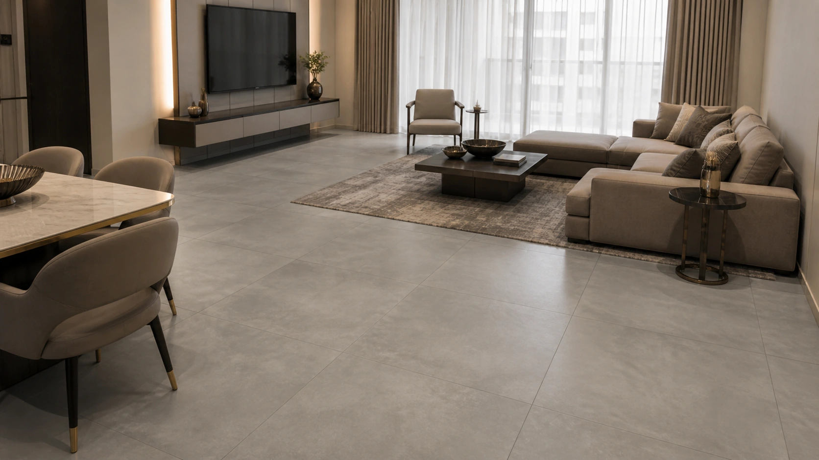
Endless pattern GVT, mid-grey concrete-look | 32x32 (800x800 mm), rectified | Matte | Rs. 135 to Rs. 200/sq.ft
Concrete-look families carry subtle tonal drift rather than defined pattern elements, so they read as texture rather than as a design demanding attention. Mid-tones with visible variation also hide dust and footprints better than either very pale or very dark floors.
Pair with: Soft white or pale greige walls, matte black or dark bronze fixtures, and 3000K to 3500K lighting with generous indirect light rather than sharp downlights.
Avoid: Strong directional spotlights, which create hot spots that expose the tonal drift as blotchiness rather than letting it read as even texture.
Idea 5: Warm Greige Cement-Look, Living Room Floor
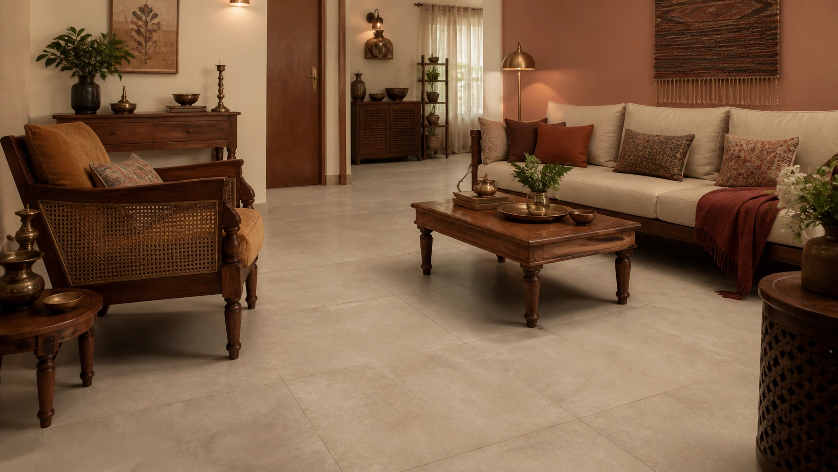
Endless pattern GVT, warm greige cement-look | 2x2 or 24x24 (600x600 mm), rectified | Matte | Rs. 130 to Rs. 195/sq.ft
A warmer variant of the same principle, suited to rooms with wooden furniture or warm textiles where a cool grey would feel clinical.
Pair with: Warm white or soft clay-toned walls, aged brass or walnut-toned accents, and 2700K to 3000K lighting which keeps the greige on its warm side.
Avoid: Cool grey walls, which pull the greige toward grey and lose the warmth that made it the right choice over plain concrete-look.
Idea 6: Sand-Toned Limestone-Look, Bedroom or Reading Room
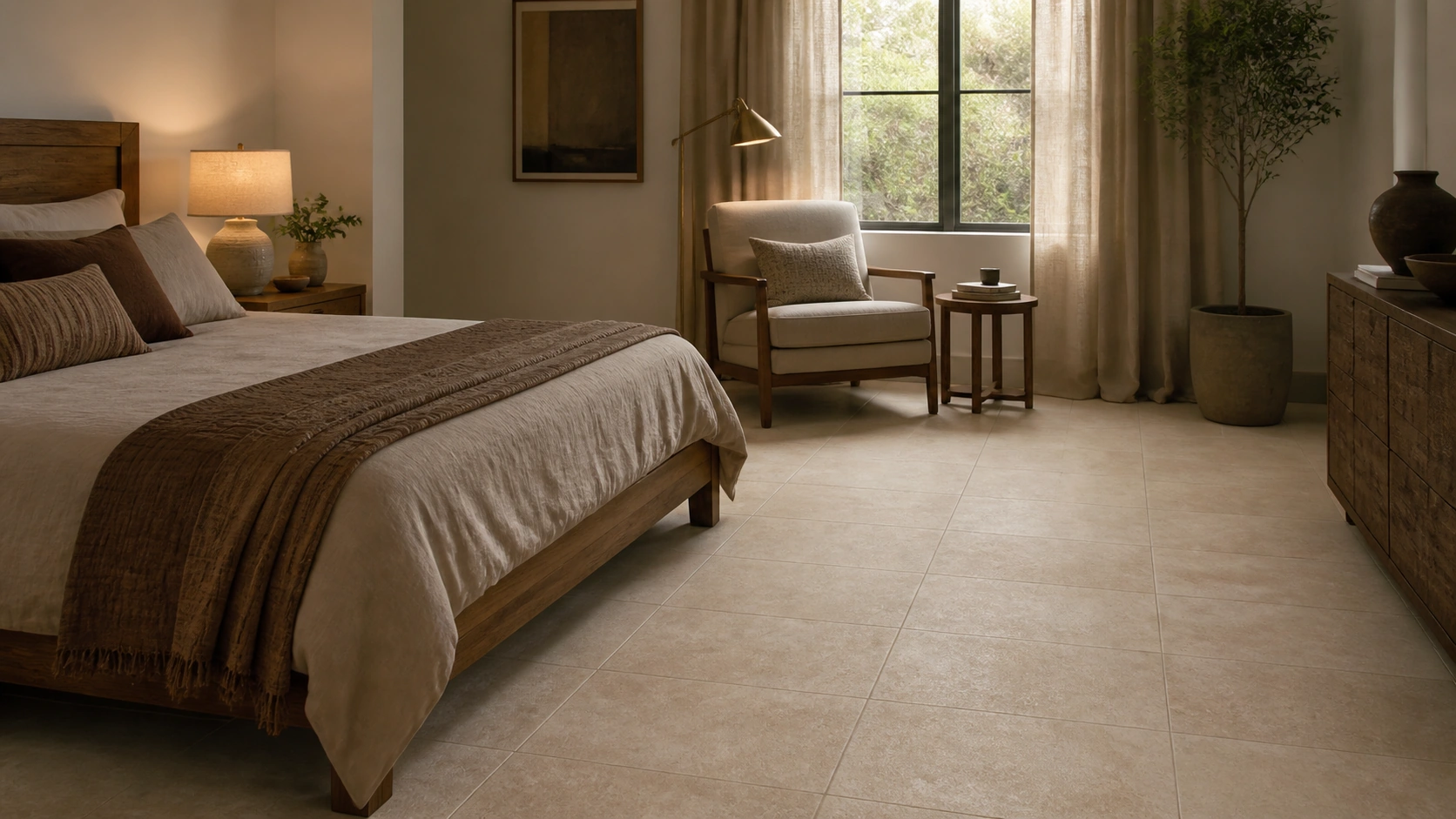
Endless pattern GVT, sand-toned limestone-look | 2x2 or 24x24 (600x600 mm), rectified | Matte | Rs. 135 to Rs. 200/sq.ft
The softest and least assertive composition in this guide, appropriate where the brief is genuinely rest rather than presentation.
Pair with: Warm off-white or pale oat walls, brushed brass or natural wood, 2700K lighting on dimmers, and generous soft furnishing to control the room's acoustics.
Avoid: Any high-gloss finish on adjacent surfaces, which introduces reflections and visual activity working against the restful intent.
Goal Three: Drama and a Clear Focal Point
The rule that makes drama work rather than exhaust: A dramatic continuous pattern needs somewhere quiet to sit against. Put it on one surface, keep every other surface plain, and it reads as a deliberate focal point. Put it on two and they compete, which reads as busy rather than bold. |
Idea 7: Book-Matched Marble, Full-Height Feature Wall
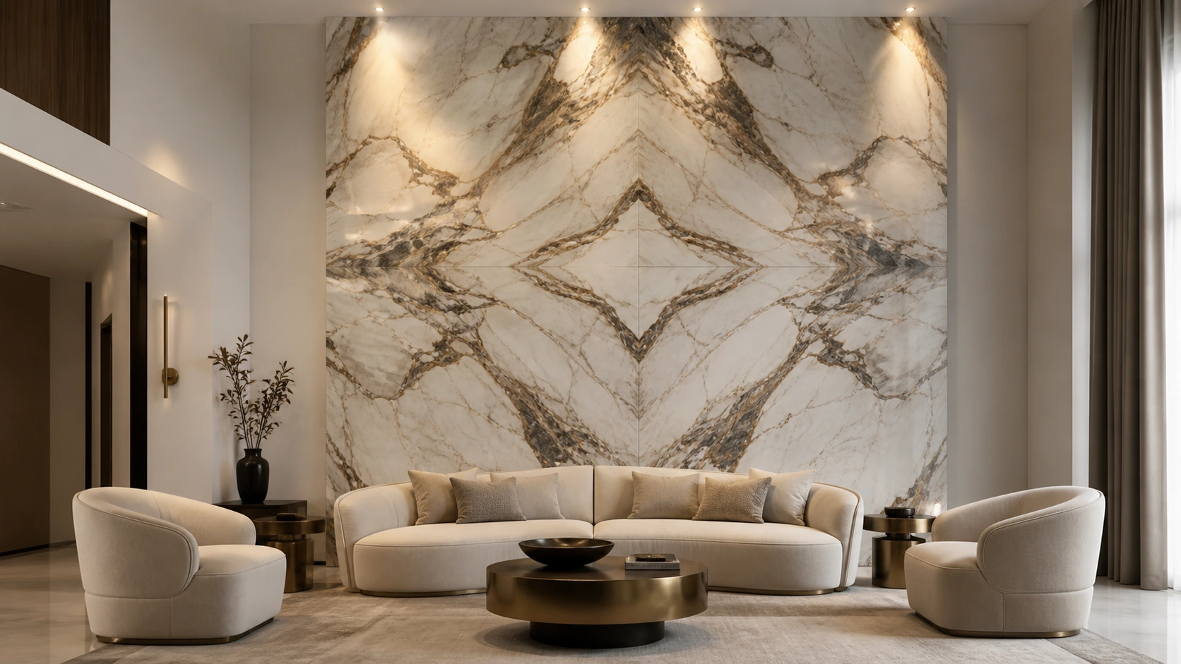
Endless pattern GVT, book-matched dramatic veining | 2x4 (600x1200 mm) or larger slab, rectified | Polished or matte | Rs. 180 to Rs. 280/sq.ft
Mirror-matched veining across a full-height wall, centred on the room's primary sightline rather than geometrically, the strongest single statement available in this category.
Pair with: Plain matte walls elsewhere, brushed brass or blackened steel, and a wall-wash from above at 3000K that grazes the surface to reveal depth.
Avoid: Ceiling downlights aimed straight down, which light the floor in front of the wall and leave the composition flat and underlit.
Idea 8: Dark Charcoal Veining, Television Wall
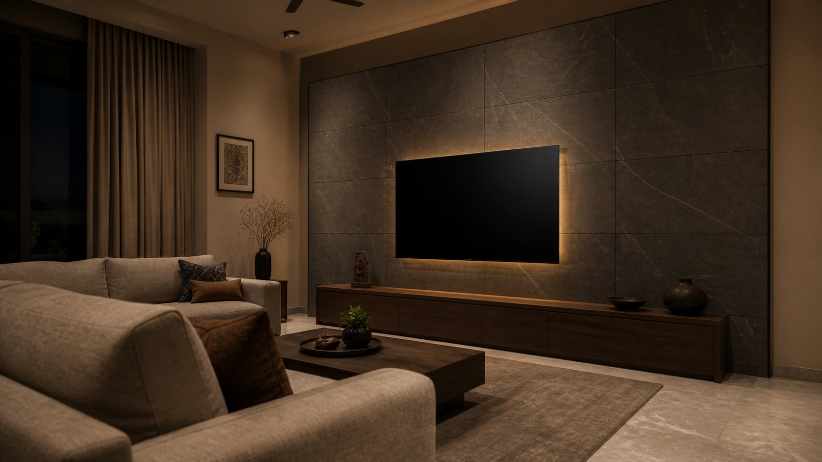
Endless pattern GVT, charcoal with pale veining | 2x4 (600x1200 mm), rectified | Matte | Rs. 165 to Rs. 250/sq.ft
A dark base keeps the pattern from competing with a switched-on screen, while the veining gives the wall genuine presence when the screen is off.
Pair with: Mid-tone walls rather than white, matte black fixtures, and low-level 3000K bias lighting behind the screen, which reduces eye strain and lifts the veining.
Avoid: A polished finish here, which produces screen reflections and glare precisely where the viewer looks for hours at a time.
Idea 9: Green Marble-Look, Bar or Display Backdrop
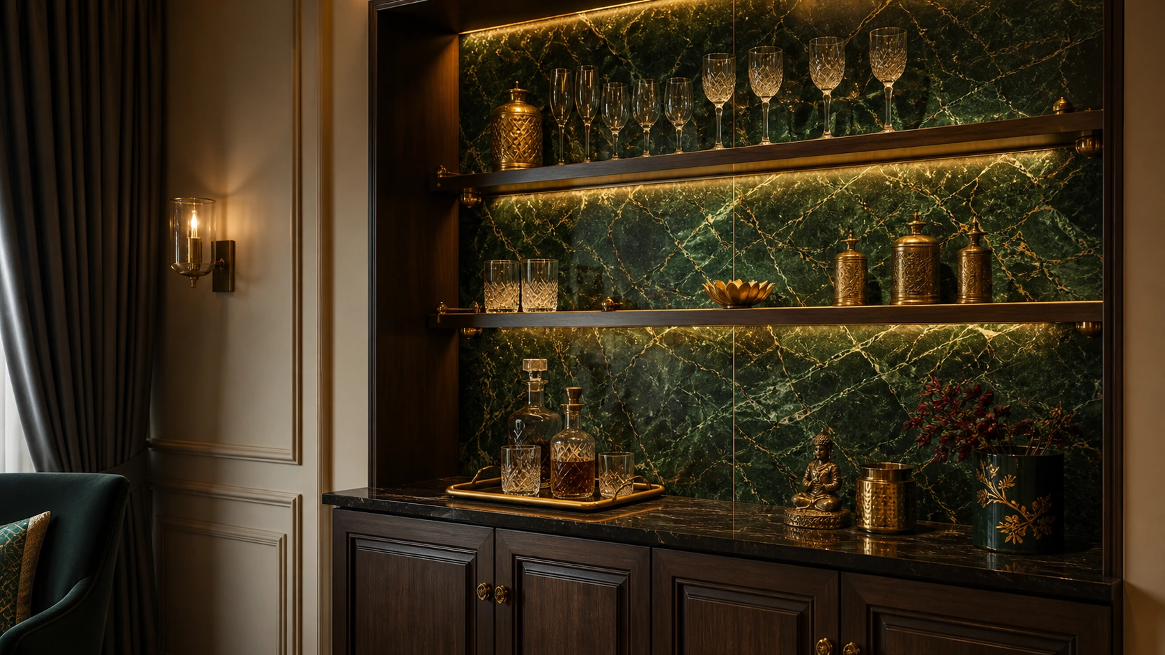
Endless pattern GVT, deep green veined marble-look | 2x4 (600x1200 mm), rectified | Polished, dry area only | Rs. 180 to Rs. 275/sq.ft
Confined to a bar back or display niche, a saturated coloured marble composition delivers concentrated drama in a small area, ideal where a full wall would be too much.
Pair with: Brass or antique gold, the classic and genuinely flattering partner to deep green, with warm 2700K accent lighting inside the niche.
Avoid: Chrome or brushed steel, which reads cold against deep green and makes an otherwise rich combination look clinical.
Goal Four: Premium Look, Controlled Budget
Idea 10: Feature Wall Only, Plain Coordinating Floor
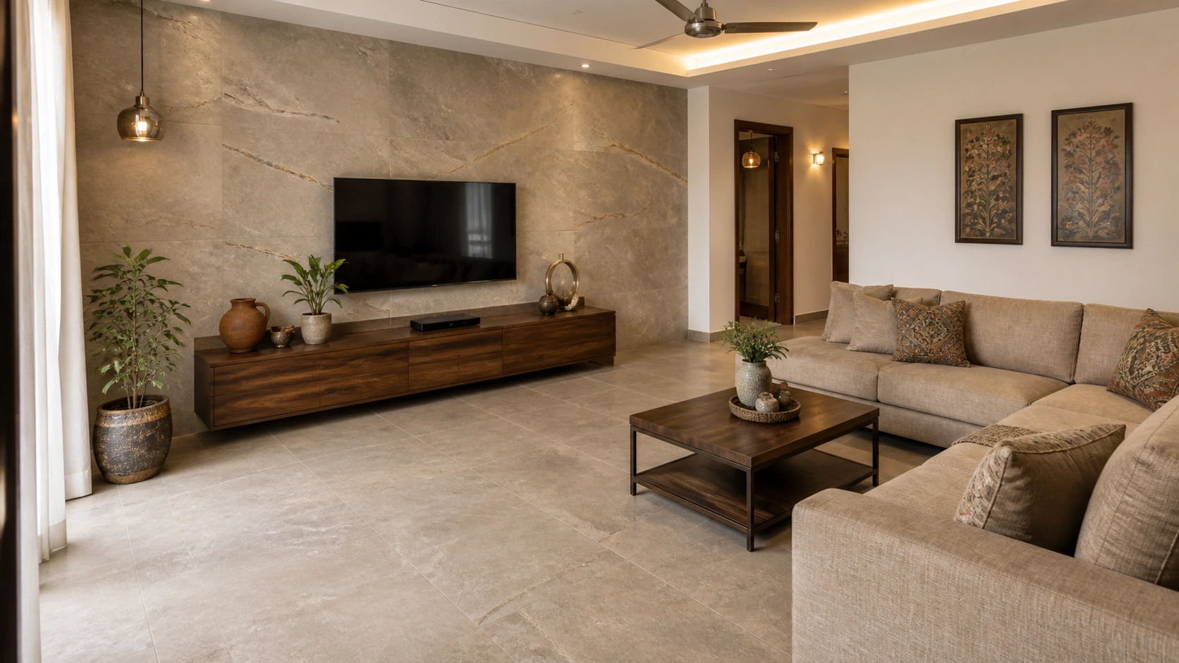
Endless pattern GVT feature wall + plain matte GVT floor | 2x4 (600x1200 mm) wall, 2x2 (600x600 mm) floor | Matte | Rs. 90 to Rs. 200/sq.ft across both
Spending the premium on one visible wall while keeping the much larger floor area in a plain coordinating tile delivers most of the visual impact at a fraction of the total cost.
Pair with: A floor tile picked from the feature wall's own mid-tone rather than a contrasting colour, plus consistent fixture metal across both.
Avoid: A floor in an unrelated tone, which makes the cost saving visible and leaves the feature wall looking like an isolated add-on.
Idea 11: Concrete-Look Endless Floor, No Feature Wall
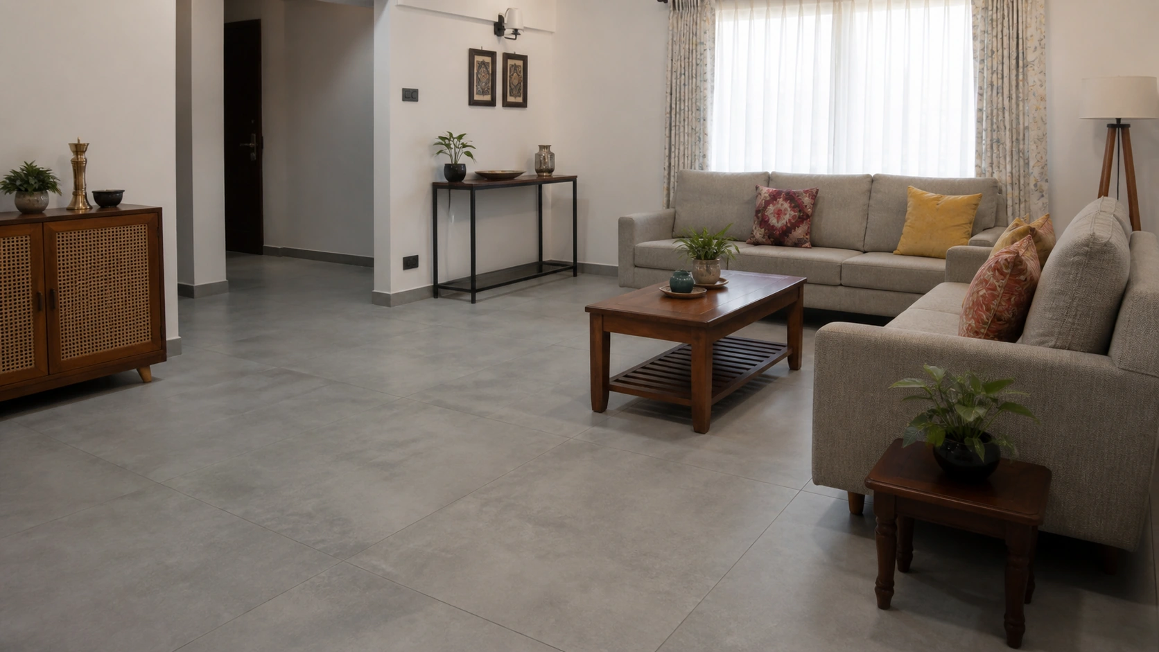
Endless pattern GVT, entry-tier concrete-look | 2x2 or 24x24 (600x600 mm), rectified | Matte | Rs. 110 to Rs. 160/sq.ft
Concrete-look ranges sit at the accessible end of the category and forgive minor sequencing imperfections better than veined patterns, making them the most budget-tolerant entry point.
Pair with: Plain painted walls in a soft neutral, simple matte black or steel fixtures, and 3500K lighting which keeps the grey honest without premium finishes elsewhere.
Avoid: Adding busy patterned wallpaper or a second feature surface, which pulls attention onto exactly the areas where the budget was not spent.
Idea 12: Contained Endless Panel Behind a Console or Niche
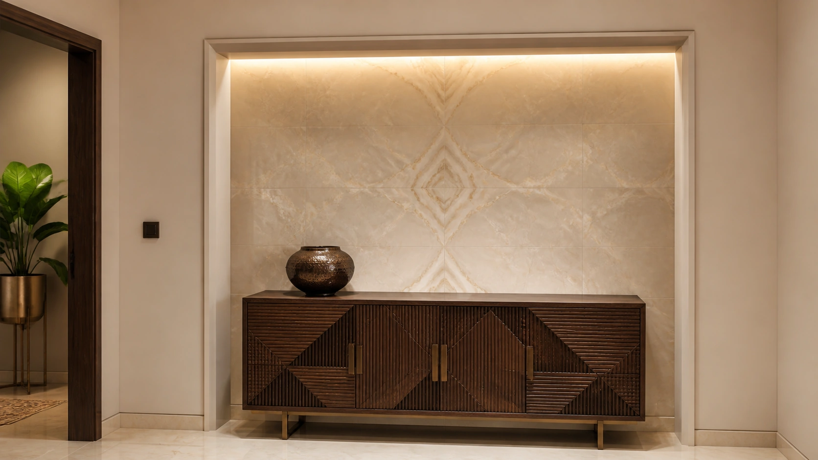
Endless pattern GVT, small contained panel | 2x2 or 24x24 (600x600 mm), rectified | Matte or polished | Rs. 140 to Rs. 215/sq.ft
A single contained panel behind a console table or within a recessed niche uses very little material while still showing a genuine continuous composition.
Pair with: A picture light or concealed strip at 3000K washing the panel, with fixture metal matched to the console's own hardware.
Avoid: Leaving the panel unlit, which reduces a deliberate design moment to an unnoticed patch of tile behind furniture.
Goal Five: Unify a Large Open-Plan Space
Idea 13: Single Continuous Floor Across Living and Dining
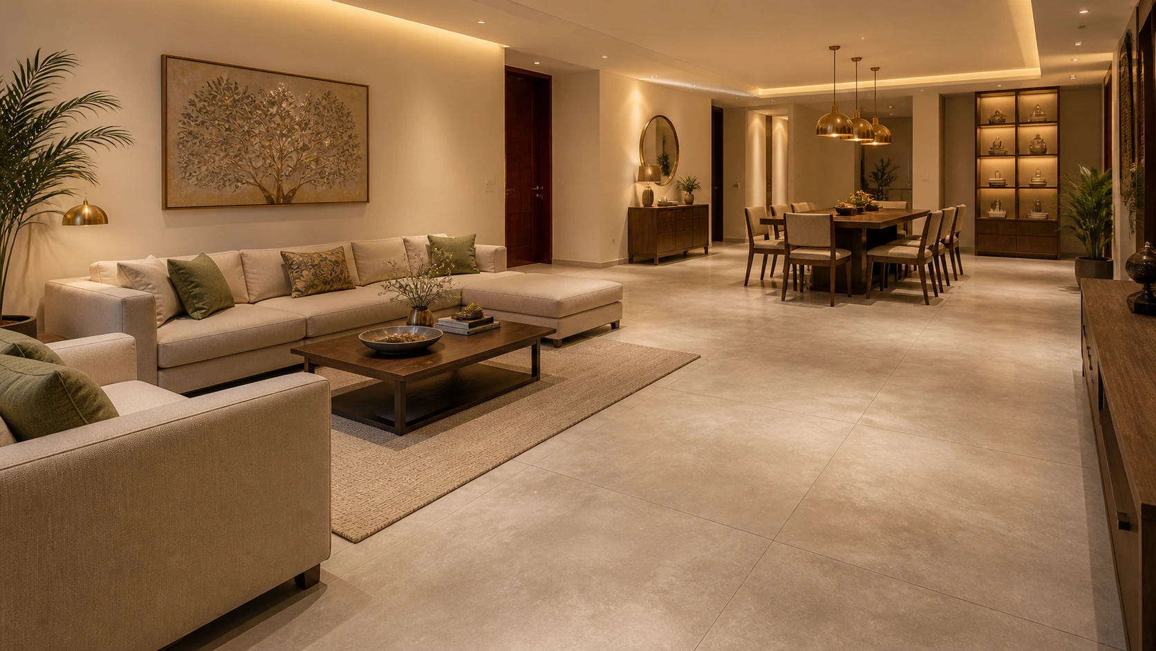
Endless pattern GVT, subtle concrete-look | 32x32 (800x800 mm), rectified | Matte | Rs. 140 to Rs. 210/sq.ft
Running one uninterrupted pattern through both zones removes the visual boundary a change of tile would create, making an open-plan area read as a single generous room.
Pair with: One wall colour and one fixture metal carried across both zones, plus soft furnishing in each zone to control reverberation across a large hard-floored space.
Avoid: Different lighting temperatures in each zone, which reinstates the boundary the continuous floor was chosen to remove.
Idea 14: Continuous Floor with Zoned Furniture Rather Than Zoned Tile
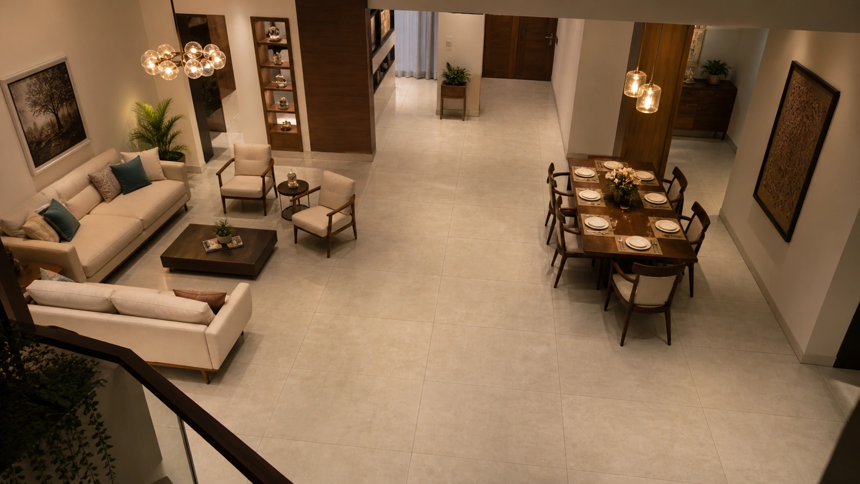
Endless pattern GVT, pale stone-look | 32x32 (800x800 mm), rectified | Matte | Rs. 145 to Rs. 215/sq.ft
Let the furniture layout define the zones while the floor stays continuous underneath, which keeps flexibility for future rearrangement in a way a tiled zone boundary does not.
Pair with: Zone-defining pendant lights at a consistent 3000K over each functional area, doing the separation work a change of tile would otherwise do permanently.
Avoid: A large central rug over the developed pattern, which covers precisely the area where the continuity is visible.
Idea 15: Living Room to Balcony Threshold Continuation
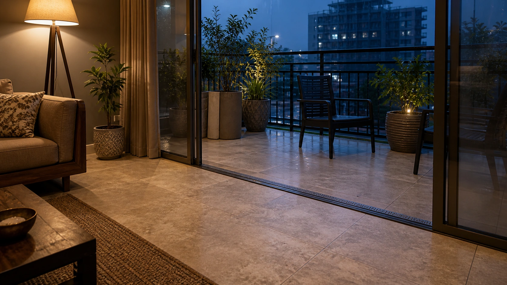
Endless pattern GVT indoors + matching anti-skid outdoor variant | 2x2 or 24x24 (600x600 mm) | Matte indoor, anti-skid R11 outdoor | Rs. 130 to Rs. 215/sq.ft
Carrying a coordinated design across the threshold visually extends the living room into the balcony, with the outdoor portion specified separately at a confirmed anti-skid rating.
Pair with: Indoor lighting temperature matched to typical evening balcony lighting at around 3000K, so the two spaces read continuous after dark as well as in daylight.
Avoid: Using the same indoor tile outdoors to keep the match perfect, which is genuinely unsafe on a monsoon-exposed balcony however well it matches.
Goal Six: A Memorable Commercial Arrival
Idea 16: Large-Scale Marble Composition, Hotel Lobby Floor
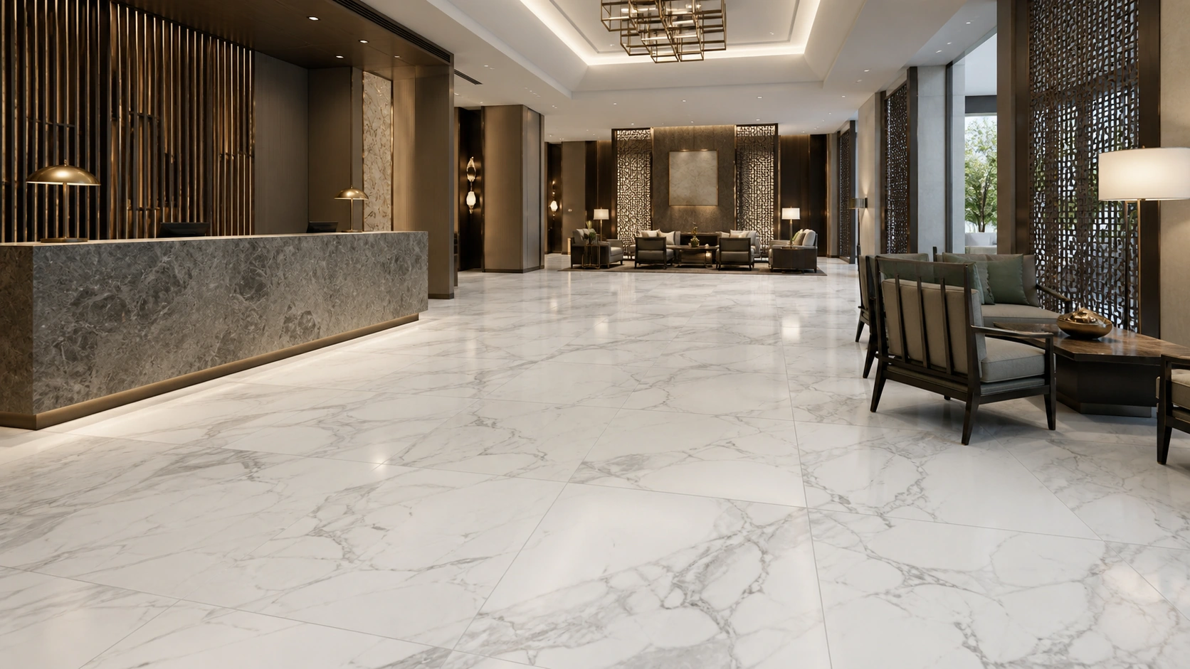
Endless pattern GVT, large-scale veining, PEI 5 | 32x32 (800x800 mm) or larger, rectified | Matte or semi-polished, dry zone | Rs. 180 to Rs. 270/sq.ft
Sized so the full composition develops across the lobby's open centre, with PEI 5 abrasion resistance confirmed on the technical data sheet for genuine commercial traffic.
Pair with: 4000K neutral lighting, the commercial standard, which keeps white and grey marble crisp, plus brushed steel or blackened brass at reception scale.
Avoid: Placing this finish in the entrance zone itself, where wet footwear during monsoon makes a smooth lobby floor a genuine liability.
Idea 17: Double-Height Reception Wall, Bold Veining
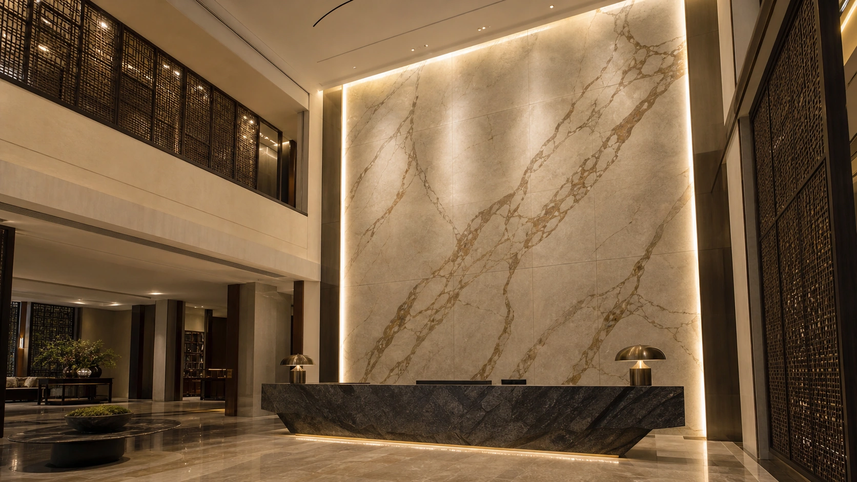
Endless pattern GVT, bold large-scale veining | 2x4 (600x1200 mm) or slab, rectified | Matte | Rs. 190 to Rs. 280/sq.ft
Chosen specifically to hold up at two viewing distances, ground level and the upper floor, which rules out fine detailed patterns that dissolve at height.
Pair with: Vertical wall-wash lighting running the full height at 3500K to 4000K, revealing the composition evenly rather than lighting only the lower portion.
Avoid: Lighting only from ground level, which leaves the upper half in shadow and wastes the material bought for it.
Idea 18: Corridor Run, Linear Pattern Along the Length
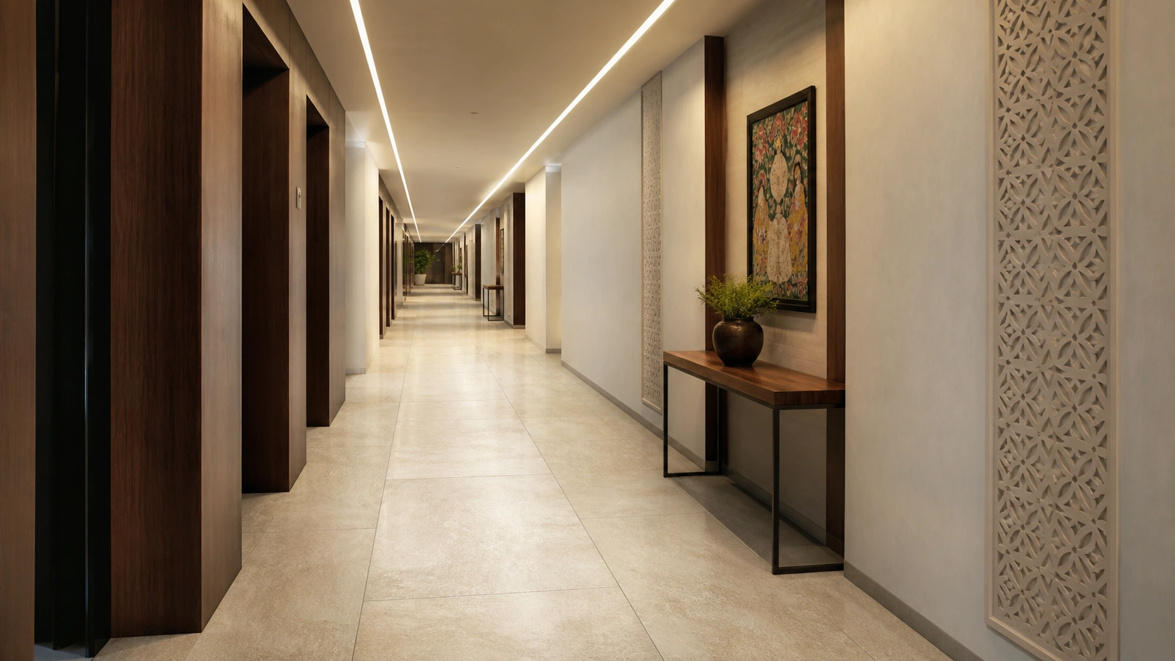
Endless pattern GVT, linear stone-look, PEI 5 | 2x4 (600x1200 mm), rectified | Matte | Rs. 165 to Rs. 245/sq.ft
A linear composition oriented along a hotel or office corridor's length makes a long circulation route feel deliberate rather than merely long.
Pair with: Linear ceiling lighting running parallel to the pattern at 4000K, reinforcing the directional pull rather than fighting it.
Avoid: Cross-corridor fittings at regular intervals, which chop the corridor into visual segments and undo the lengthening effect.
Four Field Tests to Run Before You Buy
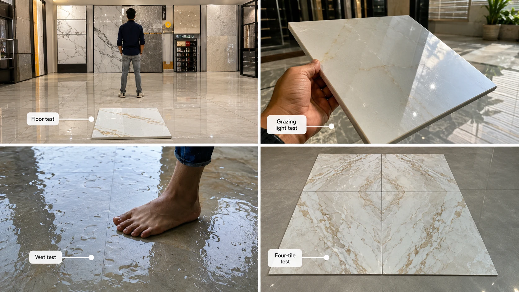
Each of these takes under a minute in the showroom and prevents a decision you cannot reverse.
- The floor test. Put the sample on the showroom floor and step six feet back. This is the only view that matches how you will actually see the tile. Gloss in particular behaves completely differently at an oblique angle than it does held at eye level.
- The grazing light test. Hold the sample so light skims across its surface at a shallow angle rather than hitting it straight on. This reveals surface texture, waviness, and how the finish will read when low sun comes through your window.
- The wet test, for any floor that will get wet. Ask to see the tile wet and place a hand or foot on it. This is not a substitute for a confirmed wet coefficient of friction figure, but it will immediately rule out anything obviously unsuitable.
- The four-tile test, for patterned ranges. Ask for four tiles laid together rather than one. A single tile tells you the colour; four tell you how the pattern actually repeats and whether the repetition will be visible across a floor.
Delivery Day: The Ten-Minute Check That Prevents The Worst Failures
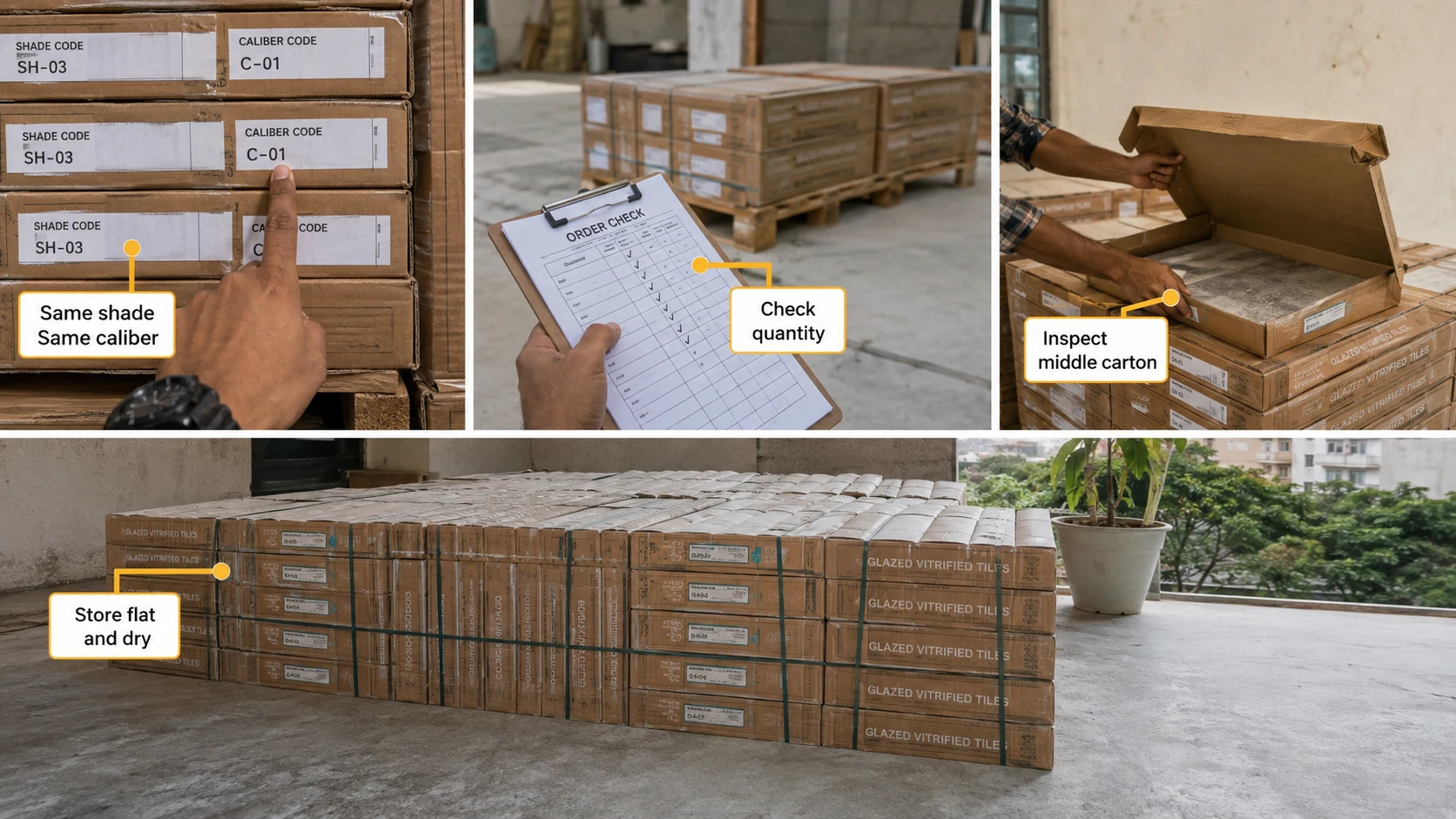
- Check the shade code is identical on every carton. Different shade codes mean different colour batches, and mixing them produces visible tonal patches across the finished floor.
- Check the calibre code is identical on every carton. Calibre identifies the dimensional batch, and mixing calibres means laying slightly different-sized tiles together, forcing either varying joint widths or misaligned grout lines.
- Check the quantity against your order, including overage, before installation begins, since running short mid-installation on a patterned range often cannot be resolved by buying more.
- Open and inspect a carton from the middle of the pallet, not just the top one, since damage and variation are not always visible from the outside.
- Confirm the tiles are stored flat and dry on site, since cartons stored on edge or exposed to rain can produce warping and staining before a single tile is laid.
Quick Reference: Lighting and Metal Pairing by Tile Tone
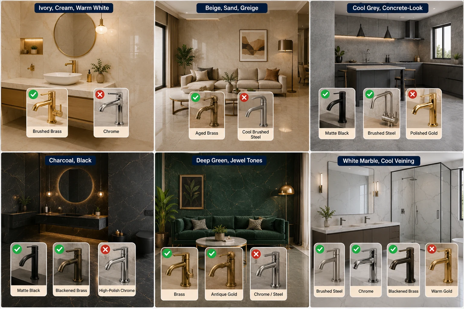
| Tile Tone | Light Temperature | Metal Finish That Flatters | Metal to Avoid |
| Ivory, cream, warm white | 2700K to 3000K warm | Brushed brass, antique gold, bronze | Chrome, which reads cold and thin against warm ivory |
| Beige, sand, greige | 2700K to 3000K warm | Aged brass, bronze, walnut-toned accents | Cool brushed steel, which pulls the warmth out |
| Cool grey, concrete-look | 3500K to 4000K neutral | Matte black, brushed steel, chrome | Polished gold, which fights the tone rather than complementing it |
| Charcoal, black | 3000K with indirect bias light | Matte black, blackened brass | High-polish chrome, which creates hard glare points |
| Deep green, jewel tones | 2700K to 3000K warm accent | Brass, antique gold | Chrome or steel, which makes rich colour look clinical |
| White marble, cool veining | 3500K to 4000K neutral | Brushed steel, chrome, blackened brass | Warm gold under warm light, which yellows a cool white |
What Not to Pair With an Endless Pattern
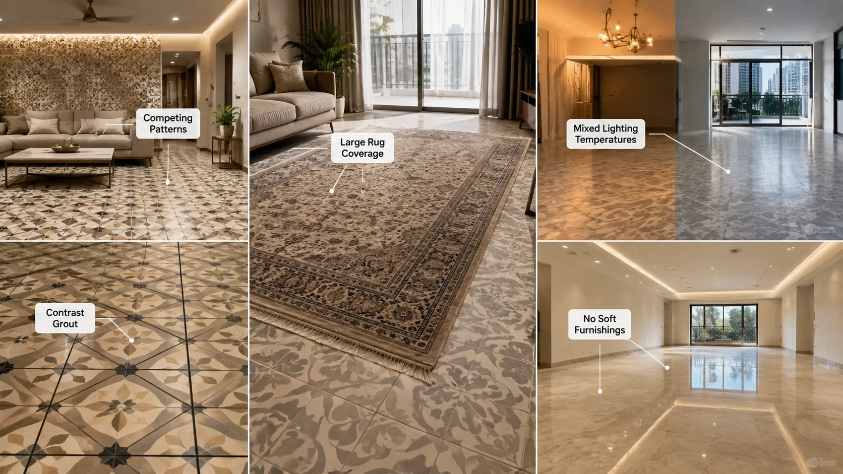
- A second patterned surface in the same sightline. Two continuous compositions competing means neither reads as the focal point.
- Contrast grout. It reinstates exactly the grid the pattern exists to remove.
- A large central rug over a patterned floor. It covers the area where the composition develops, leaving only the cut perimeter visible.
- Mixed lighting temperatures within one continuous surface, which makes a single floor appear to change colour across the room.
- A fully hard-surfaced room with no soft furnishing, which leaves the space acoustically harsh, however good the floor looks.
Specification Baseline for Every Idea Above
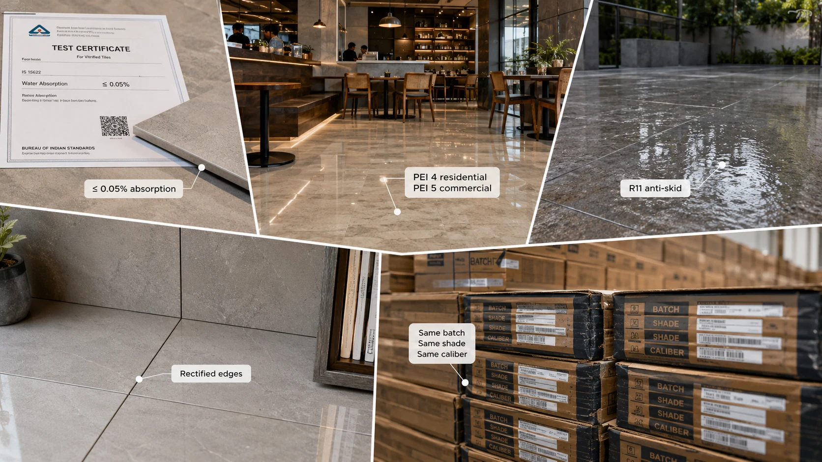
- Water absorption 0.05% or below, the benchmark set by the Bureau of Indian Standards under IS 15622 for vitrified tile, with the test certificate requested.
- PEI 4 minimum for residential floors, PEI 5 for commercial, as stated on the manufacturer's technical data sheet.
- Confirmed wet coefficient of friction 0.4 minimum for any floor that gets wet, and anti-skid R11 for exposed outdoor surfaces.
- Rectified edges wherever the joint should disappear, paired with a genuinely flat substrate, since narrow joints expose unevenness rather than hiding it.
- Single batch, single shade code, single calibre code across the full quantity plus 10 to 15% overage.
Find the Look That Matches Your Goal on TilesFinders
Endless pattern ranges can be compared on TilesFinders by pattern family, format, edge finish, and rating, so you can start from the outcome you want and confirm the full recipe before committing.
FAQs
This is critical lighting. When the sun or a light source strikes the floor at a shallow raking angle, it casts a small shadow off every height difference between adjacent tiles, making unevenness visible that overhead light hides completely. Rooms with large east- or west-facing windows experience this daily and need tighter installation tolerance.
Shade code identifies the colour batch, and calibre code identifies the dimensional batch, since fired tiles shrink slightly and can vary marginally in actual size between production runs. Every carton in one order should carry identical codes; mixing shades causes tonal patches and mixing calibres causes misaligned grout lines.
The opposite. A wider joint absorbs small height differences with a soft visual transition, while a very narrow joint puts two tile edges almost in contact so any height difference reads as a hard ridge. Narrow joints require rectified tiles and a genuinely flat substrate to work.
Put it on the floor and step six feet back, which matches how you will actually view it. Judging a floor tile held vertically at eye level is misleading, particularly for gloss, which behaves very differently at oblique viewing angles.
Considerably. Warm light at 2700K to 3000K makes beiges, ivories, and gold veining glow while turning cool greys muddy. Neutral 4000K keeps greys and cool marbles crisp but drains warmth from beiges. Showrooms usually run 4000K or higher, so warm tiles often look richer at home than in store.
It can. Tile reflects sound rather than absorbing it, so a tiled room with bare walls and minimal soft furnishings has a longer reverberation time, making conversation sharper and television sound harsher. Curtains, upholstered seating, and a rug at the seating group resolve it.
Mid-tones with visible surface variation, rather than very pale or very dark floors. Dark floors in particular show dust and footprints far more readily than most buyers expect, and dark gloss shows the most of all.
Brushed brass, antique gold, or bronze, which share the tile's warm undertone. Chrome and cool brushed steel read cold against warm ivory and pull warmth out of the scheme.
With a wall-wash from above that grazes the surface, rather than ceiling downlights aimed straight down. Downlights light the floor in front of the wall and leave the composition itself flat and underlit.
10 to 15% overage from a single batch with matching shade and calibre codes, ordered with the original purchase, since a later batch will not continue the sequence and off-sequence pieces have limited reuse.


See our tile guides first
Set TilesFinders as a preferred source and our buying guides surface ahead of the rest for you.
Add as preferred sourceTakes one tap. Nothing to install.
What Readers Say
I was about to redo my parking area with the wrong tile size until I read this. The layout comparisons saved me from a costly mistake.
We reference TilesFinders guides while briefing clients on material selection. The size and pattern breakdowns are accurate and easy to explain visually.
On site, I get asked about grout spacing all the time. This article gave me a solid reference I now share with my team before every job.
Finally a guide that doesn't just push generic advice. The oil stain removal steps actually worked on our clubhouse driveway tiles.
I run a small construction firm and now send this link to clients directly when they ask about entrance tile sizing. Saves me an hour of explaining.
Good practical detail, though I wish there were more examples for compact apartment entrances specifically, not just villas.
My mother-in-law wanted marble, I wanted vitrified. This blog gave us the neutral comparison we needed to actually decide together.
Detailed without being overwhelming. I appreciated that it covered both cost and maintenance, not just the aesthetics.
Used the algae and hard water removal tips on our terrace tiles after the monsoon. Worked better than what our regular cleaner was doing.
As someone who sources tiles for multiple builder projects, I find these comparisons genuinely useful for vendor conversations, not just consumer content.
Recommended this to a client who kept second-guessing the entrance design. The small vs large layout section settled the debate instantly.
Straightforward and honest, no unnecessary jargon. Would like to see a similar breakdown for outdoor pool-deck tiles next.
We've bookmarked several TilesFinders guides for our design handbook. Reliable source when clients want data, not just opinions.
Two paths, one marketplace.
Get free quotes from verified suppliers.
Share your room, budget, and style. Suppliers in Morbi respond within hours.
Get Free QuotesList your business, reach real buyers.
Put your showroom in front of homeowners searching for tiles right now.
List Your Business