

Vastu-Based Tile Selection in Pilibhit: Colours, Finishes and Room-by-Room Guide
Loading designs...
-
 3D 001
 -
 3D 002
 -
3D 003
-
3D 004
-
3D 005
-
3D 006
-
3D 007
-
3D 008
-
3D 009
-
3D 010
-
Adison Grey
-
Adison chocco
-
Afyon Bianco
-
Adison Ivory
-
3D 011
-
Albert White
-
Armani chocco
-
Aldur Brown
-
3D 012
-
Armani Nero








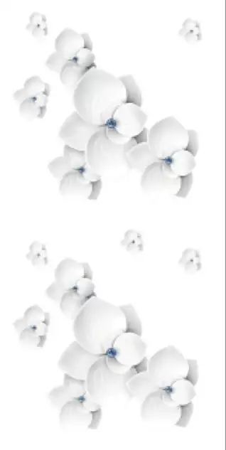
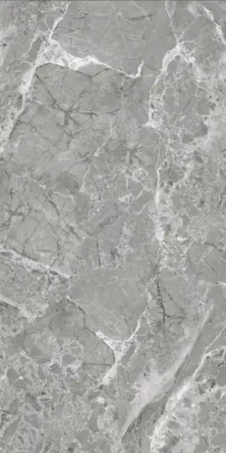
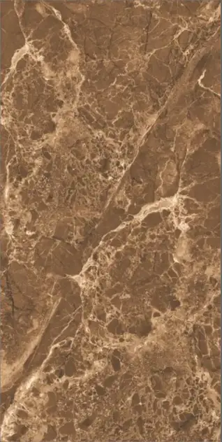
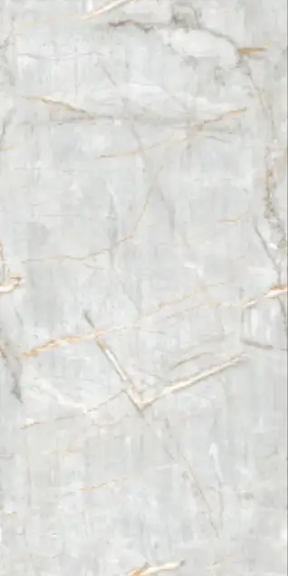






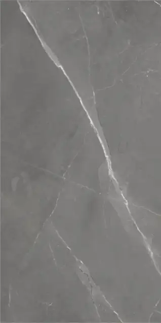
Vastu Shastra tile selection in Pilibhit is a deeply ingrained cultural practice, with most independent house projects incorporating Vastu principles for tile colour and placement. The alignment between Vastu colour recommendations and practical tile performance in Pilibhit's climate is largely positive. Vastu's preference for light, neutral tones (white, cream, beige, light yellow) in main living spaces corresponds well with colours that manage Pilibhit's dusty dry-season conditions and complement natural light levels. Pilibhit homeowners often find that Vastu guidance and practical preferences converge on the same light neutral palette for living spaces, available at local dealers along Bareilly Road and Puranpur Road. Explore more tile design ideas for Vastu-compliant interiors.
Best Tile Colours Per Vastu for Pilibhit Homes
Vastu Shastra offers specific guidance on tile colours for homes in Pilibhit to promote positive energy and harmony. These recommendations are often practical for the local climate, balancing aesthetics with functional benefits. Adhering to these principles helps create a balanced and welcoming environment for residents.
White and Off-White: Most Auspicious General Shade
White tiles symbolise purity, peace, and positive energy in Vastu and are recommended for living rooms, pooja rooms, and North-East facing areas. In Pilibhit, this aligns with the practical performance advantage of light tiles in most interior spaces. Off-white or ivory provides the same Vastu benefit with slightly better dust camouflage than pure white in Pilibhit's dry season.
Beige and Cream: Stability and Grounding
These colours are associated with stability and emotional grounding in Vastu. Recommended for bedrooms and common areas. Beige GVT tiles are widely purchased floor tile colours in Pilibhit precisely because they satisfy both Vastu guidance and the practical maintenance needs of Pilibhit households. Warm cream tones also suit the traditional local home interior context. For living room areas, living room tiles in these shades offer a calm atmosphere.
Light Yellow for East-Facing Spaces
Light yellow is associated with warmth and positivity connected to the rising sun in Vastu. It is beneficial for east-facing kitchens and study rooms. In Pilibhit, soft yellow or warm cream pastel wall tiles in east-facing kitchens create a bright, welcoming morning cooking environment, aligning with Vastu principles for the Agni (fire) element.
Soft Green for the North Direction
Green symbolises growth and prosperity in Vastu. Soft green wall tiles or green-toned accent tiles are recommended for north-facing areas in Pilibhit homes. This is particularly appropriate for north-facing kitchen or utility spaces where the colour creates a fresh, clean environment and promotes positive energy. These tones bring natural balance to the space.
Light Grey for Modern Balance
Light grey tiles are considered neutral and acceptable in Vastu for living rooms and corridors where a contemporary appearance is desired. In Pilibhit, light grey is a fast-growing floor tile colour in new construction precisely because it satisfies both modern aesthetic preferences and the practical dust management that Vastu-comfortable living requires. It offers a subtle, sophisticated backdrop.
Tile Finishes as Per Vastu for Pilibhit
Vastu Shastra also provides guidance on tile finishes, aiming to create environments that promote stability and balanced energy. These recommendations often complement practical considerations for Pilibhit's climate, such as managing dust and ensuring safety in wet areas. The right finish contributes significantly to a home's overall feel.
Matte Finish for Stability
Matte finish is recommended in Vastu as it creates a stable, grounded, calm environment without excessive reflective stimulation. In Pilibhit, this aligns directly with practical performance: matte tiles hide Pilibhit dry-season dust, provide better grip on wet floors, and reduce the intense glare of direct Pilibhit summer afternoon sunlight through windows. This ensures comfort and safety.
Satin Finish for Balanced Energy
Satin matte provides moderate shine without excessive reflection. Vastu recommends moderate, balanced surfaces in family living spaces. Satin matte and carving matte vitrified tiles provide the high visual quality Pilibhit homeowners desire while maintaining the energetic balance Vastu practitioners recommend. These finishes offer a sophisticated yet understated look.
Limited Use of Glossy Finish
Vastu recommends careful use of highly reflective surfaces that can overstimulate energy in main living spaces. Polished glossy PGVT is appropriate for dry living rooms and commercial spaces in Pilibhit where maximum brightness is desired but should not dominate bedroom or pooja room flooring according to Vastu principles. This ensures a calm environment.
Anti-Skid for Bathrooms
Safety as a Vastu principle: the protection of household members from physical harm is a core Vastu concern. Anti-skid matte or punch-finish tiles for Pilibhit bathroom floors satisfy both the safety requirement and the Vastu recommendation for protected, stable wet-area surfaces. This is a critical consideration for bathroom tiles in any home.
Room-by-Room Vastu Tile Guide for Pilibhit
Applying Vastu principles to tile selection for each room in a Pilibhit home helps create harmonious and energised living spaces. This room-by-room guide provides specific colour and finish recommendations that align with both Vastu Shastra and the practical needs of local households, ensuring a well-balanced interior.
Living Room
Vastu: North or East facing living rooms benefit from white, cream, and light grey tiles. Design recommendations: marble-look, plain glossy or satin, soft vein bookmatch, and subtle terrazzo. In Pilibhit, polished or satin marble-look GVT in white, beige, or soft grey for living rooms aligns with both Vastu and the dominant aesthetic preference in Pilibhit premium residential construction. Avoid dark stone-look or deep charcoal in the North-East corner.
Bedroom
Vastu: South-West bedroom preferred with earthy tones: beige, light brown, warm cream. Design recommendations: wood-look tiles, matte stone, plain vitrified, light cement-finish. In Pilibhit, wood-look plank tiles in teak and walnut or warm beige marble-look in satin matte are the most Vastu-aligned and practically appropriate bedroom tiles. Avoid heavily glossy patterns that create visual stimulation inappropriate for sleeping spaces.
Kitchen
Vastu: South-East kitchen (Agni zone). Light yellow, soft peach, and cream are considered beneficial. In Pilibhit, light-coloured stain-resistant ceramic tiles for kitchen walls and matte vitrified in stone or cement look for kitchen floors align with Vastu recommendations. Avoid black, dark blue, or very dark stone-look tiles in the kitchen, which may visually conflict with the fire element of the Agni zone. For other areas, explore kitchen tiles.
Pooja Room
Vastu: North-East facing. White, ivory, and light marble-look tiles are recommended to enhance purity and positive energy. Auspicious design options: plain white tiles, marble-look, soft bookmatch, and tiles with Om, Swastik, Lotus, or Kalash decorative motifs. Light glossy finish is appropriate in pooja rooms to increase brightness and spiritual ambience. Tilesfinders connects Pilibhit buyers with dealers who stock decorative devotional tile designs for Pilibhit pooja room applications.
Bathroom
Vastu: North-West or West location. White, light blue, and soft grey recommended. In Pilibhit, white glossy ceramic for bathroom walls (easy cleaning, Vastu-aligned) with matte or anti-skid grey or light blue vitrified for bathroom floors (safety and Vastu-aligned simultaneously). This is the most practical and Vastu-consistent Pilibhit bathroom combination.
Common Tile Vastu Mistakes to Avoid in Pilibhit
Avoiding common Vastu mistakes in tile selection helps prevent negative energy and ensures a harmonious living environment in Pilibhit homes. These considerations cover colour choices, maintenance, and the condition of tiles. Mindful selection contributes to both physical comfort and spiritual well-being.
- Dark tiles in the North-East: Dark colours in the North-East inauspicious corner may block positive energy. Avoid black or very dark brown floor tiles in this zone of Pilibhit homes.
- Cracked or broken tiles: Vastu strongly advises against damaged tiles as they symbolise negative energy and obstacles. Prompt replacement of chipped or cracked tiles in Pilibhit homes is both a safety and a Vastu requirement.
- Excessive black flooring: Dark tile floors should be balanced with lighter walls and furnishings. Not recommended as a dominant floor choice in main living areas per Vastu.
- Direction-wrong colour choices: Red tiles in North-facing rooms or dark blue in South-facing bedrooms conflict with Vastu directional principles. The room-by-room guide above provides correct colour-direction alignment for Pilibhit homes.
For Pilibhit homes, vitrified GVT tiles in light neutral colours (white, cream, beige) are preferred for floors, typically in 600x600 mm or 600x1200 mm sizes, with water absorption below 0.5%. Prices range from Rs. 40 to Rs. 95 per sq.ft. Ceramic wall tiles are common in white or light pastels for bathrooms.
These tiles are manufactured in Morbi, Gujarat, adhering to quality standards. Pilibhit's hot and humid subtropical climate, with its dusty dry season, makes Vastu-aligned choices for light and matte finishes also practical, as they manage dust and reduce glare, benefiting homeowners in the city.
Vastu Shastra Tiles Showroom and Dealer in pilibhit
Somany Tiles
Sundaram Home Plaza
Contact: +91 +91 95204 23123
-99607407-bf3b-4347-a7ec-c253f2cb4ab2.jpg)

-80bdb9ab-b6d6-49e3-8582-88d3d1f76900.jpg)