

Vastu-Based Tile Selection in Kotputli & Behror: Colours, Finishes & Space-Wise Guide
Loading designs...
-
 KDT 209
 -
 11005
11005 -
3021 HL 1
-
Wenge Wood
-
20901-L
-
Badas Cyan
-
ROYAL BOTTOCHINO
-
ELE-1203
-
7068
-
ALPHAINE BLUE
-
Kempas
-
CR Endless Glam Grey(800x1600)
-
Biscuit
-
10018
-
10001 DK
-
Escros Bright (800 x 1600)
-
NEROLI SILVER
-
2383 HL 1
-
Zic Zak 01
-
Nor Gold(800x1600)
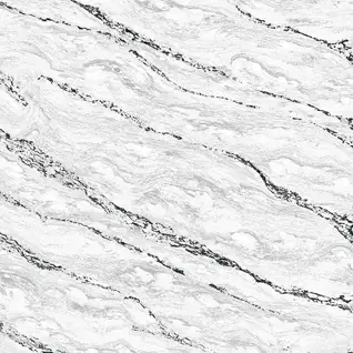
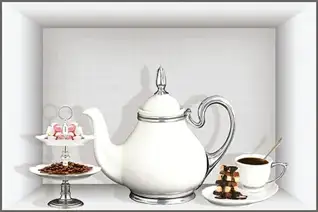




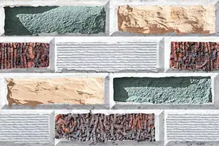
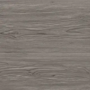









Vastu-based tile selection in Kotputli & Behror is increasingly embraced by homeowners keen on aligning their interiors with traditional energy principles, while simultaneously maintaining modern design aesthetics and practical durability. This approach ensures harmony and positive energy flow in both new constructions and renovated spaces across the residential areas of Kotputli & Behror, reflecting a blend of cultural values and contemporary living.
Best Tile Colours as per Vastu in Kotputli & Behror Homes
The choice of tile colours in Kotputli & Behror homes, guided by Vastu principles, aims to enhance positive energy, create a sense of calm, and promote overall well-being. These selections are especially popular in independent homes and villas.
Light White & Off-White Shades
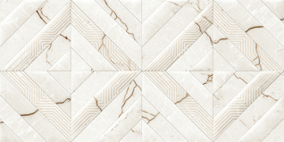
White and off-white tiles are considered highly auspicious in Vastu, symbolizing purity, peace, and positive energy. In Kotputli & Behror homes, these shades are widely applied in living rooms and pooja areas, as they effectively reflect light and enhance brightness. These colours also contribute to making compact rooms appear more spacious while maintaining a serene and balanced environment, aligning with traditional values.
Beige & Cream Tones
Beige and cream colours are associated with stability and grounding energy in Vastu. According to these principles, these shades are well-suited for bedrooms and common areas, as they promote comfort and emotional balance. In Kotputli & Behror’s practical living conditions, these colours also prove to be dust-friendly and easy to maintain, a significant advantage for busy households.
Light Yellow for East-Facing Areas
Light yellow tones are considered beneficial for east-facing rooms, as they represent warmth and positivity, intrinsically linked to the rising sun. Kitchens or study rooms situated in the east direction can greatly benefit from subtle yellow or pastel shades, creating an inviting and energetic atmosphere. This choice is often seen in new builder floors in Kotputli & Behror.
Soft Green for the North Direction
Green symbolizes growth and prosperity in Vastu. Soft green tiles are particularly suitable for north-facing areas or bedrooms, as they are believed to encourage harmony and financial stability. In Kotputli & Behror homes, muted green tones are frequently used in combination with neutral furniture to maintain a balanced and peaceful interior. This complements the natural surroundings.
Light Grey for Modern Balance
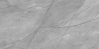
While darker greys are generally advised against in Vastu for certain directions, light grey tiles are considered neutral and acceptable. They are well-suited for living rooms and corridors where homeowners desire a modern aesthetic without disrupting the energetic balance. This allows for contemporary designs that still respect Vastu principles in Kotputli & Behror.
Ideal Tile Finishes According to Vastu Principles
The selection of tile finishes, when guided by Vastu principles, focuses on promoting a harmonious and positive environment within homes. In Kotputli & Behror, homeowners blend these traditional guidelines with modern material choices to create balanced interiors.
Matte Finish for Stability and Grounding
Matte-finish tiles are highly recommended in Vastu as they foster a stable and calm environment. Unlike overly reflective surfaces, matte finishes minimize glare and promote a gentle, subtle energy flow. In Kotputli & Behror homes, matte tiles are commonly utilized in living rooms, bedrooms, and kitchens, providing a grounding effect and easy maintenance, essential for the local climate.
Satin Finish for Balanced Energy
Satin finishes offer a gentle sheen without excessive reflection. As per Vastu, a moderate shine maintains harmony without overstimulating the living space. These finishes are ideal for bedrooms and family rooms where a sense of calmness is paramount, making them a popular choice in newly constructed apartments and villas in Kotputli & Behror. Modern home tile ideas often incorporate satin finishes.
Natural Stone or Textured Finish
Textured or natural stone finishes are considered closely connected to nature and, therefore, positive in Vastu philosophy. They perform exceptionally well in balconies, verandahs, and open areas, promoting grounding energy and stability. These are often used in farmhouses and independent houses in Kotputli & Behror to blend with the natural surroundings and offer durability against the elements. You can see various tile preview designs for these finishes.
Limited Use of Glossy Finish
Glossy finishes reflect light intensely and should be applied judiciously. In Vastu, excessive shine can disrupt the balance of energy in certain spaces. Glossy tiles are better suited for pooja rooms or smaller areas where brightness is desired, but should not dominate the entire flooring of a room to maintain harmony in Kotputli & Behror homes.
Anti-Skid Finish for Bathrooms
Safety is a crucial aspect of Vastu, emphasizing a secure living environment. Anti-skid finishes in bathrooms ensure protection against slips while maintaining a smooth energy flow. Matte or punch-finish tiles are recommended for wet areas, combining safety with Vastu alignment, a practical choice for all types of residences in Kotputli & Behror.
Space-Wise Tile Selection as per Vastu in Kotputli & Behror
Vastu principles guide specific tile choices for different areas within a home, ensuring optimal energy flow and harmony. In Kotputli & Behror, these guidelines are often integrated into architectural plans for both new constructions and renovations, reflecting local cultural importance.
Living Room Tiles
The living room is typically positioned in the north or east direction according to Vastu principles. Light shades such as white, cream, or light grey are recommended to promote openness and positive energy flow. Designs like Marble-Look Tiles, Plain Glossy Tiles, Soft Vein Bookmatch Designs, and Subtle Terrazzo Patterns are considered suitable for living rooms in Kotputli & Behror homes. These designs enhance brightness while maintaining harmony. It's advised to avoid dark stone-look or deep charcoal flooring in the north-east corner, as it may impede positive energy flow.
Bedroom Tiles
Bedrooms, ideally located in the south-west direction, should feature earthy tones like beige, light brown, or warm cream shades. These colours are believed to foster emotional stability and restful energy. Designs such as Wood-Look Tiles, Matte Stone-Inspired Tiles, Plain Vitrified Tiles, and Light Cement-Finish Tiles align well with Vastu recommendations for grounding and calmness. Overly glossy or boldly patterned tiles should be avoided to preserve peaceful vibrations in Kotputli & Behror bedrooms, ensuring a serene environment. For more inspiration, explore interior tile design ideas.
Kitchen Tiles
The kitchen is ideally situated in the south-east direction (Agni corner), representing the fire element. Warm tones such as light yellow, soft peach, or cream are considered beneficial. Suitable design options include Plain Matte Tiles, Light Marble-Look Designs, Subtle Textured Tiles, and Mild Pattern Ceramic Tiles. Flooring should not be black, dark blue, or very dark stone-look tiles, as these may imbalance the fire energy and reduce positive flow. This is a key consideration for kitchens in Kotputli & Behror homes.
Pooja Room Tiles
The pooja room should ideally be in the north-east direction. White, ivory, or light marble-look tiles are highly recommended to enhance purity and positive energy. Designs such as Marble-Look Tiles, Plain White Tiles, Soft Bookmatch Patterns, and Decorative Tiles with Om, Swastik, Lotus, or Kalash motifs are considered highly auspicious. Light glossy finishes can be used to increase brightness and spiritual ambiance, while dark or heavy patterns should be avoided to maintain peace and harmony in Kotputli & Behror's pooja spaces.
Bathroom Tiles
Bathrooms, ideally located in the north-west or west direction, should utilize light blue, white, or light grey shades to maintain balance. Designs like Matte Marble-Look Tiles, Soft Stone-Finish Tiles, Subtle Plain Tiles, and Punch-Finish Anti-Skid Tiles are ideal for both safety and Vastu alignment. Deep red, dark black, or heavily patterned tiles should be avoided, especially on flooring, to prevent energetic imbalance in Kotputli & Behror bathrooms, ensuring a calming and hygienic space.
Common Tile Mistakes to Avoid as per Vastu in Kotputli & Behror Homes
Adhering to Vastu principles can prevent common mistakes that may disrupt the energy balance in a home. In Kotputli & Behror, being mindful of these errors ensures that interiors not only look good but also foster positive vibrations.
Using Very Dark Tiles in North-East Areas
Dark colours in the north-east direction are considered inauspicious as they may block positive energy flow. Homeowners in Kotputli & Behror should avoid black or dark brown tiles in this crucial area, as it can negatively impact spiritual well-being and prosperity, aligning with local Vastu beliefs.
Broken or Cracked Tiles
Vastu strongly advises against retaining cracked or damaged tiles, as they symbolize negative energy and obstacles. Prompt replacement ensures both safety and positive vibrations, maintaining the integrity and auspiciousness of a home in Kotputli & Behror. Regular maintenance is essential.
Excessive Black Flooring
While black tiles can impart a modern aesthetic, Vastu suggests limiting their use, particularly in main living spaces. Dark tones should be balanced with lighter walls and furniture to prevent creating heaviness or an energetic imbalance, which is a common guideline among local architects in Kotputli & Behror.
Overly Busy Patterns
Heavy patterns and chaotic designs can disturb both visual and energetic harmony within a home. Subtle marble-look or plain designs are considered more conducive to peaceful interiors, promoting a sense of calm rather than distraction. This is a key consideration for designing serene spaces in Kotputli & Behror.
Wrong Direction-Based Colour Selection
Ignoring directional principles while choosing tile colours can lead to imbalance. For instance, placing red tiles in north-facing rooms or dark blue in south-facing bedrooms may not align with Vastu recommendations, potentially creating energetic discord. This awareness is growing among homeowners in Kotputli & Behror, who increasingly consult Vastu experts.
Vastu Shastra Tiles Showroom and Dealer in kotputli-and-behror
Baberwal Tiles & Sanitary ware
Contact: +91 99790 04681
H&R Johnson showroom
Contact: +91 98292 46155
RAJASTHAN MARBLE
Contact: +91 97823 41477
-99607407-bf3b-4347-a7ec-c253f2cb4ab2.jpg)

-80bdb9ab-b6d6-49e3-8582-88d3d1f76900.jpg)