

Golden Tiles In Kotputli & Behror: Contrast, Balance & Visual Anchors
Loading designs...
-
 7039
7039 -
 7007
7007 -
5054 HL 22
-
1784 HL 1
-
1784 HL 2
-
5092 HL 1
-
3046 D
-
Provenza Yellow
-
5054 HL 6
-
3045 D
-
Bruno Gold
-
White Gold Decore
-
Tropical Azure
-
White Gold
-
Tropical Brown
-
Sky Bronze
-
Aqua Gold
-
Calacatta Gold
-
Zodic Blue
-
7007









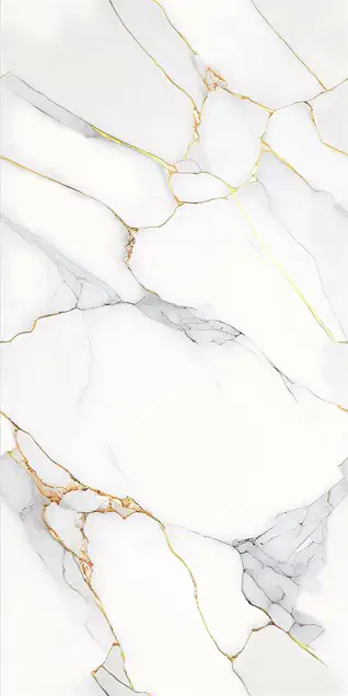



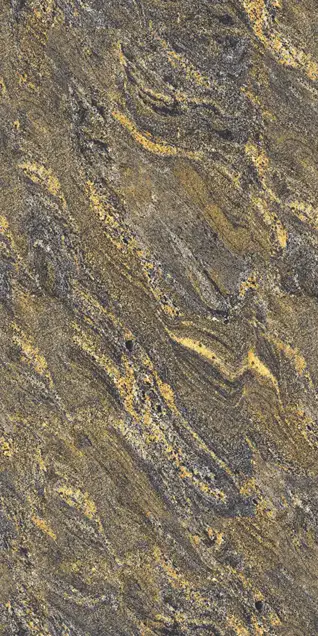
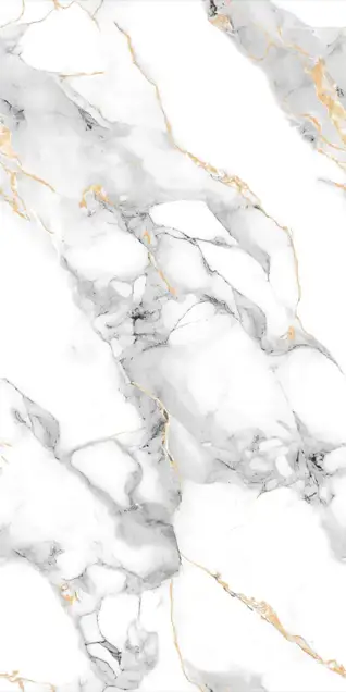
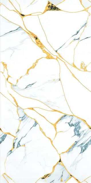
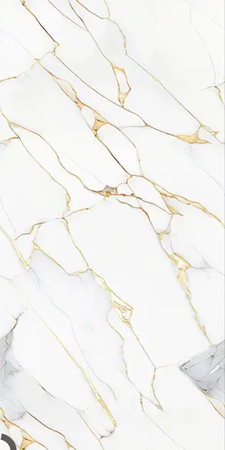

In Kotputli & Behror's evolving interior landscape, gold tiles are no longer solely about ostentatious display; they are a strategic design tool used to command attention and define space. When deployed correctly, gold tiles serve as the “jewellery” of the room, elevating the ordinary into the extraordinary through principles of contrast and restraint. They offer a luxurious touch to modern apartments and traditional Havelis alike, providing a striking alternative to common stone finishes found in the region.
The Art of Contrast: Pairing Gold with Black & Grey Tiles
Gold effectively “disappears” when placed next to warm colors like beige or cream. To make gold tiles truly shine in a Kotputli & Behror home, one must rely on the physics of contrast. Gold demands a dark partner to reflect against, creating a dramatic visual effect in various residential and commercial settings. This technique is favored by architects for creating impactful interiors. Tile design ideas often highlight these contrasts.
- The Science of Light: Gold tiles (especially PVD or Metallic finishes) are highly reflective. When paired with Matte Black or Charcoal Grey, the dark tiles absorb light while the gold reflects it. This creates a “chiaroscuro” effect, a dramatic interplay of light and shadow that instantly adds depth to a flat wall, enhancing the sophistication of spaces in Kotputli & Behror.
- Recommended Combinations:
- Portoro Gold & Black: Use Black Marble-look tiles as the base and insert a row of Golden Portoro tiles (black tiles with heavy gold veins) as a border. This creates a rich, seamless luxury, ideal for high-end living rooms in Kotputli & Behror and commercial establishments along NH48.
- Concrete & Gold Mosaic: For a modern look, pair raw Grey Cement tiles with a vertical strip of Golden Mosaic tiles. The matte grey makes the shimmering gold mosaic pop, creating a sophisticated feature, perfect for contemporary homes and industrial-chic offices in Kotputli & Behror.
- Royal Navy & Gold Pattern: Deep Midnight Blue tiles paired with Golden Damask or Floral decor tiles create a “Regal” palace vibe, ideal for bedroom feature walls in traditional Havelis or luxury apartments in Kotputli & Behror, adding a touch of opulent heritage.
- Emerald Green & Gold Highlighters: Dark Bottle Green tiles mixed with Golden Highlighter tiles (tiles with gold foil print) evoke the look of precious gemstones, perfect for a moody, luxury bathroom in Kotputli & Behror. This combination adds depth and a sense of indulgence.
- Chocolate Brown & Gold Veins: For a warmer look, pair deep Coffee Brown tiles with White tiles featuring Gold veins. The brown grounds the room, allowing the gold veins to sparkle without being overwhelming, creating a cozy yet luxurious ambiance in Kotputli & Behror homes.
Visual Anchors: Gold Highlighters for TV Units & Vanity Walls
In interior design, a “Visual Anchor” is a focal point that stops the eye from wandering. Gold is the most powerful anchor available because the human eye is naturally drawn to brightness. This technique is highly effective in Kotputli & Behror homes, from independent houses to new apartment complexes, creating distinct zones and enhancing aesthetic appeal. Tile mockups often demonstrate this effect.
- The “Pinning” Effect: Use gold tiles to “pin” the viewer's attention to specific zones, making them stand out.
- Behind the TV: Instead of a plain wall, use 3D Gold Punch tiles or Golden Mosaic sheets behind your LED unit. This frames the entertainment area and turns technology into a decor feature, a popular choice in modern Kotputli & Behror living rooms.
- The Vanity Wall: In bathrooms, the mirror area is the hero. Framing your mirror with Golden Subway tiles or a vertical strip of Golden Highlighter tiles adds a hotel-like luxury to your daily routine in Kotputli & Behror, elevating standard bath spaces.
- The Puja Room: In Kotputli & Behror, this is a sacred space. Using Gold-plated Om or Swastik motif tiles as a backdrop creates a glowing, spiritual focal point that commands reverence, especially in traditional homes, reflecting cultural demand patterns.
- Go Big for Impact (Size & Finish): To make these anchors look truly seamless, use High Gloss slabs available in 600x1200mm or 800x1600mm. Why? Small tiles create too many “grid lines” that break the flow. These large formats minimize joints, creating a continuous, mirror-like golden surface that looks far more expensive than smaller tiles, a favored choice among architects in Kotputli & Behror.
Balancing the "Bling": The 80/20 Rule for Luxury Interiors
The biggest mistake homeowners in Kotputli & Behror make is overusing gold, which can transform a room from “Royal” to “Gaudy.” Professional designers adhere strictly to the 80/20 Rule, ensuring a balanced and sophisticated aesthetic. This principle helps avoid overwhelming spaces, particularly in the city’s evolving housing types, ensuring a tasteful integration of luxury. Tile preview designs help achieve this balance.
- The Formula: 80% of the surface should be neutral (White, Grey, Black, or Cream), and only 20% should be Gold. This ratio ensures that gold acts as an accent, providing sparkle without dominating the entire space, a key aspect for creating elegant interiors in Kotputli & Behror.
- How to Apply It: If tiling a bathroom, use plain white marble tiles for the walls (80%) and reserve gold tiles only for the shower niche or a single vertical strip behind the commode (20%). This restraint elevates the design, making it feel more opulent and less ostentatious, a common practice in luxury projects in Kotputli & Behror.
- The "Less is More" Philosophy: True luxury whispers; it doesn't shout. A single thin line of gold running across a floor is far more expensive-looking than a floor entirely covered in gold-colored tiles. This subtle approach appeals to the refined tastes of modern Kotputli & Behror homeowners, integrating elegance seamlessly.
- Furniture Coordination: If your floor has gold accents, ensure your furniture legs or light fixtures also feature hints of gold. This “connects” the floor to the rest of the room, creating a cohesive design language that enhances the overall aesthetic, a popular choice among interior decorators in Kotputli & Behror.
Golden tiles showroom and dealer in kotputli-and-behror
kajaria tiles ramavtar & son's 2nd showroom
Kajaria tiles exclusive showroom
Contact: +91 89493 74600
H&R Johnson showroom
Contact: +91 98292 46155
-01ae8c5a-0400-4c6d-8ff7-a3b93e85bf8f.jpg)
-9f831d48-b3bd-4701-a2a1-136f1cbd1251.jpg)
-1ffbd51f-aa6b-40f9-a0bc-3e01d7a88a73.jpg)